Gestalt theory in web design
A quick introduction to the design theory for beginners
By: Ajdin Imsirovic 18 August 2021
Gestalt theory comes from psychology. The goal was to understand the process by which we derive meaning from our environment. As it turns out, these principles translate nicely to (web) design.
What follows is a list of the Gestalt principles.
1. Emergence
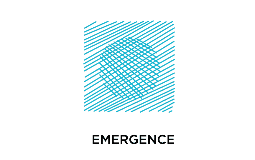
This principle says that when a person sees something, they initially try to comprehend it as a full shape. They compare the shape with other shapes they’ve already seen, and try to find a match. If there is a match in our previous experience, great! We then know what it is.
Otherwise, if it’s unfamiliar, we look at the inidividual parts that make up this shape - trying to come up with what this whole thing is, based on its individual parts.
In web design, emergence means that there’s just so much “wiggle room” when implementing a design: a user needs to immediately understand what they’re looking at. Thus a menu needs to look like a menu - its “shape” needs to be instantaneously recognizable.
When a visitor to your websites sees the main menu, they need to think: “I’ve already seen this, I know what it is and how it works”.
What emergence boils down to: we can be creative with individual parts of a component on our web page - such as a main menu component - as long as the whole component doesn’t look unfamiliar and weird. It’s sort of the essence of the whole “Don’t make me think” thing.
Emergence is also the number one argument for minimalism in web design: The simpler our main menu component gets, the more obvious it becomes. Thus, minimalism is a welcome approach, due to emergence.
2. Reification
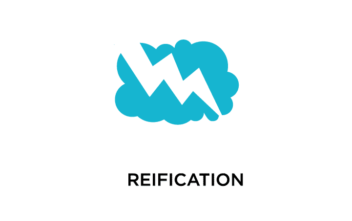
I always think about reification like this: A tiger in a jungle behind some trees.
If we imagine ourselves being in a jungle, and seeing a tiger behind some trees, that might mean the difference between life and death: it’s enough to see just some parts of the tiger to know that it is indeed a tiger.
So, reification might be a survival instinct that’s hard-wired into our brains. On the other hand, tigers came up with stripes, because that pattern is tougher to see.
If anything, remember this: Tigers fight reification.
In web design, reification can be translated to this: it’s enough to see only a part of a component to understand what it is or what it does.
3. Multistability
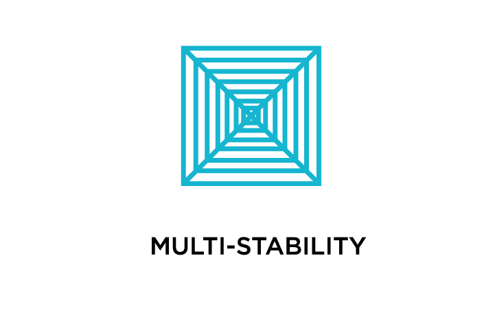
Lots of optical illusions have to do with multi-stability. We can only hold one interpretation of an image at any given time.
There’s a famous optical illusion where there’s a white vase on a dark background - but the edges of the vase are shaped like to faces facing each other.
The funny thing is: we can perceive either a vase or the two faces, but not both. That’s the essence of multi-stability.
In web design, multi-stability is usually employed in various clever logos using negative space to build two images out of one.
The ATP tour logo is an example of multistability principle in use.
4. Invariance
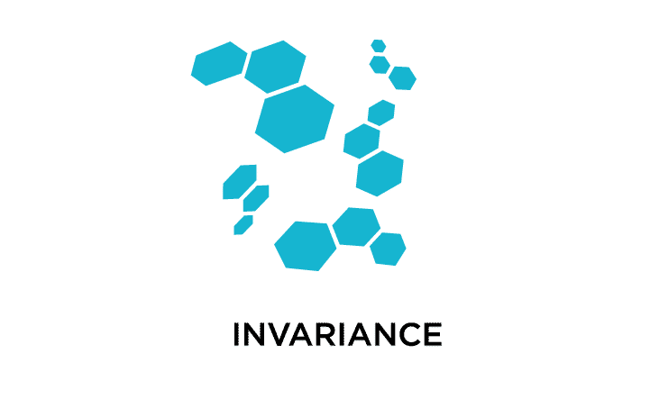
Invariance principle states that we have an amazing pattern-recognition abililites, allowing us to recognize things that stick out.
In web design, this means that we can control user flow on our web pages using the invariance principle.
For example, in a main menu, all the items are uniform, except the one we’ve given a different background color: nudging the user to notice it, and hopefully click it, since it’s the one that looks different.
Another example is a price list where, out of, say, four options, we use invariance to make one of those four options stick out, by, for example, flipping the color scheme on it.
Invariance is great for things like call-to-action buttons.
5. Closure
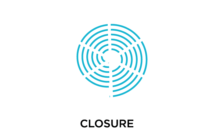
Given a complex image, we’ll look for a single pattern that “unifies” it. This is what’s referred to as closure.
Here’s another explanation: if we are looking at a complex arrangement of different elements, rather than perceiving them as individual elements, we’ll use our pattern-matching “software” to try to make a “unification pattern”.
That’s why this is one of the common examples of closure as a concept:
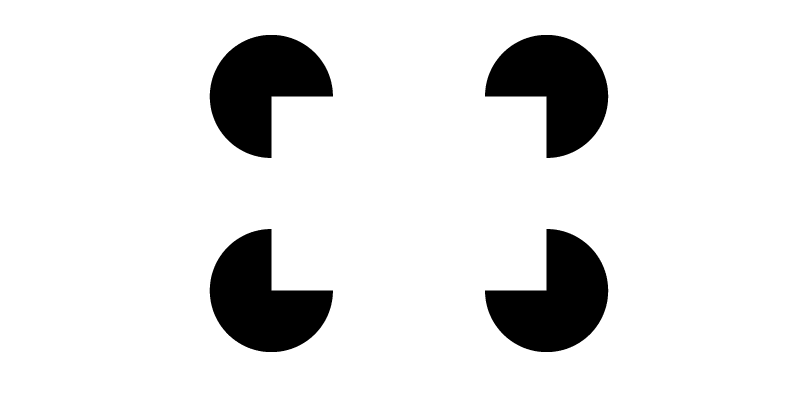
Our mind fills in the blanks, and we see a rectangle with four circles under each of the rectangle’s corners.
In practical web design, proper use of closure can lead to great results.
It can be a bit hard to come up with an example for closure, but it’s actually pretty neat once you understand it and start using it in your designs.
Here’s a simple example:
Without the “closure elements” above, the image would be a lot less interesting. Whenever you need to spice up a dull design with not a lot of content, using closure can be a good strategy.
6. Symmetry and order
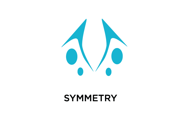
People look for order in everything they do. It’s a built-in instinct. Symmetry is a version of order, and thus people find it aesthetically pleasing.
Having three or four cards in a row in a container is an example of symmetry in web design.
However, too much symmetry can be monotonous - and this is a chance for us designers to break the monotony by introducing disbalance into symmetry.
If we do this right, a call-to-action can be that disbalance, and can be a perfect magnet for visitors - because as already said, it fires off our pattern-matching alarms.
7. Figure / ground
There’s a duality of perception: We either recognize the thing as the background, or the figure (the focal point).
In web design, we can make this work to our advantage by making the figure the center of our design, the thing that everything else on our web page is pointing to.
There are three “varieties” in the figure/ground relationship. The first one is my personal favorite, but by no means is it the only possibility:
- stable - it’s clear what is what, and the focus is on the figure
- reversible - both figure and ground are competing for the viewers attention - and thus the figure and ground are reversible; this can still be a great design, but it’s hard to pull off
- ambiguous - it’s unclear what is the figure and what is the ground
8. Uniform connectedness
We perceive visually connected elements to be more closely related. An example would be adding connections such as arrows between images and text to reinforce the fact that these concepts are connected, rather then letting the viewer process what they’re seing. It’s a case of “Don’t make me think” again.
9. Common regions
When design elements are a part of the same container, we consider them as a part of the same group. The very-often-used card component is a perfect example of this.
10. Proximity

Elements that are closer to one another are perceived as being more related than those that are further away. This rule is sort of obvious. To break it, we might have to use borders and other visual cues, depending on our designs.
11. Continuity (continuation)
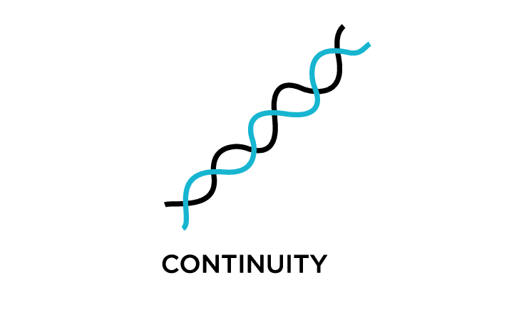
Elements that lie on a curve or on a line are perceived as more related than those that aren’t on the said trajectory. An example: all the separate cards in a sidebar are still perceived as more related than those that exist in the rest of the page.
Another common example is a multi-image slider, where usually the image on the right edge is cut off - indicating that the image slider continues outside of the viewport.
12. Common fate (synchrony)
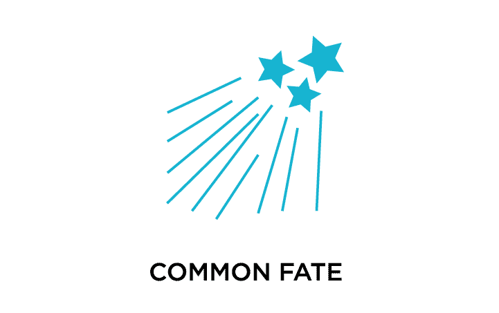
We consider elements related, if they are moving in the same direction - or if they are pointing in the same direction.
13. Parallelism
Parallel elements are more related than those that are not parallel.
14. Similarity
Similarity is the rule that says that we consider elements that share multiple characteristics as more related than those that don’t.
An example is a list of email messages in the master view. Those that have the “important” icon to the left of the message overview card are more similar than other messages that do not have that card.
15. Focal Points
Points of emphasis or difference are attention-grabbers. This is achieved through drastic changes in:
- color
- size
- typography
- whitespace
- etc.
16. Past experiences
This is a tough one to nail down, because each person’s experience is, to an extent, unique. Thus, our goal as designers is to use images that would appeal to the most of our users, or to our user persona.
17. Good figure (law of Prägnanz)
Also known as the law of simplicity, it’s sort of an Occam’s razor of design.
Here’s the original Occam’s razor: The simplest explanation for something is usually the correct one.
Here’s the law of Good Figure: An ambiguous image will be perceived as simply as possible.
Or we could say: A complex image will be comprehended as simply as it makes sense to the viewer.
An example is the logo of the Olympics: We see 5 interlocking rings, but we could perceive it as two “biscuits” with their one side bitten off, and another three “buiscuits” with two bites on each, then the biscuits positioned so as to barely touch on the edges of the “bite marks”. See how much more complicated the second interpretation is?

