Building Bootstrap 4 layouts, part 10: Build a Bootstrap 4 layout and track it with Git
Let's build a Bootstrap layout locally and track it with Github for Desktop
By: Ajdin Imsirovic 07 October 2019
This is the tenth of 20 articles in the Building Bootstrap 4 Layouts article series.
 Photo by
Yancy Min on Unsplash.com
Photo by
Yancy Min on Unsplash.com
In this article we’ll see how to use Github and Github Desktop while we build a brand new layout locally in Brackets.
First we’ll look at registering on Github.
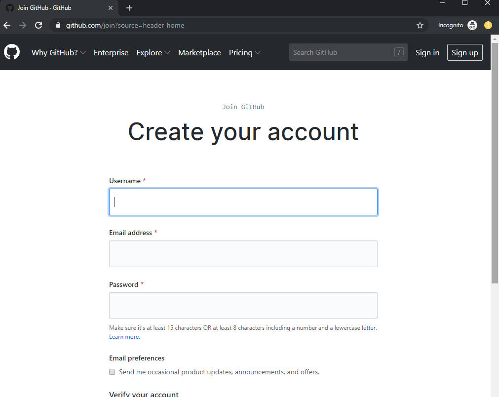
Register a new account on Github
Github was acquired by Microsoft for $7.5 billion on October 26, 2018. Github was founded in February 2018, running on Ruby on Rails.
If there ever was a success story, Github seems to be it.
Let’s register an account on Github and start discovering why it’s so popular.
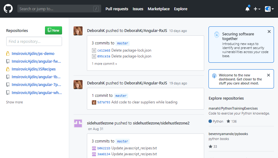
Once you’ve registered and logged into Github, you’ll see a dashboard, similar to this:
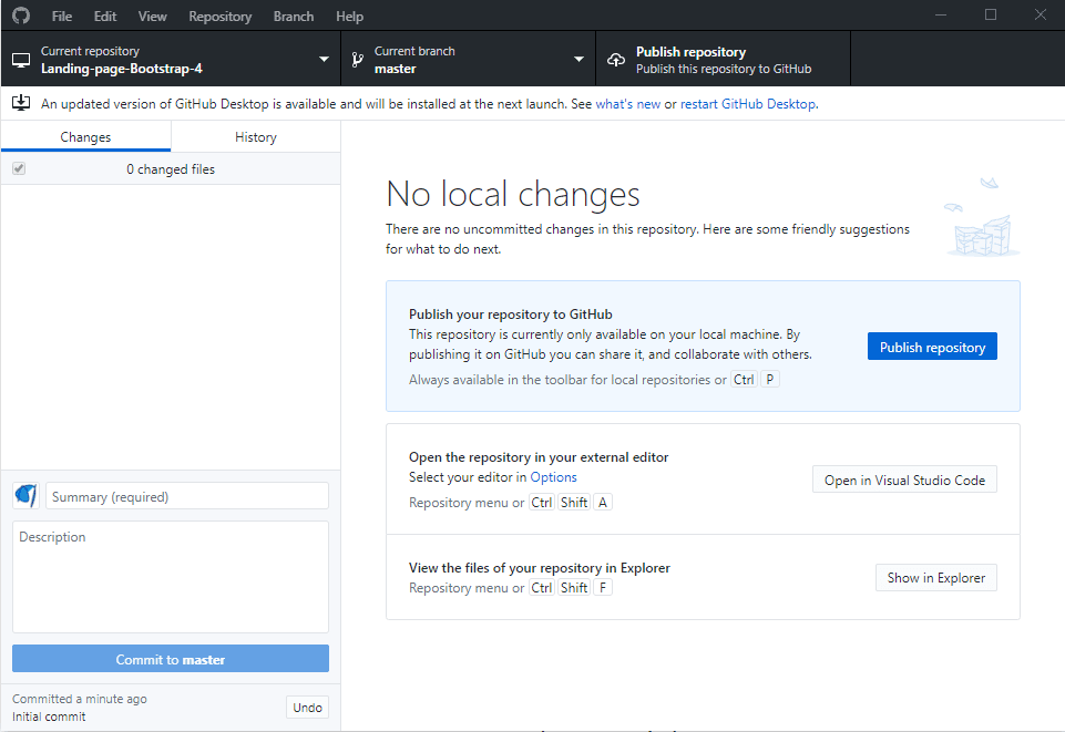
Start tracking your code with Github Desktop
To track your code using Github, you could start a new repository straight from the Github dashboard. There are two quick ways to start a repository on Github: Press the “new” green button in the top left of the above screenshot, or click on the profile image in the top right, and then press Your repositories, which will open a screen with all your repositories listed. You can then find the “new” green button in the top right of the repository list header.
Alternatively, you can download Github Desktop, and start a repository using this app. Using Github Desktop is the easiest way to start using Github on your computer, so that’s what we’re going to do in this article.
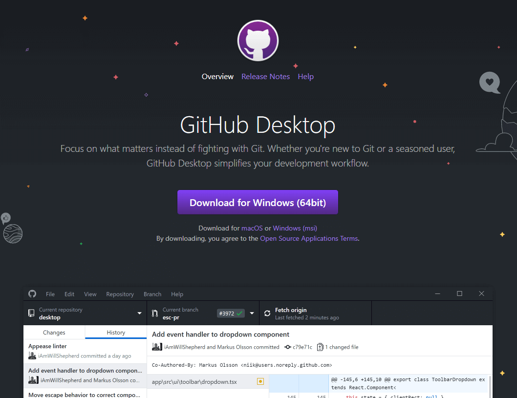
Once you’ve downloaded and started Github Desktop, it’s going to ask you to log in.
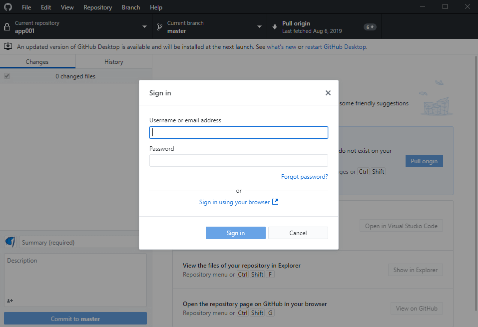
You can locate the sign in any time by clicking the File menu, then the Options sub-menu item. In the Options window, on the Accounts Tab, you have the information about the currently signed-in user. You can also sign out on this screen, so another user can sign in (if, for example, you’re sharing a computer with another Github user).
Choosing a folder to track
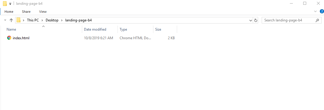
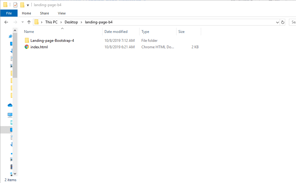
Add a folder on your file system where you’ll keep your Bootstrap 4 layout.
We’ll call this folder “landing-page-b4”.
Let’s also add an index.html file inside of it, and add this file the code from the starter template.
Feel free to add the code to index.html using the Brackets code editor.
So, here is the landing-page-b4 folder in my file explorer:
Adding the folder to Github Desktop
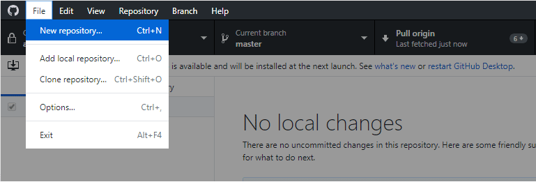
Now let’s add the folder to Github Desktop.
Click File on the top menu, then New Repository.
Next, choose the local path for your new repo, pointing it to the folder that holds the Bootstrap 4 layot we’re building.
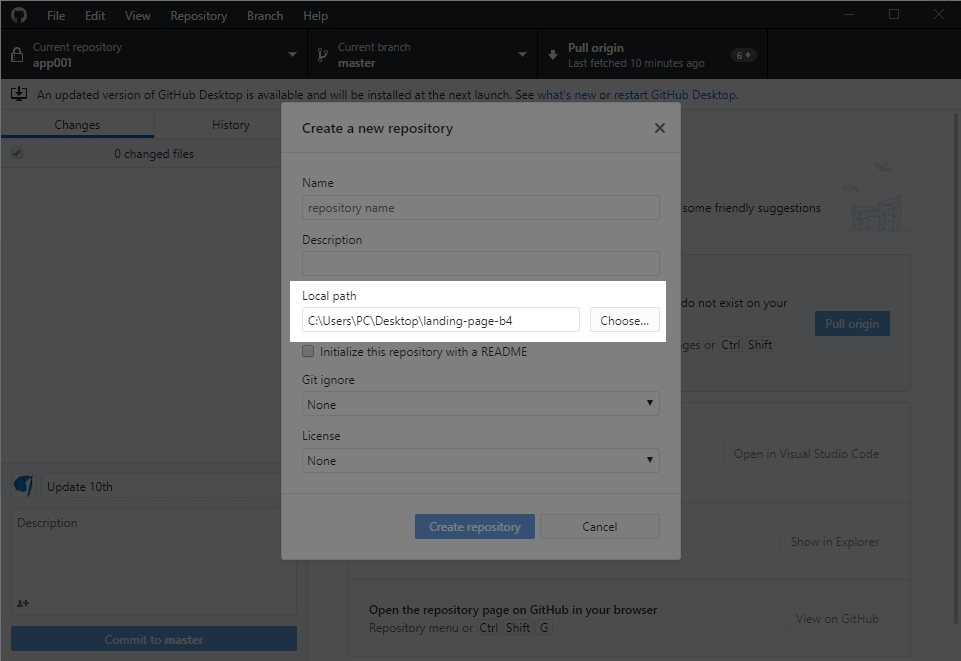
You should also give your repository a name.
Let’s call it Landing-Page-Bootstrap-4.
Now press the Create repository button, and you’re ready to publish it.
Publishing your repository
To publish your repository to Github from Github Desktop, at this point, you can just click the Publish repository button.
A modal window will appear, and here you can change your repository’s privacy settings.
If you want to show your code to the world, make sure to uncheck the Keep this code private option:
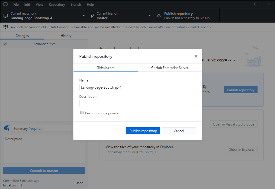
If you want to make it visible for everyone, you don’t have to uncheck anything; just confirm you want to publish the repo by clicking the Publish repository button again.
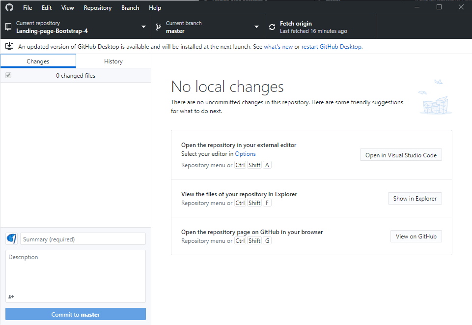
Once you’ve published your repo, you’ll see the following screen.
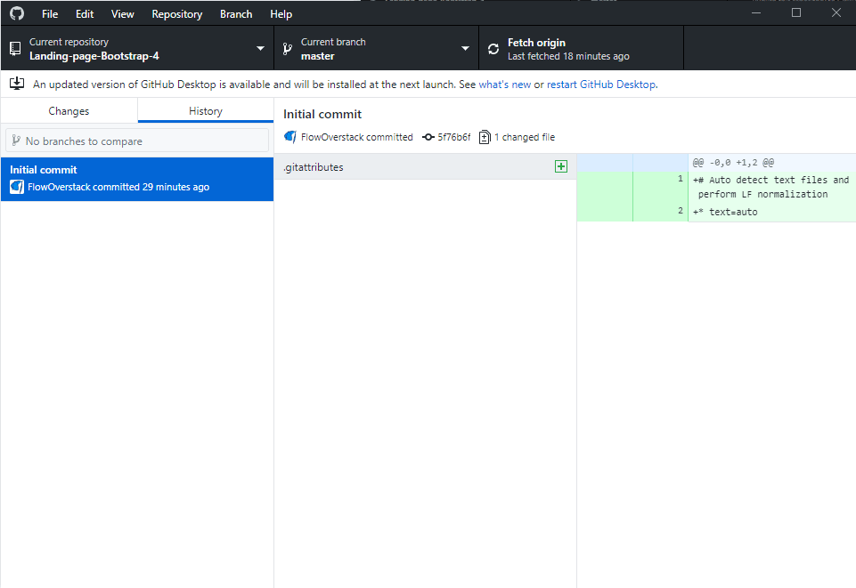
If you click on the history tab, you’ll see the Initial commit with which this repository was published to Github.
Let’s now go back to Github to see the our repository there.
We see that our commit has only this weird .gitattributes file. This file is irrelevant now so we won’t go into the details of why it’s there.
But, where’s our index.html file?
As it turns out, I’ve made an error. Have a look at this screenshot of my local landing-page-b4 folder:
This is an easy fix: simply cut and paste the index.html file into the Landing-page-Bootstrap-4 folder.
Since Git is watching the changes to Landing-page-Bootstrap-4 folder, it’s going to notice the addition of index.html:
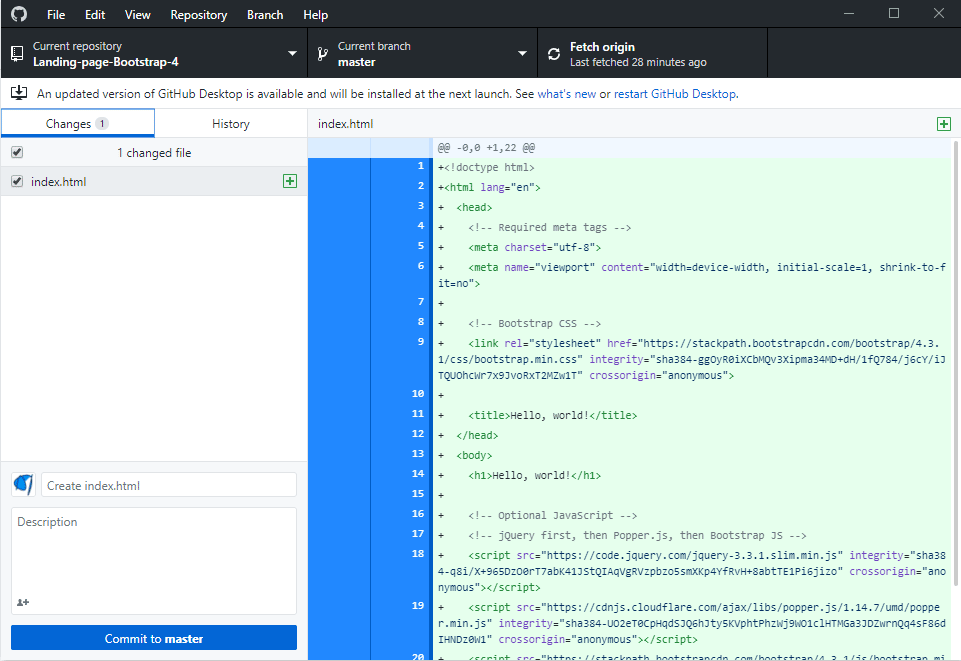
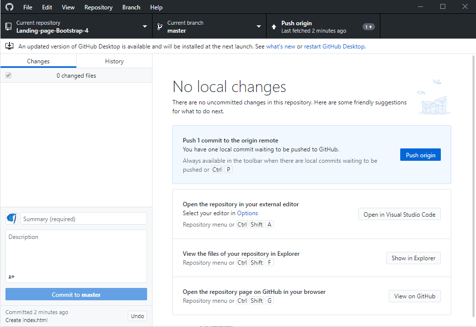
Let’s commit these changes now, by pressing the Commit to master button in the very bottom-left of the Github Desktop window. Once you do, the Push origin button will appear. That means that we’ve commited the change on our local machine, and now we’re pushing that change to the remote server (the Github server), referred to as the “origin”.
Let’s see this update on Github website.
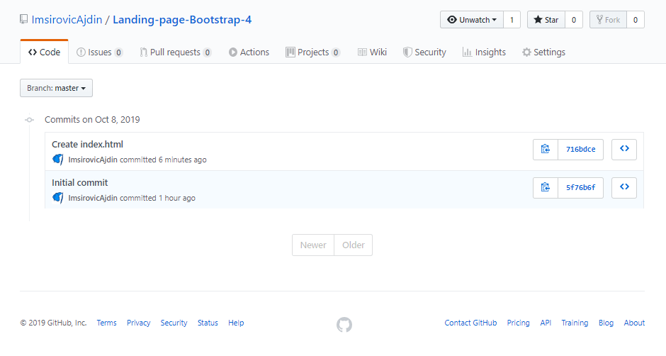
If we click into the second commit message, Create index.html, we’ll see the index file we’ve added.
Now you can reopen the index.html file inside the Brackets editor to continue working on it.
Building the landing page
In the previous article in this series, we’ve discussed the benefits of using Git.
As we mentioned, one of the main benefits is speed.
Once you build a layout while tracking it with Git, you can “time-travel” to any point in time of the layout development.
For this “time-travelling” to be efficient, there is one rule of Git, and that is: commit small and often.
If you keep your commits small and your commit messages clear, that can do wonders for you once you revisit a repository, say, three months from now.
The added benefit of sticking to this approach is: if another person looks at your code, they’ll find it easier to understand what’s going on.
We’ll see this in practice now, when we build the landing page.
Each new addition to the landing page will be saved as a separate commit. We’ll add proper commit messages, so that once our layout is complete, we can look at the completed repository with all the commit messages.
Thus, we will instantly have a birds-eye view of what steps needed to be taken to complete the layout.
Let’s get started!
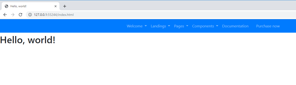
Adding the header
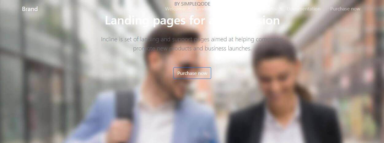
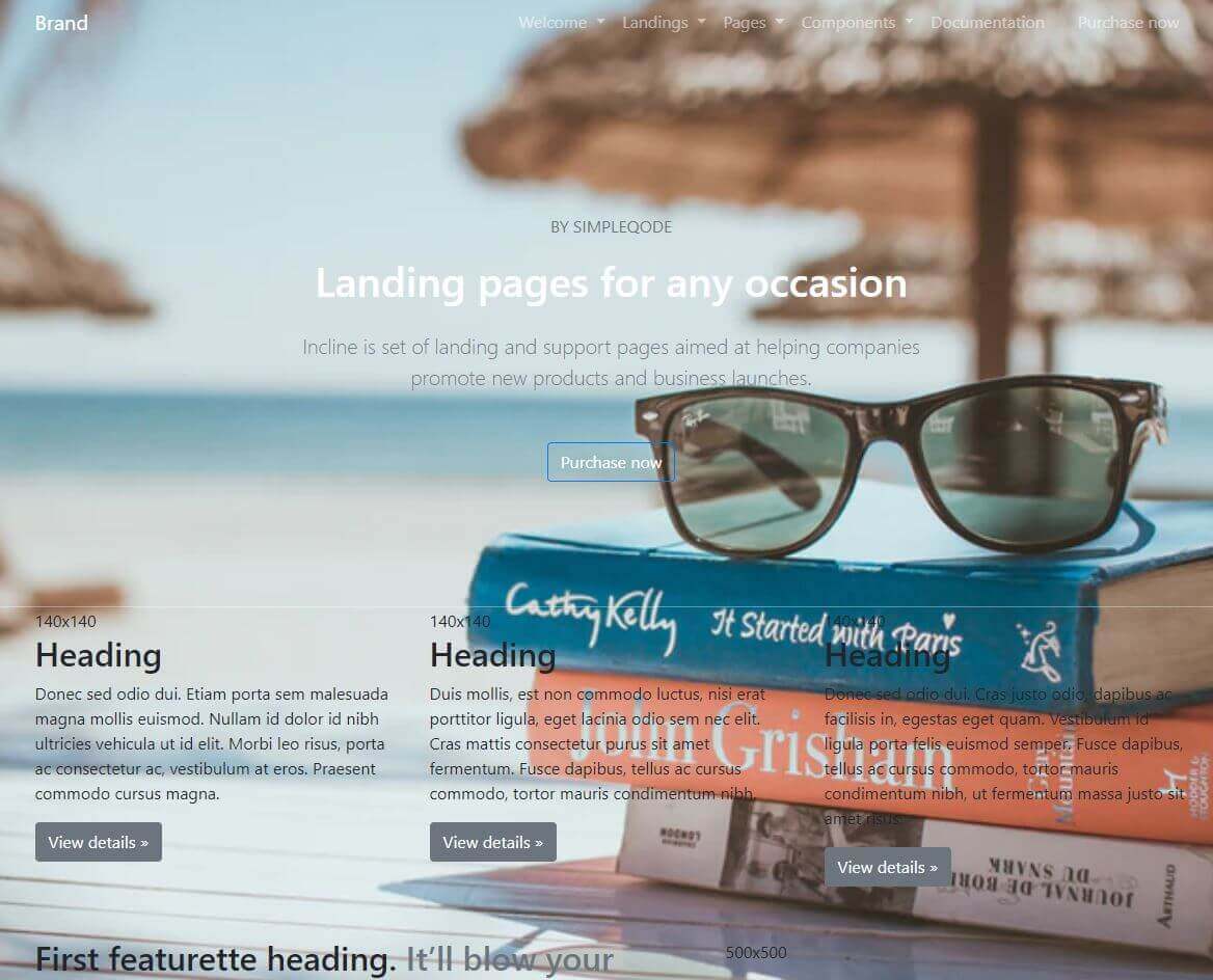
We’ll begin from the top of the page. Let’s find a header we like, by browsing through the official premium themes.
I find the Incline Landing Page Set interesting, so let’s look at it closer.
We will copy the code from the theme’s navbar.
In this article series, we’ve already seen how to copy website’s code using devtools in Chrome.
We’ll go through a similar process to copy our chosen theme’s navbar. Next, we’ll paste it into the index.html file in our local repository, right under the opening <body> tag.
Finally, we’ll commit the changes with the following commit message: Add navbar HTML structure. This commit message implies we haven’t added the styles yet.
Here’s the screenshot of the layout in browser, after the update.
Adding temporary styles to the navbar
To make the header visible we’ll add some temporary CSS.
First, we’ll move the h1 element down by adding an inline style to it:
<h1 style="position: absolute; top: 60px">Hello World!</h1>
Next we’ll add the contextual color classes on the nav element:
<nav class="bg-primary text-light navbar navbar-expand-xl navbar-dark navbar-togglable fixed-top">
This minor update makes the navbar visible:
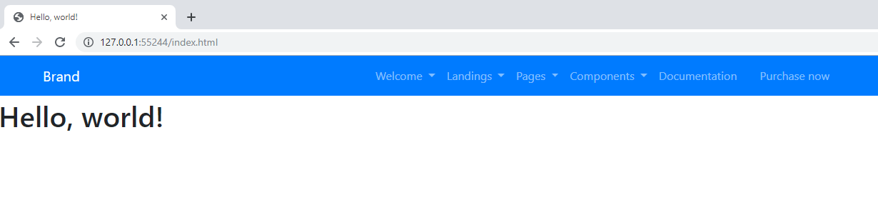
Replace the SVG navbar-brand image
Next, we’ll erase the SVG inside the a tag with the class of navbar-brand, and replace it with text: Brand.
The commit for this update is titled: Replace navbar-brand image.
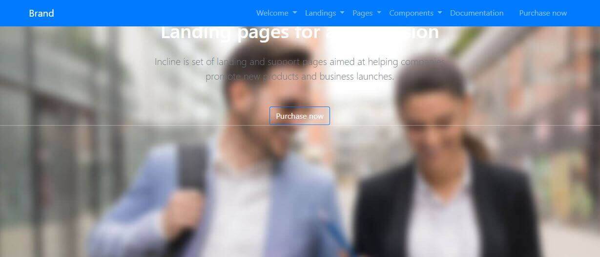
Next, we’ll add the jumbotron area.
Adding the background image
In this section, we’ll be adding the large photo in the background.
Next, again, we’ll use devtools to find the HTML element to copy.
Besides the HTML for the background image, this time I’ve also used the styles panel to find the CSS used to get the effect of the image covering the whole screen, and I’ve copied the CSS styles too. They are inline on the element for now. Once we’ve updated the layout completely, we can move these inline styles to their proper CSS classes. Dealing with this now would just slow things down and make this article longer.
We’ll name this commit: Add the background image.
Right now, our layout looks like this:
Removing navbar’s contextual colors
Now we can get rid of the temporary contextual colors on the navbar, and remove the Hello World h1 element.
This commit is titled: Remove temp CSS and dummy h1.
The updated layout is still a work in progress:
To fix it, we’re really going to have to dig into the dev tools and find the styles applied.
Improving the styles
This part of the layout-building process is a bit like detective work.
We’re looking at the source theme and we’re piecing together the CSS to apply and the CSS to ignore.
We’re inspecting the Elements panel and deciding which HTML is relevant and which HTML can be skipped.
We’re trying to match the HTML to the CSS that achieves the effect that we want.
If this process feels hard or tedious, try to gamify it for yourself.
You could:
- Race against the clock - see how many elements you can copy from the source theme in 10 minutes
- Take a notebook and jot down the techniques you haven’t seen before; for example, ask yourself, “why did the developer use this approach when adding the background image?”
Regardless of how you try to make it easy, keep in mind that learning a new skill is hard, and that sometimes you’ll struggle. Push through it, learn from it, and soon you’ll have your own little repository of CSS tips and tricks. This will make your own website layout development much easier.
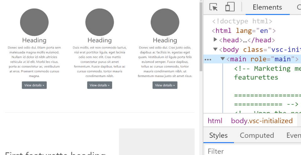
Anyway, let’s get back to the subject. We’ll improve the styles by finding out how the main text gets placed in the vertical center of the screen.
Vertically centering the main text
Here’s a screenshot of the image and the devtools. We’re hovering the mouse over the wrapping section element and the developer tools highlights its padding and shows the styles affecting it:
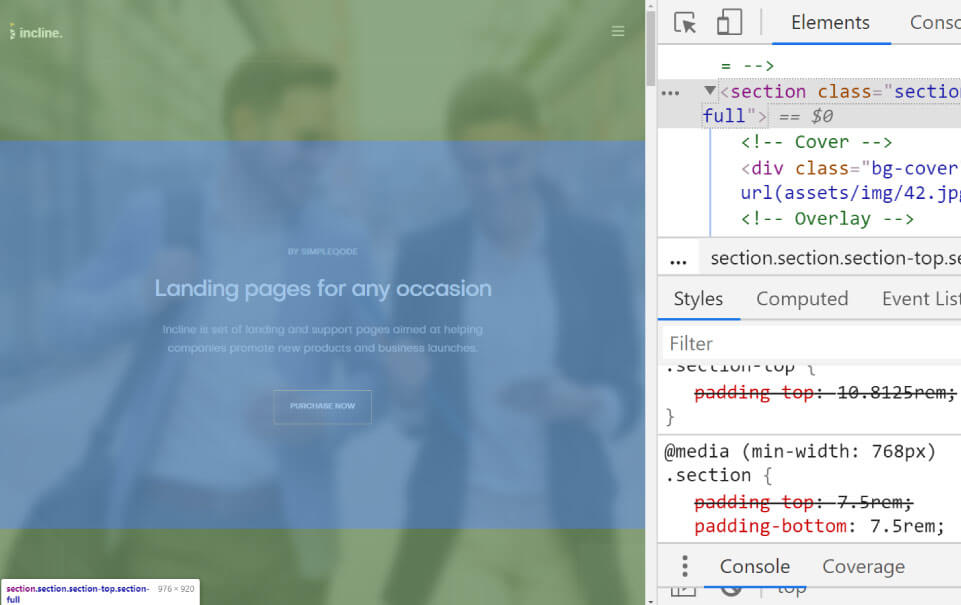
In the bottom-right corner of the above image, we can see that the text gets centered by adding the padding-bottom CSS property with the value of 7.5rem, in a media query that is set to work at min-width of 768px.
The entire CSS code that affects the padding of this section element looks like this:
@media(min-width: 768px) {
    section {
        padding-top: 13.3125rem;
    }
    section {
        padding-bottom: 7.5rem;
    }
}
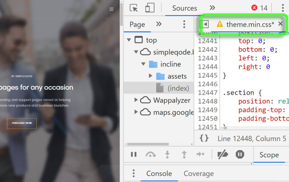
An alternative approach to the one above would be to simply copy the entire theme.min.css, then slowly remove the CSS that isn’t used.
For now, let’s just add the media query to our layout’s style tag, and see the result in the browser.
This commit will be titled: Vertically center the main text with padding.
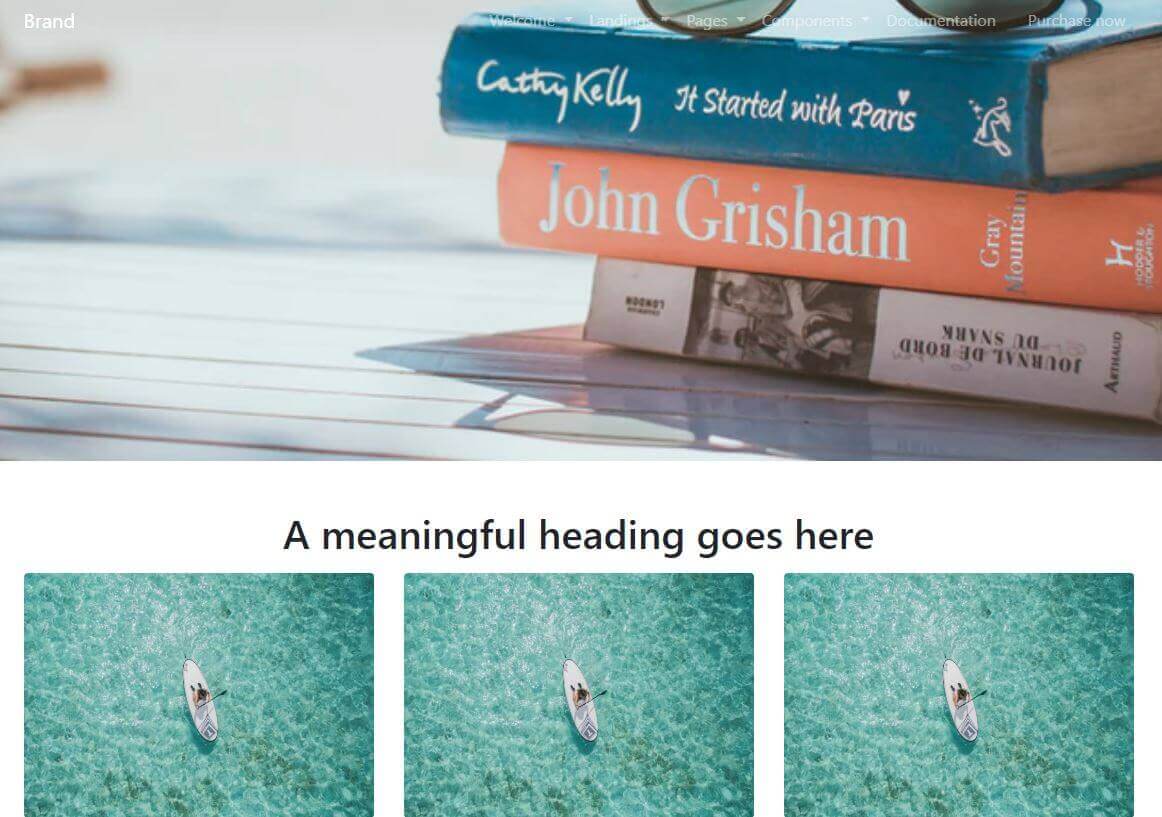
An image is worth a thousand words
Let’s now replace the image we copied from the source theme.
First, let’s find a nice image on Unsplash.com.
Next, let’s right click this image and open it in a new window, then copy the URL from the address bar.
Now, back in our own theme’s browser window, let’s open the developer tools and with the developer tools’ Elements panel in focus, press the CTRL f keyboard combination.
This will open up the search utility: we can search for any string (any combination of characters). We’ll type in “image”.
Great, we’ve got only two occurences of the word “image” on the page.
What I was trying to do is to easily find the style that reads: background-image: url inside the HTML of the page, because I’ve copied it over from the source theme earlier.
Now I’m trying to add an image from unsplash live inside the browser, so that I can try different images before I find the one that I like and that I think will work with my theme.
Like they say, an image is worth a thousand words - so I was trying out different images, live in the browser, until I found this vacation-themed image that I liked.
Now all that I need to do is right click onto the part of the Elements panel that shows my searched-for ```background-image: url``, and click the “Edit as HTML” command.
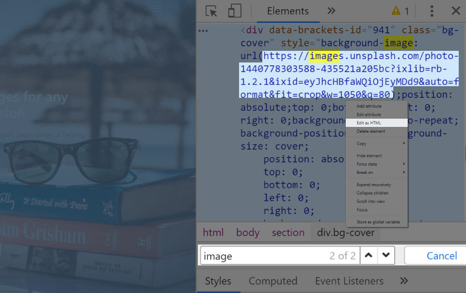
Now that I’ve replaced the background image live in devtools, I can save it inside my layout’s HTML.
The commit is titled: Replace the background image.
Next, let’s add some additional sections to our webpage.
Adding additional sections to our page
To speed things up, we’ll refer to the examples from the official documentation.
This time, we’ll copy a part of the carousel example layout from the Bootstrap 4 official examples.
Adding the main element
This time, we’ll use the developer tools slightly differently.
Basically, we’ll add the entire carousel example layout, minus its navbar and carousel.
How do we do this? With devtools, of course.
Open the devtools, then click on the Elements panel to get the HTML structure in focus. Next, locate the header, and click on the <header> element inside the devtools.
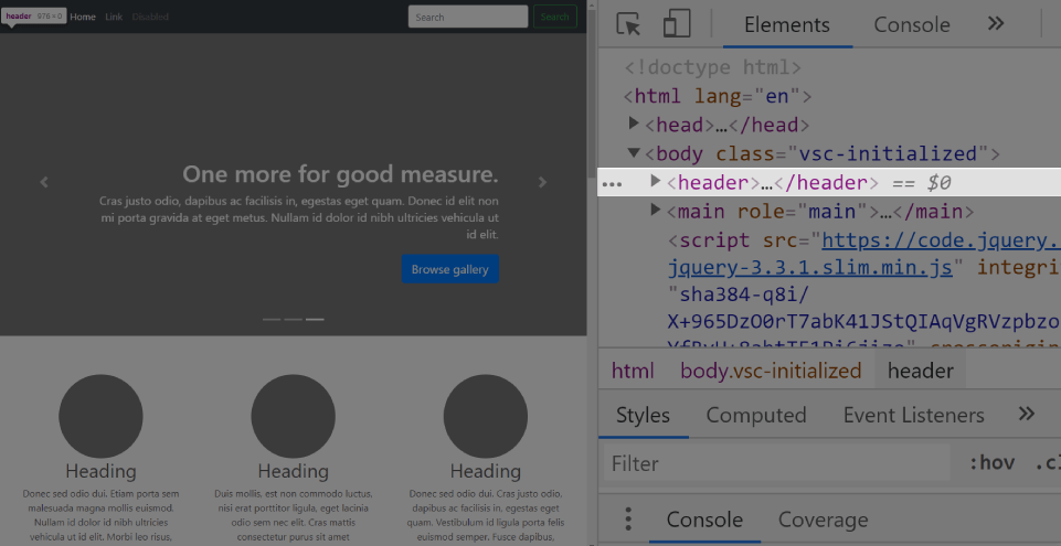
Now simply press the DEL key on your keyboard; this will remove the <header> element from the website.
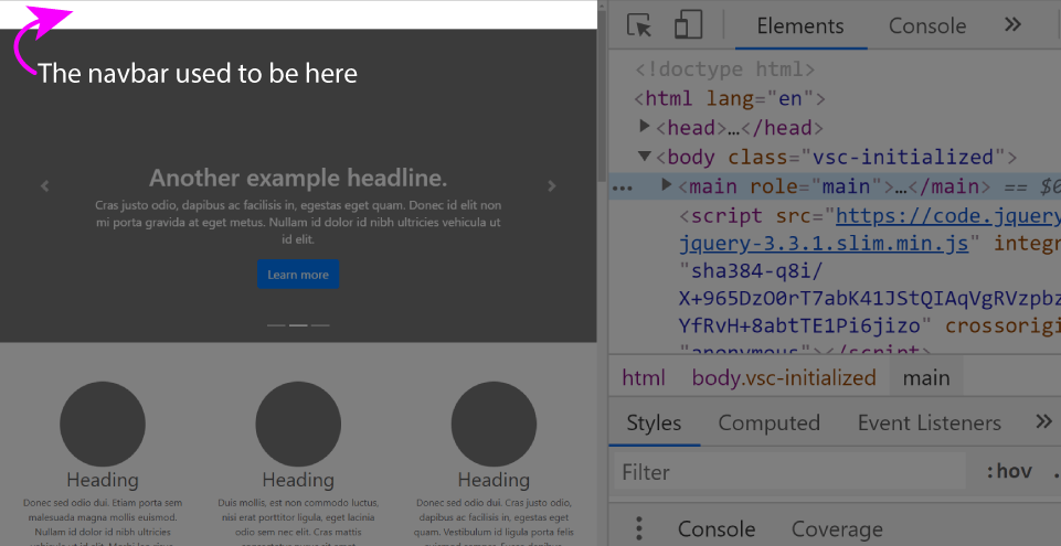
Note that this deletion is a non-destructive change (meaning that this change will not be saved). It doesn’t matter if you’re deleting an element from a website on the internet or on your own file system, the updates you make to the HTML structure of a website using the devtools will not be saved.
Now we’ll click the little triangle left of the <main> tag, and we’ll click on the div with the id attribute set to myCarousel.
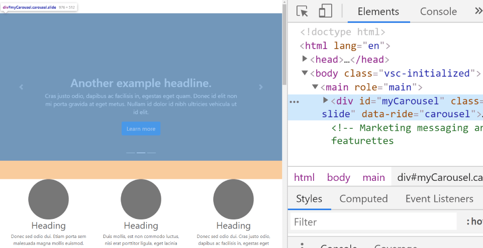
Now we’ll press the DEL button again, which will again update the live website.
Now we can just copy the <main> tag, by right-clicking on it, then clicking “Copy”, and then “Copy element”.
We’ll paste it into our theme, after the section with the background image.
Let’s view our own theme now:
The layout is still far from perfect, but since we’ve added a large chunk of HTML, let’s commit it with this commit message: Add the main tag to layout
Why did we delete elements from the devtools in the first place?
Because I wanted to show you a technique to use to quickly single out an element to copy.
I find this a quick and easy way to work if I need to copy something from a complex layout. It helps me quickly get rid of the noise.
Should you use this approach?
Yes, if it makes sense to you. If it doesn’t, at least you know it’s possible - you might use it some other time in a different context.
Formatting our HTML code in Brackets
At this point, our theme’s structure is finished. There are many things we still need to improve, but they’re mostly style-related.
However, there is one thing regarding the HTML structure that is still missing. With all this copying and pasting, our HTML code is not properly formatted: the indentation is off.
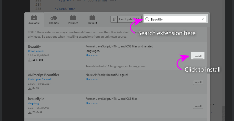
Rather than fixing this line by line, we can simply install the Beautify extension.
Install the Beautify extension to Brackets
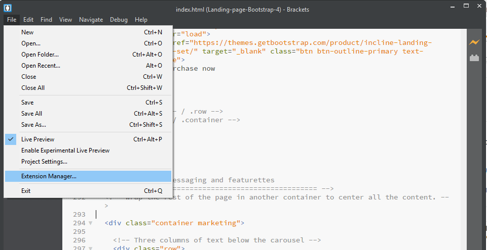
To install an extension in Brackets, we need to click File > Extension manager.
Next, we need to type the name of the extension into the search input field, and click the little install button in the right-hand side.
On Windows, to beautify your HTML file, press the CTRL ALT B keyboard combination.
Let’s commit this change with this commit message: Reformat layout’s code.
Next, let’s improve the styling.
Improving the styling
Let’s move all the content inside the <main> element under the big image.
This fix is simple: we’ll just wrap the <nav> and the <section> element inside a <div> with a class of container-fluid, and we’ll give it an inline style of height: 100vh.
The commit message for this update is: Fix the elements’ overlap.
Add the missing images
Next, we’ll add the missing rounded images.
After adding the rounded images, we actually get elliptical images instead of round ones.
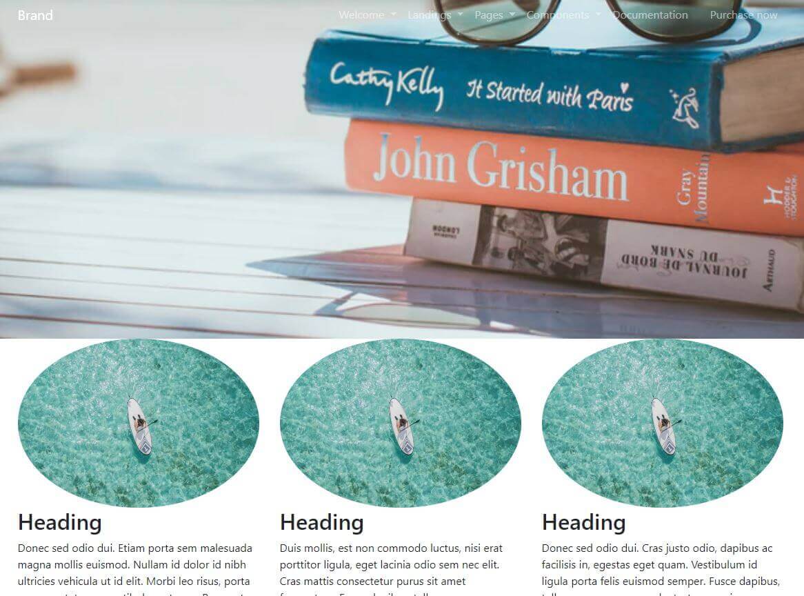
The rounded-circle Bootstrap 4 class will take images that have the same width and height (in a 1:1 ratio), and add CSS property of border-radius of 50%, thus giving them such a large rounded border that the image looks like a circle.
However, this only works on square images. If the width to height ratio is different than 1:1, the circle will become an ellipse, as we can see in the above screenshot.
Luckily, somebody already found a fix for this issue.
Of course, we also have another option, and that is, to tweak the layout and make it a bit more our own. Thus, rather than applying the rounded-circle class to our images, we’ll apply another Bootstrap 4 CSS image manipulation class: rounded. This CSS class, when applied to an image, will give it nice rounded corners.
This looks like a good time to learn about some other ways to affect how images look in Bootstrap 4.
The message for the commit that does just that is: Add rounded corners to images. Note that in this commit we’ve also added a title above the images, and some padding to separate it from the large image one section above. Note also that we are using the <h2> tag in the title above the images, but we’re applying the Bootstrap CSS class of h1 to it, like this:
<h2 class="h1">
This is a quick and easy way to make our text look a lot more prominent. You can apply this technique to other HTML elements, not just headings!
Our layout at this point looks like this:
Note that you can download the repository for this layout at any time, by visiting the layout’s repository on Github.
Next, press the Clone or download button, and then click the Download zip at the bottom of the dropdown.
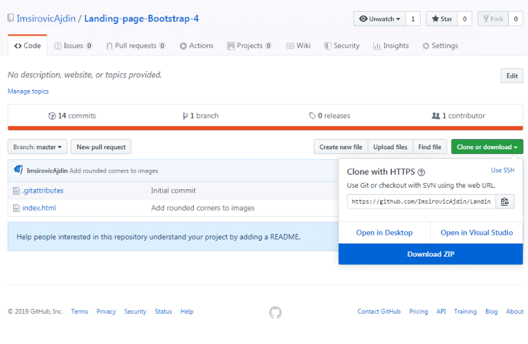
You could also clone the project. Follow this wonderful guide from Github to clone the project using Github Desktop.
Next, we’ll update the images on the rest of the layout.
Update the images on the rest of the layout
This is an easy update: We’ll just copy one image tag from the images we added earlier, then we’ll simply paste it into each of the three divs that have the col-md-5 class.
This update’s commit message is: Update images on layout.
Next, we’ll update the navbar so that its background updates when we scroll down the page.
For that, we’ll be using the scrollspy component from Bootstrap 4.
Making the navbar change background color on scroll
This requires a bit of jQuery. Let’s add a <script> tag just above the closing </body> tag:
<script type="text/javascript">

    $(document).scroll(function () {
        $('.navbar').toggleClass('scrolled', $(this).scrollTop() > $('.navbar').height());
    })

</script>
We’ll also need to update our <style> tag, just above the closing </head> tag:
.navbar.scrolled{
    background: hsla(210, 58%, 47%, 0.8) !important;
    transition: 0.25s;
}
This update is saved in a commit message titled: Add scrollspy to navbar.
With this update, our layout now has 16 commits, and we can now see the full history of how our theme was built.
In the next article in this article series, we’ll build another layout using the process described in this article.

