Building Bootstrap 4 layouts, part 12: Build a Shopify clone layout
Let's clone the Shopify layout in Bootstrap 4, and track it with Git
By: Ajdin Imsirovic 11 October 2019
This is the twelveth of 20 articles in the Building Bootstrap 4 Layouts article series.
 Image by
codingexercises
Image by
codingexercises
In this article we’ll clone the Shopify website’s homepage using Bootstrap 4.
Let’s have a look at the screenshot of the actual site.
Since this layout is quite tall, we’ll look at screenshots of each section separately - as we build it.
Altogether, there are 7 sections on this homepage. Let’s inspect the actual HTML structure using devtools to “extract” the names of sections:
- The navbar
- Hero section (we usually call it jumbotron in Bootstrap)
- Showcase section (inluding the heading and the start, sell, market, and manage sub-sections)
- Support section (a simple container with 3 columns)
- Merchants section (i.e “a success story” section)
- Signup section (the “Start free trial” call to action)
- Footer area (a bunch of links here!)
Let’s start building our Shopify clone!
Setting up the project
To begin, just like we did in the previous article, let’s setup a starter index.html file in Brackets, using Github Desktop to add Git tracking right from the start.
As before, as soon as we add a local folder to a new repository with Github Desktop, a commit with the message of Initial commit will be added.
Once we’ve added our index.html starter template with all the necessary Bootstrap imports and some starter text, we’ll make another commit.
The commit message is Add starter index.html file.
Here’s the live preview of our Shopify homepage clone right now.
There’s not much there to see on our preview right now, but if you’ve followed the series up to this point, you’ll probably recognize the display-1 Bootstrap 4 CSS text class that styles this text. Next, we’ll add the navbar.
1. Building the navbar
Let’s start with the navbar:

To begin, we’ll just copy-paste a navbar from Bootstrap 4 docs.
We’re copying the navbar which has an image for navbar-brand on the left:
<!-- Just an image -->
<nav class="navbar navbar-light bg-light">
  <a class="navbar-brand" href="#">
    <img src="/docs/4.3/assets/brand/bootstrap-solid.svg" width="30" height="30" alt="">
  </a>
</nav>
Of course, we’ll need to use the image to the Shopify logo:
<!-- Just an image -->
<nav class="navbar navbar-light bg-light">
  <a class="navbar-brand" href="#">
    <!--
        We'll copy the SVG Shopify logo right from
        the devtools on the official Shopify homepage
    -->
  </a>
</nav>
In the next commit, we’ll save the update with the Shopify SVG.
To properly size that SVG, we simply gave it a max-height, as can be seen here:
<svg id="logos-shopify-black" style="max-height:37px">
The commit message for this update is Add properly-sized Shopify SVG.
Next, we’ll add the rest of the navbar, as two separate ul tags.
We’ll begin by copying the code from the very first navbar example on the Bootstrap docs, right under the Supported content heading.
<button class="navbar-toggler" type="button" data-toggle="collapse" data-target="#navbarSupportedContent" aria-controls="navbarSupportedContent" aria-expanded="false" aria-label="Toggle navigation">
    <span class="navbar-toggler-icon"></span>
  </button>

  <div class="collapse navbar-collapse" id="navbarSupportedContent">
    <ul class="navbar-nav mr-auto">
      <li class="nav-item active">
        <a class="nav-link" href="#">Home <span class="sr-only">(current)</span></a>
      </li>
      <li class="nav-item">
        <a class="nav-link" href="#">Link</a>
      </li>
      <li class="nav-item dropdown">
        <a class="nav-link dropdown-toggle" href="#" id="navbarDropdown" role="button" data-toggle="dropdown" aria-haspopup="true" aria-expanded="false">
          Dropdown
        </a>
        <div class="dropdown-menu" aria-labelledby="navbarDropdown">
          <a class="dropdown-item" href="#">Action</a>
          <a class="dropdown-item" href="#">Another action</a>
          <div class="dropdown-divider"></div>
          <a class="dropdown-item" href="#">Something else here</a>
        </div>
      </li>
      <li class="nav-item">
        <a class="nav-link disabled" href="#" tabindex="-1" aria-disabled="true">Disabled</a>
      </li>
    </ul>
Note that the above code is incomplete - the collapse navbar-collapse div tag is not closed right. I just wanted to show you that you can start by just copy-pasting the exact same code from the docs.
We’ll slightly tweak the above code, by adding another ul tag before closing the collapse div.
This will be another commit, and this one is titled: Add two ul tags to navbar.
The updated, live, cloned layout can be found here.
We still have a wrinkle to iron out: all our links are hiding under the toggle button!
Setting the breakpoint for navbar toggle button
Our navbar is starting to look like the source Shopify homepage. However, we have this toggle button showing - even on Desktop resolutions - and it hides the actual navbar links.
To fix this, we’ll simply update the existing opening nav tag from this:
<nav class="navbar navbar-light bg-light">
…to this:
<nav class="navbar navbar-expand-lg navbar-light bg-light">
By adding the navbar-expand-lg class to the nav tag, we have the toggle button disappear on resolutions greater than 1200 pixels.
How this works is explained under the Containers heading on navbar docs.
This update is commited as Hide toggle btn on desktop resolutions.
Next, using the developer tools, we’ll copy some styles from the source theme, and add them to our layout’s <style> tag, located just above the closing </head> tag:
<style>
    .bg-custom {
        background: #f2e0cf;
    }
    .nav-link,
    .nav-link:hover,
    .navbar-light .navbar-nav .nav-link {
        color: #212b35;
        font-size: 17px;
        font-weight: 500;
        letter-spacing: 0.02em;
    }
    .maxw1600 {
        max-width: 1600px;
    }
</style>
The commit is titled: Improve navbar styling.
Next, we’ll further improve both the styles and the structure, so that it looks a lot closer to the actual Shopify homepage. This involves many updates to the HTML structure (due to the fact that most links on the navbar are grouped into separate dropdowns).
We’ll also update some missing styles. For example, we’ll override the btn-success class by adding an additional custom class of: btn-success-custom.
.btn-success-custom {
    background: #5c6ac4;
}
This improvement is saved in this commit message: Update navbar structure and styles.
Now our navbar is a lot closer to the source layout. This improvement can be seen in this codelab, as part 3 of our layout-building.
Next, we’ll start working on the Hero section.
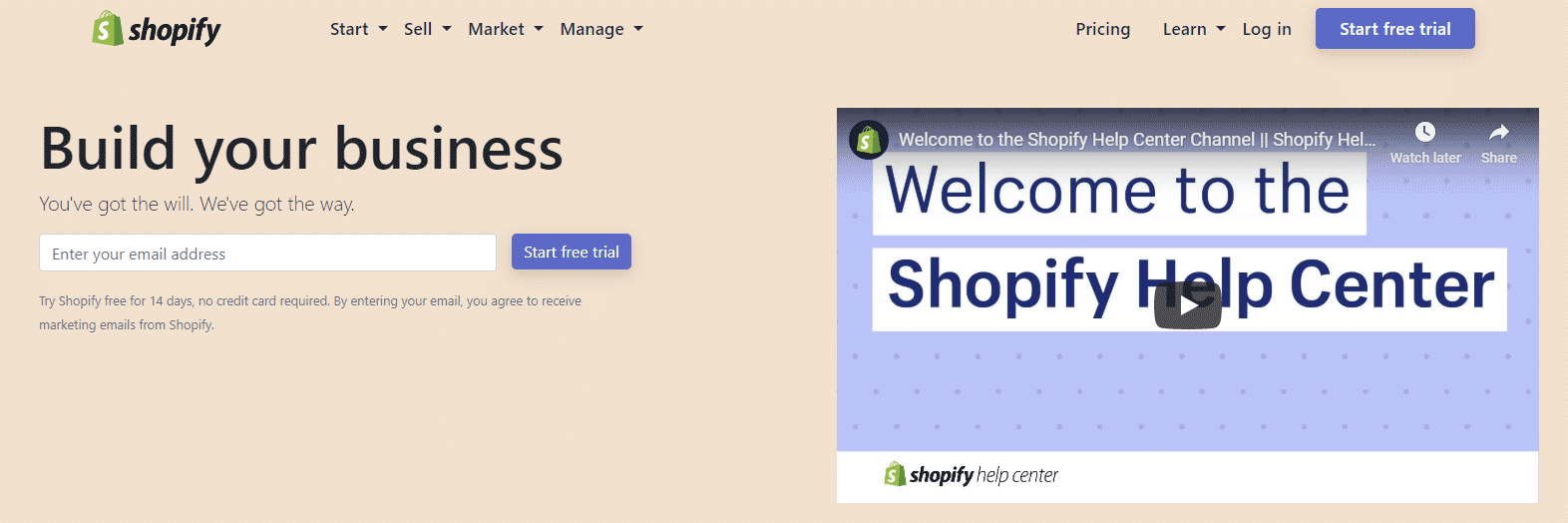
2. Hero section
Hero section is a trove of information, appearing above the fold:
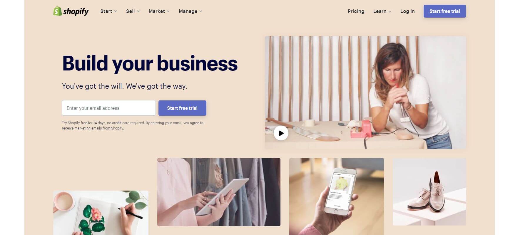
Above the fold
“Above the fold” is a term from the print media. People buy newspapers and often fold it in two so as to be able to carry them easier. The upper folded part is referred to as “above the fold”. On the web, we sometime say that the topmost area of a website that fits on the monitor is the “above the fold” area.
Let’s start building section two by adding containers, rows, and columns.
Adding in the containers, rows, and columns to section two
Let’s begin by adding the two rows:
- The first row will hold the Start free trial area and the video
- The second row will hold the four images
Thus, we’ll add this code to begin with:
<div class="container-fluid">
    <div class="bg-custom container maxw1600">
        <div class="row">
            <div class="col-md-6 p-5 border border-secondary">
                Build your business
            </div>
            <div class="col-md-6 p-5 border border-secondary">
                Shopify video from Youtube here
            </div>
        </div>
        <div class="row">
            <div class="col-md-3 border p-3 border-light">
                first image
            </div>
            <div class="col-md-3 border p-3 border-light">
                second image
            </div>
            <div class="col-md-3 border p-3 border-light">
                third image
            </div>
            <div class="col-md-3 border p-3 border-light">
                fourth image
            </div>
        </div>
    </div>
</div>
Adding the code above to our layout, will produce the following result:
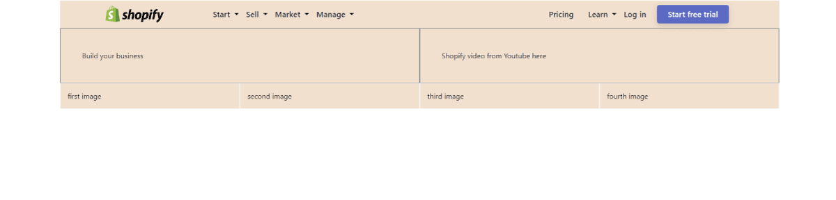
What we did above was to add the border border-light or border border-secondary Bootstrap 4 CSS classes to spot the areeas we’ll be working on easier.
To make it even easier to distinguish between them, we’ve given each column in the first row the padding of p-5, and each column in the second row the padding of p-3.
The commit for this update is titled: Start adding the second section.
Next, let’s fill in these two rows with real content!
We’ll begin with some low-hanging fruits and add a YouTube video to the second column in the first row. This is the Embed code copied from the video’s share button on YouTube:
<iframe width="560" height="315" src="https://www.youtube.com/embed/JthaEfEsLYg" frameborder="0" allow="accelerometer; autoplay; encrypted-media; gyroscope; picture-in-picture" allowfullscreen></iframe>
Let’s add it in inside the first row:
<div class="row">
    <div class="col-md-6 p-5 border border-secondary">
        Build your business
    </div>
    <div class="col-md-6 p-5 border border-secondary">
        <!-- Shopify video from Youtube here -->
        <iframe
            width="560"
            height="315"
            src="https://www.youtube.com/embed/JthaEfEsLYg"
            frameborder="0"
            allow="accelerometer; autoplay; encrypted-media; gyroscope; picture-in-picture"
            allowfullscreen>
        </iframe>
    </div>
</div>
Note that the above code has been formatted in a way that will hopefully make it easier to read.
This update is saved in commit titled Add the video.
The updated layout can be seen live here.
Here is the result of this latest update:
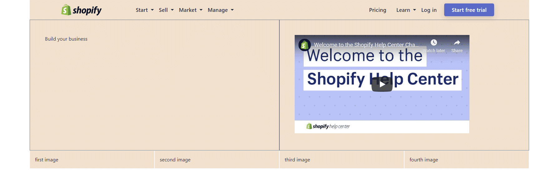
The video preview is showing, and that’s a good thing. However, we still need to make the video responsive. Currently it’s width is hard-coded to 560 pixels, and it’s height is hard-coded to 315 pixels.
Making an embedded video responsive with Bootstrap 4
To make the embedded videos responsive, we’ll use the Bootstrap 4 responsive embeds CSS classes.
After inspecting the docs, we can see that a proper update to our embedded YouTube video would be this:
<div class="col-md-6 p-5 border border-secondary">
    <!-- Shopify video from Youtube here -->
    <div class="embed-responsive embed-responsive-16by9">
        <iframe
            class="embed-responsive-item"
            src="https://www.youtube.com/embed/JthaEfEsLYg"
            frameborder="0"
            allow="accelerometer; autoplay; encrypted-media; gyroscope; picture-in-picture"
            allowfullscreen>
        </iframe>
    </div>
</div>
This update is commited under this message: Add responsive embed classes to the video.
Now our layout looks like this:
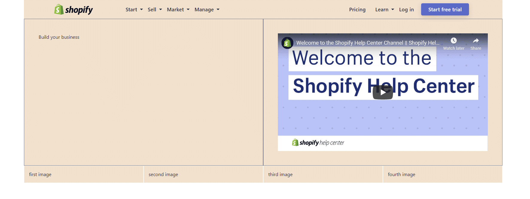
As we can see above, the embedded video now takes up the full width of its wrapping div - minus the p-5 padding, of course.
Next, let’s add the signup form in the first column of the first row.
Adding the signup form
Forms are a big topic in Bootstrap 4. There are many ways to work with forms in Bootstrap 4. It’s the same in regular HTML, when no framework is used.
For example, there are 22 different values you can add to the type attribute on an input element in HTML:
- password
- checkbox
- radio
- file
- text
- submit
- range
- button
- color
- date
- datetime-local
- hidden
- image
- month
- number
- reset
- search
- tel
- time
- url
- week
These 22 values are for the <input> HTML element alone. There are many other elements that we can use in HTML forms. Actually, HTML forms could have a series of articles on their own!
There are also different ways of styling forms in Bootstrap 4: inline, with or without labels, using sizing classes, etc.
With all this complexity, it’s easy to get confused or not sure where to start.
Thus, rather than diving into this complexity and covering each single boring form example on the official Bootstrap docs, let’s just add a simple signup form, just like we saw it on the Shopify page.
So why not begin by inspecting the source signup form in the developer tools?
Inspecting the signup form on the Shopify homepage
This is what it looks like:
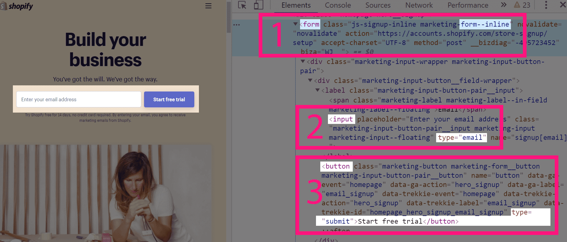
Looking at the form structure above, we see some areas marked in numbers:
- there’s a wrapping
<form>element with a customform--inlineCSS class - there’s an
<input>element, and itstypeattribute is set to the value ofemail - there’s a
<button>element, and itstypeis set tosubmit
Now we have at least a basic idea of what we need to do:
- We need to have an inline form with two elements: an
<input>element, and a<button> - The
typeattribute of the first element will be set toemail - We will have a
<button>element with the value ofsubmit
Here are the above conclusions, translated into code:
<form>
    <input placeholder="Enter your email address" type="email">
    <button type="submit" class="btn btn-success btn-success-custom">
        Start free trial
    </button>
</form>
As we can see in the above code, there are only a few Bootstrap 4 CSS classes we’re using on the <button> element.
After adding the update to our layout, this is what it looks like:
The commit message for this improvement is Add the basic form structure.
Now we can start adding the Bootstrap 4 form-specific CSS classes to make our form look better.
Making our forms look better with Bootstrap 4
On the official docs, there’s an example of a horizontal form.
Here’s one section of the example’s code that we’re interested in in particular:
<form>
  <div class="form-group row">
    <label for="inputEmail3" class="col-sm-2 col-form-label">Email</label>
    <div class="col-sm-10">
      <input type="email" class="form-control" id="inputEmail3" placeholder="Email">
    </div>
  </div>
  ...
</form>
As the docs say, we add horizontal forms by grouping the labels, inputs, and other elements using the row class. Inside the row, each separate form member is assigned it’s own col-*-* class.
Looking at the Start free trial form on the Shopify homepage, we can see that the input takes about 8 cols, while the button takes about 4. So let’s try updating our code to this:
<form>
    <div class="form-group row">
        <label for="inputEmail" class="sr-only">Email</label>
        <div class="col-sm-8">
            <input placeholder="Enter your email address" type="email">
        </div>
        <div class="col-sm-4">
            <button type="submit" class="btn btn-success btn-success-custom">
                Start free trial
            </button>
        </div>
    </div>
</form>
Once we save this change in Brackets, our live preview will update the web page to this:
We did get the column grid working, but our input is still unstyled. We’ll fix that easily, by adding the form-control class on the input, like this:
<input class="form-control" placeholder="Enter your email address" type="email">
With this little update, our form is starting to take shape:
This is a nice time for a commit, so let’s add it, with the message of Add Bootstrap 4 horizontal form.
Next, we’ll add the missing sections around our form: the Build your business title, and the motivational text under it: You’ve got the will. We’ve got the way.
We’ll also add the small text under the input: Try Shopify free for 14 days, etc.
At this point of our article series, you should be able to add those changes yourself. That’s why we won’t discuss these improvements, but rather just add the code and commit the update as Complete the free trial form area.
This update makes our layout look like this:
Next, before we move on to section 3, we’ll take a quick de-tour to discuss a very important topic: flexbox in Bootstrap 4.
Flexbox in Bootstrap 4
We’ve already covered flexbox in the HTML and CSS basics series.
Bootstrap 4 comes with many flexbox classes that closely mimic the actual CSS property-value pairs.
For example, the align-items-center CSS class in Bootstrap 4 has this CSS code:
.align-items-center {
    -ms-flex-align: center!important;
    align-items: center!important;
}
This is the code we’ll apply on our row to make the content vertically centered:
<div class="row align-items-center">
Even though this is a very small change, we’ll still add it as a new commit, titled Align items in center.
Here’s the live preview of our site now.
Finally, before moving on to the next section, we’ll just add the images in the second row, and commit the update as Add the images in the second row.
If you’re wondering about the class names that have the capital “X” added on them, this is simply a quick and easy way to “turn off” a CSS class from our HTML, without actually erasing it. Thus, later, you can easily “turn it back on” if you need to: you just erase the capital “X”.
After we’ve added the images, here’s the live website update.
Now we can move on to the showcase section.
3. Showcase section
The showcase area of Shopify’s homepage is quite big, so we’ve split it in two parts.
Here’s part one…
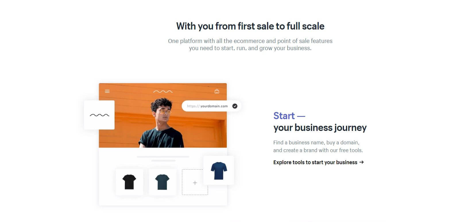
and here’s the part two:
Looking at these two parts of section three, we can see that their structure is very simple. After the heading and a paragraph with the lead class, we have three rows, with two six-column divs in each row, and the content of the rows is alternating: image - text, text - image, image - text.
After observing these simple patterns, we can convert them into code:
<!-- section 3 -->
<div class="container-fluid ">
<div class="container">
<div class="text-center mt-5 py-5 d-flex flex-column align-items-center">
<h2 class="h1 w-75 mb-4">
With you from first sale to full scale
</h2>
<p class="lead w-50">
One platform with all the ecommerce and point of sale features you need to start, run, and grow your business.
</p>
</div>
<div class="row align-items-center">
<div class="col-md-6 px-5 order-2">
<h2 class="h1">
Start — <br>
your business journey
</h2>
<p class="text-muted">
Find a business name, buy a domain,
and create a brand with our free tools.
</p>
<p class="strong">
<a href="#" style="text-decoration: none">
Explore tools to start your business >
</a>
</p>
</div>
<div class="col-md-6 bg-successX order-1">
<img
src="https://cdn.shopify.com/assets2/homepage/start-en-small-99ac3533dfebcb2e00592dce004d52f4d623ed0707faf7422203ce4094f7c1bd.png"
class="img-fluid rounded">
</div>
</div>
</div>
</div>
Note that we didn’t have to add any custom CSS here, except for the one on the anchor tag:
<a href="#" style="text-decoration: none">
Other than that, all our code is using regular Bootstrap 4 classes. It’s amazing how useful the default Bootstrap 4 CSS classes can be - with just a little bit of tinkering, you can produce some pretty good results!
Our section 3 now looks like this:
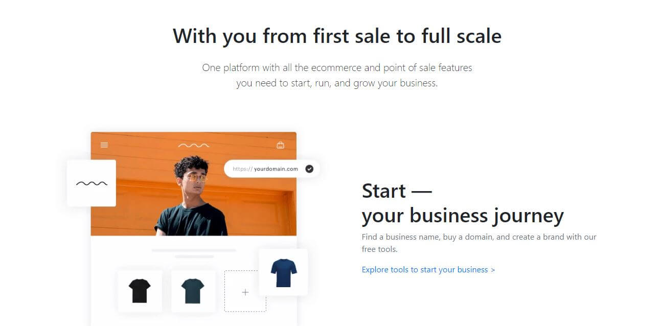
The update is saved in a commit with the following message: Start the showcase section.
Since section 3 is pretty easy to complete, let’s quickly add the rest of the code.
There are a couple of things worth mentioning in this update. First of all, the showcase section uses both images and video, which is a pretty neat design choice. However, to make things easier, I’ve decided to copy suitable images from other sections of the site.
Unfortunately, these images came in the form of SVGs, so the third image in our own Showcase section is actually an SVG image, with lots of code needed to have it look like it’s supposed to. I’m not sure why Shopify chose to add a complex SVG when they could have just used a png. Maybe they want to provide better experience to viewers with high pixel density devices?
Anyway, here’s our commit message: Complete the showcase section.
The updated layout can be seen live here.
Next, we’ll update the support section.
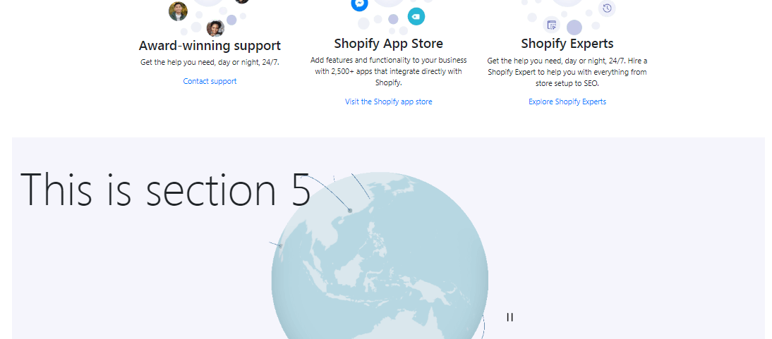
4. Support section
The support section is a simple row with three cards in three columns:

Adding the support section should be very easy. You should try doing it on your own.
Here’s what I came up with: In the first commit, I completed the Add the containers and columns part - i.e, I’ve set up the basic structure:
<!-- section 4 -->
<div class="container-fluid bg-dark p-5">
    <div class="container bg-warning p-5">
        <div class="row">
            <div class="col-md-4 bg-danger p-5">
                1st image
            </div>
            <div class="col-md-4 bg-danger p-5">
                2nd image
            </div>
            <div class="col-md-4 bg-danger p-5">
                3rd image
            </div>
        </div>
    </div>
</div>
Note the temporary use of contextual background color classes and p-5 utility spacing class above. This helps me see the immediate effect of adding this HTML structure.
Next, let’s add in the images and the text (using the images from the Shopify homepage):
<!-- section 4 -->
<div class="container-fluid">
    <div class="container">
        <div class="row">
            <div class="col-md-4">
                <img
                src="https://cdn.shopify.com/assets2/homepage/contact-support-small-e82b47be9ed2932f6d88af22e3839941c9cf4a3fd2f2e4e3eef956a4c3d4695f.png"
                class="img-fluid rounded">
                <h3 class="h3">
                    Award-winning support
                </h3>
                <p>
                    Get the help you need, day or night, 24/7.
                </p>
                <p>
                    <a href="#" style="text-decoration: none">
                        Contact support
                    </a>
                </p>
            </div>
            <div class="col-md-4">
                <img
                src="https://cdn.shopify.com/assets2/homepage/app-store-small-c5a0c87cea6be45e72976b87377f1ea91a48d98a03b4f8d82e37aeadce4ad54d.png"
                class="img-fluid rounded">
                <h3 class="h3">
                    Shopify App Store
                </h3>
                <p>
                    Add features and functionality to your business with 2,500+ apps that integrate directly with Shopify.
                </p>
                <p>
                    <a href="#" style="text-decoration: none">
                        Visit the Shopify app store
                    </a>
                </p>
            </div>
            <div class="col-md-4">
                <img
                src="https://cdn.shopify.com/assets2/homepage/experts-small-d9665c1653a6f4b6ba7e509598160660129827b3cffcae9d259392e7f5b83994.png"
                class="img-fluid rounded">
                <h3 class="h3">
                    Shopify Experts
                </h3>
                <p>
                    Get the help you need, day or night, 24/7.
                    Hire a Shopify Expert to help you with everything from store setup to SEO.
                </p>
                <p>
                    <a href="#" style="text-decoration: none">
                        Explore Shopify Experts
                    </a>
                </p>
            </div>
        </div>
    </div>
</div>
Note that in this commit we also removed the temporary contextual background classes and spacing utility p-5 CSS class.
Finally, we’ll tweak the centering of the images and the text so it looks more like the source layout.
Here’s the live site with the support section completed.
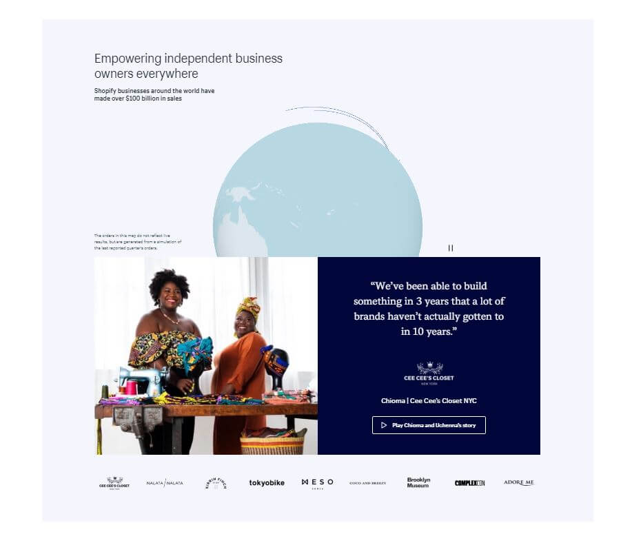
5. Merchants section
The merchants section shows off an actual success story:
Let’s begin by adding section 5 containers and custom background.
This is what our section 5 looks like with this update:
On the Shopify homepage, the merchant’s section has a video background.
To keep things simple, we’ll instead add a background image to this section’s container.
We’ve already seen how easy it is to add a background image in previous articles in this article series, so let’s just commit the update and give it the message of Add background image to merchants section.
Now the merchants section looks like this:
Next, we’ll be adding the actual content to our merchants section, in the form of two divs. The left div will hold an image of a success story - a couple of entrepreneurs.
The right div will hold some text that gives additional information about the entrepreneurs and has a call to action button.
Let’s try building it using mostly Bootstrap 4 default CSS classes.
The most recent update is commited with the message: Add two columns in merchants section.
This update looks as follows:

All that’s left now for our merchant’s section is to add it the heading, so let’s commit this update as Add the heading and lead p for merchants.
Our layout’s merchant section now looks pretty close to the original Shopify homepage, as we can see in the updated live layout.
Next, we’ll add the signup section.
6. Signup section
The signup section is pretty minimalistic:
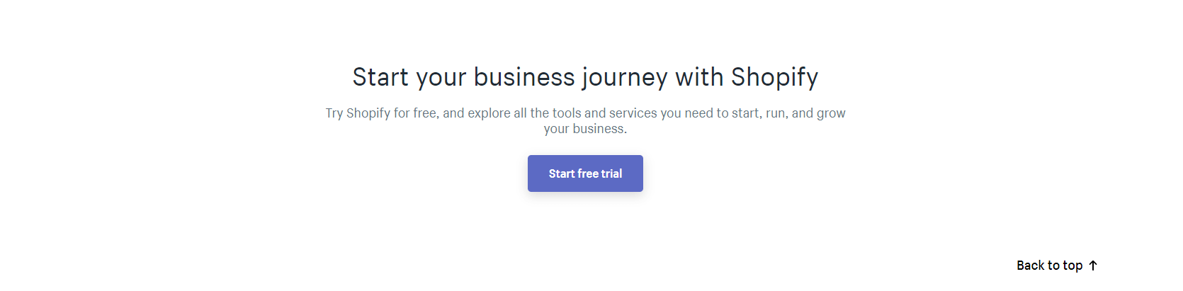
This complete section is actually very simple:
<div class="container-fluid">
    <div class="container maxw1600 py-5">
        <div class="row py-5">
            <div class="col-12 text-center">
                <p class="h1">
                    Start your business journey with Shopify
                </p>
                <p class="lead">
                    Try Shopify for free, and explore all the tools and services you need to start, run, and grow your business.
                </p>
                <button class="text-light br5 btn btn-success btn-success-custom btn-lg px-4 border-0" href="#">
                    Start free trial
                </button>
            </div>
        </div>
    </div>
</div>
We’ll commit this update as Add the signup section.
Now we’re ready to finish our Shopify clone; all we have to add is the footer.
7. Footer area
The footer area has a bunch of links, but this won’t be difficult to build:
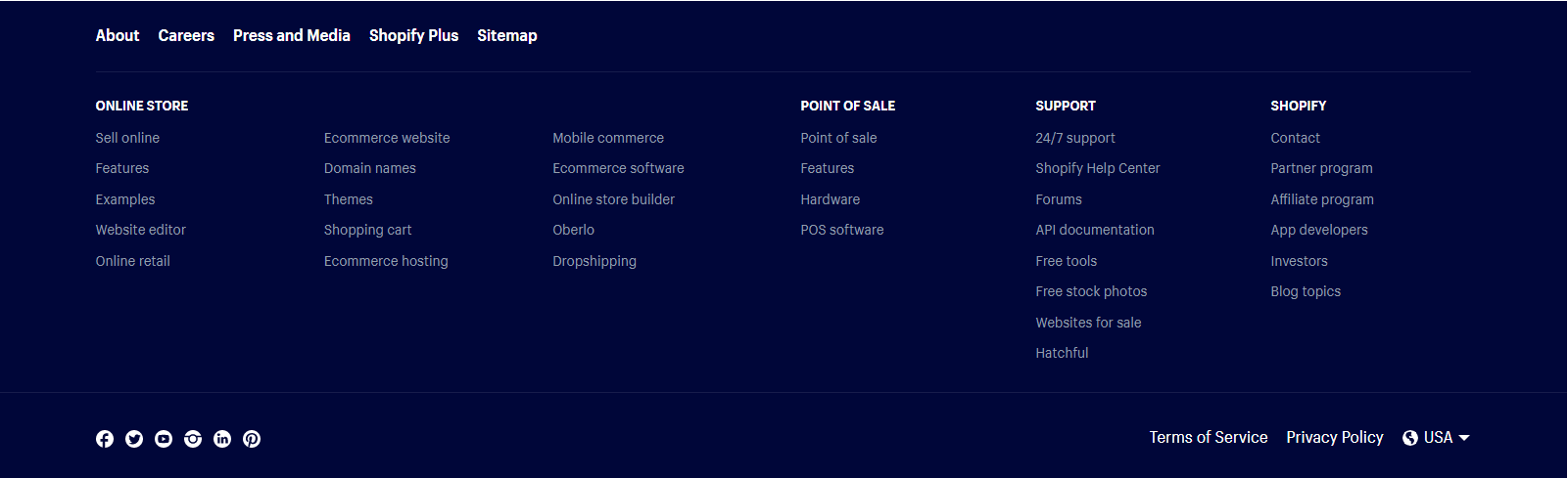
As usual, we’ll start our section by setting up containers, rows, and columns:
<!-- section 7 -->
<div class="container-fluid bg-custom3 text-light py-5">
    <div class="container maxw1600">
        <div class="row">
            <div class="col-lg-2">
                one
            </div>
            <div class="col-lg-2">
                two
            </div>
            <div class="col-lg-2">
                three
            </div>
            <div class="col-lg-2">
                four
            </div>
            <div class="col-lg-2">
                five
            </div>
            <div class="col-lg-2">
                six
            </div>
        </div>
    </div>
</div>
Let’s commit it as Add footer’s containers, rows, and cols.
That’s it for this article.
In the next one, we’ll build a Youtube homepage clone.
To quickly add our footer links, we’ll use the list group component from Bootstrap 4.
We’ll add this code inside each of the cols:
<h3 class="h5">Heading</h3>
<ul class="list-group list-group-flush">
    <li class="list-group-item py-1 pl-0 bg-custom3 mt-3">Cras justo odio</li>
    <li class="list-group-item py-1 pl-0 bg-custom3">Dapibus ac facilisis in</li>
    <li class="list-group-item py-1 pl-0 bg-custom3">Morbi leo risus</li>
    <li class="list-group-item py-1 pl-0 bg-custom3">Porta ac consectetur ac</li>
    <li class="list-group-item py-1 pl-0 bg-custom3">Vestibulum at eros</li>
</ul>
Note that the second and third column have a different margin-top class: instead of mt-3, we’re using mt-5.
This update is saved in the commit titled Update section 7 with list-group-items.
The remaining updates in the footer section would just be reiterating what we’ve already built, so we’re not going to do it.
Our layout is 95% complete, and if you feel like exercising your skills, feel free to update the footer and make the rest of the layout even closer to the source Shopify homepage.
In the meantime, you can checkout the completed live layout.

