Building Bootstrap 4 layouts, part 2: Rows and responsive columns
In this article, we'll build a simple responsive website layout using Botostrap's column grid
By: Ajdin Imsirovic 29 September 2019
Welcome to article series titled: Building Bootstrap 4 Layouts. This is the second of 20 articles in this article series.
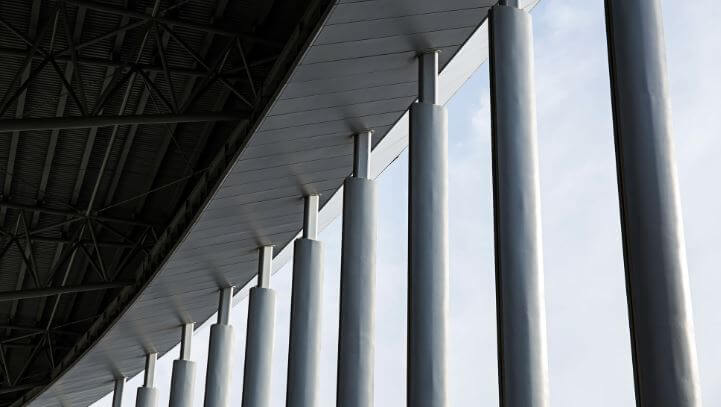 Photo by
Ren Ran, @renran on Unsplash
Photo by
Ren Ran, @renran on Unsplash
In this article, we’ll continue with a detailed introduction to the Bootstrap 4 framework. In the previous article, we’ve built a rudimentary layout using only the container and container-fluid classes, some contextual color classes, and display-* classes.
We’ll build this article’s layout with the row and column classes.
The row Bootstrap 4 CSS class
Here’s a quote straight from the Bootstrap docs:
Rows are wrappers for columns.
There’s no better way to put it: rows are a way to keep columns in check.
We’ve already covered a brief history of the column grids in the HTML and CSS basics series.
If you are unfamiliar with the concept of columns, make sure to read the article; besides the history, we also see how to build your own simple column grid.
Bootstrap’s column grid is not that much different than the one we saw how to build in the above-referenced article.
Let’s see how it works.
Bootstrap 4 column grid
Similar to the column grid we built, in Bootstrap 4, all the columns also have to add up to 12 columns in one row.
For example, we could have three columns in a row, in various combinations:
col-4,col-4,col-4, orcol-2,col-2,col-8, orcol-3,col-6,col-3,- etc.
As we can see, having 12 columns makes our column grid very flexible. We can easily achieve layouts with halves, quarters, thirds, and so on.
It now time to see this in practice. We’ll build a very simple layout, with the following structure:
As we can see in the above diagram, we’re going to have a header and a footer.
In between these two, we’ll have a repeating pattern, which will have an image spanning 4 columns, and some text spanning 8 columns.
Let’s build this layout.
Adding the HTML structure to our layout
Let’s begin by adding the container-fluid to the header and footer, and the container class to the middle section of our layout:
<header class="container-fluid bg-warning">...</header>
<div class="container">
    <!-- the column grid will be placed here -->
</div>
<footer class="container-fluid bg-warning">...</footer>
In the above code, we’re using all the Bootstrap 4 CSS classes we’ve learned about in the previous article in this series.
Let’s now add the middle section, using Bootstrap’s column grid.
Adding Bootstrap’s column grid
Let’s update the code so far by adding the row class to group our columns:
<header class="container-fluid bg-warning">...</header>
<div class="container">
    <div class="row">the first image and text goes here</div>
    <div class="row">the second image and text goes here</div>
    <div class="row">the third image and text goes here</div>
</div>
<footer class="container-fluid bg-warning">...</footer>
We’ve just added three wrapping row classes to group the divs.
Why are we adding exactly three rows?
Because each row is supposed to wrap a total of 12 columns. As we’ll see next, these 12 columns can be spread over several HTML elements:
<header class="container-fluid bg-warning display-4">
    The header goes here
</header>
<div class="container">
    <div class="row">
        <div class="col-sm-4">
            <img class="img-fluid"
            src="https://images.unsplash.com/photo-1542291026-7eec264c27ff?ixlib=rb-1.2.1&auto=format&fit=crop&w=1950&q=80">
        </div>
        <div class="col-sm-8">
            Here goes the text
            for the first image
        </div>
    </div>
        <div class="row">
        <div class="col-sm-4">
            <img class="img-fluid"
            src="https://images.unsplash.com/photo-1549298916-b41d501d3772?ixlib=rb-1.2.1&ixid=eyJhcHBfaWQiOjEyMDd9&auto=format&fit=crop&w=1300&q=80">
        </div>
        <div class="col-sm-8">
            Here goes the text
            for the second image
        </div>
    </div>
        <div class="row">
        <div class="col-sm-4">
            <img class="img-fluid"
            src="https://images.unsplash.com/photo-1542834281-0e5abcbdc5b4?ixlib=rb-1.2.1&ixid=eyJhcHBfaWQiOjEyMDd9&auto=format&fit=crop&w=1350&q=80">
        </div>
        <div class="col-sm-8">
            Here goes the text
            for the third image
        </div>
    </div>
</div>
<footer class="container-fluid bg-warning display-4">
    The footer goes here
</footer>
We’re hotlinking the above images directly from Unsplash.com
Hotlinking is the practice of linking to images directly from another domain, i.e you’re not storing images on your server.
With all of these updates made to our code, we can now see the result in this codelab.
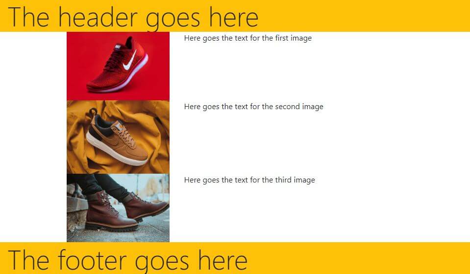
Let’s see a screenshot of our layout at this stage:
Let’s now see this layout with the Bootstrap 4 grid overlay.

We can see above that we’re indeed fitting the image into four columns out of the 12 columns in each row.
We can also see that the rest of the space is taken up by the few words that we added to the col-sm-8 divs.
In the previous article, we’ve learned about some classes to use to give our divs some borders.
We will use them here, next.
Adding borders to our rows
Let’s update our code to this:
<header class="container-fluid bg-warning display-4">
    The header goes here
</header>
<div class="container">
    <div class="row border border-primary">
        <div class="col-sm-4">
            <img class="img-fluid"
            src="https://images.unsplash.com/photo-1542291026-7eec264c27ff?ixlib=rb-1.2.1&auto=format&fit=crop&w=1950&q=80">
        </div>
        <div class="col-sm-8 bg-light">
            Here goes the text
            for the first image
        </div>
    </div>
    <div class="row border border-primary">
        <div class="col-sm-4">
            <img class="img-fluid"
            src="https://images.unsplash.com/photo-1549298916-b41d501d3772?ixlib=rb-1.2.1&ixid=eyJhcHBfaWQiOjEyMDd9&auto=format&fit=crop&w=1300&q=80">
        </div>
        <div class="col-sm-8 bg-light">
            Here goes the text
            for the second image
        </div>
    </div>
    <div class="row border border-primary">
        <div class="col-sm-4">
            <img class="img-fluid"
            src="https://images.unsplash.com/photo-1542834281-0e5abcbdc5b4?ixlib=rb-1.2.1&ixid=eyJhcHBfaWQiOjEyMDd9&auto=format&fit=crop&w=1350&q=80">
        </div>
        <div class="col-sm-8 bg-light">
            Here goes the text
            for the third image
        </div>
    </div>
</div>
<footer class="container-fluid bg-warning display-4">
    The footer goes here
</footer>
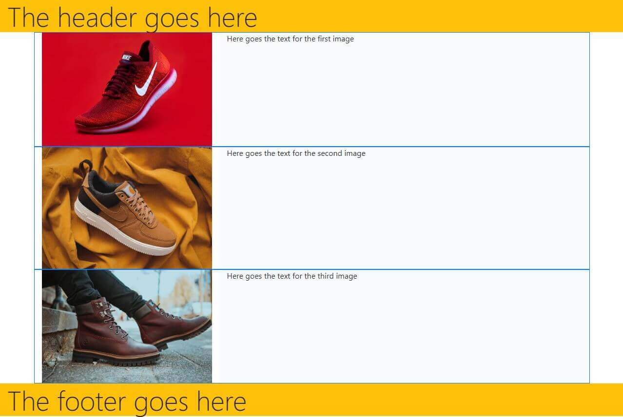
We’ve added borders around each row in the layout above. We’ve also added the bg-light background to each of the col-sm-8 divs that contain the “description” for each image.
Now that we’ve updated our layout, it will look like this:
The next improvement to our layout could be adding some margins and paddings.
Luckily, Bootstrap has a bunch of so-called utility classes, including margin and padding classes.
Margin and padding utility classes in Bootstrap 4
There are 5 default margin and padding classes in Bootstrap 4:
m-0andp-0m-1andp-1m-2andp-2m-3andp-3m-4andp-4m-5andp-5
As you might have guessed, both the m-0 and p-0 set the margin and padding to zero, respectively.
Then with each rising number, the value of the margin or padding increases, giving us the largest possible default margin and padding in Bootstrap with m-5 and p-5 classes, respectively.
We can also add margins and paddings to each individual side (top, right, bottom, left). For example:
mt-0sets the top margin to 0pr-1sets the right padding’s “intensity” to 1mb-2sets the bottom margin’s “intensity” to 2- etc, all the way up to 5
Now that we know how these utility classes work, lets add them to our layout.
Here’s the complete code for this article’s layout, including some margin utility classes:
<header class="container-fluid bg-warning display-4">
    The header goes here
</header>
<div class="container">
    <div class="row border border-primary mt-5">
        <div class="col-sm-4">
            <img class="img-fluid"
            src="https://images.unsplash.com/photo-1542291026-7eec264c27ff?ixlib=rb-1.2.1&auto=format&fit=crop&w=1950&q=80">
        </div>
        <div class="col-sm-8 bg-light">
            Here goes the text
            for the first image
        </div>
    </div>
        <div class="row border border-primary mt-5">
        <div class="col-sm-4">
            <img class="img-fluid"
            src="https://images.unsplash.com/photo-1549298916-b41d501d3772?ixlib=rb-1.2.1&ixid=eyJhcHBfaWQiOjEyMDd9&auto=format&fit=crop&w=1300&q=80">
        </div>
        <div class="col-sm-8 bg-light">
            Here goes the text
            for the second image
        </div>
    </div>
        <div class="row border border-primary mt-5">
        <div class="col-sm-4">
            <img class="img-fluid"
            src="https://images.unsplash.com/photo-1542834281-0e5abcbdc5b4?ixlib=rb-1.2.1&ixid=eyJhcHBfaWQiOjEyMDd9&auto=format&fit=crop&w=1350&q=80">
        </div>
        <div class="col-sm-8 bg-light">
            Here goes the text
            for the third image
        </div>
    </div>
</div>
<footer class="container-fluid bg-warning display-4">
    The footer goes here
</footer>
Here is the completed layout’s screenshot:
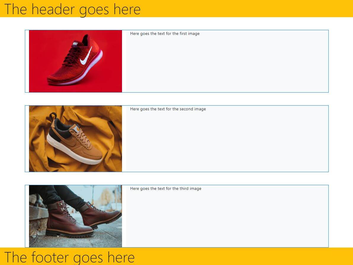
Feel free to check out the live example as well.
Conclusion
In this article, we’ve learned about Bootstrap’s column grid and about the row class. We’ve built a fully responsive layout. We’ve also learned about margin and padding utility classes in Bootstrap.
We’ve also implemented some stuff we’ve learned before, namely:
container-fluidandcontainerclassess- contextual background classes
- contextual border classes
- typographic
display-*classes
In the next article, we’ll bring our layouts to a whole new level by learning about components in Bootstrap.

