Building Bootstrap 4 layouts, part 3: Bootstrap components
Prototyping layouts faster with the help of components
By: Ajdin Imsirovic 30 September 2019
Welcome to article series titled: Building Bootstrap 4 Layouts. This is the third of 20 articles in this article series.
 Photo by
Ryan Quintal, @ryanquintal on Unsplash
Photo by
Ryan Quintal, @ryanquintal on Unsplash
In the first two articles of this article series, we’ve learned about containers, rows, column grids, and utility classes.
Bootstrap also comes with its own CSS reset, called Reboot. We’ve covered CSS resets in the article series titled HTML and CSS basics.
We’ve got enough basics down to really start using all that Bootstrap 4 has to offer.
Introducing components in Bootstrap
Components in Bootstrap are the result of the fast evolution of layouts on the web.
In his book Don’t make me think, Steve Krug writes about how users come to expect certain norms and patterns in design. For example, you wouldn’t expect a steering wheel on a laundry machine, just like you wouldn’t expect a lid covering up the top of a dashboard in a car.
The argument that the author makes there is that you shouldn’t build layouts that will leave your users head-scratching.
While these examples might seem a bit silly, they point to the fact that as soon as the novelty wears off, website designers generally start using and re-using some patterns in design more than others, and after enough time has passed, those patterns become the norm.
In web design, the essence of this norm can be seen in Bootstrap components. There are not many of them: the official documentation for Bootstrap version 4.3 lists 24 components altogether, alphabetically.
Let’s divide these components in a better way, by splitting them into two broad groups: primary layout components, and secondary layout components.
Note that these two terms are just something that I came up with, there’s no such phrase in the official docs.
Primary and secondary layout components
Primary layout components include components that fit the following criteria: They represent an entire chunk of a layout.
For example, Bootstrap’s navbar is a primary layout component: it is a full solution for the main navigation on a web layout.
On the other hand, Bootstrap’s button is a secondary layout component: it cannot be used for an entire section of a website layout.
Here is the full list of Bootstrap 4 components that I consider primary layout components:
- Breadcrumb
- Card
- Carousel
- Jumbotron
- Navbar
- Pagination
All the other components, in my opinion, can be thought of as secondary layout components. These can be further subgrouped into:
- inputs (buttons, button groups, dropdowns, forms, input group)
- notifications (alerts, badges, modals, popovers, progress, spinners, toasts)
- miscellaneous (collapse, list group, media object, navs, scrollspy, spinners)
Now that we’ve listed them, it’s time to use these components!
In this article, we’ll build a layout using only primary layout components.
Building a Bootstrap 4 layout with primary layout components only
Let’s start by navigating to the Navbar section of Bootstrap’s documentation.
We’ll copy the code found in the very first example, under the Supported content heading.
Here is the code:
<nav class="navbar navbar-expand-lg navbar-light bg-light">
  <a class="navbar-brand" href="#">Navbar</a>
  <button class="navbar-toggler" type="button" data-toggle="collapse" data-target="#navbarSupportedContent" aria-controls="navbarSupportedContent" aria-expanded="false" aria-label="Toggle navigation">
    <span class="navbar-toggler-icon"></span>
  </button>

  <div class="collapse navbar-collapse" id="navbarSupportedContent">
    <ul class="navbar-nav mr-auto">
      <li class="nav-item active">
        <a class="nav-link" href="#">Home <span class="sr-only">(current)</span></a>
      </li>
      <li class="nav-item">
        <a class="nav-link" href="#">Link</a>
      </li>
      <li class="nav-item dropdown">
        <a class="nav-link dropdown-toggle" href="#" id="navbarDropdown" role="button" data-toggle="dropdown" aria-haspopup="true" aria-expanded="false">
          Dropdown
        </a>
        <div class="dropdown-menu" aria-labelledby="navbarDropdown">
          <a class="dropdown-item" href="#">Action</a>
          <a class="dropdown-item" href="#">Another action</a>
          <div class="dropdown-divider"></div>
          <a class="dropdown-item" href="#">Something else here</a>
        </div>
      </li>
      <li class="nav-item">
        <a class="nav-link disabled" href="#" tabindex="-1" aria-disabled="true">Disabled</a>
      </li>
    </ul>
    <form class="form-inline my-2 my-lg-0">
      <input class="form-control mr-sm-2" type="search" placeholder="Search" aria-label="Search">
      <button class="btn btn-outline-success my-2 my-sm-0" type="submit">Search</button>
    </form>
  </div>
</nav>
The above code at this point can be found as a live example in this codelab.
On narrow resolutions, the navbar even adds a toggle button (sometimes called “the hamburger”), with all the navigation items hidden behind it, to use the narrow space better:
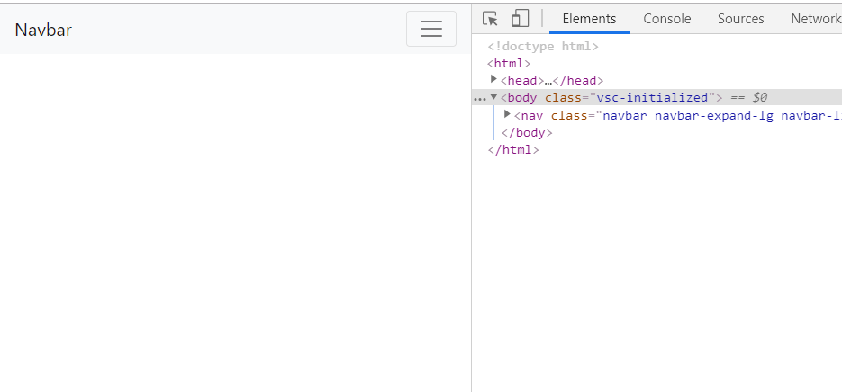
If you click the menu button (“the hamburger”), it should slide down and show all the hidden navigation items.
However, if you did it now, nothing would happen.
Why is that?
It’s because Bootstrap 4 uses the jQuery JavaScript library to make interactivity work.
We’ve just seen an example of what happens when there’s no jQuery added to our Bootstrap-based layout: the navbar toggle button doesn’t toggle.
The fix is easy enough: we just need to add a <script> tag that points to a link to Bootstrap’s jQuery.
Adding jQuery to Bootstrap 4 layout
In any website layout, the best place to add a <script> tag is usually just above the closing </body> tag.
So let’s hop on over to Bootstrap’s official docs and copy the code for adding jQuery:
<script src="https://code.jquery.com/jquery-3.3.1.slim.min.js"
    integrity="sha384-q8i/X+965DzO0rT7abK41JStQIAqVgRVzpbzo5smXKp4YfRvH+8abtTE1Pi6jizo"
    crossorigin="anonymous"></script>
<script
    src="https://cdnjs.cloudflare.com/ajax/libs/popper.js/1.14.7/umd/popper.min.js" integrity="sha384-UO2eT0CpHqdSJQ6hJty5KVphtPhzWj9WO1clHTMGa3JDZwrnQq4sF86dIHNDz0W1"
    crossorigin="anonymous"></script>
<script
    src="https://stackpath.bootstrapcdn.com/bootstrap/4.3.1/js/bootstrap.min.js"
    integrity="sha384-JjSmVgyd0p3pXB1rRibZUAYoIIy6OrQ6VrjIEaFf/nJGzIxFDsf4x0xIM+B07jRM"
    crossorigin="anonymous"></script>
As we can see above, we are actually adding three different JavaScript files. The order is important: first we add the jQuery library, the file name being jquery-3.3.1.slim.min.js, then we add popper.min.js (which helps with the tooltip component), and we add bootstrap.min.js. Since Bootstrap relies on jQuery, it’s important that jQuery gets imported first.
Our entire website layout for this article now looks like this:
<!doctype html>
<html>

<head>
    <link rel="stylesheet" href="https://stackpath.bootstrapcdn.com/bootstrap/4.3.1/css/bootstrap.min.css"
        integrity="sha384-ggOyR0iXCbMQv3Xipma34MD+dH/1fQ784/j6cY/iJTQUOhcWr7x9JvoRxT2MZw1T" crossorigin="anonymous">
</head>

<body>
    <nav class="navbar navbar-expand-lg navbar-light bg-light">
        <a class="navbar-brand" href="#">Navbar</a>
        <button class="navbar-toggler" type="button" data-toggle="collapse" data-target="#navbarSupportedContent" aria-controls="navbarSupportedContent" aria-expanded="false" aria-label="Toggle navigation">
          <span class="navbar-toggler-icon"></span>
        </button>

        <div class="collapse navbar-collapse" id="navbarSupportedContent">
          <ul class="navbar-nav mr-auto">
            <li class="nav-item active">
              <a class="nav-link" href="#">Home <span class="sr-only">(current)</span></a>
            </li>
            <li class="nav-item">
              <a class="nav-link" href="#">Link</a>
            </li>
            <li class="nav-item dropdown">
              <a class="nav-link dropdown-toggle" href="#" id="navbarDropdown" role="button" data-toggle="dropdown" aria-haspopup="true" aria-expanded="false">
                Dropdown
              </a>
              <div class="dropdown-menu" aria-labelledby="navbarDropdown">
                <a class="dropdown-item" href="#">Action</a>
                <a class="dropdown-item" href="#">Another action</a>
                <div class="dropdown-divider"></div>
                <a class="dropdown-item" href="#">Something else here</a>
              </div>
            </li>
            <li class="nav-item">
              <a class="nav-link disabled" href="#" tabindex="-1" aria-disabled="true">Disabled</a>
            </li>
          </ul>
          <form class="form-inline my-2 my-lg-0">
            <input class="form-control mr-sm-2" type="search" placeholder="Search" aria-label="Search">
            <button class="btn btn-outline-success my-2 my-sm-0" type="submit">Search</button>
          </form>
        </div>
      </nav>

      <script src="https://code.jquery.com/jquery-3.3.1.slim.min.js"
      integrity="sha384-q8i/X+965DzO0rT7abK41JStQIAqVgRVzpbzo5smXKp4YfRvH+8abtTE1Pi6jizo"
      crossorigin="anonymous"></script>
  <script
      src="https://cdnjs.cloudflare.com/ajax/libs/popper.js/1.14.7/umd/popper.min.js" integrity="sha384-UO2eT0CpHqdSJQ6hJty5KVphtPhzWj9WO1clHTMGa3JDZwrnQq4sF86dIHNDz0W1"
      crossorigin="anonymous"></script>
  <script
      src="https://stackpath.bootstrapcdn.com/bootstrap/4.3.1/js/bootstrap.min.js"
      integrity="sha384-JjSmVgyd0p3pXB1rRibZUAYoIIy6OrQ6VrjIEaFf/nJGzIxFDsf4x0xIM+B07jRM"
      crossorigin="anonymous"></script>
</body>

</html>
With these updates in place, let’s see the example layout in action.
As expected, the navbar component now works; the menu button can be toggled, as seen below:

Great! We’ve successfully added the navbar component to our layout.
Next, let’s add some breadcrumbs right under the navbar.
Adding the breadcrumb component
Let’s re-visit Bootstrap docs and copy an example of the breadcrumb component:
<nav aria-label="breadcrumb">
  <ol class="breadcrumb">
    <li class="breadcrumb-item"><a href="#">Home</a></li>
    <li class="breadcrumb-item"><a href="#">Library</a></li>
    <li class="breadcrumb-item active" aria-current="page">Data</li>
  </ol>
</nav>
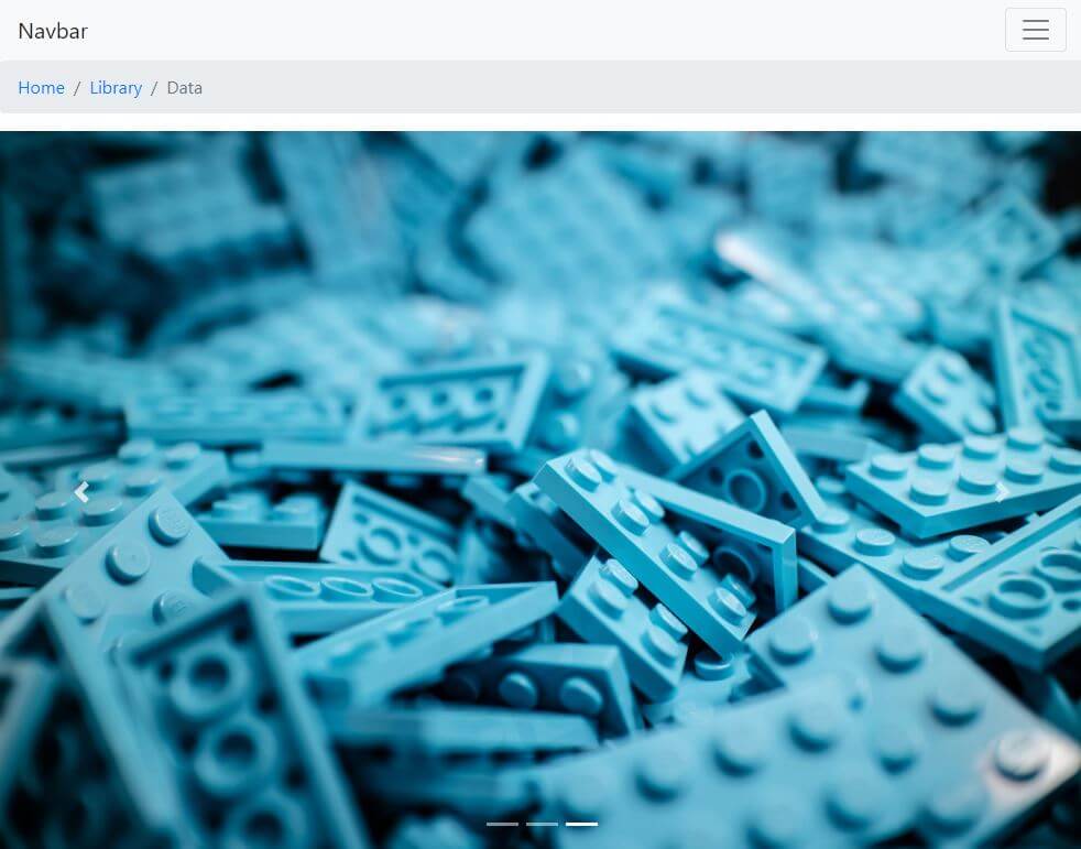
Now we’ll just paste it in right under the navbar’s closing </nav> tag.
The resulting layout is actually starting to look like a real webpage!
Next, let’s add a carousel.
Adding the carousel component
Carousel is just a slideshow component, with items sliding from right to left, by default.
Let’s copy-paste an example to see this slideshow in action.
<div id="carouselExampleIndicators" class="carousel slide" data-ride="carousel">
  <ol class="carousel-indicators">
    <li data-target="#carouselExampleIndicators" data-slide-to="0" class="active"></li>
    <li data-target="#carouselExampleIndicators" data-slide-to="1"></li>
    <li data-target="#carouselExampleIndicators" data-slide-to="2"></li>
  </ol>
  <div class="carousel-inner">
    <div class="carousel-item active">
      <img src="..." class="d-block w-100" alt="...">
    </div>
    <div class="carousel-item">
      <img src="..." class="d-block w-100" alt="...">
    </div>
    <div class="carousel-item">
      <img src="..." class="d-block w-100" alt="...">
    </div>
  </div>
  <a class="carousel-control-prev" href="#carouselExampleIndicators" role="button" data-slide="prev">
    <span class="carousel-control-prev-icon" aria-hidden="true"></span>
    <span class="sr-only">Previous</span>
  </a>
  <a class="carousel-control-next" href="#carouselExampleIndicators" role="button" data-slide="next">
    <span class="carousel-control-next-icon" aria-hidden="true"></span>
    <span class="sr-only">Next</span>
  </a>
</div>
The live example of our updated layout now looks like this.
The only difference between the above code and the one in our live example is that in the live example I’ve actually added some images from unsplash.com, namely:
Here’s our layout with carousel added:
We’ve added three different primary components so far.
What we’ve got left is to add the card, the jumbotron, and the pagination components.
Adding the card component
The card component is very, very versatile.
Cards can be used for numerous web layout functionalities, such as, for example:
- biography sections on blogs
- product showcase on e-commerce sites
- pricing sections
- testimonial sections
The card component is ubiquitous.
In this article’s layout, we’ll add three card components in a single row.
Before we add the cards, let’s plan it out a bit: we’ll need a div with the class of container-fluid, and we’ll add it a nice background, for example bg-info. Inside this div, we’ll add another div, which will have the class of container. One more level deep, we’ll have a row, and inside the row we’ll nest three divs with col-sm-4 classes (so that each card takes up a third of the width on sm and greater resolutions).
Here’s the code we’ll start with:
<div class="container-fluid bg-info">
  <div class="container">
    <div class="row">
      <div class="col-sm-4">card 1 here</div>
      <div class="col-sm-4">card 2 here</div>
      <div class="col-sm-4">card 3 here</div>
    </div>
  </div>
</div>
We’ll replace the “card X here” with the following example from Bootstrap docs:
<div class="card" style="width: 18rem;">
  <img src="..." class="card-img-top" alt="...">
  <div class="card-body">
    <h5 class="card-title">Card title</h5>
    <p class="card-text">Some quick example text to build on the card title and make up the bulk of the card's content.</p>
    <a href="#" class="btn btn-primary">Go somewhere</a>
  </div>
</div>
Again, we’re adding some images of lego blocks inside the src attribute of the above card.
The updated layout can be found here.
To make the images look at least somewhat different, we’re also adding an inline style of filter: grayscale(1) to each of them, a trick we learned in this article.
Next, we’ll be adding the jumbotron, an easy way to style a simple signup form quickly.
Adding the jumbotron component
We’re copying the code from the second jumbotron example:
<div class="jumbotron jumbotron-fluid">
  <div class="container">
    <h1 class="display-4">Fluid jumbotron</h1>
    <p class="lead">This is a modified jumbotron that occupies the entire horizontal space of its parent.</p>
  </div>
</div>
We also need to update it with a simple input and a submit button, copied from the forms section:
<form class="form-inline">
  <div class="form-group mb-2">
    <label for="staticEmail2" class="sr-only">Email</label>
    <input type="text" readonly class="form-control-plaintext" id="staticEmail2" value="email@example.com">
  </div>
  <div class="form-group mx-sm-3 mb-2">
    <label for="inputPassword2" class="sr-only">Password</label>
    <input type="password" class="form-control" id="inputPassword2" placeholder="Password">
  </div>
  <button type="submit" class="btn btn-primary mb-2">Confirm identity</button>
</form>
Of course, in the updated layout, we’re combining the two examples into this:
<div class="jumbotron jumbotron-fluid">
    <div class="container">
        <form class="form-inline">
        <div class="form-group mb-2">
            <label for="staticEmail2" class="sr-only">Email</label>
            <input type="text" readonly class="form-control-plaintext" id="staticEmail2" value="email@example.com">
        </div>
        <div class="form-group mx-sm-3 mb-2">
            <label for="inputPassword2" class="sr-only">Password</label>
            <input type="password" class="form-control" id="inputPassword2" placeholder="Password">
        </div>
        <button type="submit" class="btn btn-primary mb-2">Confirm identity</button>
        </form>
    </div>
</div>
At this point, our layout is almost complete. The newest addition looks like this:
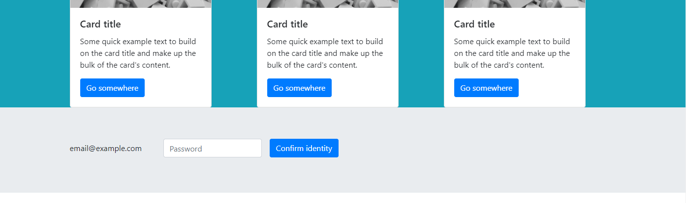
As we can see, there are a few problems with this section. There’s still dummy text on the input, and we should add something like “Sign-up to our newsletter”.
Actually, there are a few other places where our layout could be better-looking.
Improving our layout
Here are some major issues with our layout now:
- The color scheme is sort of inconsistent
- The carousel area’s images should be made to look nicer, or the carousel area should be made shorter
- The cards all have dummy text and placeholder images
- There are some margin issues under the breadcrumbs area
- We need to fix the “zoomed out” effect
Let’s fix these issues, one by one.
Adding better images to out layout
We’ll be using Unsplash images here again.
For the carousel, we’ll use these:
- red shoes by Lindsay Henwood
- white shoes by Clem Onojeghuo
- yellow shoes by Danny G
We’ll also update the cards, with these images:
- dance shoes by Caitlyn Wilson
- casual shoes by freestocks.org
- fashion shoes by Sylwia Bartyzel
Fixing the color scheme and the dummy text
As far as the color scheme goes, we’ve just made the backgrounds alternate between bg-light and bg-dark contextual color classes.
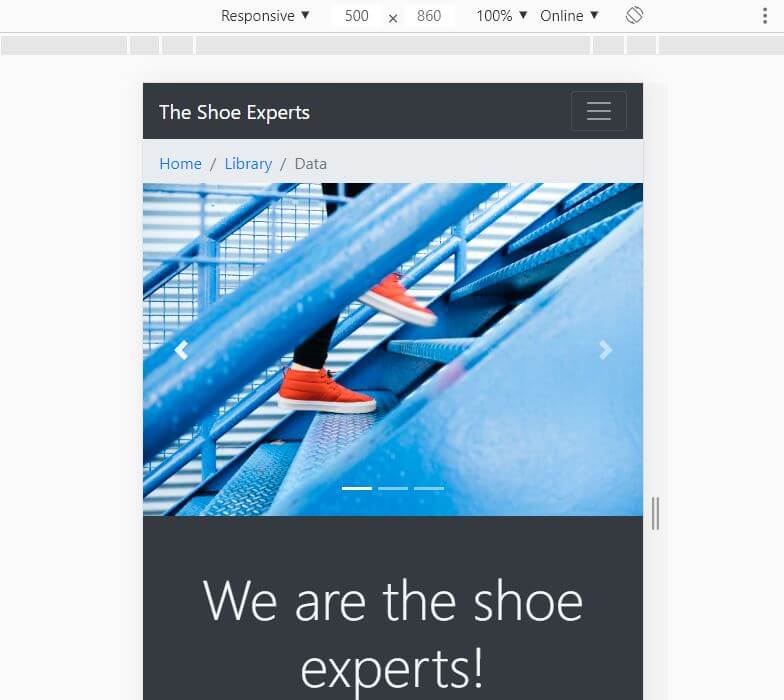
We’re still using dummy text in the cards, but now it’s shoes-themed dummy text. We’ve updated the Navbar’s brand section similarly, so that it reads “Shoe experts”.
Fixing margin issues and centering newsletter subscription
We’re fixing the margin issues under the breadcrumbs area, using Bootstrap’s margin utility classes.
Finally, we’re using the narrow container trick to easily center the navbar area.
That’s it for all the improvements to our layout.
To see the completed layout, check out this link.
Fixing the zoomed out “effect”
If you opened the above layout on a mobile, you’ll see a weird bug: the entire page is zoomed out.
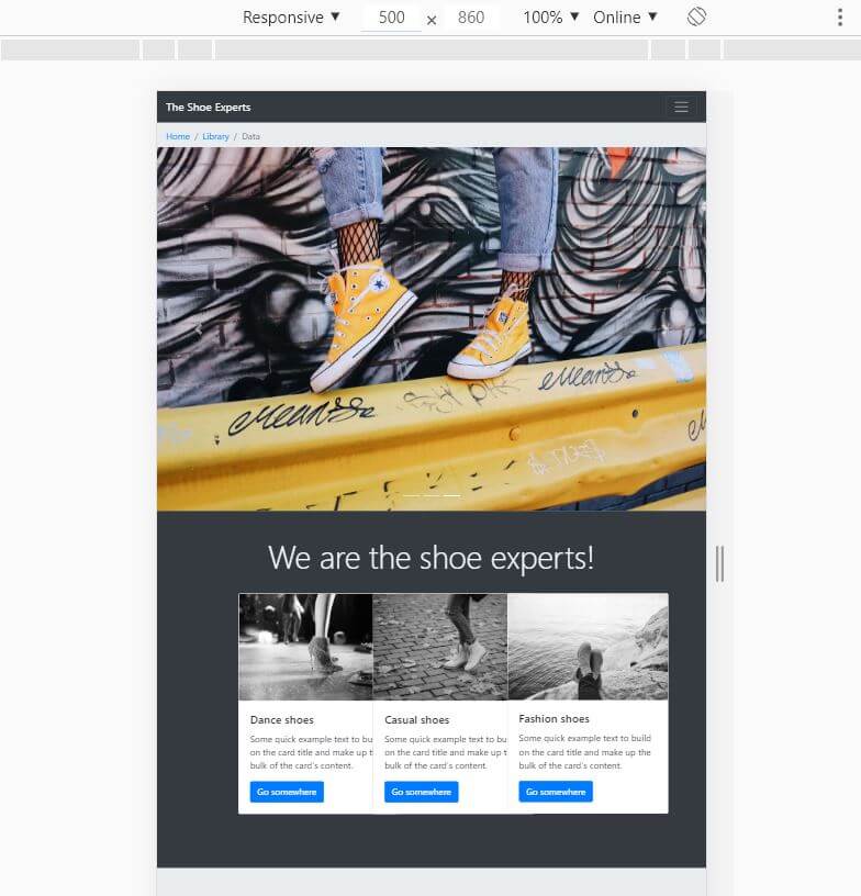
What we need to do to make it work is add our first <meta> tag to the <head> element of our layout.
This meta tag looks as follows:
<meta name="viewport" content="width=device-width, initial-scale=1">
The above piece of code will fix our layout’s zoom issue. The tag is used to make the browser “obey” the width of the screen the layout is viewed on.
Whatever device you’re on, the browser will honour the width of the screen (the viewport), as correct width for the layout. The initial-scale=1 will make the layout start at the natural zoom of 1:1, but the user can zoom in on a mobile device using finger gestures.
Here’s the updated layout after we add the above meta tag.
Our site now looks a lot more like what we’re used to see on mobile:
Conclusion
In this article, we’ve learned about Bootstrap 4 components, why they’re important and how to use them.
We’ve also seen how they are one of our best tools in prototyping layouts fast.
In the next article, we’ll explore some other components by building a more complex layout.

