Building Bootstrap 4 layouts, part 8: Modularize your Bootstrap layouts
In this article we'll discuss the options we have for modularizing our layout development
By: Ajdin Imsirovic 05 October 2019
In this eighth of 20 articles in the Building Bootstrap 4 Layouts article series, we’ll expand on the layout we’ve built in the previous article.
Before we do that, we need to stop and think: what are we still missing in our layout-building process? In other words, where is the space for improvement?
 Photo by
Eric & Niklas on Unsplash.com
Photo by
Eric & Niklas on Unsplash.com
How to improve our layout-building process?
To improve our layout building process, we need to think about where it is currently lacking.
So far in this article series, we’ve covered a number of tips, tricks, and techniques in building layouts with Bootstrap 4.
We’ve covered SCSS, but we saw that it’s a bit hard to set up. And it’s a bit clunky to use.
We’ve covered Bootstrap 4 components. In another article series, we’ve covered the concept of Don’t repeat yourself (DRY development).
The question is, can we take the concept of DRY and combine it with the approach to layout components that Bootstrap has?
There’s another challenge to solve, and that is the challenge of speed:
- How do we build Bootstrap 4 layouts, faster?
- How do we implement various components, faster?
- How do we learn and improve our skills, faster?
There is no perfect answer to these questions. Or, put differently, modern web technologies give us a plethora of ways to solve these issues.
So what are we to do?
As beginners (which I’m assuming you are), we need to find the balance between getting new knowledge and practicing what we already know.
It’s a hard thing to achieve, because these two goals are often in collision with one another.
Ultimately, the choice boils down to a simple cost-benefit analysis: Based on the investment, what are my returns?
That’s why I’ve decided to continue this series of Bootstrap 4 articles with the help of Angular.
Angular is a mature front-end web development framework, backed by Google.
Here are the reasons to use it when learning Bootstrap layouts:
- It solves the “problems” with SCSS
- It helps us modularize our layouts (easily!)
- It helps us keep dry
- We can do this quickly (with the help of Stackblitz)
- Consequently, we’ll become faster in building layouts
- Using Angular with Bootstrap 4 will help us be faster to learn and improve our skills the right way
Let’s get started!
Understanding how Angular works
Angular is complex.
This can make it look like it’s a lot harder to learn than it really is.
One sure way to make it easy to understand is to limit the scope of what we are trying to do.
We have only 1 goal right now: to split our large one-file HTML layouts, into several smaller files.
Thus we are not really trying to understand how the entire Angular framework works.
What we are doing here is: we’re learning how to split our HTML files with the help of Angular.
That’s all that we’re doing in this article!
How to split HTML files with Angular
Before we can even get to the HTML part, we will look at how code is organized in Angular:
- Modules hold components
- Components hold the styles file, the HTML template file, and the class file
Let’s see a diagram of this:
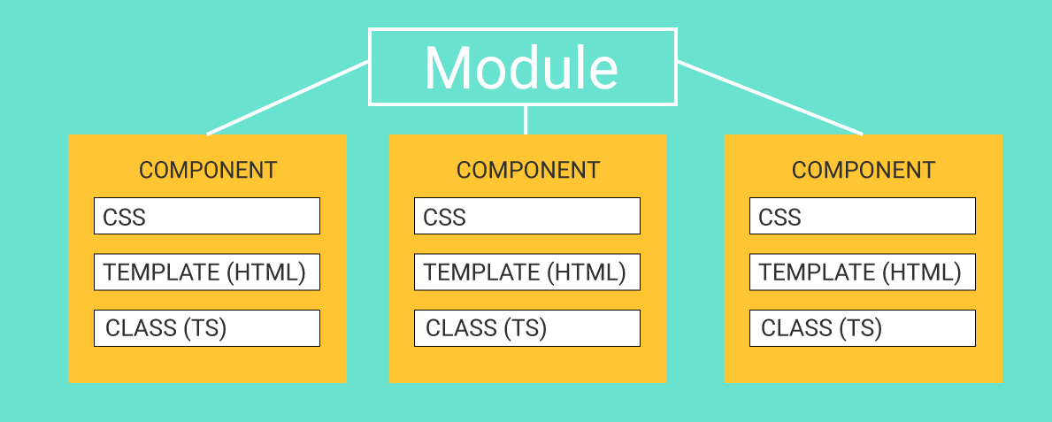
An Angular module holds components together. Inside each component in Angular, we already know everything we need to know about the styles file and the template HTML file: the styles file holds all the styles that will apply only to the HTML of their specific component. The template HTML file is just plain HTML - that’s how we’ll use it.
But what’s with this “class (ts)” file?
The class file in an Angular template
The class file is just there to do two things:
- List the component’s HTML and CSS files
- Add some functionality (interactivity)
While point 1 is easy to comprehend, point 2 might need a bit more explaining.
How does the class file add functionality in an Angular component?
If we were not using a framework, the interactivity would be added with plain JavaScript.
If we say that our website is like a house, we could say that:
- HTML is the house structure (the walls, the doors, the roof, etc)
- CSS is the house coloring and decoration
- JavaScript is the house functionality: opening and closing the doors, turning on the lights, etc.
Angular takes things one step further and uses another language: TypeScript. Let’s explain TypeScript and JavaScript relationship by looking at the relationship between SCSS and CSS.
In our introduction to SCSS, we said that SCSS is a superset of CSS.
What that means is that SCSS includes all the CSS, plus some additional features that CSS doesn’t have. SCSS also compiles down to CSS, the process which we described earlier in this series.
It’s also important to note that we can write pure CSS inside of SCSS files. We never have to use the SCSS functionalities in SCSS files! Since SCSS includes the entire CSS functionality, we can stick to using only this subset of SCSS.
Why then use SCSS anyway? Because of the partial include files!
Similar to SCSS and CSS, in Angular we use TypeScript by default. But TypeScript is a superset of JavaScript, and we’re fine - for the most part - using plain JavaScript inside TypeScript files.
If all of this is making your head spin, I’ve got good news for you: We will use almost no TypeScript or JavaScript functionality in this article. No opening and closing doors in our HTML house!
It’s simply too early in this article series to be that advanced. And there’s no need for it at this point.
What we will have to do however, is use just the bare necessary minimum of TypeScript inside the class file, just to make it possible to split HTML files into different components.
Thus let’s look at this minimal required understanding of the component’s class TypeScript file.
Understanding the minimal code of a component’s class file
Here’s a diagram of what a component’s class file looks like:
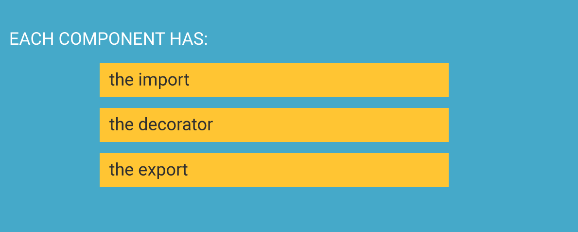
Each component must have the import section, the decorator section, and the export section.
The import section imports all the code that will be used in a specific component. The bare minimum for the import section is this:
import { Component } from '@angular/core'
The above code means that we are importing the Component class from the @angular/core JavaScript module (Node module, to be precise).
The decorator section adds options to the imported Component, like this:
@Component()
The @Component is called the decorator. Inside the decorator, we add our component’s meta data: the custom HTML selector the component will be given, the location of the component’s template HTML file, and the location of the component’s CSS file:
@Component({
    selector: 'some-kebab-cased-custom-html-element-name',
    templateUrl: './component-name.component.html',
    styleUrls: ['./component-name.component.css']
})
Finally, the export code is just this:
export class ClassNameComponent {
    // additional interactive
    // functionality is set up here
    // we won't use this section
}
That’s it, we’ve just explained all the building blocks of a minimum required code for a component to work in Angular.
Finally, a component that’s prepared this way needs to be imported into its module. To import a component into a module, we need to do two things:
- Use the
importsyntax to import the component into a module - List the imported component in the declarations array of the module where it’s imported to
That’s it!
This might look like a lot of theory, but as soon as we build our first one or two Bootstrap layouts in Angular, this will be easy as pie.
Setting up our Angular minimal app
In the past, Angular required a bit more setup, but it is getting ever more approachable.
Currently, one of the easiest and fastest ways to set up an Angular prototype is to use Stackblitz.
The layout we’ll be looking at is the exact same layout we built in the previous article in this article series. It’s the Movies & Typography layout.
Lets begin by looking at the first, incomplete version of our layout, with only the navbar added.
The Stacblitz app is actually an instance of the VS Code editor, running online. That’s great, because if you’ve used VS Code before, you should feel right at home!
If you haven’t used it, here’s a quick tour:
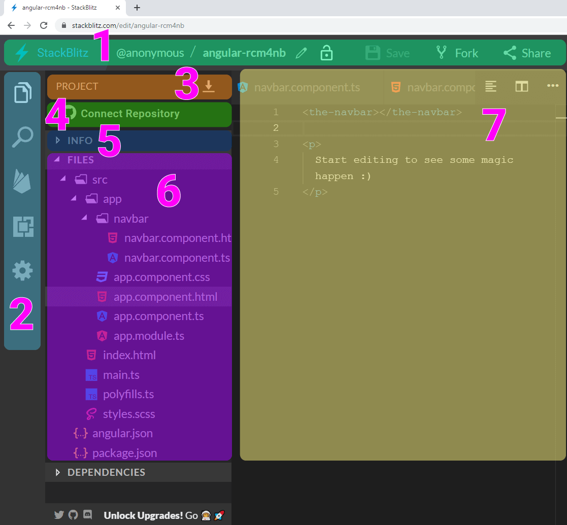
Let’s explain each section of Stackblitz above:
- The bar on top has the link to the Stackblitz home, then your username (if you’re logged-in), the unique name for the app online, padlock for privacy settings, fork to copy the project in one click, and the share options
- The sidebar on the left inludes: project files list, searc functionality, link for firebase hosting, extensions section, and the settings button
- This sidebar depends on what button from the sidebar (item 2 above) is clicked. If the active sidebar button is clicked, then you will see the details of the project list; under number 3 on the image above, you have a little down arrow icon; that’s the download button to easily download your Angular project
- The Connect repository is for Github integration (we’ll cover Github in a separate article, so for now, ignore this button)
- If you clicked on the Project info, you’d see some basic stats: how many views your stackblitz received, and how many times it was forked. You’ll also get the project description: Starter project for Angular apps that exports to the Angular CLI
- The files section lists all your project’s files, and finally
- The editor groups are holds the files you can edit. If you double click any file, it will open here.
In the right half of the screen (on a desktop), you can see the preview of your app - or sometimes you’ll see some errors. Either way, you can see the end result of your code in this right half section on Stackblitz:
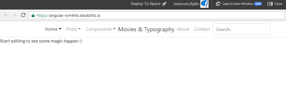
In the above preview, we can see that our Movies & Typography layout is starting to come together nicely.
We’ve added the navbar, and now, before we continue, let’s look at the actual code that made this possible.
Inspecting our app’s code on Stackblitz
At the beginning of this article, we’ve covered the basics of how modules and components in Angular work together.
We’ll now look at a practical example, by examining how we added our layout’s navbar.
The top-level structure of our Stackblitz app currently looks like this:
src/
 └── ...
angular.json
package.json
In the root of our Stackblitz project, there’s the src folder and two files:
angular.json, andpackage.json
The package.json file holds our project’s information. This is a big topic, and we’ve already covered it in this in-depth article.
However, we won’t touch the package.json file in this article, so at this point, you really shouldn’t go down that rabbit hole.
The angular.json file holds our Angular settings, and we can change those settings if we want to.
When you start a new boilerplate Angular app on Stackblitz, these files come with a new installation. Sometimes you need to update the angular.json file, which is exactly what I did here, on line 26 of angular.json:
"src/styles.scss"
Why this update? Because there’s a file inside the root of the src folder, called styles.css, which holds the styles that will apply to the entire app, globally. By renaming this file to styles.scss (provided that you’ve already updated the angular.json file), you’re now ready to use SCSS instead of CSS in all your files.
Here’s the contents of the src/styles.scss file:
/* Add application styles & imports to this file! */

@import url(https://stackpath.bootstrapcdn.com/bootstrap/4.3.1/css/bootstrap.min.css);
As you can see, we’re importing the Bootstrap framework, version 4.3.1, from the Stackpath CDN.
The purpose of a CDN
CDN stands for “Content Delivery Network”. A CDN is a global network of servers that hosts popular libraries on these servers. The Bootstrap framework is an example of such a popular library.
But why the global network of servers, and not just one server in one location? Well, that’s the whole purpose of a CDN: to host files close to where a user is.
So, for example, if you’re located somewhere in the USA, you’ll get served the Bootstrap 4.3.1 minified CSS file from, for example, New York, or LA. If you’re visiting it from Europe, it might get served to your from the server in London or Frankfurt.
The point of a CDN is speed. A CDN helps serve files quickly to website visitors. There are other things that a CDN does too, but let’s keep it at that for now - and get back to examining our project’s file structure.
The contents of the src folder
Here are the top-level items inside of the src folder:
src/
  ├── app/
  │   ├── ...
  │   ├── ...
  │   └── ...
  ├── index.html
  ├── main.ts
  ├── polyfills.ts
  └── styles.scss
There are five items altogether. Out of these five, only the styles.scss file and the app folder are of any relevance for us. We can disregard the rest.
Drilling down further the app folder holds these files and folders:
app/
  ├── navbar/
  │   ├── navbar.component.html
  │   └── navbar.componetn.ts
  ├── app.component.css
  ├── app.component.html
  ├── app.component.ts
  └── app.module.ts
This is where our layout gets built!
Let’s now see how the app folder works visually:
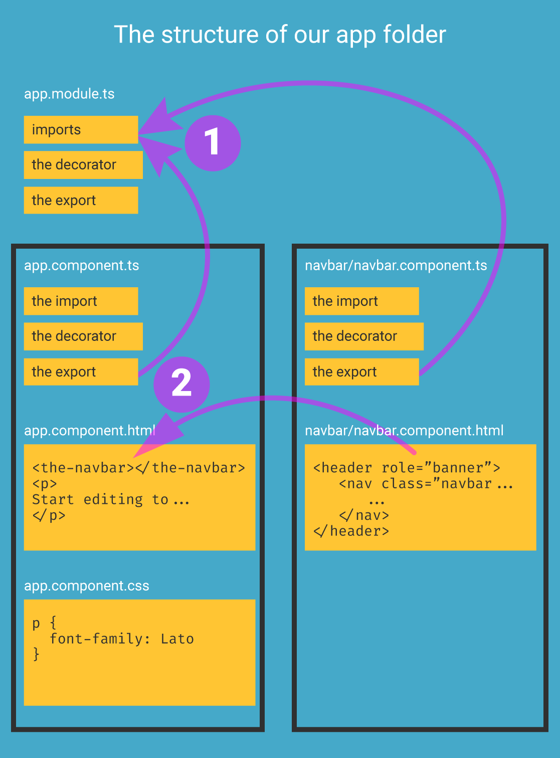
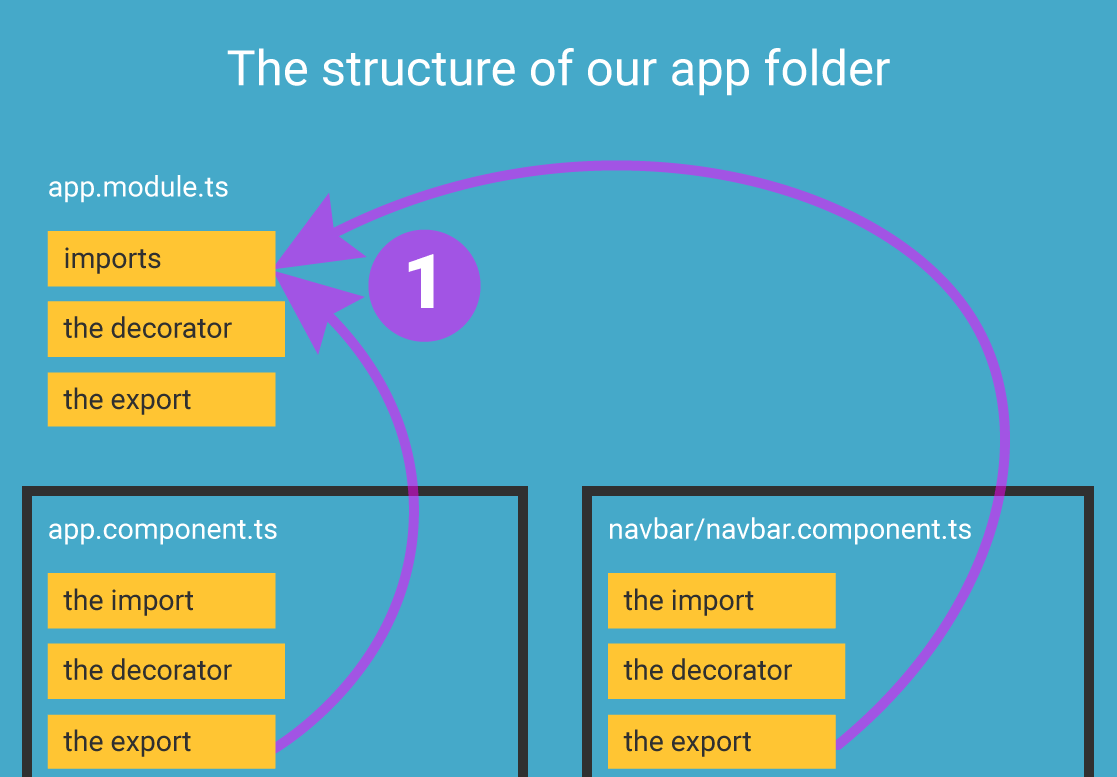
#1: The app module imports all the components
Obviously, the app.module.ts file imports all the components. Currently there are two:
- the app component
- the navbar component
Let’s see that again:
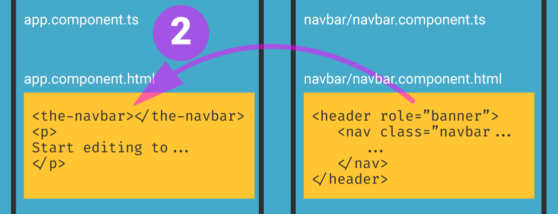
#2: The app.component.html imports all the other HTML files
The app.component.html file imports all the other HTML “partial” files, from all the other components.
Currently, there’s only one single partial file, located inside the navbar folder, so it’s the only one that gets imported:
This is a very important point to make, so let’s repeat it once again, even if it might sound redundant: In Angular, the app.module.ts imports all the exported component classes, and the app.component.html imports all the other HTML partial files.
In Angular:
The app.module.ts imports classes;
the app.component.html imports HTML.
Inspecting the app.module.ts file
Let’s now see what’s going on inside the app.module.ts file:
1
2
3
4
5
6
7
8
9
10
11
12
13
import { NgModule } from '@angular/core';
import { BrowserModule } from '@angular/platform-browser';
import { FormsModule } from '@angular/forms';

import { AppComponent } from './app.component';
import { NavbarComponent } from './navbar/navbar.component';

@NgModule({
  imports:      [ BrowserModule, FormsModule ],
  declarations: [ AppComponent, NavbarComponent ],
  bootstrap:    [ AppComponent ]
})
export class AppModule { }
In the code above, on lines 1-3, we import some basic functionality that makes Angular work. No need to focus on that now.
On lines 5-6, we import the AppComponent and the NavbarComponent. These class names were exported from the app.component.ts and navbar/navbar.component.ts files, respectively.
On lines 8-12, we’re specifying the module’s meta data in its @NgModule decorator. This is similar to what we already discussed earlier what we saw how the @Component decorator works.
Inside the @NgModule decorator, on line 9, we use the modules imported in lines 1-3.
Still inside the @NgModule decorator, on line 10, we put all the imported classes into the declarations array:
declarations: [ AppComponent, NavbarComponent ]
This is the line where we’ll be adding more HTML partials as we add each section of our layout in a new component folder.
Finally, line 11 inside the @NgModule decorator shows the entry point for the module: it’s the AppComponent. Notice the bootstrap array:
bootstrap: [ AppComponent ]
It’s important to understand that this line has got nothing to do with the Bootstrap framework! It’s just a coincidence that Angular is using the same word for a different thing. Here, bootstrap means “the entry component for this module```.
That’s it for the app.module.ts file.
Next, let’s inspect the app.component.ts file.
Inspecting the app.component.ts file
Here’s the file:
1
2
3
4
5
6
7
8
9
10
import { Component } from '@angular/core';

@Component({
  selector: 'my-app',
  templateUrl: './app.component.html',
  styleUrls: [ './app.component.css' ]
})
export class AppComponent  {
  name = 'Angular';
}
On line 1, we see the import for the base Component functionality; this is needed for line 3, where we use the @Component decorator.
Inside the decorator, on lines 3-7, we specify the meta data: the selector name, the templateUrl, and the styleUrls.
Finally, we export the class of AppComponent.
There’s nothing special happening here, so let’s move along to the next file.
Inspecting app.component.html
Inside this file, we’re just importing the one HTML partial that we currently have:
1
2
3
4
5
<the-navbar></the-navbar>

<p>
  Start editing to see some magic happen :)
</p>
We’ve already explained earlier, in step 2 of the diagram. The navbar component’s custom HTML tag is <the-navbar>, and we can just add it here like we did.
Inspecting app.component.css
Here’s the CSS file:
1
2
3
p {
  font-family: Lato;
}
The CSS file here is completely irrelevant. We don’t even have to use it!
We can see what a component looks like without any CSS, by inspecting the contents of the navbar folder, and its two files: navbar.component.html and navbar.component.ts.
Inspecting navbar.component.ts
Here we can see code that we’re already familiar with (the import, the decorator, and the export):
1
2
3
4
5
6
7
8
import { Component } from '@angular/core';

@Component({
  selector: 'the-navbar',
  templateUrl: './navbar.component.html',
  // styleUrls: [ './navbar.component.css' ]
})
export class NavbarComponent  { }
Above, we can see the styleUrls array commented out. That means that the TypeScript / JavaScript parser will completely ignore it! We could have just deleted it if we wanted to - having it commented out is the same as if we did.
Inspecting navbar.component.html
This file is just plain HTML that we copied from our HTML layout, the one we built in the previous article. Since it’s just plain HTML, there’s nothing special to see here.
With this, we’re done inspecting our layout.
We’ve covered a lot of ground in this article.
We discussed the problems we’re facing building layouts the “old-school” way.
We found one possible solution, using Angular and Stackblitz, and we listed the reasons why do it.
We also discussed the Stackblitz interface, so that we’re able to better use it.
We discussed the very basics of how Angular works too. We covered just enough to be able to separate our layouts into multiple components, and then re-assemble them inside the app module.
Rather then wrapping up this article, we’ll look at another Stackblitz Angular app: this one will show the completed Movies & Typography layout, fully ported to Angular 8.
Inspecting the completed layout in Angular 8
The completed layout’s web page can be seen on this url.
The code for the layout in the Stackblitz editor can be seen at this link.
Let’s inspect the app’s root:
src/
angular.json
package.json
Obviously, the app’s root is the same as what we saw in the previous Stackblitz app.
If we now look at the contents of the src folder, this is the structure we’ll find:
app/
index.html
main.ts
polyfills.ts
Again, exactly the same like in the previous Angular app.
Like we mentioned before, our layout - the app itself - lives in the app folder, so let’s inspect it:
app-component/
blog-posts-component/
footer-component/
heading-component/
navbar-component/
app.module.ts
Here, the structure is slightly different from what we saw before. Hopefully, organizing our folders and files this way makes it easier to understand what’s going on.
First of all, we’ve move the component class and the template HTML files for the AppComponent into its own subfolder, named app-component.
Next, we’ve added all the sections of the web page as separate components:
- the navbar component
- the heading component
- the blog-posts component, and
- the footer component
As we’ve learned earlier, the role of the AppComponent’s HTML template file is to use the actual custom HTML tag we specified in each of the above components, and thus this file, app-component/app.component.html, looks like this:
1
2
3
4
<the-navbar></the-navbar>
<the-heading></the-heading>
<blog-posts></blog-posts>
<the-footer></the-footer>
Like we said earlier in the article, the app.module.ts file imports all the class names that get exported from each individual component class files:
1
2
3
4
5
6
7
8
9
10
11
12
13
14
15
16
import { NgModule } from '@angular/core';
import { BrowserModule } from '@angular/platform-browser';
import { FormsModule } from '@angular/forms';

import { AppComponent } from './app-component/app.component';
import { NavbarComponent } from './navbar-component/navbar.component';
import { HeadingComponent } from './heading-component/heading.component';
import { BlogPostsComponent } from './blog-posts-component/blog-posts.component';
import { FooterComponent } from './footer-component/footer.component';

@NgModule({
  imports:      [ BrowserModule, FormsModule ],
  declarations: [ AppComponent, NavbarComponent, HeadingComponent, BlogPostsComponent, FooterComponent ],
  bootstrap:    [ AppComponent ]
})
export class AppModule { }
Looking at the code above, we can see two groups of imports: the first group includes imports that are compulsory in any Angular app, and the second group imports the actual components we made for our specific Angular app on Stackblitz:
import { AppComponent } from './app-component/app.component';
import { NavbarComponent } from './navbar-component/navbar.component';
import { HeadingComponent } from './heading-component/heading.component';
import { BlogPostsComponent } from './blog-posts-component/blog-posts.component';
import { FooterComponent } from './footer-component/footer.component';
Next, inside the @NgModule decorator, we’re declaring all the components our module is using, listed in the declarations array:
declarations: [
    AppComponent,
    NavbarComponent,
    HeadingComponent,
    BlogPostsComponent,
    FooterComponent
]
Notice that the declarations array above is formatted slightly differently than in the source code; this is done only to improve the readability, but you can freely format your Angular apps this way, without problems.
Finally, let’s just mention one little issue on Stackblitz: currently, in October 2019, there’s no way to serve static assets, such as images, in Angular apps on Stackblitz.
While the Stackblitz team might resolve this issue quickly, we are employing a simple work-around: we are hot-linking images directly from the Unsplash.com website, and this is currently working fine.
The only issue here is that the images’ width and height ratios are different from those we used in our Movies & Typography layout from the previous article. This can be easily solved in two ways:
- We could either format our photos’ appearance using CSS, or
- We could hot-link images from the codingexercises website, or another website, as we see fit
Regardless of how we do it, this is an easy fix, so we will not go into the details here.
That’s it for this article. In the next one, we’ll build another Bootstrap layout in Angular.

