How to prototype Bootstrap 4 layouts with Angular 8, part 2
Let's build a Bootstrap-styled navbar using the ngx-bootstrap's collapse component
By: Ajdin Imsirovic 26 August 2019
This is the second part in this two-part series of articles. You can read the first article here.
 Photo by Jose Alejandro Cuffia on Unsplash
In the previous article, we saw how to add an ngx-bootstrap component to our page. In this article, we’ll look into adding a navbar component with a working toggle button.
View the second example app on Stackblitz
Before we begin, let’s look at the completed example app on Stackblitz.
Here’s the link.
Let’s get started!
Adding the necessary dependencies and code
Here we’ll see an overview of steps that need to be taken to complete this exercise. If you get stuck on any particular step, refer to the first article in this article mini-series.
Step 1: Add ngx-bootstrap
To start off, add the ngx-bootstrap dependency to a new Stackblitz Angular project (the details are explained in the first article).
Next, we need to add an external Bootstrap css style to our global Angular styles.
Step 2: Add Bootstrap 4 CSS file
First let’s rename styles.css to styles.scss. Next, let’s update angular.json "styles" entry from "src/styles.css" to "src/styles.scss".
Next, we’ll open up styles.scss and import the Bootstrap 4 CSS code from a CDN (Stackpath CDN in this case):
@import url(https://stackpath.bootstrapcdn.com/bootstrap/4.3.1/css/bootstrap.min.css);We can already see our text getting the default Bootstrap styling.
You can find the app at this stage on this Github commit.
Step 3: Add navbar from Bootstrap 4 documentation
Let’s visit a Bootstrap 4 navbar example code at this link: https://getbootstrap.com/docs/4.3/components/navbar/#nav.
Next, let’s make a new folder, call in navigation, and add a new file, called navigation.component.html, where we’ll simply paste in the code copied from the Bootstrap website:
<nav class="navbar navbar-expand-lg navbar-light bg-light">
  <a class="navbar-brand" href="#">Navbar</a>
  <button class="navbar-toggler" type="button" data-toggle="collapse" data-target="#navbarNav" aria-controls="navbarNav" aria-expanded="false" aria-label="Toggle navigation">
    <span class="navbar-toggler-icon"></span>
  </button>
  <div class="collapse navbar-collapse" id="navbarNav">
    <ul class="navbar-nav">
      <li class="nav-item active">
        <a class="nav-link" href="#">Home <span class="sr-only">(current)</span></a>
      </li>
      <li class="nav-item">
        <a class="nav-link" href="#">Features</a>
      </li>
      <li class="nav-item">
        <a class="nav-link" href="#">Pricing</a>
      </li>
      <li class="nav-item">
        <a class="nav-link disabled" href="#" tabindex="-1" aria-disabled="true">Disabled</a>
      </li>
    </ul>
  </div>
</nav>
Besides the template, our component also needs a Typescript file, so we can export our component class:
1
2
3
4
5
6
7
import { Component } from '@angular/core';

@Component({
  selector: 'nav-bar',
  templateUrl: './navigation.component.html'
})
export class NavbarComponent {}
Note that we could have added two additional files to our navigation folder, namely:
navigation.component.css(an optional component CSS file)navigation.component.spec.ts(a unit-testing file)
We’ll keep it simple and skip adding these files.
Next, we’ll display our navigation component inside the AppComponent.
Step 4: Display the NavbarComponent in AppComponent
In this step, we’ll add the navbar component.
Our NavbarComponent selector is nav-bar, so we will add a custom HTML element, <nav-bar>, to our AppComponent template file. At the top of app.component.html, add this line of code:
<nav-bar></nav-bar>
We also need to add the NavbarComponent to a module, and since we only have one module, AppModule, we’ll be adding it there, by updating its declarations array:
declarations: [ AppComponent, HelloComponent, NavbarComponent ],
We should also import our NavbarComponent to app.module.ts. At the bottom of the list of imports, add the following line:
import { NavbarComponent } from './navigation/navigation.component';
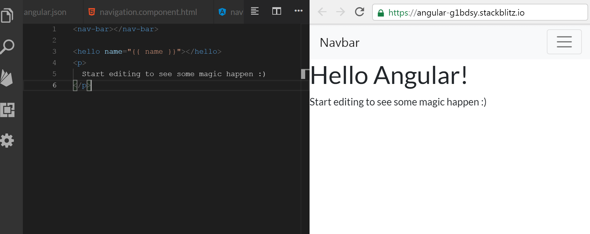
This is what our app looks like now:
The app, as it currently is, can be found in this Github commit.
Step 5: Making the toggle button work
Currently, the toggle button in our navigation doesn’t work. We’ll make it work using the CollapseModule from ngx-bootstrap and BrowserAnimationsModule from @angular.
First we’ll need to add our imports to AppModule, and list them in the imports array:
1
2
3
4
5
6
7
8
9
10
11
12
// ...code skipped for brevity...

import { BrowserAnimationsModule } from '@angular/platform-browser/animations';
import { CollapseModule } from 'ngx-bootstrap/collapse';

// ...code skipped for brevity...

  imports: [
    BrowserAnimationsModule,
    CollapseModule.forRoot(),
    ...
  ]
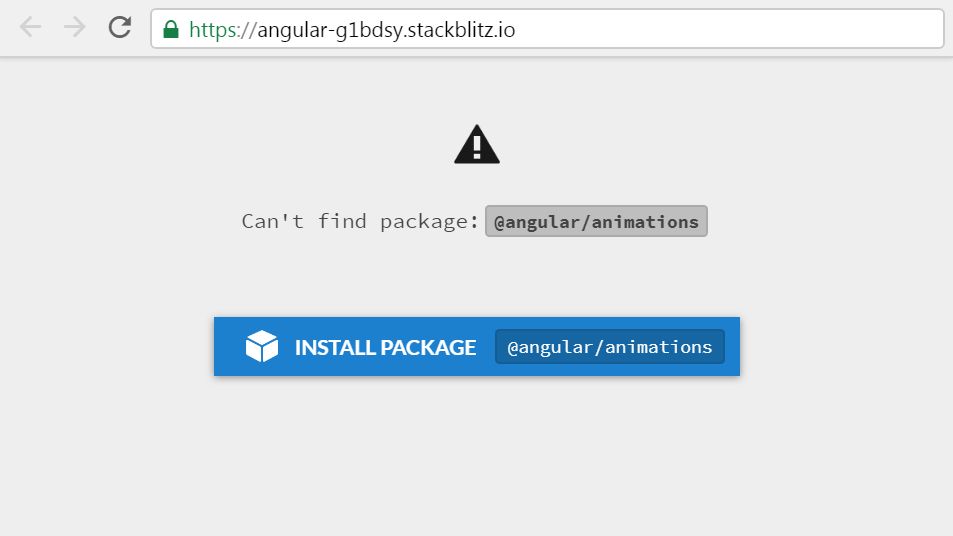
When we save our changes, Stackblitz will inform us that we need to add another package:
Back in the NavbarComponent class, we need to declare and set a new property, isCollapsed. We also need to define a toggleCollapsed() function:
1
2
3
4
5
6
7
8
export class NavbarComponent {
  isCollapsed = true;

  toggleCollapsed() {
    this.isCollapsed = !this.isCollapsed;
    console.log(this.isCollapsed);
  }
}
In navigation.component.html, we need to call the toggleCollapsed() method whenever a user clicks the toggle button:
1
2
3
4
5
6
7
8
9
  <button
    class="navbar-toggler"
    type="button"
    data-toggle="collapse"
    data-target="#navbarNav"
    aria-controls="navbarNav"
    aria-expanded="false"
    aria-label="Toggle navigation"
    (click)="toggleCollapsed()" >
We also need to bind the isCollapsed to a collapse property in the opening tag of the collapsed div:
<div class="collapse navbar-collapse" id="navbarNav" [collapse]="isCollapsed">
Our navigation toggle now works!
Here’s the Github commit for the code at this stage.
All that’s left to do now is to add an animation to our toggle.
Step 6: Animating our toggle
We’re facing an issue we already had in Part 1 of this tutorial. Our fix is easy enough: we just need to add an [isAnimated] property binding to our collapsible <div> element, inside the navigation.component.html file, like this:
<div class="collapse navbar-collapse" id="navbarNav" [collapse]="isCollapsed" [isAnimated]="true">
That’s it, we now have a fully working, animated togglable Bootstrap 4 navbar in our Angular 8 app.
If you’d like to, you can check this Github commit for the completed app code.

