HTML and CSS Basics, part 11: Building the first layout
Let's combine what we've learned so far and build an actual layout
By: Ajdin Imsirovic 19 September 2019
This series of posts is titled HTML and CSS Basics. If you’re just starting out with web development, it is crucial to read and understand this series of posts.
This is the eleventh post in this series of articles.
After covering many basic topics of CSS, now we can finally build an HTML5 and CSS3 layout, confident in the fact that we’ll be knowledgable enough to do so without any major hiccups.
Like before, we’ll rely on Codepen for our layout development.
We’ll build the layout in several steps:
- The mockup
- The HTML
- The CSS
First we’ll prepare a rough draft of what our website will look like. Then we’ll convert the actual structure into HTML, and finally we’ll turn it into a nice-looking website layout with the help of CSS.
The mockup
For a simple mockup you can simply sketch it out on a piece of paper, or use any software that has the ability to draw squares.
It’s as simple as that!
Here’s a mockup I drew in MS Paint, in about 5 minutes.
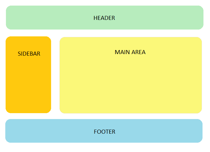
There are two important things to remember:
- if it’s a simple layout, it shouldn’t take more than 5 minutes to draw
- it’s not a work of art, just something to have as a guide
Assuming you’re just starting out with web development, you should spend as little time on mockups as humanely possible. But you should still do it, just to have an idea of what you’ll be building.
Our layout’s HTML code
Here’s the mockup translated into HTML code:
1
2
3
4
<header>This is the header.</header>
<aside>This is the sidebar</aside>
<main>This is the main content area.</main>
<footer>This is the footer</footer>
Pretty easy, right?
One of the reasons why this is so easy is because the Codepen web app actually hides some complexity from us.
The hidden complexity includes some additional, required HTML code.
Basically, this:
1
2
3
4
5
6
7
8
9
10
11
12
13
<!DOCTYPE html>
<html>
  <head>
    <!-- meta tags go here -->
  </head>

  <body>
    <header>This is the header.</header>
    <aside>This is the sidebar</aside>
    <main>This is the main content area.</main>
    <footer>This is the footer</footer>
  </body>
</html>
As we can see above, there is a “wrapping structure” of sorts, around our actual Codepen example code.
This wrapping structure is necessary for a well-structured HTML page. But Codepen is helpful in hiding this complexity.
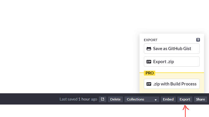
If you still want to see what the full page looks like, you can download it right from Codepen, and then open the local page in a code editor such as VS Code.
The download button in the Codepen layout can be found in the bottom-right corner of any Codepen example.
It’s the button titled “export”. Click on it, then click the “export zip” option:
Note also that we’re using semantic, HTML5 tags: <header>, <aside>, <main>, and <footer>.
Why are they called semantic?
Semantic, in a loose translation, means “meaningful”. In other words, the very type of the element we’re using, hints at its meaning.
This is much better than writing an HTML structure like this:
<div>This is the header.</div>
<div>This is the sidebar</div>
<div>This is the main content area.</div>
<div>This is the footer</div>
Although the above code is valid, it’s still much better to use semantic HTML 5 tags, like we did.
Our web page at this point doesn’t look like much. Let’s make it look the way it should with some CSS code.
Our layout’s CSS code
At this stage of our simple layout development, it would be beneficial to look at the completed example on Codepen.
1
2
3
4
5
6
7
8
9
10
11
12
13
14
15
16
17
18
19
20
21
22
23
24
25
26
27
28
29
30
31
32
33
34
35
36
37
38
39
40
41
42
body {
  margin: 0;
}
header {
  height: 70px;
  position: absolute;
  top: 0;
  left: 0;
  right: 0;
  background: yellowgreen;
  border: 1px solid gray;
}
aside {
  margin-top: 10px;
  position: absolute;
  top: 70px;
  width: 300px;
  height: calc(100% - 160px);
  background: yellow;
  border: 1px solid gray;
}
main {
  margin-top: 10px;
  position: absolute;
  right: 0;
  top: 70px;
  width: calc(100% - 310px);
  height: calc(100% - 160px);
  background: yellow;
  border: 1px solid gray;
}
footer {
  margin-top: 10px;
  position: absolute;
  left: 0;
  right: 0;
  bottom: 0;
  width: 100%;
  height: 70px;
  background: blue;
  border: 1px solid gray;
}
This is the output of the above code in the browser:
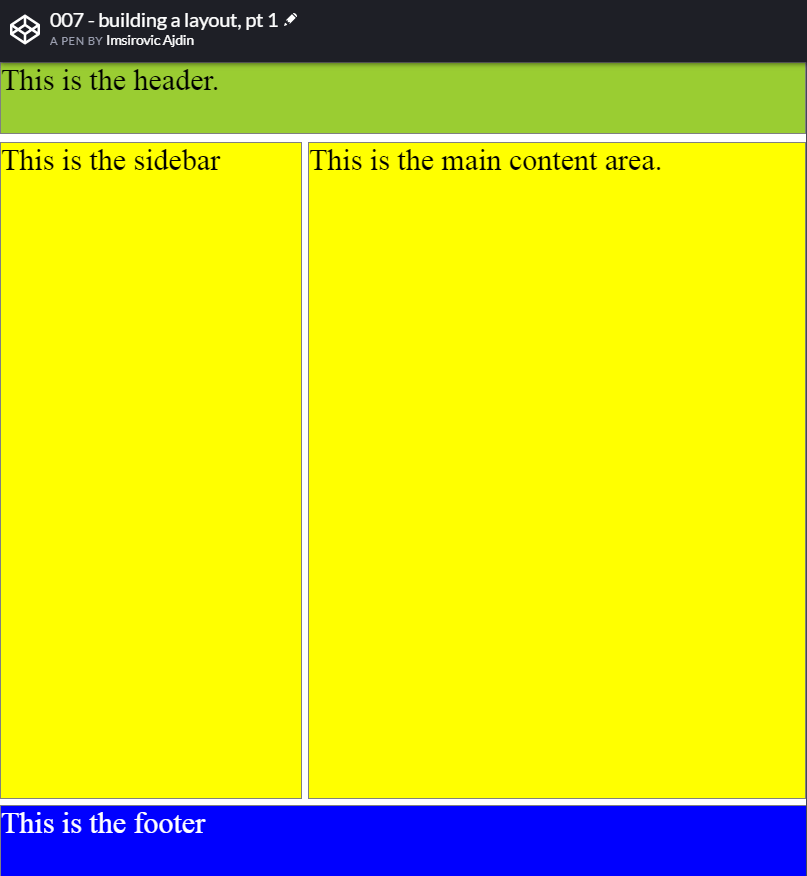
You can easily see the full page view of the above Codepen here.
Note that the above layout does not show the best practice in building website layouts!
It is just a simple example to see how we can start combining what we’ve learned to start building rudimentary layouts.
We’ve got quite a long way to go before we can build a nice-looking, standard-compliants layout in HTML and CSS.
Before we can do that however, we need to explain the new CSS property: value pairs we used in the above example.
Using the calc() function in CSS
The CSS calc() function is most commonly used to calculate 100% of width and/or height, minus some specific width/height.
That’s exactly how we’re using it in the above example’s CSS code, on line 18:
height: calc(100% - 160px);
We’re setting the height of our <aside> and <main> elements to cover the entire height of the screen, minus the height of the <header>, the <footer>, and their vertical margins.
We’re having a similar scenario on lines 26 and 27:
width: calc(100% - 310px);
height: calc(100% - 160px);
This time we’re calculating both the width and the height of the <main> area.
We’re not going to be improving our layout with any additional CSS styling in this post.
However, we do have another important thing to look at, closely related to the previous post in this series, namely, the most commonly used CSS selectors.
There’s one kind of a very commonly used CSS selector that we didn’t cover, because it’s not really a selector: the humble comma : ,.
We’re using the , when we want to group shared property: value pairs across multiple unrelated selectors.
In other words, when a CSS property: value pair is applied to more than one CSS selector, each selector that the property: value applies to is separated by commas.
For example, let’s say we have two CSS classes, .a, and .b:
.a {
  font-family: Arial, sans-serif;
  border: 1px solid red;
}
.b {
  font-family: Arial, sans-serif;
  border: 1px solid green;
}
There’s a popular general rule in coding, called DRY.
It’s an acronym that stands for: “Don’t repeat yourself.”.
It’s an easy way to remind developers that repetition in code is bad.
You might here a co-worker sometimes proclaim: “Your code is not DRY enough”.
This means you need to refactor your code, i.e re-write it while keeping the exact same functionality.
In CSS, we have the , character to easily keep our code dry. Here’s the above example, refactored using the ,:
.a, .b {
  font-family: Arial, sans-serif;
}
.a {
  border: 1px solid red;
}
.b {
  border: 1px solid green;
}
Note that the space character above, after the .a, IS NOT the descendant selector!
Let’s now build on the Codepen example, and group the CSS selectors where needed.
Grouping CSS selectors to optimize our CSS code
Here’s the updated code:
1
2
3
4
5
6
7
8
9
10
11
12
13
14
15
16
17
18
19
20
21
22
23
24
25
26
27
28
29
30
31
32
33
34
35
36
37
38
39
40
41
42
body {
  margin: 0;
}
header {
  height: 70px;
  top: 0;
  left: 0;
  right: 0;
  background: yellowgreen;
  border: 1px solid gray;
}
aside {
  margin-top: 10px;
  top: 70px;
  width: 300px;
  height: calc(100% - 160px);
  background: yellow;
  border: 1px solid gray;
}
main {
  margin-top: 10px;
  right: 0;
  top: 70px;
  width: calc(100% - 310px);
  height: calc(100% - 160px);
  background: yellow;
  border: 1px solid gray;
}
footer {
  margin-top: 10px;

  left: 0;
  right: 0;
  bottom: 0;
  width: 100%;
  height: 70px;
  background: blue;
  border: 1px solid gray;
}
header, aside, main, footer {
  position: absolute;
}
We’ve taken out the position: absolute and listed out all the selectors using it, like this:
header, aside, main, footer {
  position: absolute;
}
We’ve removed the position: absolute from each individual CSS element selector.
Next, let’s further improve it by extracting all the shared CSS property-value pairs:
body {
  margin: 0;
}
header {
  top: 0;
  background: yellowgreen;
}
aside {
  width: 300px;
  background: yellow;
}
main {
  right: 0;
  width: calc(100% - 310px);
  background: yellow;
}
footer {
  margin-top: 10px;
  bottom: 0;
  width: 100%;
  background: blue;
}
header, aside, main, footer {
  position: absolute;
  border: 1px solid gray;
}
header, footer {
  left: 0;
  right: 0;
  height: 70px;
}
aside, main {
  top: 70px;
  margin-top: 10px;
  height: calc(100% - 160px);
}
Separating selectors that share the same functionality is a common practice in CSS, and you’ll see it in many, many projects, because it’s a way to make the CSS code leaner, and ultimately makes the CSS files smaller in size - which makes them faster to download from a server to a browser. That’s why this practice is so popular.
Conclusion
In this article, we’ve covered a lot:
- How and why to use mockups,
- HTML 5 semantic tags,
- We’ve used our current knowledge of CSS to build a simple layout,
- We saw how to use the
calc()function in CSS - We also saw why and how to keep our CSS dry using the comma separator
In the next article we’ll fill in a big missing piece of the CSS puzzle we’ve buit in this series: responsive web layouts with media queries.
This will help us bring our first layout closer to the modern standards and the way that website layouts are built in the real world.
Use the below links to navigate through other tutorials in this guide.
< Back to part 10: CSS selectors and CSS targeting revisited
You are here: Part 11, Building the first layout
Continue to part 12: Responsive web layouts with media queries >

