HTML and CSS Basics, part 12: Responsive web layouts with media queries
Making our websites adjust to mobile phones
By: Ajdin Imsirovic 19 September 2019
This series of posts is titled HTML and CSS Basics. If you’re just starting out with web development, it is crucial to read and understand this series of posts.
This is the twelveth post in this series of articles.
The topic of this post is responsive web design.
In a well-known metaphor, we can imagine our content to be like water.
Bruce Lee famously said, “you pour water into a cup, it becomes a cup”.
Similarly, our content can be thought of as the water. And the device we view this content on, is like a cup.
So if our “cup” is a mobile device, our “water” (i.e content) will fit into this “cup”.
If our “cup” is a monitor on a desktop computer, the content will fit the available container.
A very popular way to achieve this is by using media queries.
Before we get started with media queries, let’s first consider some content, and how it should fit the available space.
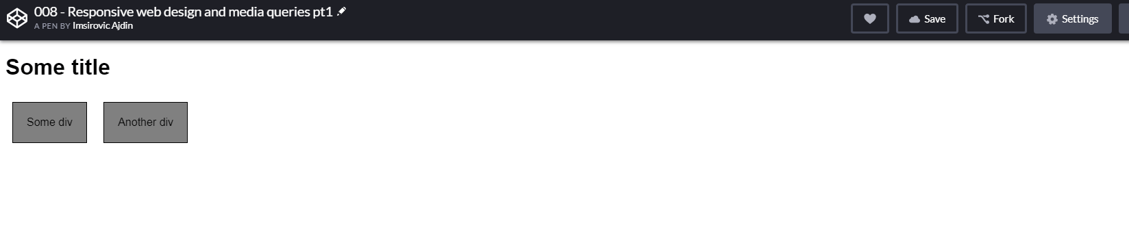
Here’s an example codepen of a non-responsive layout.
On a mobile device’s browser, this non-responsive layout will look like this:

On a small laptop’s browser, this non-responsive layout will look like this:
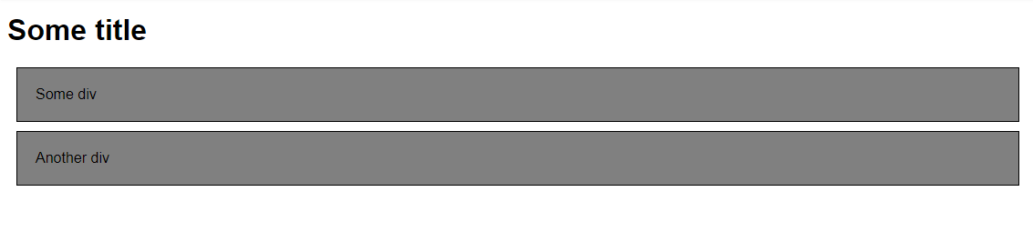
What can we conclude from the above screnshots?
We can conclude that our layout always looks the same, regardless of what device we’re inspecting it on.
Here’s the HTML for our example:
1
2
3
<h1>Some title</h1>
<div>Some div</div>
<div>Another div</div>
And here’s the CSS:
1
2
3
4
5
6
7
8
9
10
11
12
13
14
15
16
17
18
* { font-family: Arial }
div {
  background: gray;
  padding: 20px;
  border: 1px solid black;
  margin: 10px
}
/*
@media (max-width: 1200px) {
  div { background: tomato }
}
@media (min-width: 1201px) and (max-width: 1600px) {
  div { font-size: 24px; border: 10px solid tomato }
}
@media (min-width: 1600px) {
  div { display: inline-block }
}
*/
Notice that everything under line 8 in the above CSS code is commented out.
This is done on purpose, to hide the effect of the code that turns our web page example into a fully responsive page.
Let’s see how it works next.
How media queries work
Let’s begin by uncommenting the commented CSS code below line 8 in the above example.
Here’s the result in the browser.
On screens wider than 1600 pixels:
On screen between 1200 and 1600 pixels:
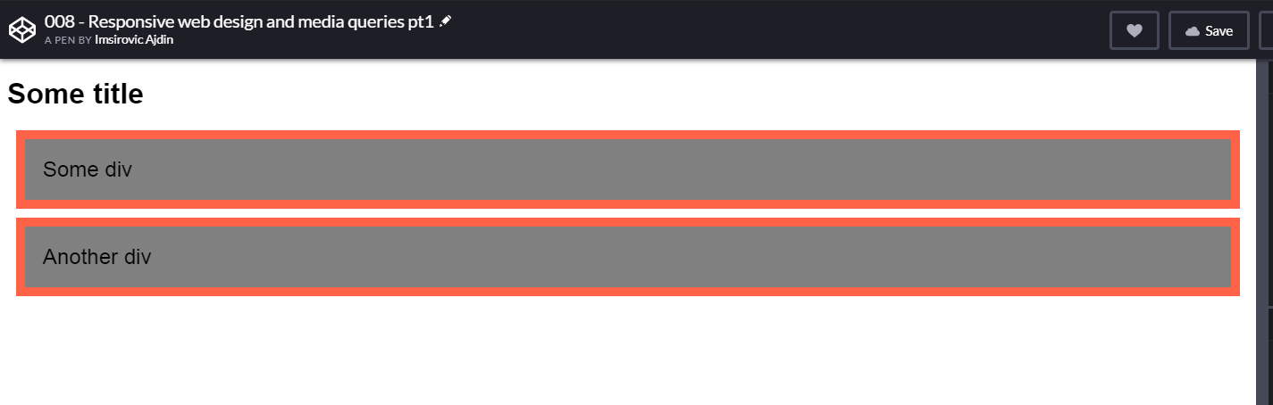
On screens under 1200 pixels wide:
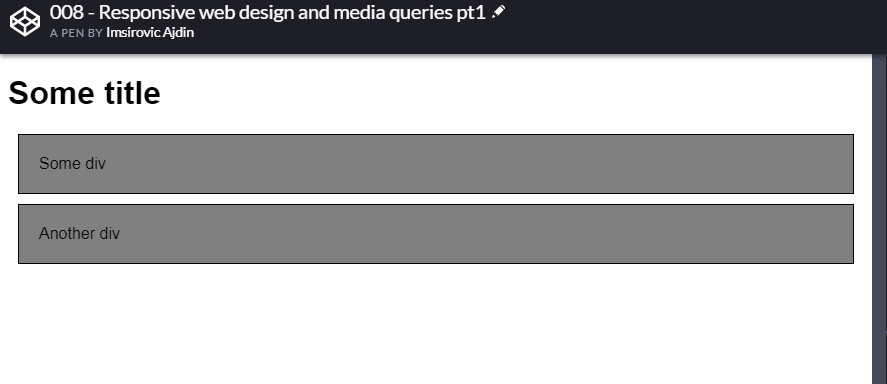
Great, we’re now adapting the contents of our web page to its container!
There’s no magic here: Everything is spelled out in the previously commented-out CSS code:
@media (max-width: 1200px) {
  div { background: tomato }
}
@media (min-width: 1201px) and (max-width: 1600px) {
  div { font-size: 24px; border: 10px solid tomato }
}
@media (min-width: 1600px) {
  div { display: inline-block }
}
Here’s how it works:
- we first specify the
@media, followed with a pair of round brackets. - inside the round brackets, we can specify either of these three values:
- (max-width: 1200px),
- (min-width: 1201px) and (max-width: 1600px)
- (min-width: 1600px)
- We then follow it up with a pair of curly brackets,
{, and} - Finally, we add the actual code for the specific media query inside the curly brackets, like this:
div { display: inline-block }
The pixel values inside the round brackets are commonly referred to as breakpoints.
You can specify any pixel values you feel like - the above values are just there because we’re following our example.
That’s the media queries for you in the nutshell.
In the next post in this series, we’ll convert our example layout from the previous post from a static layout into a fully responsive one.
Use the below links to navigate through other tutorials in this guide.
< Back to part 11: Building the first layout
You are here: Part 12, Responsive web layouts with media queries
Continue to part 13: Converting our first layout into a responsive one >

