HTML and CSS Basics, part 15: Column-based CSS layouts
Before CSS frameworks, there were column-based layouts
By: Ajdin Imsirovic 21 September 2019
This is the fifteenth post in this series of articles.
What are CSS frameworks? How did they come to be?
To understand where we are today in front-end web developement, we need to look at a bit of history.
So let’s look at what was going on in the world of CSS before CSS frameworks became the main show in town.
A very brief history of CSS layouts
Since this is a beginners’ series of articles, we won’t dive too deep into how and why CSS frameworks developed the way they have.
We will only mention the most important parts of this history, so that we can better understand how things work and why things are done the way they are in popular front-end CSS frameworks.
So let’s go way back to around 2005.
In 2005, table-based layouts were still a thing
In the early days of the web, builing HTML layouts was not at all easy.
CSS was not nearly as advanced as today, and there weren’t too many things that one could do with it.
For quite some time, using actual HTML tables was a way to build layouts! This was a very slow and painstaking way to build web pages.
It wasn’t easy to do, and it wasn’t easy to maintain.
Then, sometimes around 2005, as CSS matured, CSS-based design started to become more popular.
Debates of choosing between table-based layouts vs CSS layouts were a common occurence.
Here’s an interesting excerpt from a comment from the comment section of the above article:
The one thing I think makes it harder to grasp CSS are all these hacks neccesary today to make CSS sites look good in most browsers.
This was a comment made on May 12, 2004, and it goes right back to what we’ve already discussed in this article series, which is that in the early days of the web, building website layouts meant writing code with a lot of hacks and work-arounds.
Very soon, people started seeing the benefits in using CSS rather than table-based HTML layouts, and the CSS camp started getting ever larger.
This lead to the next step in the evolution of CSS layouts: CSS column grid systems.
The invention of the CSS column grid systems
During the fast-paced evolution of the web layouts, some smart people started using visual columns to make it easier to write tableless, CSS-powered HTML layouts.
This lead to various CSS column grid systems (note that this has nothing to do with the actual CSS grid, which came around years later).
One of the early CSS column grid systems is the 960.gs grid system. The nutshell of how it works can be found on their demo page, right here.
The idea of CSS column grid systems was revolutionary. People realized that most layouts can be separated into columns. For some time, there was some debate on the best number of columns to use, and slowly but surely, the accepted norm became 12 columns in a layout.
The reason for this was pure maths: 12 columns can be split in halves (6 and 6), thirds (4 columns repeated three times), quarters (3 columns repeated four times each), and so on. It was this simplicity and versatility that ultimately won.
Soon, all kinds of tools related to column grids started appearing. An example of a useful tool is the Design Grid Overlay Chrome extension.
Here’s the above Design Grid Overlay tool used in action, on this very website:
To get the same result as seen above, you need to use these basic settings and advanced settings in the Design Grid Overlay tool:

Now you can experiment with grid overlay of any site you choose. The important thing to note is that many, many sites will have their column grid fit the width of 1170 pixels, because that’s the default desktop breakpoint of the Bootstrap front-end framework.
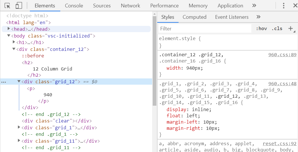
But how did the 960.gs column grid actually work? What’s the code behind the grid system?
To find the answer, you can simply reopen the 960.gs demo and inspect its HTML code, like this:
- press F12 to open devtools
- click on the “Elements” tab
- press CTRL SHIFT C to turn on the “Select an element in the page to inspect it” command
- hover the mouse over the section that has the number of “940” (which stands for the pixel-width of the widest column)
The result of doing the above steps will be this:
Let’s make this article a bit more practical, and build our own version of the 960.gs column grid system, using the techniques we’ve learned in this article series.
Building our own version of 960 column grid system
Before we start building our own column layout system, we need to understand what exactly is it we are trying to build.
Thus, let’s spell out the requirements:
- Our column grid should have 12 columns
- We need a defined “grouping” container for the column grid (which will span the full width of the parent HTML element)
- We should be able to nest column grid containers (so that a container can be placed inside another container’s 6-column CSS class, for example)
- Our column grid needs to be as versatile as possible; can we make it at least somewhat responsive
If you’ve looked at the source code of the 960.gs demo page, you’ve probably noticed that they’ve added some additional options, such as the possibility to “push” and “pull” columns left or right, so that instead of displaying the columns from the left-most edge of the screen, they handle special scenarios and allow us to place them at whatever position we’d like.
We’re not going to do this, since it adds additional problems to solve.
We’ll stick to the very basic functionality, just to understand how grids work.
Building our 12 columns
Let’s write the HTML for our example:
1
2
3
4
5
6
7
8
9
10
11
12
13
14
15
16
17
18
19
20
21
22
23
24
25
26
27
28
29
30
31
32
<div class="wrapper">
  <div class="col12">
    This div spans 12 columns.
  </div>
</div>

<div class="wrapper">
  <div class="col6">
    This div spans 6 columns.
  </div>
  <div class="col6">
    This div spans 6 columns.
  </div>
</div>

<div class="wrapper">
  <div class="col1">
    This div spans 1 column.
  </div>
  <div class="col2">
    This div spans 2 columns.
  </div>
  <div class="col3">
    This div spans 3 columns.
  </div>
  <div class="col4">
    This div spans 4 columns.
  </div>
  <div class="col2">
    There's only 2 columns here because that's all the space we have left.
  </div>
</div>
Let’s now add some CSS styles to our basic column grid:
1
2
3
4
5
6
7
8
9
10
11
12
13
14
15
16
17
18
19
20
21
22
23
24
25
26
27
28
29
30
31
32
33
34
.wrapper {
  background: silver;
  width: calc(100% - 20px);
  margin: 10px;
  min-height: 50px;
}
.col1  { width: calc(100% * 1/12 ) }
.col2  { width: calc(100% * 2/12)  }
.col3  { width: calc(100% * 3/12)  }
.col4  { width: calc(100% * 4/12)  }
.col5  { width: calc(100% * 5/12)  }
.col6  { width: calc(100% * 6/12)  }
.col7  { width: calc(100% * 7/12)  }
.col8  { width: calc(100% * 8/12)  }
.col9  { width: calc(100% * 9/12)  }
.col10 { width: calc(100% * 10/12) }
.col11 { width: calc(100% * 11/12) }
.col12 { width: calc(100% * 12/12) }

.col1,
.col2,
.col3,
.col4,
.col5,
.col6,
.col7,
.col8,
.col9,
.col10,
.col11,
.col12 {
  background: lightsalmon;
  min-height: 50px;
}
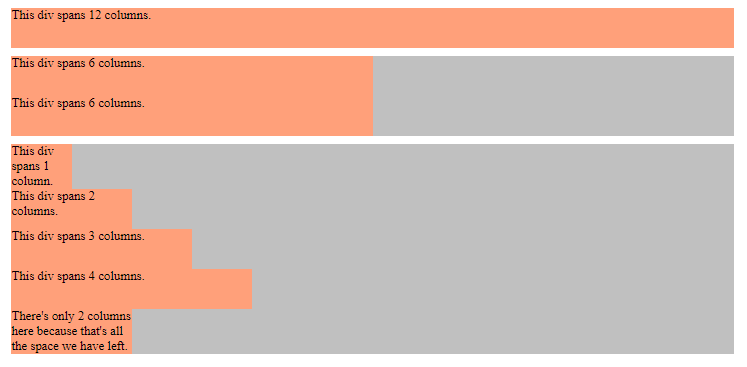
Let’s now see the result of this grid in this article’s first codelab here.
This is the result so far:
Making our 12 columns line up next to each other
Obviously, we need to make our 12 columns line up next to each other. How can we do that?
One viable option, if we’re not using flexbox and modern CSS grid, is to use floats.
This technique is not the best practice anymore, but it’s still widely used, so we’ll see how it’s done.
First, let’s add this CSS to the grouped .col* CSS selector’s code:
.col1,
.col2,
.col3,
.col4,
.col5,
.col6,
.col7,
.col8,
.col9,
.col10,
.col11,
.col12 {
    background: lightsalmon;
    min-height: 50px;
    display: block;
    margin: 10px 1%;
    outline: 1px solid black;
    float: left;
}
Note that besides floating our columns, we have also added some additional CSS code to make our columns look even nicer.
We are adding the margin: 10px 1% on each col* class. That means each of the affected elements we will have the margin-top and margin-bottom set to 10px each, while the margin-left and margin-right will be set to 1% of the width of the parent container.
To make our col* styled elements more obvious, we’re giving it an outline property. Its value is 1px solid black. It behaves very similar to the border property, except that it is not affecting the calculations on the element’s width. In other words, it’s much better to use the outline property than the border property in this case, because the border property would affect our column width calculations.
Next, let’s update the wrapper class and the actual column widths:
.wrapper {
    background: silver;
    width: calc(100% - 20px);
    margin: 10px;
    min-height: 50px;
    overflow: auto;
    clear: both;
}
/* 1/12 = 0.0833 */
.col1 { width: calc(8.33% - 2%) }
.col2 { width: calc(16.66% - 2%) }
.col3 { width: calc(24.99% - 2%) }
.col4 { width: calc(33.32% - 2%) }
.col5 { width: calc(41.65% - 2%) }
.col6 { width: calc(49.98% - 2%) }
.col7 { width: calc(58.31% - 2%) }
.col8 { width: calc(66.64% - 2%) }
.col9 { width: calc(74.97% - 2%) }
.col10 { width: calc(83.33% - 2%) }
.col11 { width: calc(91.63% - 2%) }
.col12 { width: calc(100% - 2%) }
Now that we’re floating our columns, we needed to add the clear on the wrapper class. We’re also making our wrapper class aware of its floated child elements with overflow: auto.
As for the columns, we’ve updated how they’re calculated:
- first we found the result of dividing 1 with 12, which is 0.833
- then we multiplied it by 100%, and then multiplied it again with the number of colums, which gave us the following percentages: 8.33%, 16.66%, 24.99%, 33.32%, etc.
- Finally, we’re subtracting 2% of the width, using the
calc()CSS function: 1% for themargin-rightand 1% for themargin-leftthat we’ve set on eachcol*class.
Here’s the resulting screenshot:
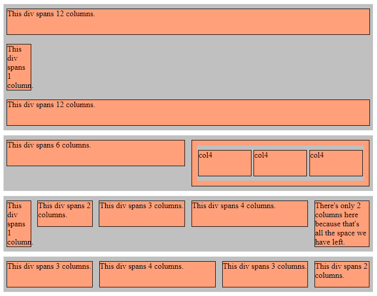
If you’d like to see the live web page, you can find it in this codelab.
Obviously, we’ve extended our HTML a bit, to test out different combinations of columns:
<body class="container">
    <div class="wrapper">
        <div class="col12">
            This div spans 12 columns.
        </div>
        <div class="col1">
            This div spans 1 column.
        </div>
        <div class="col12">
            This div spans 12 columns.
        </div>
    </div>

    <div class="wrapper">
        <div class="col6">
            This div spans 6 columns.
        </div>
        <div class="col6">
            <div class="wrapper">
                <div class="col4">col4</div>
                <div class="col4">col4</div>
                <div class="col4">col4</div>
            </div>
        </div>
    </div>

    <div class="wrapper">
        <div class="col1">
            This div spans 1 column.
        </div>
        <div class="col2">
            This div spans 2 columns.
        </div>
        <div class="col3">
            This div spans 3 columns.
        </div>
        <div class="col4">
            This div spans 4 columns.
        </div>
        <div class="col2">
            There's only 2 columns here because that's all the space we have left.
        </div>
    </div>
    <div class="wrapper">
        <div class="col3">
            This div spans 3 columns.
        </div>
        <div class="col4">
            This div spans 4 columns.
        </div>
        <div class="col3">
            This div spans 3 columns.
        </div>
        <div class="col2">
            This div spans 2 columns.
        </div>
    </div>
</body>
As you can see, we’ve even built a nested group of columns.
With all of this, our column grid now works pretty good.
We still need to make it responsive, so we’ll do that next.
Making our CSS column grid responsive
We’ve already seen how to use media queries to make our web pages responsive.
We’ll use the same approach here as well.
But why should we do it? Why should we add our columns to media queries, and what will be the result of doing so?
To answer this question, let’s look at our second codelabs example - the one we’ve already seen, only this time using the responsive preview in Chrome.
Here are the steps to follow:
- Open developer tools by pressing F12
- Click the “Toggle device toolbar” icon (or, just press the CTRL SHIFT M keyboard combination)
- Set your responsive preview to some phone-like width, such as 400px
Here’s how this looks in the browser:
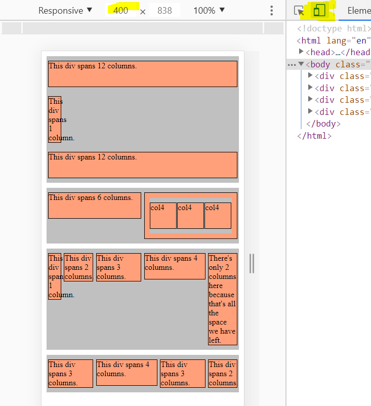
On the above mobile view screenshot, we can see a single column towards the top of the page, the one that reads “This div spans 1 column”.
We can see that most text spills our of the column, simply because the column itself is too narrow.
Now we see what the issue is: on desktops, this 1 column works perfectly fine, but on mobile, there’s simply not a lot of width to begin with, and dividing that width into 12 sections, and then using only 1 slice of those 12 sections - simply won’t work.
Fortunately, there is a tried and tested solution to this problem.
It’s one of the more common patterns on the web: at wide resolutions, we’ll display our div with a single column, but on mobiles, we’ll turn it into a wider number of columns.
In other words, on desktops, our div will span one twelves of the available screen, but on mobile, it will span, for example, four twelves, or even six twelves.
To do this, we simply add two classes on the same element: one class will work at lower resolutions, and another will work at higher resolutions.
Adding media queries for column classes
Before we explain the code in this example, let’s first see the finished preview.
Here’s the live codelab for this, third step in building our CSS column grid.
Again, we’re looking at our layout at 400 pixels, but this time we’ve added media queries for columns:

Here’s the same layout at a different breakpoint - at about 850 pixels wide:
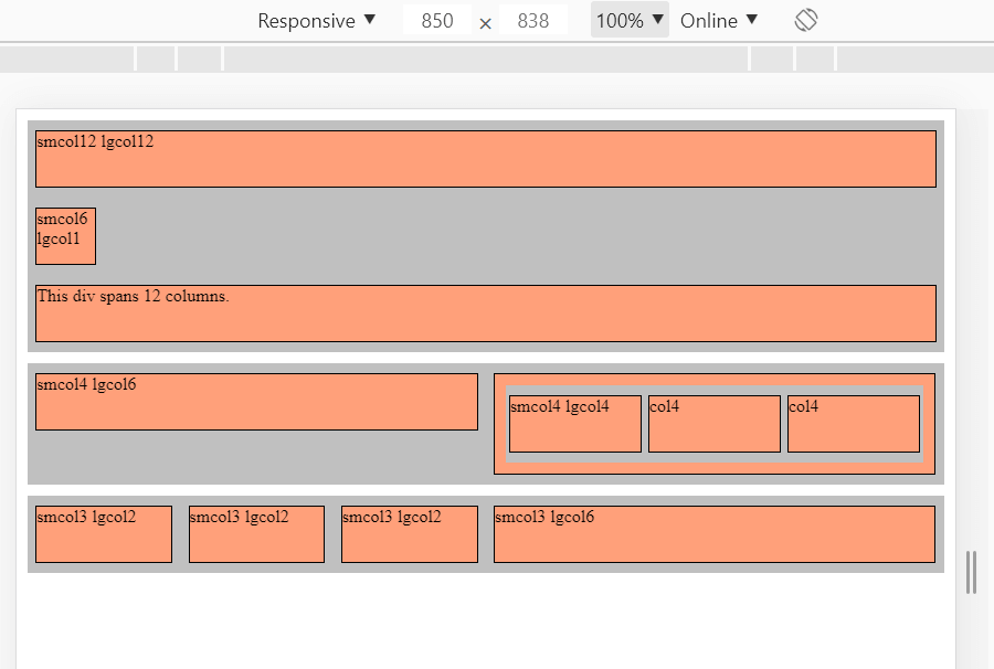
To make it easier to distinguish between the 2 media queries, we’ve added a different HTML color background to different resolutions:
- HTML yellowgreen background on screens under 800px wide
- HTML lightsalmon backgorund on screens over 800px wide
Pay attention to the second div in the above layout - the div that reads “smcol6 lgcol1”.
In the mobile view, we can see the div takes up half the available width. Obviously, the smcol6 class is applied here.
On desktops, the div takes up only 1/12 of the available width, since the lgcol1 class is applied here.
Before we conclude this article, let’s look at the above example’s HTML and CSS code.
Here’s the HTML:
1
2
3
4
5
6
7
8
9
10
11
12
13
14
15
16
17
18
19
20
21
22
23
24
25
26
27
28
29
30
31
32
33
34
35
36
37
38
39
40
41
<body class="container">
    <div class="wrapper">
        <div class="smcol12 lgcol12">
            smcol12 lgcol12
        </div>
        <div class="smcol6 lgcol1">
            smcol6 lgcol1
        </div>
        <div class="smcol12 lgcol12">
            This div spans 12 columns.
        </div>
    </div>

    <div class="wrapper">
        <div class="smcol4 lgcol6">
            smcol4 lgcol6
        </div>
        <div class="smcol8 lgcol6">
            <div class="wrapper">
                <div class="smcol4 lgcol4">smcol4 lgcol4</div>
                <div class="smcol4 lgcol4">col4</div>
                <div class="smcol4 lgcol4">col4</div>
            </div>
        </div>
    </div>

    <div class="wrapper">
        <div class="smcol3 lgcol2">
            smcol3 lgcol2
        </div>
        <div class="smcol3 lgcol2">
            smcol3 lgcol2
        </div>
        <div class="smcol3 lgcol2">
            smcol3 lgcol2
        </div>
        <div class="smcol3 lgcol6">
            smcol3 lgcol6
        </div>
    </div>
</body>
…and here’s the complete CSS:
1
2
3
4
5
6
7
8
9
10
11
12
13
14
15
16
17
18
19
20
21
22
23
24
25
26
27
28
29
30
31
32
33
34
35
36
37
38
39
40
41
42
43
44
45
46
47
48
49
50
51
52
53
54
55
56
57
58
59
60
61
62
63
64
65
66
67
68
69
70
71
72
73
74
75
76
77
78
79
80
81
82
83
.container {
    max-width: 1200px;
    width: 100%;
    margin: 0 auto;
}
.wrapper {
    background: silver;
    width: calc(100% - 20px);
    margin: 10px;
    min-height: 50px;
    overflow: auto;
    clear: both;
}
/* 1/12 = 0.0833 */
@media (max-width: 799px) {
    .smcol1 { width: calc(8.33% - 2%) }
    .smcol2 { width: calc(16.66% - 2%) }
    .smcol3 { width: calc(24.99% - 2%) }
    .smcol4 { width: calc(33.32% - 2%) }
    .smcol5 { width: calc(41.65% - 2%) }
    .smcol6 { width: calc(49.98% - 2%) }
    .smcol7 { width: calc(58.31% - 2%) }
    .smcol8 { width: calc(66.64% - 2%) }
    .smcol9 { width: calc(74.97% - 2%) }
    .smcol10 { width: calc(83.33% - 2%) }
    .smcol11 { width: calc(91.63% - 2%) }
    .smcol12 { width: calc(100% - 2%) }

    .smcol1,
    .smcol2,
    .smcol3,
    .smcol4,
    .smcol5,
    .smcol6,
    .smcol7,
    .smcol8,
    .smcol9,
    .smcol10,
    .smcol11,
    .smcol12 {
        background: yellowgreen;
        min-height: 50px;
        display: block;
        margin: 10px 1%;
        outline: 1px solid black;
        float: left;
    }
}

@media (min-width: 800px) {
    .lgcol1 { width: calc(8.33% - 2%) }
    .lgcol2 { width: calc(16.66% - 2%) }
    .lgcol3 { width: calc(24.99% - 2%) }
    .lgcol4 { width: calc(33.32% - 2%) }
    .lgcol5 { width: calc(41.65% - 2%) }
    .lgcol6 { width: calc(49.98% - 2%) }
    .lgcol7 { width: calc(58.31% - 2%) }
    .lgcol8 { width: calc(66.64% - 2%) }
    .lgcol9 { width: calc(74.97% - 2%) }
    .lgcol10 { width: calc(83.33% - 2%) }
    .lgcol11 { width: calc(91.63% - 2%) }
    .lgcol12 { width: calc(100% - 2%) }

    .lgcol1,
    .lgcol2,
    .lgcol3,
    .lgcol4,
    .lgcol5,
    .lgcol6,
    .lgcol7,
    .lgcol8,
    .lgcol9,
    .lgcol10,
    .lgcol11,
    .lgcol12 {
        background: lightsalmon;
        min-height: 50px;
        display: block;
        margin: 10px 1%;
        outline: 1px solid black;
        float: left;
    }
}
Conclusion
Many modern CSS frameworks (such as Bootstrap), have similar implementations to the one we’ve just built.
The difference between what we’ve done and what these CSS frameworks do is just in the amount of detail.
For example, the Bootstrap framework comes with 5 breakpoints preset for various screen sizes:
- under 576 pixels for extra-small screens,
- between 577 and 768 pixels for small screens,
- between 769 and 990 pixels for medium-sized screens,
- from 991 to 1170 pixels for large screens,
- over 1171 pixels for extra-large screens
Obviously, all these frameworks come with many other things besides the column grid we’ve built in this tutorial.
Next, we’ll look at what these modern CSS frameworks are all about.
Use the below links to navigate through other tutorials in this guide.
< Back to part 14: CSS resets and Emmet
You are here: Part 15, Column-based CSS layouts

