HTML and CSS Basics, part 7: CSS positioning
In CSS, positioning is relative, not just some absolutely fixed, static thing!
By: Ajdin Imsirovic 15 September 2019
This series of posts is titled HTML and CSS Basics. If you’re just starting out with web development, it is crucial to read and understand this series of posts.
This is the seventh post in this series of articles.
CSS has a position property.
Its values can be set to static, relative, absolute, fixed, and sticky.
Video tutorial on CSS positioning
I’ve recorded this short video on CSS positioning to accompany this article.
If you like 👍 the video, please subscribe 🥰 to our Youtube channel.
What is CSS positioning?
CSS positioning is a way for us to “nudge” an HTML element, such as a div, in any direction we want, be it top, right, bottom, or left.
Note that this “nudging” doesn’t actually remove the element from normal document flow, it just displaces it.
Here’s an example of three divs.
Each div’s display property is set to inline-block, so that they are all appearing next to one another, rather than on top of one another:
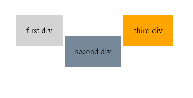
Notice how the middle div is slightly nudged away from the top edge. That’s because we’re setting its position to relative, using this CSS selector: div.bg2. The div.bg2 selector is like saying in plain English: “hey Browser, find the HTML <div> element that has a class attribute set to bg2, and apply the position of relative to it.
Here’s the HTML code:
1
2
3
<div class="bg1 pad1 dib">first div</div>
<div class="bg2 pad1 dib">second div</div>
<div class="bg3 pad1 dib">third div</div>
And here’s the CSS:
1
2
3
4
5
6
7
8
9
10
11
12
13
14
.bg1 { background: lightgray }
.bg2 { background: lightslategray }
.bg3 { background: orange }
.pad1 { padding: 20px }
.pad2 { padding: 40px }
.m1 { margin: 20px }
.m2 { margin: 40px }
.dib { display: inline-block }

div {
  position: static;
  top: 40px
}
div.bg2 { position: relative; }
Notice that the div CSS selector on line 10 of the above CSS code sets all the divs to position: static and top: 40px.
The CSS position property is by default set to static - and thus we don’t have to specify it.
When position is static, we cannot “nudge” elements out of the flow with the top property.
When the value of the position property is set to relative, the top property suddenly starts working.
How does a browser decide if it’s going to use the position static that is set in the div element CSS selector, or if it’s going to use the position: relative that’s set in the div.bg2 CSS selector?
It resolves this conundrum with something that’s called CSS specificity. Basically, CSS specificity works like this: A more specific CSS selector will take precedence over a more general CSS selector.
Thus, in our example above, we have two CSS selectors with competing position properties.
The first CSS selector, div, sets the position property to the value of static.
The second competing CSS selector, div.bg2, sets the position property to the value of relative.
The second CSS selector wins, because it is more specific. It reads something like: “Hey browser, target the div that has the class of bg2.” Obviously, this selector is more specific then the selector that just reads: “Hey browser, target all the div elements.
We’ll go back to CSS specificity in more detail later.
Relative positioning with top, right, bottom and left values
Like we mentioned above, position: relative is like a switch that “turns on” the top, right, bottom, and left properties.
When top, right, bottom, and left properties and used on an element that has the position property set to relative, this is what happens:
- the element gets moved from its normal position in the document flow by the exact number of pixels we specified in the
top,right,bottom, orleftproperty. - The
top,right,bottom, orleftproperty can have both negative and positive values. For example: -100px or 100px.
As a side note, an easy way to “turn off” a CSS class is to just add another character to it. The end of a CSS class name is a great place for that. For example, you can get into the habit of adding a capital “X” to the end of every CSS class that you want to “turn off”. That way, just by looking at your HTML, you can easily distinguish between classes that are “turned on” and those that are “turned off”.
Note that this practice of adding the “X” letter to the end of a CSS class is just a best practice learned from using HTML and CSS for years. It’s not part of any specification - it’s just a handy way to improve your workflow. You don’t have to do it yourself if it doesn’t work for you.
Practicing relative positioning
Let’s practice relative positioning with an example.
This is the example as it looks in the browser:
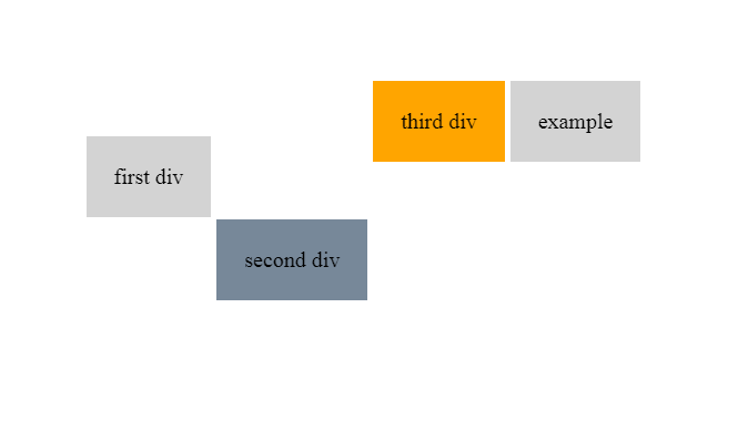
Here’s the example’s HTML:
1
2
3
4
5
6
7
8
<div class="bg1 pad1 dib top">first div</div>
<div class="bg2 pad1 dib bottom">second div</div>
<div class="bg3 pad1 dib right0">third div</div>

<div class="bg1 pad1 dib
            right0X right-50X right-100X right200X right350X">
  example
</div>
And here’s the CSS:
1
2
3
4
5
6
7
8
9
10
11
12
13
14
15
16
17
18
19
20
.bg1 { background: lightgray }
.bg2 { background: lightslategray }
.bg3 { background: orange }
.pad1 { padding: 20px }
.pad2 { padding: 40px }
.m1 { margin: 20px }
.m2 { margin: 40px }
.dib { display: inline-block }

div { position: relative }

.top { top: 40px }
.right0 { right: 0px }
.bottom { bottom: -100px }
.left { left: 500px}

.right-50 { right: -50px }
.right-100 { right: -100px }
.right200 { right: 200px }
.right350 { right: 350px }
As we can see in our example, we’re moving the elements on the page in several ways, using both the positive and negative values for top, right, bottom, and left properties. There are also some classes that we “turned off” with a capital “X”.
Feel free to play around with the above example to get a feel for how the example behaves with classes turned on or off. Play around with positioning values, add both negative and positive numbers. That way you’ll get an intuitive feeling for how these properties affect the rendering of your HTML.
That’s it for this article.
Use the below links to navigate through other tutorials in this guide.
< Back to part 6: The box model
You are here: Part 7, CSS Positioning
Continue to part 8: Relative, absolute, and fixed positioning >

