Working with ngx-bootstrap's rating, sortable, timepicker, and tooltip components in Angular 8
We're looking at another group of ngx-bootstrap components in Angular 8
By: Ajdin Imsirovic 01 September 2019
In this article, we’ll be working with yet another group of components in ngx-bootstrap library:
 Photo by Lukas Blazek, @goumbik on Unsplash
This is the sixth post in our series of articles on building Angular 8 layouts with ngx-bootstrap.
If you are a complete beginner, it might be better to follow the series from the very first article.
Here is the listing for the entire series:
- How to prototype Bootstrap 4 layouts with Angular 8, part 1
- How to prototype Bootstrap 4 layouts with Angular 8, part 2
- Working with ngx-bootstrap tabs in Angular 8
- Working with ngx-bootstrap alerts in Angular 8
- Working with ngx-bootstrap buttons, carousel, datepicker, and dropdowns in Angular 8
- Working with ngx-bootstrap modals, pagination, popover, and progress bars in Angular 8
- Working with ngx-bootstrap’s rating, soratble, timepicker, and tooltip components in Angular 8 (you are here!)
- Working with ngx-bootstrap’s typeahead component
If you’re completely new to ngx-bootstrap layouts, make sure to check out at least the first two posts in the series.
To see what we’ll build, have a look at the completed app in Stackblitz.
1. Adding all the components’ folders and files
Similar to what we did in the previous article in the series, we’ll begin by adding all the folders and files we’ll need for our components. Inside the app folder, let’s add the following structure of new folders and files:
app/
├── rating/
│   ├── rating.component.html
│   └── rating.component.ts
├── sortable/
│   ├── sortable.component.html
│   └── sortable.component.ts
├── timepicker/
│   ├── timepicker.component.html
│   └── timepicker.component.ts
├── tooltip/
│   ├── tooltip.component.html
│   └── tooltip.component.ts
├── ...
With our 4 new folders and 8 new files added, we can follow the recipe for adding any component to an Angular 8 app.
The recipe is simplified into only a few steps, and it’s available in this section of the previous post in this series.
1. Adding the rating component
Following the recipe, we’ve already added the rating folder and its class and template files (i.e the rating.component.ts and rating.component.html files).
Now’s the time to add some code to each of these files.
We’ll be using the select on enter example, where we’re triggering the rating change preview on mouse hover.
Now it’s just a matter of copying the example code, so let’s begin with the rating.component.html file:
1
2
3
4
5
6
<rating [(ngModel)]="rate" [max]="max" [readonly]="isReadonly"
        (keyup)="confirmSelection($event)"></rating>
<div class="card">
  <pre class="card-block card-header" style="margin:15px 0;">Rating: <b>{{ rate</b>;  Readonly is: <i>{{isReadonly}}</i>;</pre>
</div>
<button class="btn btn-primary" (click)="resetStars()">Reset rating and status</button>
Now let’s copy paste the code for rating.component.ts:
1
2
3
4
5
6
7
8
9
10
11
12
13
14
15
16
17
18
19
20
21
22
import { Component } from '@angular/core';

@Component({
  selector: 'demo-select-on-enter',
  templateUrl: './rating.component.html'
})
export class DemoRatingSelectOnEnterComponent {
  max = 10;
  rate = 7;
  isReadonly = false;

  confirmSelection(event: KeyboardEvent) {
    if (event.keyCode === 13 || event.key === 'Enter') {
      this.isReadonly = true;
    }
  }

  resetStars() {
    this.rate = 0;
    this.isReadonly = false;
  }
}
Following our recipe further, step 3 reads that we need to add a “Usage modal”, so let’s scroll back to top of the rating page on ngx-bootstrap docs, and copy the import for RatingModule:
import { RatingModule } from 'ngx-bootstrap/rating';
We’ll need to paste it into our app.module.ts, and list it in the imports array, as follows:
// ... code skipped for brevity ...
import { RatingModule } from 'ngx-bootstrap/rating';
// ... code skipped for brevity ...
imports: [
  BrowserModule,
  FormsModule,
  RatingModule.forRoot()
],
If you don’t already have ngx-bootstrap in the list of dependencies on your Angular 8 Stackblitz project, you’ll get prompted to install the ngx-bootstrap package. If that’s the case, click the “install package” button. We also need to add Bootstrap 4 styles to our app. If you’re unsure of how to do it, you can refer to this post.
With this, we’ve set up our component to be displayed in our app.component.html. To add it, we’ll simply refer to it’s selector value, and use it as a custom HTML tag inside app.component.html, as follows:
<demo-select-on-enter></demo-select-on-enter>
Upon save, we’ll get an error:
Template parse errors:
'demo-select-on-enter' is not a known element:
1. If 'demo-select-on-enter' is an Angular component, then verify that it is part of this module.
To resolve the error, we’ll add the demo-select-on-enter element to AppModule’s declarations array, like this:
DemoRatingSelectOnEnterComponent
Of course, we also need to import it into the app.module.ts file, so let’s add the import like this:
import { DemoRatingSelectOnEnterComponent } from './rating/rating.component';
Now we can save our changes, and our new component will appear in our app:
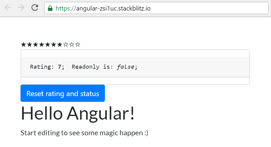
To see the updates made to the app at this point, feel free to check out the the Github commit titled: Adding a rating component.
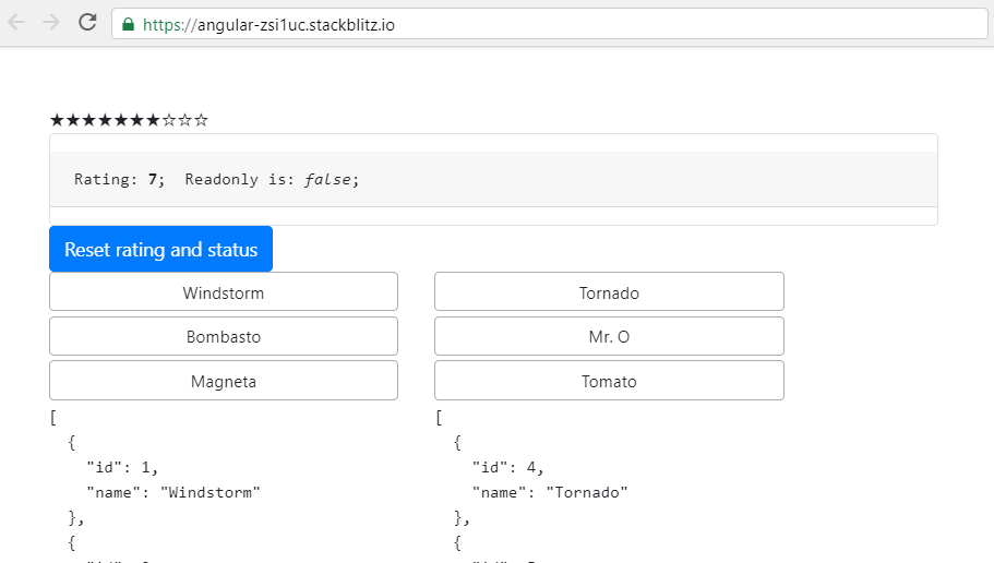
2. Adding the sortable component
Let’s speed things up a bit and simply list out our recipe’s steps:
- We’ve already prepared for our sortable component, by adding the respective folders and files
- We’ll copy the HTML and Typescript into these files. The example we’re using is titled “Complex data model” in the official docs.
- We’ll refer to the Usage section, import the respective module, and add it to AppModule’s list of imports.
- We’ll use the custom
<complex-datamodel-demo>HTML tag in ourapp.component.htmltemplate, and to make the template work, we’ll have to import its respective class. In this case, it’s theComplexDatamodelDemoComponentclass. Of course, we also need to add it to thedeclarationsarray inside theapp.module.tsfile.
We have a working sortable component! Feel free to check out the Github link.
However, although the component is working, the sortable elements in the app could still use some styling. Here’s the commit with the styling updates.
3. Adding the timepicker component
Obviously, the timepicker component has a lot in common with the datepicker component. Let’s walk through the recipe and the corresponding commits:
- We’ve added the folder and the
*.tsand*.htmlfiles at the beginning of this article. - We’re copying the files from the official docs’ example titled form.
- We’re adding the usage module, and listing it in
imports. - We’re importing the new component, and listing it in
declarations. - We’re using the custom HTML element from the new component’s
selectorentry where needed - in this case, inside theapp.component.htmlfile.
Even if you did everything right, you’ll be greeted with the following error:
Template parse errors:
Can't bind to 'formGroup' since it isn't a known property of 'form'. ("<ng-container *ngIf="form">
What Angular’s saying is that it doesn’t know what a formGroup is.
How do we fix this error? Let’s try to fix it by visiting official Angular docs at angular.io, and typing formGroup into the search. Several results will appear, but we’re interested only in the one under the Reactive forms link, more specifically, under the Reactive Forms Getting started link.
So, obviously, for Angular to be able to bind to formGroup, we need to make it aware of it, by importing the ReactiveFormsModule, and listing it in the imports array, like this:
// ...code skipped for brevity...
import { ReactiveFormsModule } from '@angular/forms';
// ...code skipped for brevity...
  imports: [
    BrowserModule,
    FormsModule, ReactiveFormsModule,
    RatingModule.forRoot(),
    SortableModule.forRoot(),
    TimepickerModule.forRoot()
  ],
Now the timepicker component appears, as we can see in the image below:
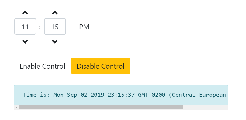
Here’s our newest update’s commit.
4. Adding the tooltip ngx-bootstrap component
Let’s go through the recipe again:
- We’ve already added the folder and the
*.tsand*.htmlfiles - We’re copying the files from the official docs’ example titled form.
- We’re adding the usage module, and listing it in
imports. - We’re importing the new component’s class name, and listing it in
declarations. - We’re using the custom HTML element from the new component’s
selectorentry where needed - in this case, inside theapp.component.htmlfile.
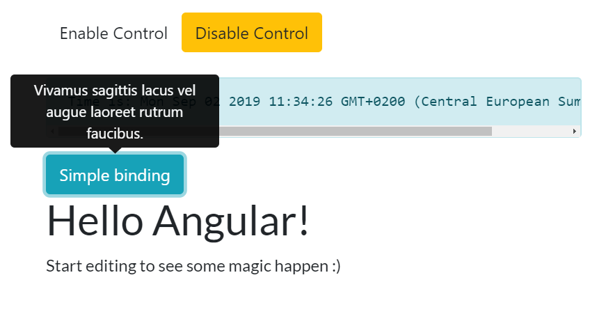
Here’s the Github code for our tooltip example.
This brings us to the end of the seventh article in this ngx-bootstrap article series. In the next article, we’ll look at the typeahead component.

