Conditionally showing a text area if a checkbox is checked in Angular 8
A primer on dealing with a practical checkbox checked task in Angular 8
By: Ajdin Imsirovic 04 September 2019
In this post we’ll see how to conditionally show a textarea only if a checkbox is checked. If it’s not checked, the text typed into the checkbox should be reset to placeholder value.
Can’t wait to see the completed example? Check it out on Stackblitz.
The Github repo for this project is available here, and the first, initial commit is the starter Angular 8 app on Stackblitz.
Setting up our project
First, we’ll add the Bootstrap 4 styles from the CDN.
We’ll also immediately use the Bootstrap 4 styles. It’s just a utility CSS class we’re using, to add padding to a new, wrapping div inside app.component.html:
1
2
3
4
5
6
<div class="p-5">
  <hello name="{{ name }}"></hello>
  <p>
    Start editing to see some magic happen :)
  </p>
</div>
Once that’s done, we’ll add our custom component’s folder and files. Here’s the new component’s file structure:
app
 ├── table/
 │   ├── table.component.html
 │   └── table.component.ts
 ├── ...
Let’s temporarily add some minimal code to these files, just to hook everything up.
We’ll start with table.component.html:
<div>table works!</div>
Next, inside table.component.ts, we’ll add the following code:
1
2
3
4
5
6
7
import { Component } from '@angular/core';

@Component({
  selector: 'the-table',
  templateUrl: './table.component.html'
})
export class TableComponent {}
Above, we’re specifying our custom HTML element’s selector as the-table, so let’s add this new HTML element, <the-table>, to our app.component.html:
1
2
3
4
5
6
7
<div class="p-5">
  <hello name="{{ name }}"></hello>
  <p>
    Start editing to see some magic happen :)
  </p>
  <the-table></the-table>
</div>
Of course, this custom HTML element is not a part of the HTML specification. We need to let a module know about this, so let’s update the app.module.ts with the following code:
// ...code skipped for brevity...
import { TableComponent } from './table/table.component';
// ...code skipped for brevity...
declarations: [ AppComponent, HelloComponent, TableComponent ],
We’ve now set everything up and we’re ready to customize the table component with the actual example code.
The commit at this stage of our project is titled Add starter components and Bootstrap 4 styles.
Adding the table component’s template and class file
To begin, let’s paste in the updated table.component.html code:
1
2
3
4
5
6
7
8
9
10
11
12
13
14
15
16
17
18
19
20
21
22
23
24
25
26
27
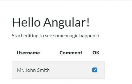
<table class="table-responsive table-striped">
<thead>
<tr>
<th class="p-3">Username</th>
<th class="p-3">Comment</th>
<th class="p-3 text-center">OK</th>
</tr>
</thead>
<tbody _ngcontent-c21="">
<tr class="cart border border-muted">
<td class="p-3">Mr. John Smith</td>
<td class="p-3">
<textarea [hidden]="isChecked" [(ngModel)]="userComment" placeholder="userComment"></textarea>
</td>
<td class="p-3">
<div class="custom-control custom-checkbox">
<input
(click)="toggleCheckbox($event)" [checked]="isChecked"
class="custom-control-input" id="customCheckbox1" name="customCheckbox1" type="checkbox">
<label class="custom-control-label" for="customCheckbox1">
{{ isChecked === true ? 'OK' : 'NOT OK' }}
</label>
</div>
</td>
</tr>
</tbody>
</table>
Let’s also paste in the code for table.component.ts:
1
2
3
4
5
6
7
8
9
10
11
12
13
14
15
16
17
18
19
20
21
22
23
24
import { Component } from '@angular/core';

@Component({
  selector: 'the-table',
  templateUrl: './table.component.html'
})
export class TableComponent {

  public isChecked = true;
  public userComment: string = "Just some placehlder text";

  toggleCheckbox(e) {
    if (!this.isChecked) {
      if(confirm("Clicking OK will erase your comment, are you sure?")){
        this.isChecked = !this.isChecked;
        this.userComment = "Just some placehlder text";
      } else {
        e.preventDefault();
      }
      return
    }
    this.isChecked = !this.isChecked
  }
}
Now we have a checkbox that is checked when the app initially loads. If you click the checkbox, the word “OK” will flip to “NOT OK”, and a comment textarea will appear. If a user types into the box, then clicks the checkbox, the user will be asked for a confirmation because they’re about to cancel their comment message. Basically, the OK being checked and the message being typed into the textarea are mutually exclusive.
Here you can see the gif of the functionality we’ve achieved:
The logic for this example is pretty straightforward, but nonetheless very useful when you need a solution similar to the one presented.
The code for the completed example can be found here.

