Building Bootstrap 4 layouts, part 5: Improving Bootstrap's official examples
Customizing the Pricing layout from the Custom components section
By: Ajdin Imsirovic 01 October 2019
This is the fifth of 20 articles in the Building Bootstrap 4 Layouts article series.
In this article, we’ll upgrade the official Pricing example that can be found under the Custom components title on the Bootstrap 4 website.
 Photo by
@pixabay on Pexels.com
Photo by
@pixabay on Pexels.com
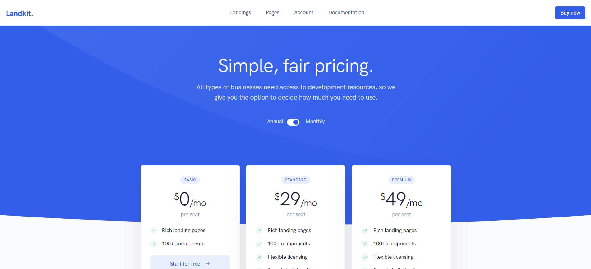
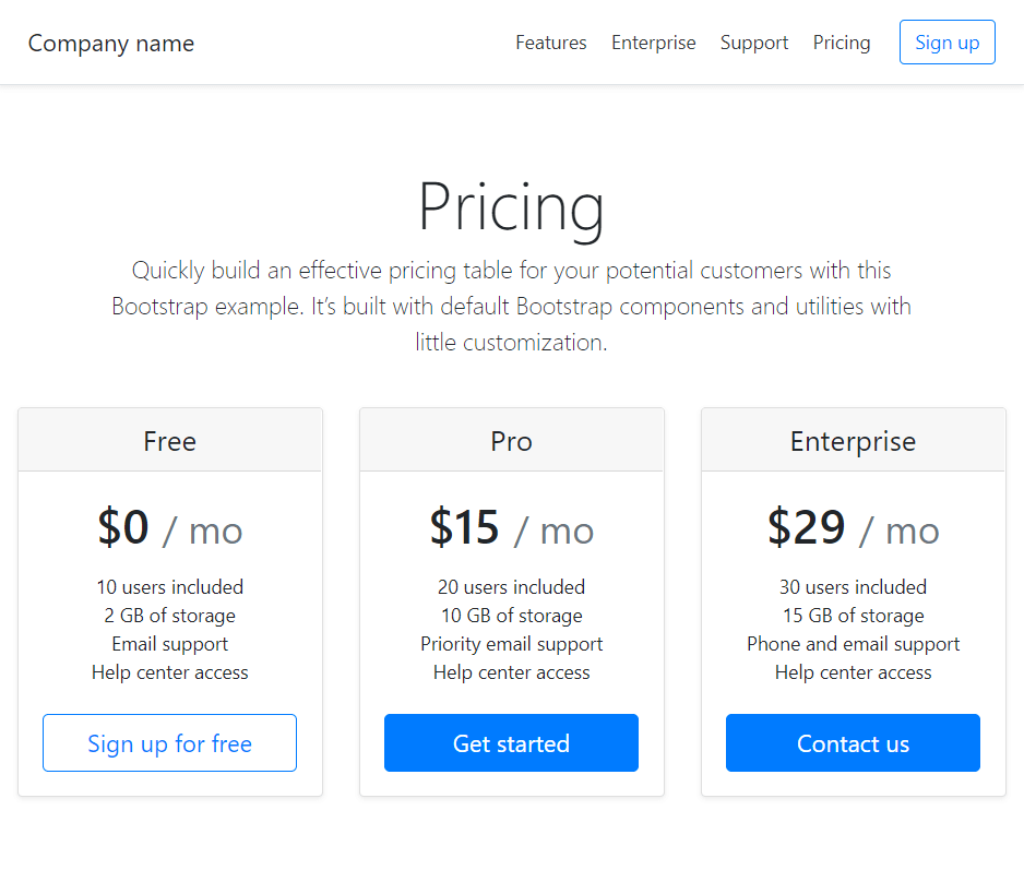
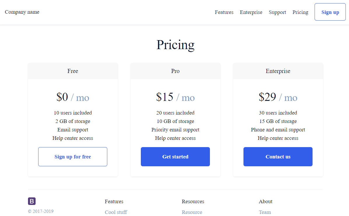
Let’s have a look at the pricing example on getbootstrap.com.
What’s the difference between it, and the premium pricing example here?
Obviously, they have almost the same features, except that the premium pricing example looks a lot better than the default one.
In this article, we’ll look at how we can combine the two layouts; that is, we’ll see how we can copy some of the features from the premium layout so that our default layouts gets some customization.
Note that building a beautiful layout takes skill and time, so please buy the Landkit layout if you want to use it. Also note that this is not an affiliate link, I just want to remind you that it’s a paid product and I’m only showing you an example of how to learn building layouts by looking at some premium ones.
Ok, let’s begin by copying the theme’s CSS.
Copying CSS from another Bootstrap layout into our own
Sometimes the quickest way to freshen up a layout is to copy the styles from another one.
So let’s locate the main stylesheet of the Landkit theme and copy the CSS into our own theme.
Doing this will involve lots of work in the developer tools, so if you wanted to learn more about how to work with devtools in Chrome, this will be a nice tutorial for you.
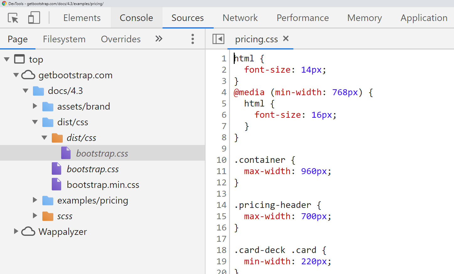
Locating the theme’s main CSS file and unminifying it
Let’s begin by opening the Pricing layout for the Landkit theme, available here.
Next, let’s turn on the developer tools.
Interestingly, this very same layout that you see above, can be represented like this:
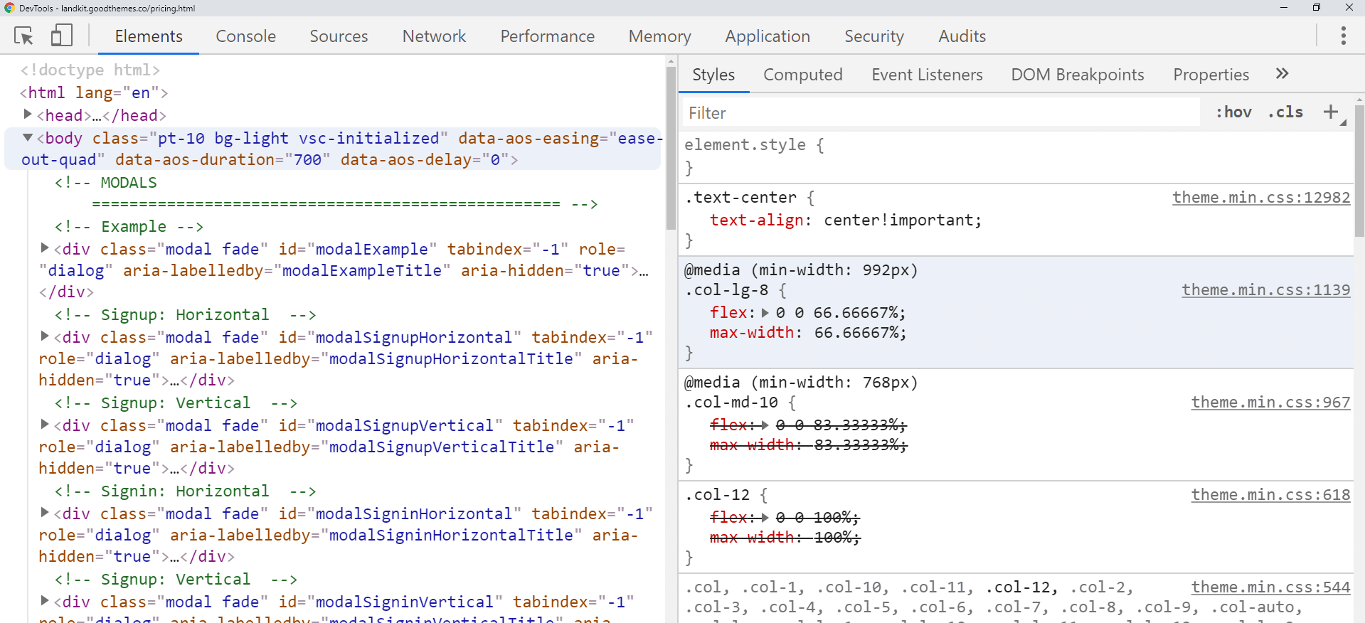
It’s the same webpage! The first screenshot is the render, the second one is the DOM - the code - of the page in developer tools.
The devtools screenshot shows the HTML structure on the left half of the picture, and the styles that affect the HTML structure in the right half of the picture.
On this right-hand side, inside the Styles tab, you can see some CSS class definitions (such as text-center, col-lg-8, col-md-10, and col-12). But, where are these classes coming from? Devtools actually helps us with that.
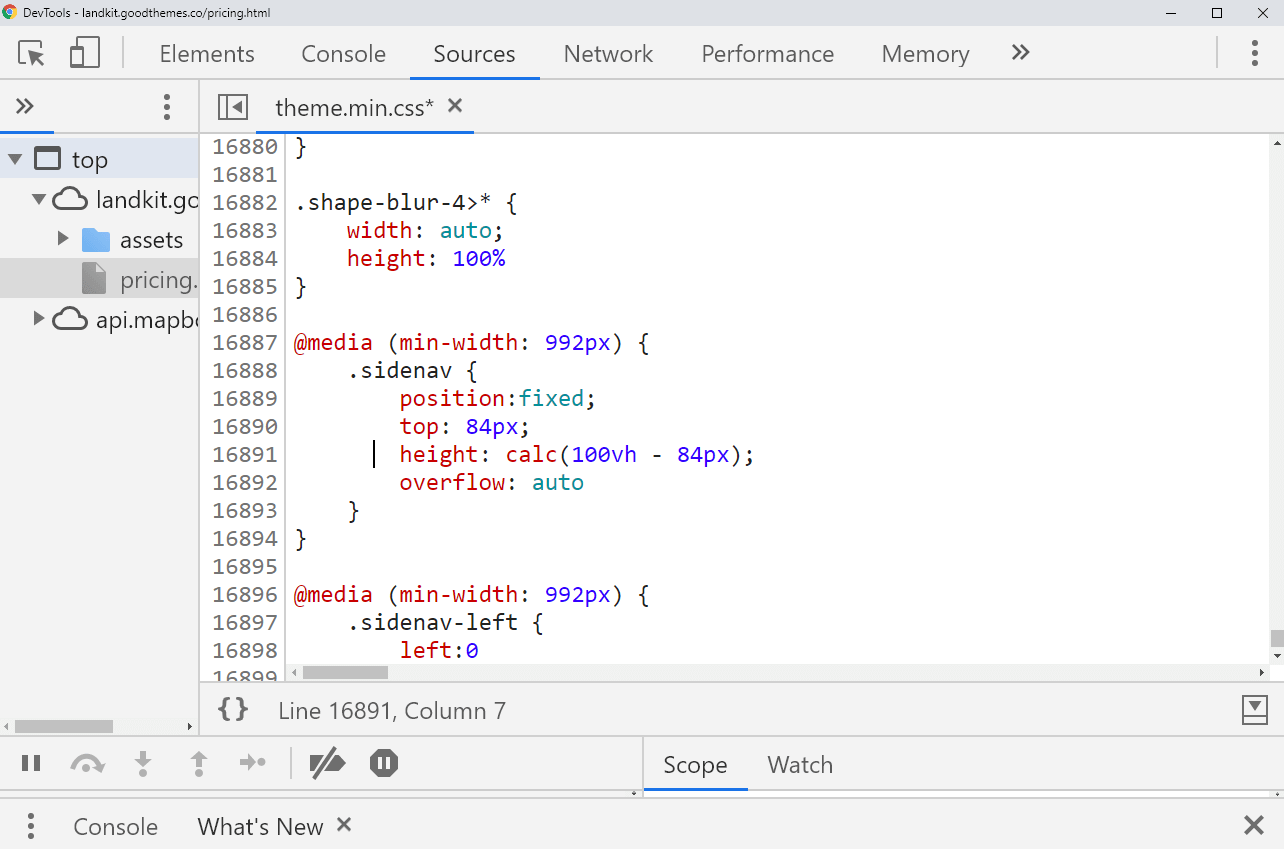
To the right of these listed CSS class definitions, there’s the title of the CSS file where each CSS class definition is located. Note that for each of them, there is the same source file: theme.min.css.
The title of the file - in this case, the theme.min.css - is actually a link, so if you click on it, you’ll see the file inside devtools.
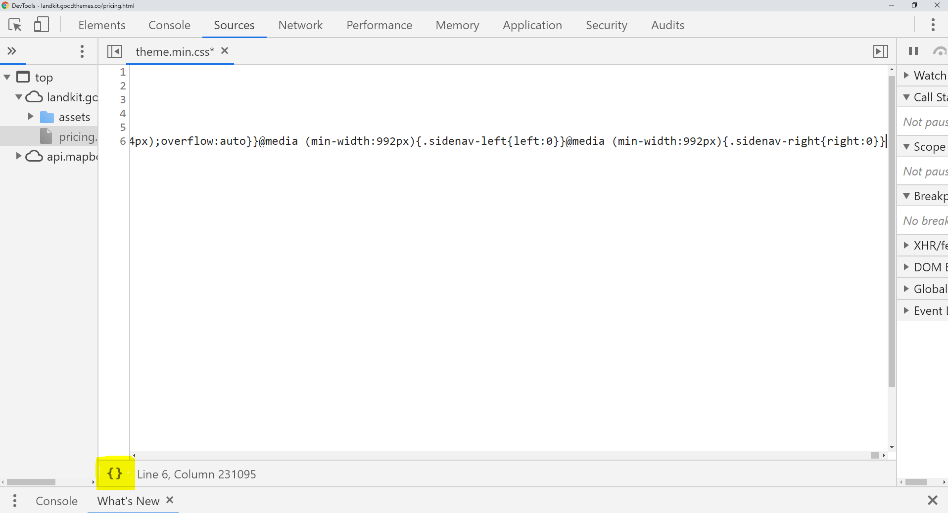
Note that this file is minified, meaning that it’s been stripped of whitespace, which effectively makes the entire file into one big line of CSS.
To unminify it - meaning, to make it human-readable - you can simply click the {} sign, highlighted in yellow in the picture above (hovering over that sign will make a little tooltip apprear - the tooltip reads the word “Format”).
If you click it, you’ll see the same CSS file, unminified.
Regardless of how you view the file, the next thing to do is copy the whole thing.
Copying the theme’s CSS file
To do that, simply click inside the file, and press the CTRL a keyboard combination. This will select the entire file.
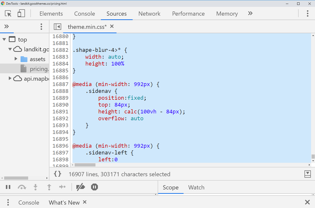
Now we need to copy the file; the easiest way is to just press CTRL c keyboard shortcut.
Next, we need to go back to our default pricing theme from the Bootstrap docs.
Pasting in the copied CSS code into the default theme
Back inside the default pricing theme, we’ll open the elements pane inside the devtools: the goal is to paste in the entire copied CSS inside a new <style> tag in the <head> of the default pricing theme.
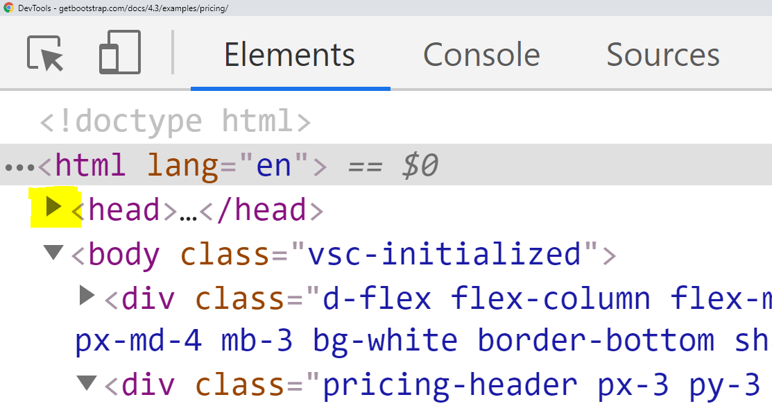
The highlighted little triangle in front of the <head> tag shows you where to click to “twirl open” the head tag so you can see the elements in it.
Once you twirl open the <head> element, scroll all the way down to its closing </head> tag. Right above the closing </head> tag, you’ll see the following line of code:
<link href="pricing.css" rel="stylesheet">
The pricing.css file holds the custom styles for the default bootstrap pricing example. To see the actual file, right-click on the actual value of the href attribute, pricing.css. A contextual right-click menu will appear; click on the first menu item, the one that reads “Reveal in sources panel”.
Once you’ve clicked the “Reveal in sources panel” command, this is what you’ll get:
Now we’ll paste in the CSS we copied from the premium theme:
- First, click inside the
pricing.cssfile - Next, press the
CTRL ENDkeyboard shortcut to select all the file’s contents - Finally, press the
CTRL vkeyboard shortcut to paste in the copied code
You’ll immediately see that the default bootstrap layout has been updated.
Here’s the default theme with the new styles applied:
We can see that just like that, we’ve pasted in a lot of styles from the original theme.
If you’d like to compare your updated layout with the previous one, here’s a little trick you can use: with the Elements tab in focus in developer tools, press the CTRL z shortcut keys to undo the update to the stylesheet. Pressing the CTRL y will redo the update to the stylesheet.
Now that we’ve seen how fast and easy it is to copy-paste the styles from a different theme, we need to see how we can save our changes.
Saving the changes to our theme and trimming the unused CSS
We’ll begin by saving the default Bootstrap theme to our local machine.
The fastest way to save it, is to first open it in Chrome, at this url.
Next, just right click anywhere in the layout, and click the “Save as…” command.
This will open a dialog box, and you can use your operating system’s file system to save it to a location you choose. It’s best to save it to a new folder; I called mine the-theme.
Once you’ve saved it to a new folder, this is the folder structure:
the-theme/
  ├── Pricing example · Bootstrap_files/
  │   ├── bootstrap.min.css
  │   ├── bootstrap-solid.svg
  │   └── pricing.css
  └── Pricing example · Bootstrap.html
Now, all we need to do is update the pricing.css file: just go back to the premium theme, locate the CSS file as described above, copy its’ contents and paste it back into the pricing.css file.
Now just double click the Pricing example · Bootstrap.html file to view it in the browser. If you want to open it in a specific browser, but that browser’s not the default one in your system, you can simply click on the file, than drag and drop it into the browser of your choice. Some operating systems will also simply let you choose the browser.
Now we can trim unused CSS, all with the help of the Chrome browser.
Trimming unused CSS with Chrome’s devtools
With our local copy of the pricing example layout open, let’s open the devtools again.
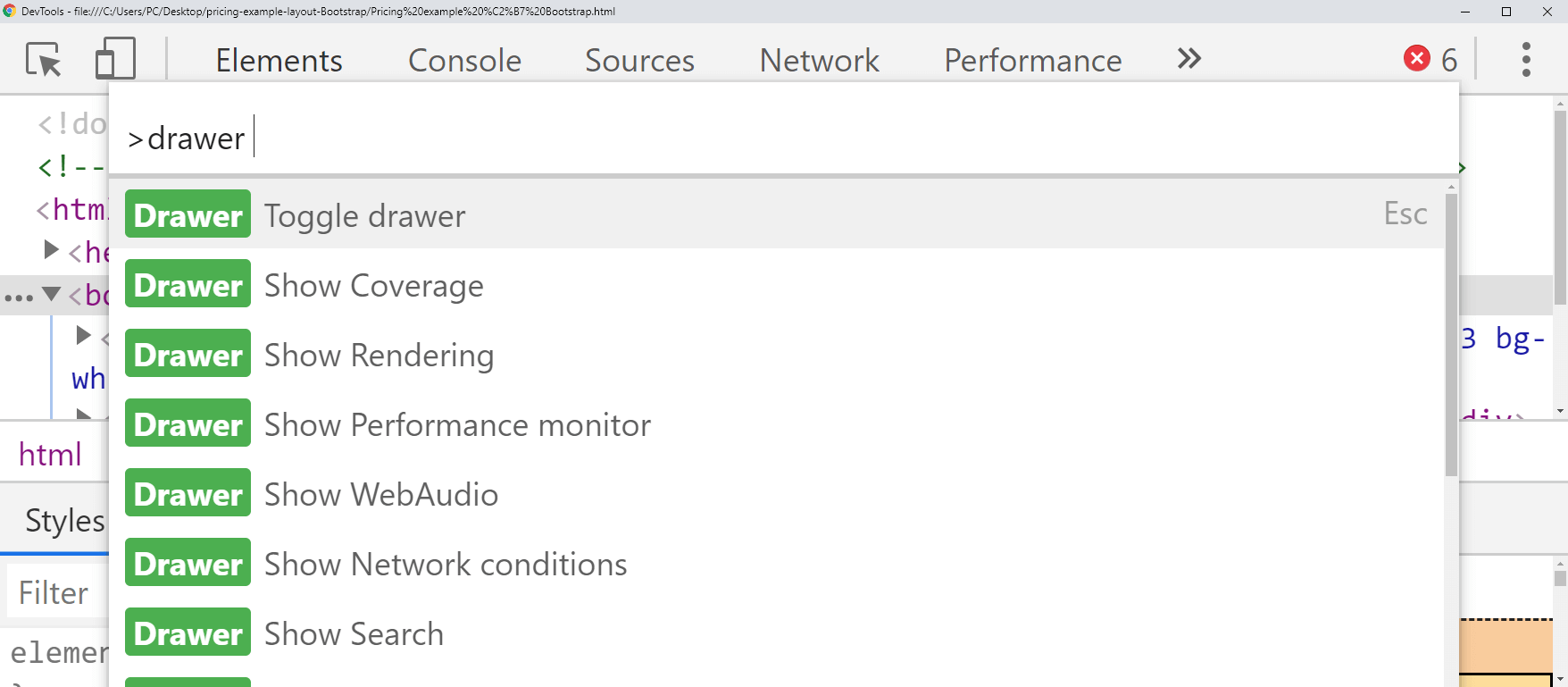
Once the devtools window is in focus, we’ll use a keyboard shortcut to open the Command Menu.
The shortcut is CTRL SHIFT p. You can just type into the command input that appears. The command we need is drawer coverage.
Even if you typed a few letters, the commands matching what you’ve typed will start appearing:
Click on the Show Coverage command.
The Coverage tab will appear, but sometimes you wont’ easily notice it, like in the following screenshot:
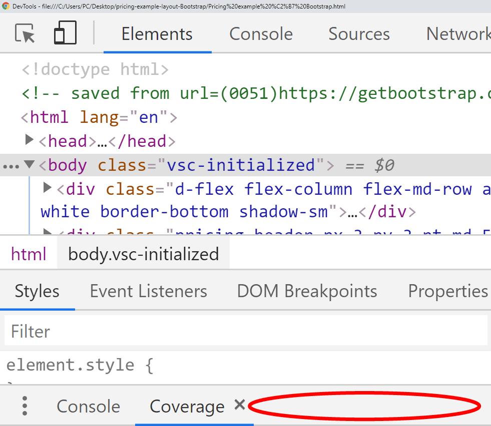
In the above image, you can see the Coverage tab “hidden” at the very bottom of the devtools window. To see more of it, you can simply hover your mouse on the gray background to the right of the Console and Coverage tabs. The area where you should hover the mouse is highlighted with a red ellipse in the image above. Doing this will make a two-pointed arrow appear; now you can click, hold, and drag up the Coverage tab, to see more of it.
Once you’ve done that, the screen should look like this:
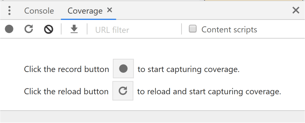
As the instructions above say, now you need to click the gray dot to start recording the coverage. Once you do, the gray circle will turn red. You can click on it again to stop it in a few seconds.
The Coverage tab will show the CSS file, the percentage of unused CSS, and the horizontal bar colored in red and green. The red color shows the amount of unused code; the green color shows the amount of the code that’s actually used.
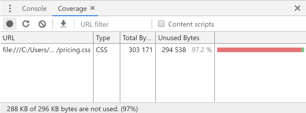
Now you can double-click on the row that shows unused bytes; this will open up the CSS file with green or red vertical bars showing, depending on whether or not the CSS is used.
To test it out, you can dowload the project up to now from this zip file.
After double-clicking the row that shows the unused bytes in the pricing.css file, we can see the exact unused CSS, line by line: the css that’s used will have a green bar to its left, next to line numbers. All the other lines will have a red bar to its left.
One way to remove unused CSS is to simply make a local copy of your CSS file and cut out all the unused CSS from it. Alternatively, you can do the opposite, and use the unused bytes information from Chrome to copy-paste the used code into a brand new file, than save that file as the CSS file to use.
Hopefully, if your project’s not too big, this shouldn’t take too much time.
Another way to remove unused CSS is to automate it with a taskrunner such as Grunt or Gulp, and a plugin such as UnCSS.
Yet another way to do it is to use Purge CSS with webpack (a JavaScript module bundler).
Whatever you decide to do, just make sure you don’t remove unused CSS before you’re absolutely sure you won’t use it later. With automated tools this is not such a huge issue, since you can have the source CSS with all the unused code, and then the production-ready CSS with only the code that is being used.
Let’s now go back to our layout and complete the updates to the official pricing example.
Completing the changes to the pricing example layout
To complete our layout, we’ll do only a couple of things:
- set Arial as the layout’s font
- Update the Pricing “jumbotron” section
To set Arial as the layout’s font, we can just add this CSS to our layout:
* { font-family: Arial !important }
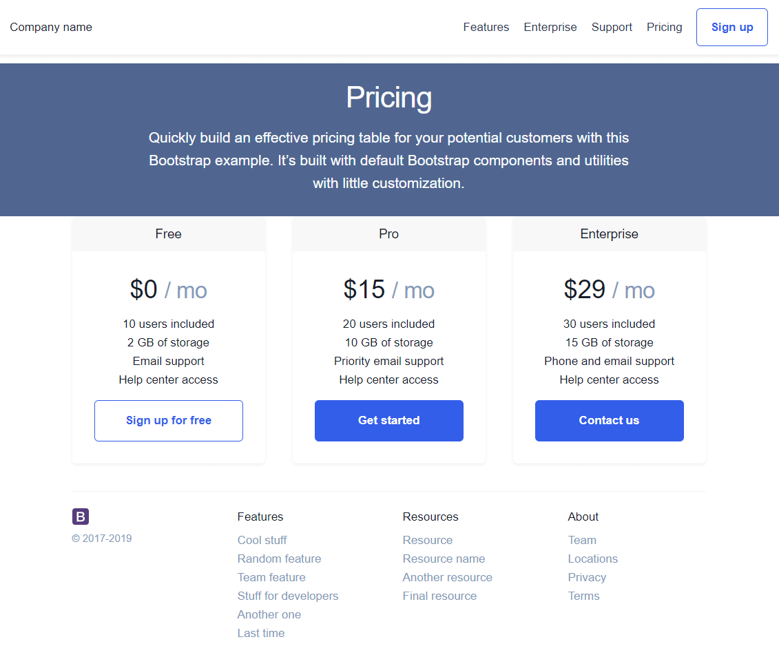
Next, we’ll update the pricing section, which currently looks like this:
<div class="pricing-header px-3 py-3 pt-md-5 pb-md-4 mx-auto text-center">
  <h1 class="display-4">Pricing</h1>
  <p class="lead">Quickly build an effective pricing table for your potential customers with this Bootstrap example. It’s built with default Bootstrap components and utilities with little customization.</p>
</div>
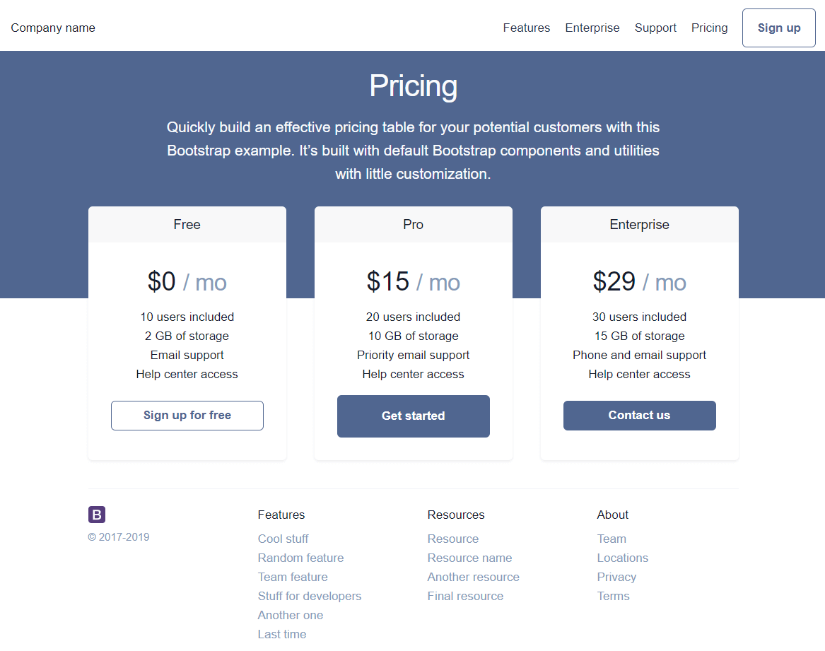
We’ll simply alter the above code by adding another class to wrap the h1 and p tags, and give it a class of container-narrow:
<div class="pricing-header px-3 py-3 pt-md-5 pb-md-4 mx-auto text-center">
    <div class="container-narrow bg-secondary">
        <h1 class="display-4">Pricing</h1>
        <p class="lead">Quickly build an effective pricing table for your potential customers with this Bootstrap example. It’s built with default Bootstrap components and utilities with little customization.</p>
    </div>
</div>
Next, we’ll add the class to our CSS:
.container-narrow {
    max-width: 700px;
    margin: 0 auto;
}
We’ve seen how margin: 0 auto works in a previous article here on codingexercises.
We’ve also added the classes of bg-primary and text-light to the outmost wrapping div, to make our pricing copy look a bit nicer.
After all these changes, here’s the result:
What we can do now to make our layout look nicer is:
- remove the margin between the navbar and the pricing section
- make the pricing background drop down some more (so that its bottom section fits under the vertical middle of pricing cards)
- do something about these buttons!
Removing the margin between the navbar and the pricing section and making the pricing background drop
A quick way to “remove the margin is to “lift” the pricing section up, by adding its outer-most wrapping div the following CSS:
position: relative;
top: -20px;
Next, we need to give it the min-height of, say, 500 pixels:
min-height: 350px
Finally, we’ll move up the cards section by giving them a negative value for margin-top on this HTML:
<div class="card-deck mb-3 text-center">
We’ll just add some inline style to it, because that’s the fastest way to do it (meaning, we don’t have to make a CSS class and then reference it):
<div class="card-deck mb-3 text-center" style="margin-top: -150px">
Fixing the buttons
To fix the buttons, we’ll do a few things:
- change them from primary to secondary contextual colors
- Make the middle one stand out, and the other buttons smaller
- Center the buttons horizontally
This is the look that we’re trying to achieve:
To achieve this look, we need to replace all the instances of primary buttons with secondary buttons.
First we’ll update the Sign up button in the navbar, from this:
<a class="btn btn-outline-primary" href="https://getbootstrap.com/docs/4.3/examples/pricing/#">Sign up</a>
…to this:
<a class="btn btn-outline-secondary" href="https://getbootstrap.com/docs/4.3/examples/pricing/#">Sign up</a>
Next we’ll update the buttons in the pricing table. While we’re at it, we might as well make the first button small, and give it the mt-5 utility class so that all the buttons are seemingly vertically centered.
For the first button, with the Sign up for free text, we’ll go from this:
<button type="button" class="btn btn-lg btn-block btn-outline-primary">Sign up for free</button>
…to this:
<button type="button" class="btn btn-sm mt-5 btn-block btn-outline-secondary">Sign up for free</button>
On the second button, we’ll just update the contextual color to this:
<button type="button" class="btn btn-lg btn-block btn-secondary">Get started</button>
On the third button, we’ll repeat what we did with the first one. We’ll go from this HTML:
<button type="button" class="btn btn-lg btn-block btn-primary">Contact us</button>
…to this:
<button type="button" class="btn btn-sm mt-5 btn-block btn-secondary">Contact us</button>
We’ve added all the updates so far, and we could call it a day.
But if the background bothers you, maybe you could add a background image. In the next update, we’re adding a background image and we’re overlaying it with a box-shadow trick:
position: relative;
top: -20px;
min-height: 650px;
max-height: 350px;
background-image: url(https://images.unsplash.com/photo-1511988617509-a57c8a288659?ixlib=rb-1.2.1&ixid=eyJhcHBfaWQiOjEyMDd9&auto=format&fit=crop&w=1951&q=80);
background-position: -20px 1040px;
box-shadow: inset 0 0 0 1000px hsla(212, 100%, 50%, 0.4)
In the code above, we’re using an image from Helena Lopes on Unsplash.
The inset box-shadow gives a 1000px blur over our image, and the color of the shadow is set to a transparent hsla(212, 100%, 50%, 0.4) color.
Without transparency, this color would be hsla(212, 100%, 50%, 1), and we could add that color to our pricing table’s buttons.
We’re not going to do that at this point, but we’ll rather leave it as is.
Our pricing layout now looks like this:
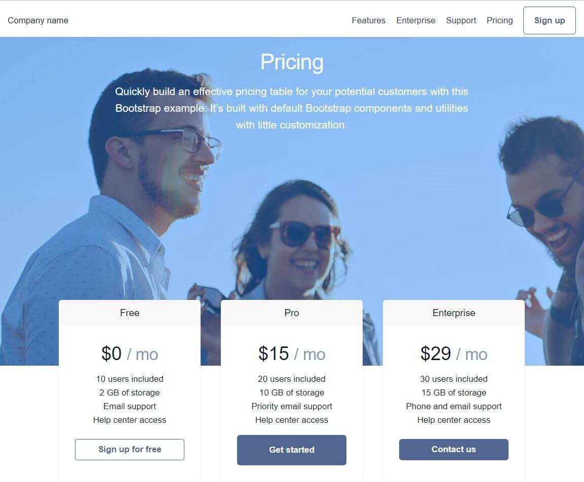
The completed layout can be downloaded as a zip from here.
Conclusion
In this article, we’ve seen many different techniques, tips and tricks of working with layouts.
We’ve seen how to:
- Copy CSS from another layout into ours
- Locate and manipulate CSS in developer tools
- Unminify CSS files in the browser
- Paste CSS into devtools
- Work with Elements panel
- Use the Command launcher and the Coverage command to check for unused CSS
- Save our layouts to our local machine
- Creatively use negative margins
- Combine background images and inset shadows to quickly give a faux background color to them
At this point, you might think that the layout needs some additional improvements before we can call it done.
However, the goal of the first ten articles in this article series is not really to show you how to build complete layouts.
Our goal at this point is to learn the work flow, the process, to have the techniques to look at a blank screen - or a very basic Bootstrap starter theme - and know two things:
- What things we can do to update the theme
- Know that we are able to do it - since we’ve already done it before
For example, in this tutorial we’ve seen how we can take a dull background and change it into an image, and then, even better, color that image any way we want, using the inset box-shadow trick.
Each of these simple tricks don’t do much on their own, but when you combine them, you get a powerful mix, and you can come up with your own ideas easily.
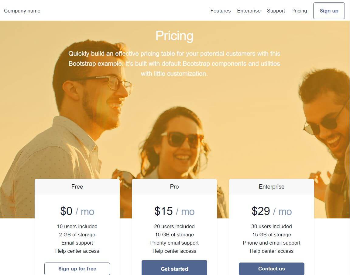
For example, let’s look one more time at the completed layout.
To update the background image from the blue shade to an orange one, all we need to do is update the hsla color from this:
box-shadow: inset 0 0 0 1000px hsla(212, 100%, 50%, 0.4);
…to this:
box-shadow: inset 0 0 0 1000px hsla(40, 100%, 50%, 0.4);
Go ahead, give it a try! Just use the devtools to type the values right in.
My goal with this article series is to teach you how to work independently, like you did just now if you followed the little exercise above.
If you haven’t followed the exercise, here’s the updated layout’s screenshot:
That’s it for this article. In the next one, we’ll look at working with SCSS in Bootstrap 4.

