Build a Bootstrap layout in React
We'll build a Bootstrap layout using React so that we can learn in practice how React composes components
By: Ajdin Imsirovic 24 January 2022
We’ll use this chapter to practice everything we’ve learned today, in a new setting.
This will have two great results for our React learning:
- First, we’ll practice everything we’ve learned in a more life-life, real scenario
- We’ll understand better how to compose components
React is all about components. Those components being composable is one of its strengths.
Alright, let’s dive in!
Table of contents
- Prototyping our website layout’s components
- Adding Bootstrap 5
- Adding the Navbar - the MainMenu component
- Adding the Jumbotron-component
- Fixing the rendering issue
- Adding the Footer component
- Coding our React Bootstrap layout locally
- Updating the App.js file
- One component per file
- Importing a component to App.js
- Adding the jumbotron and the footer component
Prototyping our website layout’s components
We’ll code our layout on codepen, starting with a navbar.
Thus, let’s navigate to the official site of the Bootstrap framework, version 5, and let’s locate a navbar example that we can copy.
1
2
3
4
5
6
7
8
9
10
11
12
13
14
15
16
17
18
19
20
21
22
23
24
<nav class="navbar navbar-expand-lg navbar-light bg-light">
  <div class="container-fluid">
    <a class="navbar-brand" href="#">Navbar</a>
    <button class="navbar-toggler" type="button" data-bs-toggle="collapse" data-bs-target="#navbarNav" aria-controls="navbarNav" aria-expanded="false" aria-label="Toggle navigation">
      <span class="navbar-toggler-icon"></span>
    </button>
    <div class="collapse navbar-collapse" id="navbarNav">
      <ul class="navbar-nav">
        <li class="nav-item">
          <a class="nav-link active" aria-current="page" href="#">Home</a>
        </li>
        <li class="nav-item">
          <a class="nav-link" href="#">Features</a>
        </li>
        <li class="nav-item">
          <a class="nav-link" href="#">Pricing</a>
        </li>
        <li class="nav-item">
          <a class="nav-link disabled">Disabled</a>
        </li>
      </ul>
    </div>
  </div>
</nav>
Now we need to:
- Make the above main menu into a component
- Add it to the page
Here’s a simplified look at how that works:
1
2
3
4
5
6
7
8
9
10
function MainMenu() {
  return (
    <h1>Main Menu goes here</h1>
  );
}

ReactDOM.render(
    <MainMenu />,
    document.getElementById("app")
)
Obviously, we’re just showing a “prototype” of how our navbar works.
Now we need to replace the <h1>Main Menu goes here</h1> with the entire contents of the navbar.
However, before we do that, let’s plan our site a bit more.
We’ll keep things relatively simple and add only the jumbotron and the footer to it.
Thus, our site’s full, non-working “prototype”, built as React components, will now look like this:
1
2
3
4
5
6
7
8
9
10
11
12
13
14
15
16
17
18
19
20
21
22
function MainMenu() {
  return (
    <h1>Main Menu goes here</h1>
  );
}

function Jumbotron() {
  return (
    <h1>Jumbotron goes here</h1>
  );
}

function Footer() {
  return (
    <h1>Footer goes here</h1>
  );
}

ReactDOM.render(
    <MainMenu />,
    document.getElementById("app")
)
Now it’s all a matter of adding the individual component’s HTML code inside each of the returns.
Additionally, we also need to include the proper version of the Bootstrap framework to our codepen.
Adding Bootstrap 5
We’ll be adding the Bootstrap 5 framework from a CDN. We’ll achieve this using Codepen’s built in functionality, similar to how we’ve setup Babel.
Our Codepen is titled A React Bootstrap example.
However, this time, we’ll click the “Settings” button at the very top of our Codepen.
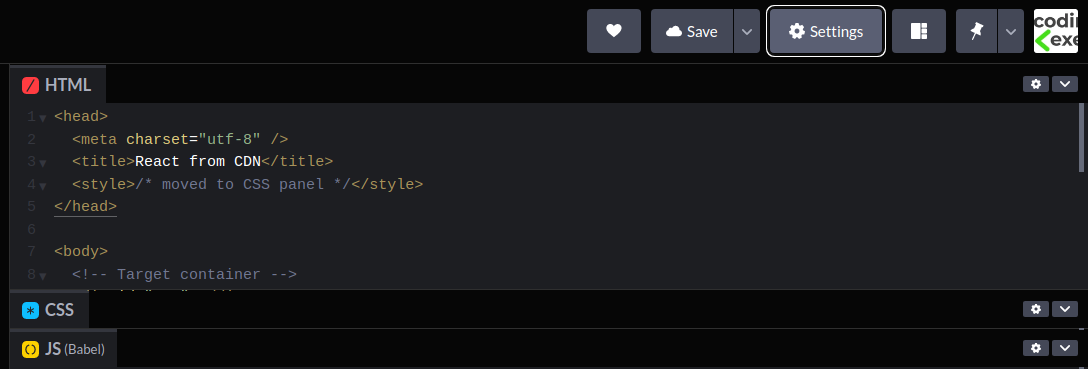
Once we’ve clicked on the Settings button, we’ll get the same settings modal window like we had when we were setting up Babel. Now we can click on the CSS option, and type “Bootstrap” in the search. The result will auto-complete and give us a matching Bootstrap v5.0.2 CDN link.
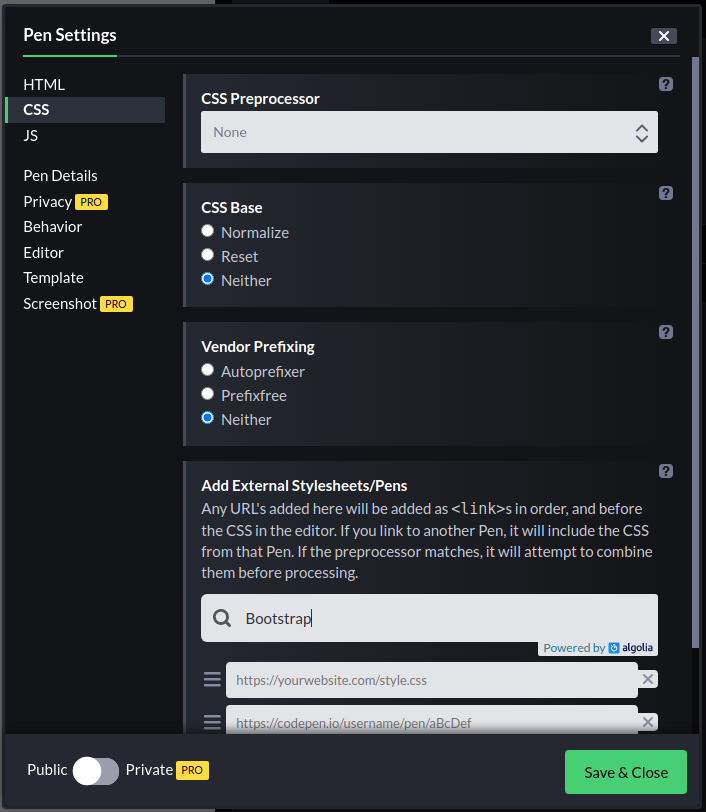
Click on the suggested top result, then click the Save & Close button.
After we’ve added the Bootstrap CDN, the styles on the text should have updated - which is a confirmation that what we did worked.
Adding the Navbar - the MainMenu component
Now, we’ll add the Navbar.
Here’s our component’s updated code:
1
2
3
4
5
6
7
8
9
10
11
12
13
14
15
16
17
18
19
20
21
22
23
24
25
26
27
28
29
30
31
32
33
34
35
36
37
38
39
40
41
42
43
44
function MainMenu() {
  return (
    <nav className="navbar navbar-expand-lg navbar-light bg-light">
      <div className="container-fluid">
        <a className="navbar-brand" href="#">
          Navbar
        </a>
        <button
          className="navbar-toggler"
          type="button"
          data-bs-toggle="collapse"
          data-bs-target="#navbarNav"
          aria-controls="navbarNav"
          aria-expanded="false"
          aria-label="Toggle navigation"
        >
          <span className="navbar-toggler-icon"></span>
        </button>
        <div className="collapse navbar-collapse" id="navbarNav">
          <ul className="navbar-nav">
            <li className="nav-item">
              <a className="nav-link active" aria-current="page" href="#">
                Home
              </a>
            </li>
            <li className="nav-item">
              <a className="nav-link" href="#">
                Features
              </a>
            </li>
            <li className="nav-item">
              <a className="nav-link" href="#">
                Pricing
              </a>
            </li>
            <li className="nav-item">
              <a className="nav-link disabled">Disabled</a>
            </li>
          </ul>
        </div>
      </div>
    </nav>
  );
}
Next, we’ll add the jumbotron.
Adding the Jumbotron component
The jumbotron component has been dropped in version 5.
However, we can still copy-paste its HTML structure from one of the example pages.
Once we’ve copied the relevant code into our component, the Jumbotron component will now look like this:
1
2
3
4
5
6
7
8
9
10
11
12
13
14
15
16
17
18
19
function Jumbotron() {
return (
<div class="p-5 mb-4 bg-light rounded-3 text-center">
<div class="container-fluid py-5 text-center">
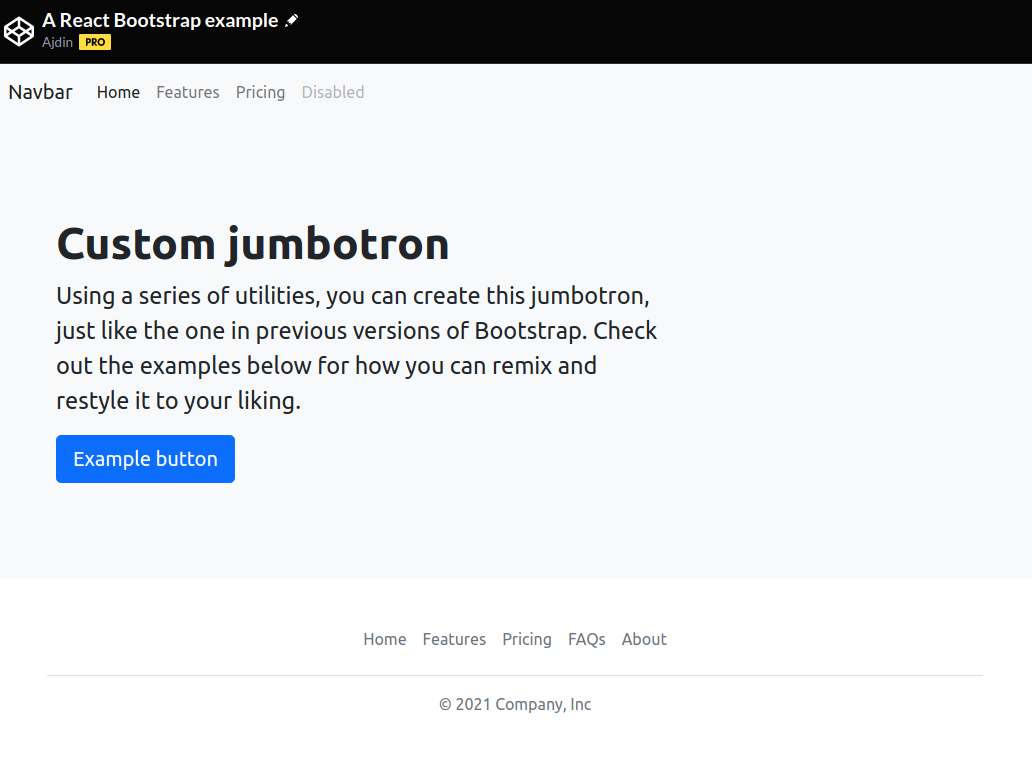
<h1 class="display-5 fw-bold">Custom jumbotron</h1>
<p class="col-md-8 fs-4 m-auto mt-5 mb-5">
Using a series of utilities, you can create this jumbotron, just like
the one in previous versions of Bootstrap. Check out the examples
below for how you can remix and restyle it to your liking.
</p>
<button class="btn btn-primary btn-lg" type="button">
Example button
</button>
</div>
</div>
);
}
ReactDOM.render(<MainMenu />, <Jumbotron />, document.getElementById("app"));
However, we have “messed up” the ReactDOM.render() call on purpose. And that’s why our app, if left like this, would not render anything - obviously, because we’ve made the error.
Thus, instead of including the MainMenu and Jumbotron as demonstrated above, let’s revise our car page, and how we did things there.
Fixing the rendering issue
Here’s the full JSX code of our previous Car page example.
1
2
3
4
5
6
7
8
9
10
11
12
13
14
15
16
17
18
19
20
21
22
function Car(props) {
  return (
    <div className="car">
      <h1>My {props.make}</h1>
      <p>
        My {props.make} is {props.color}
      </p>
      <p>It's a bit older, from {props.year}</p>
    </div>
  );
}

let logo = "https://images.unsplash.com/photo-1605816988069-b11383b50717";

let app = (
  <div>
    <img src={logo} width="400" />
    <Car make="Honda" color="red" year="2011" />
  </div>
);

ReactDOM.render(app, document.querySelector("#app"));
Logically, we can resolve our rendering issue by passing app as the first argument of the ReactDOM.render() call. Of course, before that, we’ll need to define the app variable.
Here’s how we’ll solve it.
To begin with, we won’t touch either the MainMenu or the Jumbotron components.
That’s what’s so great about composability. We just need to focus on putting our components together.
So let’s define the app variable:
1
2
3
4
5
6
const app = (
    <div>
        <MainMenu />
        <Jumbotron />
    </div>
)
And now we’ll render it:
ReactDOM.render(app, document.querySelector("#app"));Victory! We’ve successfully rendered our two components!
As a quick de-tour, here’s an alternative way to do it:
1
2
3
4
5
6
7
ReactDOM.render(
  <div>
    <MainMenu />
    <Jumbotron />
  </div>,
  document.querySelector("#app")
);
Let’s add the Footer component too, so that our layout is fully completed.
Adding the Footer component
We’ll copy another element from the DOM - since Bootstrap doesn’t have a separate footer component.
Here’s our Footer component, copy-pasted from the Bootstrap website, and custom-formatted so that the code nicely fits on this book’s page without taking too much space vertically.
1
2
3
4
5
6
7
8
9
10
11
12
13
14
15
16
17
18
19
20
21
22
23
24
25
26
function Footer() {
  return (
    <div className="container">
      <footer className="py-3 my-4">
        <ul className="nav justify-content-center border-bottom pb-3 mb-3">
          <li className="nav-item">
            <a href="#" className="nav-link px-2 text-muted">
            Home</a></li>
          <li className="nav-item">
            <a href="#" className="nav-link px-2 text-muted">
            Features</a></li>
          <li className="nav-item">
            <a href="#" className="nav-link px-2 text-muted">
            Pricing</a></li>
          <li className="nav-item">
            <a href="#" className="nav-link px-2 text-muted">
            FAQs</a></li>
          <li className="nav-item">
            <a href="#" className="nav-link px-2 text-muted">
            About</a></li>
        </ul>
        <p className="text-center text-muted">© 2021 Company, Inc</p>
      </footer>
    </div>
  );
}
Of course, to make our component show, we also need to update the app variable:
1
2
3
4
5
6
7
const app = (
  <div>
    <MainMenu />
    <Jumbotron />
    <Footer />
  </div>
)
Great! We’ve just completed our React and Bootstrap layout.
Now we’ll build that layout again, only in our local environment.
Coding our React Bootstrap layout locally
This should be a pretty familiar exercise by now:
- Find a local folder
- Run
npx create-react-app reactboostrap1 - Change into the
reactboostrap1directory - Run
yarn start
We’ll get that default starter app in no time. Now let’s start updating our files.
Updating the App.js file
Let’s start with a simple update to App.js:
1
2
3
4
5
6
7
8
9
10
11
12
13
14
import logo from './logo.svg';
import './App.css';

function App() {
  return (
    <div className="App">
      <div>Main nav goes here</div>
      <div>Jumbotron goes here</div>
      <div>Footer goes here</div>
    </div>
  );
}

export default App;
Now that we’ve streamlined it, we can add our components.
One component per file
Here’s a simple rule: one file, one component.
This is a very important rule. It keeps things simple and organized.
Now that we’re aware of this rule, let’s add another file, and name it, say, MainMenu.js.
We’ll be adding the file to the root of the src folder.
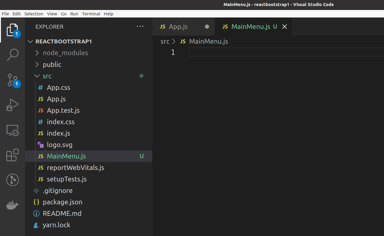
Now let’s define our component, using the now well-known function syntax (aka a functional component):
1
2
3
function MainMenu() {
  // some JSX to be returned from here
}
Here’s a screenshot of how that looks in VS Code.
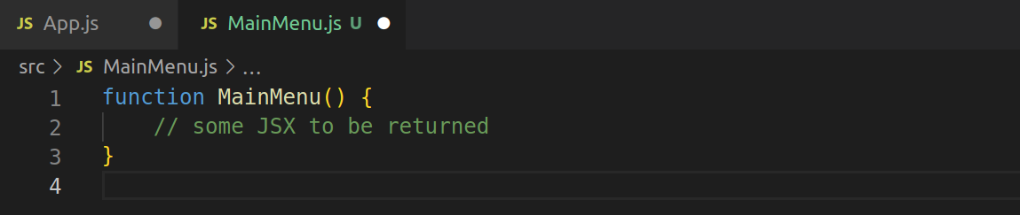
There’s not much guesswork as to what needs to go in this function’s body.
We’ll just copy-paste what we already have in the Codepen, resulting in this:
1
2
3
4
5
6
7
8
9
10
11
12
13
14
15
16
17
18
19
20
21
22
23
24
25
26
27
28
29
30
31
32
33
34
35
36
37
38
39
40
41
42
43
44
function MainMenu() {
  return (
    <nav className="navbar navbar-expand-lg navbar-light bg-light">
      <div className="container-fluid">
        <a className="navbar-brand" href="#">
          Navbar
        </a>
        <button
          className="navbar-toggler"
          type="button"
          data-bs-toggle="collapse"
          data-bs-target="#navbarNav"
          aria-controls="navbarNav"
          aria-expanded="false"
          aria-label="Toggle navigation"
        >
          <span className="navbar-toggler-icon"></span>
        </button>
        <div className="collapse navbar-collapse" id="navbarNav">
          <ul className="navbar-nav">
            <li className="nav-item">
              <a className="nav-link active" aria-current="page" href="#">
                Home
              </a>
            </li>
            <li className="nav-item">
              <a className="nav-link" href="#">
                Features
              </a>
            </li>
            <li className="nav-item">
              <a className="nav-link" href="#">
                Pricing
              </a>
            </li>
            <li className="nav-item">
              <a className="nav-link disabled">Disabled</a>
            </li>
          </ul>
        </div>
      </div>
    </nav>
  );
}
Basically, we’re taking that component that was only a section of the script file on Codepen, and we’re moving it to a separate file.
No other changes here!
However, to make this actually work, we need to add a couple of additional things, namely, the import and the export:
- we must import any dependency module
- we must export the
MainMenucomponent
Thus, our file will end up looking as follows:
// import SomeDependency from 'some-dependency';

function MainMenu() {
  return (
    // ... all the JSX code here ...
  )
}

export default MainMenu;
This is the “recipe” we’ll follow for all our components.
Note: The reason I’ve commented out the import SomeDependency... line of code above is because our files actually do not have a dependency yet. So I’m leaving it as a comment in all the files to have a reminder that we might eventually need to import something we’ll be using in our app. But we won’t do it now. However, by keeping it as a comment in each of our files, it’s going to sort of stick out like a sore thumb - and that, hopefully, will help us remembering that very often we indeed will have to import a dependency and use it in our component files.
Importing a component to App.js
Back in App.js let’s now replace the first line:
1
import logo from './logo.svg';
… with an import of our MainMenu component.
We’re no longer using the starter logo anyway, so:
1
2
3
4
5
6
7
8
9
10
11
12
13
14
import MainMenu from './MainMenu';
import './App.css';

function App() {
  return (
    <div className="App">
      <MainMenu />
      <div>Jumbotron goes here</div>
      <div>Footer goes here</div>
    </div>
  )
}

export default App;
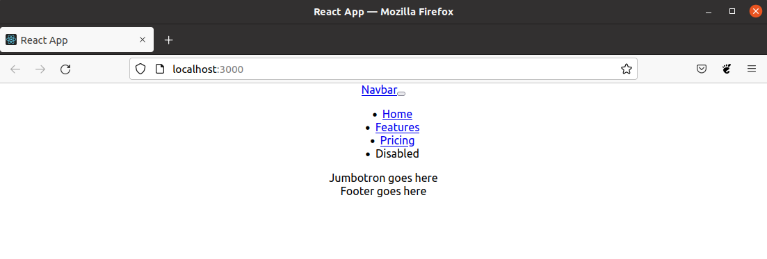
As far as the JavaScript and JSX goes, all of this works.
However, we still do not have our styling.
That’s why, currently, the app looks like this:
So how do we do it?
There’s an actual guide on the create-react-app site.
First, in our console, we’ll run:
npm i --save bootstrap
Then, at the very top of our index.js file, we’ll add the css from the module:
import 'bootstrap/dist/css/bootstrap.css';
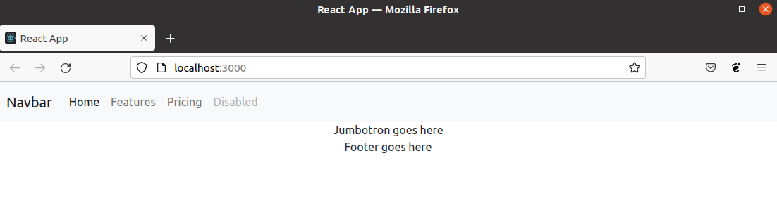
We should also probably stop the local server with CTRL + c keyboard combination, then run the yarn start command again.
Here’s the result in the browser.
Now, building the other two components should be pretty straightforward.
Adding the jumbotron and the footer component
To speed things up, let’s add two new files:
./src/Jumbotron.js./src/Footer.js
Let’s add the following code to the Jumbotron.js file:
1
2
3
4
5
6
7
8
9
10
11
12
13
14
15
16
17
18
19
20
21
// import SomeDependency from 'some-dependency';

function Jumbotron() {
  return (
    <div class="p-5 mb-4 bg-light rounded-3 text-center">
      <div class="container-fluid py-5 text-center">
        <h1 class="display-5 fw-bold">Custom jumbotron</h1>
        <p class="col-md-8 fs-4 m-auto mt-5 mb-5">
          Using a series of utilities, you can create this jumbotron, just like
          the one in previous versions of Bootstrap. Check out the examples
          below for how you can remix and restyle it to your liking.
        </p>
        <button class="btn btn-primary btn-lg" type="button">
          Example button
        </button>
      </div>
    </div>
  );
}

export default Jumbotron;
Next, let’s add the following code to the Footer.js file:
1
2
3
4
5
6
7
8
9
10
11
12
13
14
15
16
17
18
19
20
21
22
23
24
25
// import SomeDependency from 'some-dependency';

function Footer() {
    return (
      <div class="container">
        <footer class="py-3 my-4">
          <ul class="nav justify-content-center border-bottom pb-3 mb-3">
            <li class="nav-item"><a href="#" class="nav-link px-2 text-muted">
              Home</a></li>
            <li class="nav-item"><a href="#" class="nav-link px-2 text-muted">
              Features</a></li>
            <li class="nav-item"><a href="#" class="nav-link px-2 text-muted">
              Pricing</a></li>
            <li class="nav-item"><a href="#" class="nav-link px-2 text-muted">
              FAQs</a></li>
            <li class="nav-item"><a href="#" class="nav-link px-2 text-muted">
              About</a></li>
          </ul>
          <p class="text-center text-muted">© 2021 Company, Inc</p>
        </footer>
      </div>
    );
  }

export default Footer;
Now, App.js looks like this:
1
2
3
4
5
6
7
8
9
10
11
12
13
14
15
16
import MainMenu from './MainMenu';
import Jumbotron from './Jumbotron';
import Footer from './Footer';
import './App.css';

function App() {
  return (
    <div className="App">
      <MainMenu />
      <Jumbotron />
      <Footer />
    </div>
  );
}

export default App;
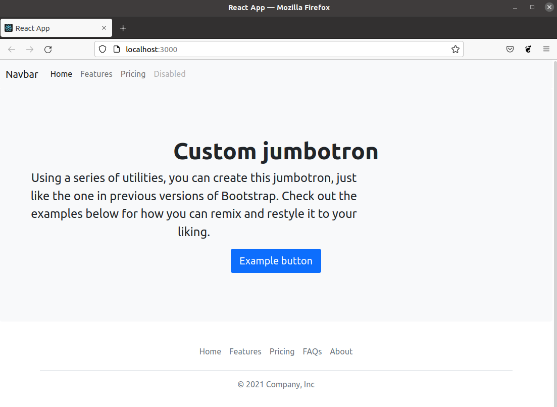
We’ve achieved the same layout as we did earler, only this time, we’ve built it using local setup.
On the next page, there’s a screenshot of our local React app being served in the Firefox browser. With that screenshot, we’ll complete this chapter.

