Building Bootstrap 4 layouts, part 4: Improving Bootstrap's official examples
Customizing the Album layout from the Custom components section
By: Ajdin Imsirovic 30 September 2019
This is the fourth of 20 articles in the Building Bootstrap 4 Layouts article series.
In this article, we’ll upgrade the official Album example that can be found under the Custom components title on the Bootstrap 4 website.
 Photo by
David Pisnoy, @davidpisnoy on Unsplash
Photo by
David Pisnoy, @davidpisnoy on Unsplash
Here’s what we’ve learned so far in this article series:
- utility classes and contextual colors
- containers, rows, and column grids
- “primary” and “secondary” components
- solving the zoom problem on layouts (i.e using
metatags)
We’ve now got most of the absolute basics down.
We could delve into theory and look at flexbox and how flexbox works, so that we’re better equipped to work with Bootstrap layouts.
Alternatively, we could simply jump right into layouts, and solve problems when we come across them.
Let’s start with this alternative approach, by upgrading this Boootstrap docs’ example layout, called Album.
Upgrading the official Album layout
We’re looking at ways to upgrade the official Album layout for two reasons:
- To see, in practice, how easy it is to replace components in a layout with other components
- To practice customizing layouts with both Bootstrap’s own CSS, and with custom styles
Let’s start by replacing the toggle bar on the top with a regular navbar, copied from the docs:
<nav class="navbar navbar-expand-lg navbar-light bg-light">
  <a class="navbar-brand" href="#">Navbar</a>
  <button class="navbar-toggler" type="button" data-toggle="collapse" data-target="#navbarNav" aria-controls="navbarNav" aria-expanded="false" aria-label="Toggle navigation">
    <span class="navbar-toggler-icon"></span>
  </button>
  <div class="collapse navbar-collapse" id="navbarNav">
    <ul class="navbar-nav">
      <li class="nav-item active">
        <a class="nav-link" href="#">Home <span class="sr-only">(current)</span></a>
      </li>
      <li class="nav-item">
        <a class="nav-link" href="#">Features</a>
      </li>
      <li class="nav-item">
        <a class="nav-link" href="#">Pricing</a>
      </li>
      <li class="nav-item">
        <a class="nav-link disabled" href="#" tabindex="-1" aria-disabled="true">Disabled</a>
      </li>
    </ul>
  </div>
</nav>
We’ll also upgrade the Album example area. Bonus points for you if you realized that this section is actually a Jumbotron.
Here’s the custom CSS we’ll give it:
.jumbotron-image {
	background-image: url('https://images.unsplash.com/photo-1458560871784-56d23406c091?ixlib=rb-1.2.1&ixid=eyJhcHBfaWQiOjEyMDd9&auto=format&fit=crop&w=1934&q=80');
	background-size: cover;
	background-repeat: no-repeat;
}
We’ll now add this new jumbotron-image class to update our jumbotron area, like this:
<section class="jumbotron jumbotron-image text-center">
Above, we can see an example of not overriding Bootstrap’s default classes, but rather extending them.
The image used for the above jumbotron background is from Adrian Korte.
As for the cards, let’s fit four cards instead of three on each row. The update we’re making is that inside each row, we need to make sure to have the following structure:
<div class="row">
    <div class="col-md-3">
        ...
    </div>
</div>
After these updates, here’s our customized Album layout.
Here’s the screenshot of the result:
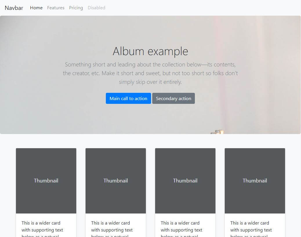
As we can see, our layout looks a bit better, but we’ve still got some improvements to add.
For example, we could update the background image so that the gramophone could be seen. That would mean that we need to show the background image from the bottom.
We could also change the navbar’s color to a darker background and turn letters a lighter color.
Let’s make these improvements.
Improving the upgraded Album layout
First, we’ll fix the image by just adding another CSS declaration to our custom jumbotron-image class:
background-position: bottom;
Next, we’ll fix the navbar colors, from this:
<nav class="navbar navbar-expand-lg navbar-light bg-light">
…to this:
<nav class="navbar navbar-expand-lg navbar-dark bg-dark">
Here’s the updated layout.
And here is the screenshot after the update:
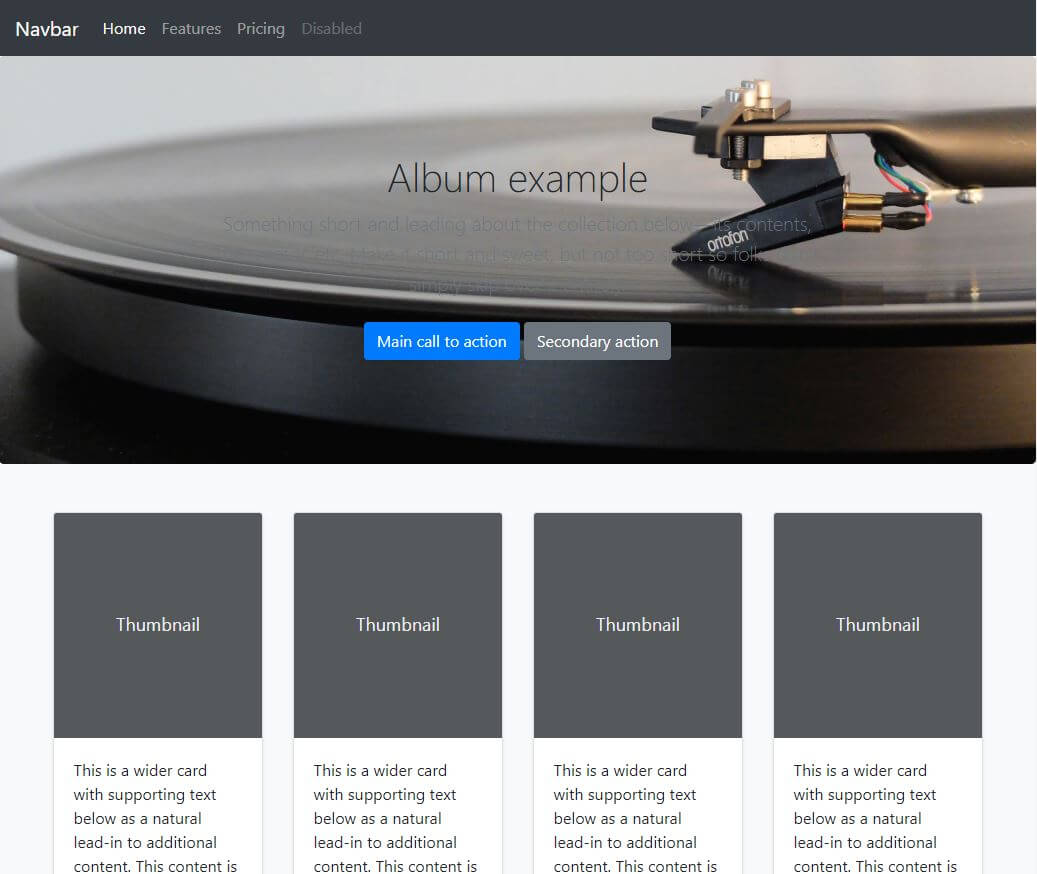
While our layout does look better in general, now our jumbotron’s text is not showing any more.
Let’s see a quick fix for this problem.
Making dark letters on dark background visible with Bootstrap’s contextual bg-* classes
To make these letters visible, let’s look at our layout’s jumbotron again:
<section class="jumbotron jumbotron-image text-center">
    <div class="container">
    <h1 class="jumbotron-heading">Album example</h1>
    <p class="lead text-muted">Something short and leading about the collection below—its contents, the creator,
        etc. Make it short and sweet, but not too short so folks don’t simply skip over it entirely.</p>
    <p>
        <a href="#" class="btn btn-primary my-2">Main call to action</a>
        <a href="#" class="btn btn-secondary my-2">Secondary action</a>
    </p>
    </div>
</section>
To quickly make the letters visible, let’s just add a contextual background color to the div with the class of container, like this:
<div class="container bg-light">
With just this one little change, our layout will update to this:
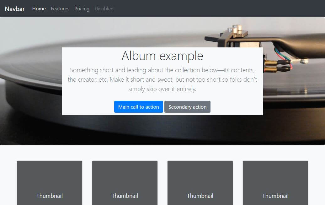
If you’re in a hurry to complete a layout, sometimes just adding this little update is enough.
However, we could also improve this quick fix further, by just adding the alpha to the background color.
Adding transparency to the background color
Note that this is not Bootstrap-specific, it’s a simple CSS technique you can use with or without a CSS framework.
Here’s how:
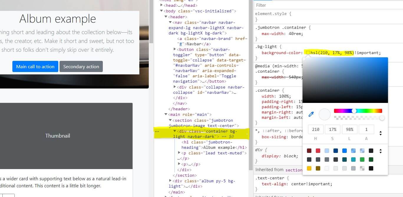
- Right click on the background you want to change, and click “Inspect” to open developer tools
- In this case, we’re looking for the bg-light class in the Styles sub-tab of the devtools Elements tab
- Once you’ve found it, you’ll see
background-color: #f8f9fa!important;inside thebg-lightCSS class; there’s also a little gray box - a preview of our background color - Hold down the SHIFT key and click on the little gray color preview square. Doing this will change the color notation from hex to rgb, then to hsl, and finally back to hex
- Once you’ve switched to hsl, just click onto the little gray box, and you’ll see a color picker.
- At the bottom of the color picker, there’s an input for each of the HSLA values. To get a transparent version of your gray color, just lower the A (alpha) to any value under 1. The lower the value, the greater the transparency.
Here’s a screenshot of how your screen should look before step 6:
When you’ve found a reasonable alpha value, you can simply copy-paste the color into your layout.
Remember not to override the existing class! This time we’ll make an entirely new class and not even use the default bg-light:
.bg-lighter {
    background-color: hsla(210,17%,98%, 0.75);
}
Here’s the completed layout.
Conclusion
In this article, we’ve seen how easy it is to alter Bootstrap’s example layouts.
We’ve also seen how building layouts with a CSS framework basically consists of combining two approaches:
- Using the framework’s components
- Adding custom CSS
That’s it for this article. In the next one, we’ll improve another default Bootstrap layout.

