HTML and CSS Basics, part 13: Converting our first layout into a responsive one
Adjusting our first layout to mobile phones, tablets, and desktops
By: Ajdin Imsirovic 20 September 2019
This is the thirteenth post in this series of articles.
In this post we’ll convert our static layout from part 11 of this series, into a responsive layout.
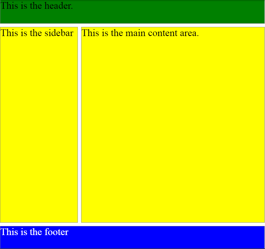
This is the non-responsive layout we ended up with at the end of part 11 of the series.
When I was writing this article, I really thought deep about how a newbie will get the most out of reading it.
Should I give an example of floats in a layout? These are not considered the best practice anymore, not that we have the option of using flexbox and grid. And float-based layouts are all hacky. On the other hand, they are widely used even to this day.
I realized that the above dilemma boils down to utility: What is the most useful thing to teach a newbie following this series of articles, at this stage of learning?
I realized it’s probably best to slowly introduce the reader to flexbox. Not really dive deep into the topic - just showcase the bare minimum needed to produce a working responsive layout.
So that being said, let’s get started using flexbox, and learn its basics.
What is flexbox
Flexbox is a modern way to build layouts on the web. It’s biggest advantage is that we don’t have to deal with hacky techniques to build layouts, like we did in the past with floats and other hacks.
So let’s look at an updated example of our non-responsive layout, converted into a flexbox non-responsive layout. After that, we’ll just add it some media queries.
Let’s see our example’s HTML:
1
2
3
4
5
6
7
8
<div>
  <header>This is the header.</header>
  <div>
    <aside>This is the sidebar</aside>
    <main>This is the main content area.</main>
  </div>
  <footer>This is the footer</footer>
</div>
Our flexbox-based HTML layout’s CSS styles look like this:
1
2
3
4
5
6
7
8
9
10
11
12
13
14
15
16
17
18
19
20
21
22
23
24
25
26
27
28
29
30
31
32
33
34
35
36
37
38
body {
  margin: 0;
  font-size: 30px;
}
div {
  display: flex;
  flex-direction: column;
  justify-content: space-between;
  min-height: calc(100vh - 160px);
}
div div {
  flex-direction: row;
  flex-grow: 1;
  margin: 10px 0;
}
aside, main {
  flex-grow: 1;
  background: yellow;
}
aside {
  width: calc(30% - 10px);
  margin-right: 10px;
}
main {
  width: calc(70% - 10px);
}
header {
  background: green;
  height: 70px;
}
footer {
  background: blue;
  color: white;
  height: 70px;
}
header, footer, aside, main {
  border: 1px solid gray;
}
Of course, we could have made the above styles more DRY.
This is what our updated, flexbox-based layout will look like now:
Before we can turn the above layout into a responsive one, we need to understand what is going on in the code above.
Understanding our simple flexbox-based non-responsive website layout
Let’s understand the layout by rebuilding it, step by step.
Step 1: Give our site some structure
To begin with, we’ll have one <div> inside the <body> element, with three top-level sections:
- the header
- the container for the aside and main area
- the footer
The structure will look like this:
    <div>
        <header>This is the header.</header>
        <div>
          <aside>This is the sidebar.</aside>
          <main>This is the main content area.</main>
        </div>
        <footer>This is the footer.</footer>
    </div>
As we can see, the HTML structure is exactly the same like the one in step 11 of this series; the only difference is, we’re now nesting the <aside> and <main> tags inside a wrapping <div> element.
Here’s the step 1 live in browser.
Obviously, this HTML structure doesn’t look like much; that’s expected, we haven’t applied any styles!
Let’s fix that by adding some color and some flexbox CSS declarations next.
Step 2: Add flexbox styles to our HTML structure
Let’s begin by adding this CSS to our outer-most <div>:
display: flex;
Earlier in this series, we’ve learned about the following values of CSS display property: block, inline, and inline-block.
It’s important to know that there’s also a flex property. It’s a whole different specification on rendering elements. Luckily, it’s a lot more intuitive than the hacky layout-building that was used prior to flex taking center stage.
Let’s extend the CSS code for our outer-most <div> element:
div {
  display: flex;
  flex-direction: column;
}
Let’s also color each of our layout sections:
aside, main {
    background: yellow;
}
header {
    background: green;
}
footer {
    background: blue;
    color: white;
}
header, footer, aside, main {
    border: 1px solid gray;
}
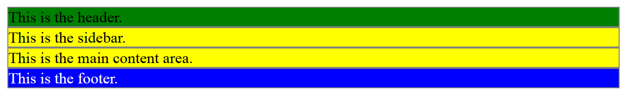
That’s it for this step. Here’s the result of step 2 live in browser.
Here’s a screenshot of the above code:
Let’s see what happens when we set the inner <div> - the one wrapping the <aside> and <main>, to display: flex as well.
Step 3: Setting the inner wrapping <div> to display: flex
Let’s extend our CSS by appending this code at the very bottom:
div div {
  display: flex;
}
Let’s add another CSS property: value:
div div {
  display: flex;
  flex-direction: row;
}
Now the <aside> and <main> are stacking next to one another rather then on top of one another:
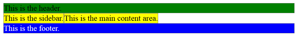
Here’s the result of step 3 live in browser.
In the next step, we’ll make our <aside> and <main> stretch 100% of the wrapping div.
Step 4: Stretching the <aside> and <main> to 100% of the wrapping div
To stretch the sidebar and the main area, we’ll add this CSS:
aside, main {
  flex-grow: 1;
  background: yellow;
}
aside {
  width: calc(30% - 10px);
  margin-right: 10px;
}
main {
  width: calc(70%);
}
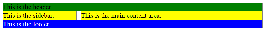
Here’s the result of step 4 live in browser.
In step 5, we’ll make the aside and main area stretch the full height of the available screen.
Step 5: Stretching the sidebar and main content area vertically
To do this, we just need to set the min height of the div div CSS selector to full viewport height, minus the <header> and the <footer>.
This is how we’ll set the height of the <header> and the <footer>:
header {
  height: 70px;
}
footer {
  height: 70px;
}
And this is how we’ll set the height of the div div:
min-height: calc(100vh - 160px);
That’s it! We have a non-responsive flexbox layout!
Feel free to check out the completed example on codepen again, before we start adding the media queries.
Making our layout responsive with media queries
Making our flexbox layout is very easy.
All that it takes is to implement media queries similar to what was described here.
Before we start writing the actual media queries, we should choose our breakpoints.
Let’s say we need only one breakpoint: we want our layout to flip to mobile layout under 800px.
Basically, we want our layout to adjust inside these two media queries:
@media (max-width: 800px) {
  /* our mobile-specific CSS code goes here */
}
@media (min-width: 801px) {
  /*  our desktop CSS code goes here */
}
Practically, these are the only updates that we are making:
@media (max-width: 800px) {
	div div {
	  flex-direction: column;
	}
  aside, main {
    background: white;
    flex-grow: 1;
    min-width: 100vw;
  }
}
We’re not going to be even adding the media query over 801px - we already have the implicit media query code: basically everything that’s not specified in the above media query.
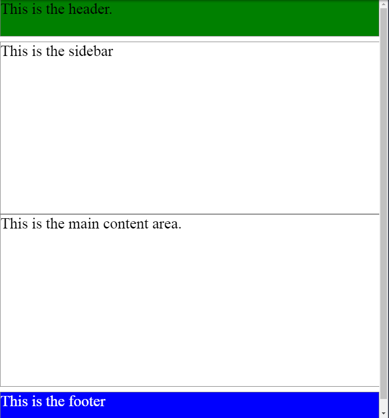
This is what the layout looks like at under 800px:
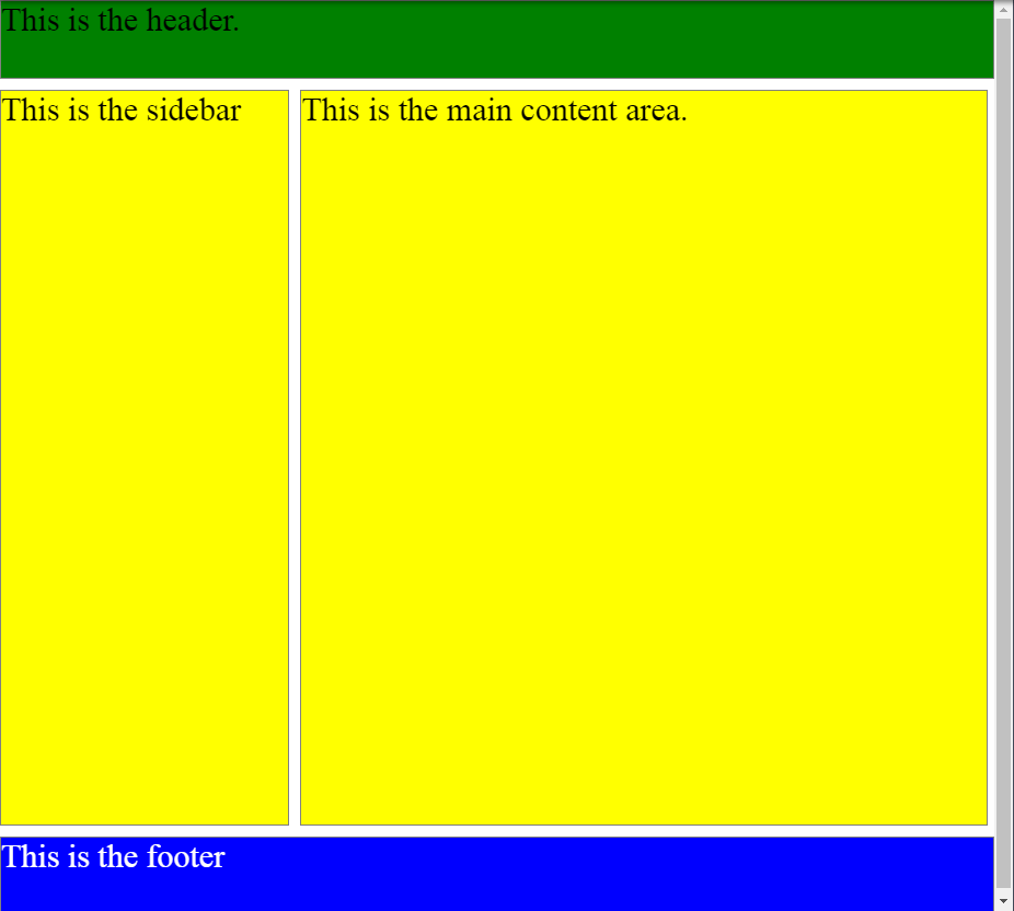
This is what the layout looks like at over 800px:
Here’s the completed example on Codepen.
Congratulations! You’ve successfully built your first responsive flexbox-based layout.
Next, we’ll discuss CSS resets and Emmet.
Use the below links to navigate through other tutorials in this guide.
< Back to part 12: Responsive web layouts with media queries
You are here: Part 13, Converting our first layout into a responsive one

