Working with ngx-bootstrap buttons, carousel, datepicker, and dropdowns in Angular 8
We're exploring more ngx-bootstrap components in Angular 8
By: Ajdin Imsirovic 28 August 2019
In this article, we’ll be working with several components in ngx-bootstrap library:
If you’re completely new to ngx-bootstrap layouts, you can check out these two posts:
- How to prototype Bootstrap layouts with Angular 8, part 1
- How to prototype Bootstrap layouts with Angular 8, part 2
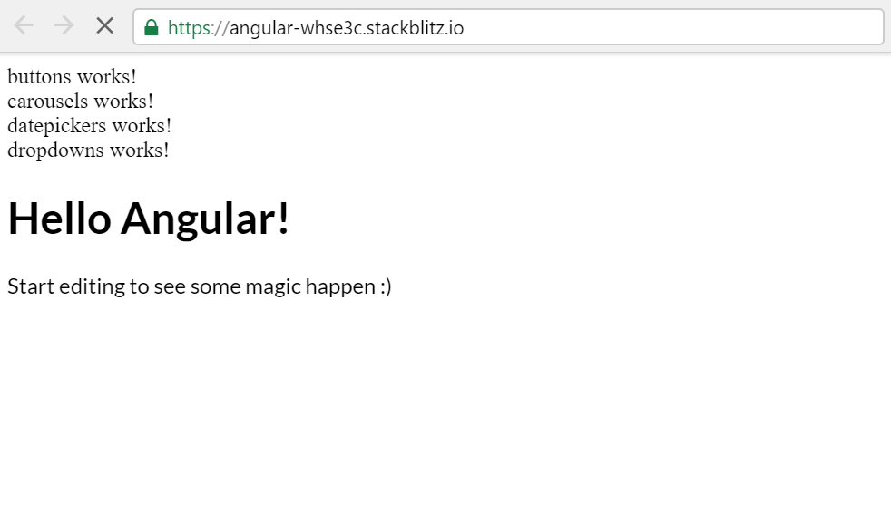
To see what we’ll build, have a look at the completed app in Stackblitz.
1. Adding all the components’ folders and files
To being working with the app, inside the app folder, let’s quickly make four new folders: buttons, carousels, datepickers, and dropdowns.
Inside each of these new folders, we’ll add a new file, named according to the folder name these files are in. For example, if the files are located inside the buttons folder, we’ll name the files:
buttons.component.htmlbuttons.component.ts
We need to add a total of 8 files, with each folder having their corresponding file names.
Next, we need to add some content to each of these files.
The content in the HTML will be almost identical for each of the files. For example, inside the buttons.component.html file, we’ll add the following one-liner:
<div>buttons works!</div>
We’ll do a similar thing for the other components’ html files, only replacing the word before the word “works!”.
Once done, let’s update the Typescript files in each of our components.
We’ll be using a default name of default for this example. The word default should be replaced with each component’s folder name, as needed. Here is the default code we’ll be altering for each component:
1
2
3
4
5
6
7
import { Component } from '@angular/core';

@Component({
  selector: 'my-default',
  templateUrl: './default/default.component.html'
})
export class DefaultComponent { }
Ok, so above we have a pattern to fill. Let’s see how it would apply to the buttons folder’s Typescript file.
Let’s open the buttons.component.ts file and alter the above default code, so it looks like this:
1
2
3
4
5
6
7
import { Component } from '@angular/core';

@Component({
  selector: 'my-buttons',
  templateUrl: './buttons/buttons.component.html'
})
export class ButtonsComponent { }
Now’s the time to practice! You need to update the other components’ Typescript files so that each file references the correct selector and templateUrl, and exports a properly named unique component class.
Once done, we need to import our newly-created components into a module. Since we only have one module in our app, the file we’ll be updating is obviously app.module.ts.
Here’s the updated file:
1
2
3
4
5
6
7
8
9
10
11
12
13
14
15
16
17
18
19
20
import { NgModule } from '@angular/core';
import { BrowserModule } from '@angular/platform-browser';
import { FormsModule } from '@angular/forms';

import { AppComponent } from './app.component';
import { HelloComponent } from './hello.component';

import { ButtonsComponent } from './buttons/buttons.component';
import { CarouselsComponent } from './carousels/carousels.component';
import { DatepickersComponent } from './datepickers/datepickers.component';
import { DropdownsComponent } from './dropdowns/dropdowns.component';

@NgModule({
  imports:      [ BrowserModule, FormsModule ],
  declarations: [
    AppComponent, HelloComponent,
    ButtonsComponent, CarouselsComponent, DatepickersComponent, DropdownsComponent ],
  bootstrap:    [ AppComponent ]
})
export class AppModule { }
As we can see above, we’re importing our four components we exported in the previous step. Once imported, we then list them out in the declarations array inside the @NgModule decorator.
Now, all that’s left to do is to use our components inside the app.component.html file. We simply add the custom HTML tags, based on the values inside the selector property of each referenced component:
1
2
3
4
5
6
7
8
9

<my-buttons></my-buttons>
<my-carousels></my-carousels>
<my-datepickers></my-datepickers>
<my-dropdowns></my-dropdowns>
<hello name="{{ name }}"></hello>
<p>
  Start editing to see some magic happen :)
</p>
With this, we have accomplished several goals:
- We’ve created the files and folders for each of our four components
- We’ve added these files and folders, as child components, to a module
- We’ve used these child components in the
app.module.htmltemplate file
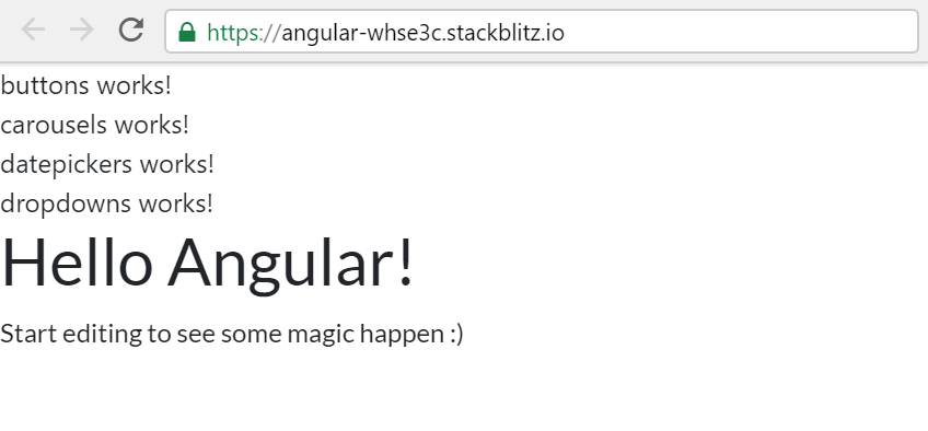
This is what our app looks like now:
Now that we’ve set everything up, you can check out the app’s commit file at this stage of our app’s development here.
Next, we’ve got some housekeeping to do. We’ve hooked up our components, but we haven’t added any Bootstrap styles yet!
Here on CodingExercises, we’ve already covered how to add Bootstrap styles to an Angular 8 app.
We’ve also covered how to add the ngx-bootstrap dependency to our Stackblitz app.
Here’s our app now with Bootstrap styles applied:
If you’re still unsure how to add ngx-bootstrap and Bootstrap 4 styles to this app we’re building, you can check out the commit at this stage here.
Next, we’ll update our buttons component, so that it uses the ngx-bootstrap functionality.
1. Adding buttons
 Photo by Nirzar Pangarkar, @nirzar on Unsplash
Let’s begin by visiting the buttons section on ngx-bootstrap’s website. As the docs read, we need to begin by importing the ButtonsModule. There’s only one place to import it into: the app module.
Adding a static ngx-bootstrap button
So let’s open app.module.ts and add the following import:
import { ButtonsModule } from 'ngx-bootstrap/buttons';
We’ll also need to consume it in the decorator, so let’s add the following entry to the imports array inside @NgModule decorator:
ButtonsModule.forRoot()
Next, open the buttons template file (buttons.component.html), erase all the contents, and add the code from the docs:
<button type="button" class="btn btn-primary">
  Single Button
</button>
For this example, we don’t have to update the class file (buttons.component.ts).
The code up to this point is available in the commit titled Adding a simple button in ngx-bootstrap
But we don’t have to stop here! Let’s add the next example from the docs, the checkbox.
Adding a mobile-friendly ngx-bootstrap checkbox button
Let’s begin by appending the following code to the buttons template file:
1
2
3
4
5
6
7
8
9
10
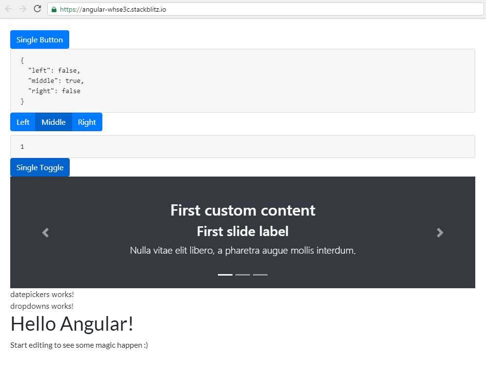
<pre class="card card-block card-header">{{ checkModel | json }}</pre>
<div class="btn-group">
<label class="btn btn-primary" [(ngModel)]="checkModel.left"
btnCheckbox tabindex="0" role="button">Left</label>
<label class="btn btn-primary" [(ngModel)]="checkModel.middle"
btnCheckbox tabindex="0" role="button">Middle</label>
<label class="btn btn-primary" [(ngModel)]="checkModel.right"
btnCheckbox tabindex="0" role="button">Right</label>
</div>
Let’s also add the following code to our buttons class file’s export class:
export class ButtonsComponent {
  checkModel: any = { left: false, middle: true, right: false };
}
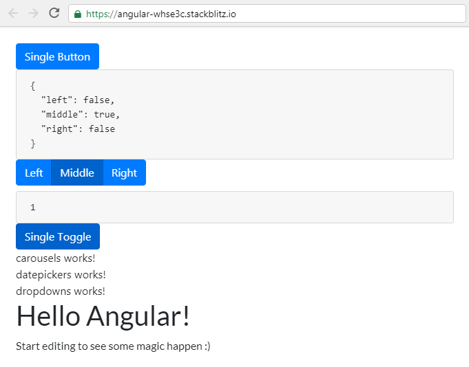
This is what our app looks like after this update:
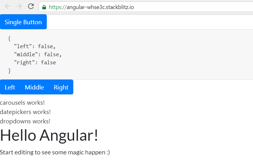
Here are the updates on the Github commit titled Added checkbox buttons.
Adding a checkbox ngx-bootstrap button with a custom value
We’ll wrap up the buttons functionality by adding a checkbox with a custom value.
For this example, we need to append the following code to the buttons template file:
1
2
3
4
5
6
<pre class="card card-block card-header">{{ singleModel }}</pre>
<button type="button" class="btn btn-primary"
        [(ngModel)]="singleModel" btnCheckbox
        btnCheckboxTrue="1" btnCheckboxFalse="0">
  Single Toggle
</button>
The only update we need to make to the class file is the addition of a variable to track the value of the checkbox. The variable is called singleModel:
1
2
3
4
export class ButtonsComponent {
  checkModel: any = { left: false, middle: true, right: false };
  singleModel = '1';
}
Regardless of the buttons, We’ll also add a single improvement to the styles of our page, by adding a wrapping div with a padding CSS class to the app.component.html:
1
2
3
4
5
6
7
8
9
10
<div class="p-4">
  <my-buttons></my-buttons>
  <my-carousels></my-carousels>
  <my-datepickers></my-datepickers>
  <my-dropdowns></my-dropdowns>
  <hello name="{{ name }}"></hello>
  <p>
    Start editing to see some magic happen :)
  </p>
</div>
Now our elements are not touching the edges of the viewport:
The Github commit at this stage is called Add a custom checkbox value in a toggle button.
2. Adding carousels
 Photo by CHUHAN Z, @chuhan on Unsplash
Just like we did with the buttons component, first we’ll inspect the documentation in the carousel section on the ngx-bootstrap website.
Adding a static carousel
So let’s open app.module.ts and import the CarouselModule:
import { CarouselModule } from 'ngx-bootstrap/carousel';
Let’s also add the CarouselModule to the imports array in the AppModule’s decorator:
imports: [ BrowserModule, FormsModule, ButtonsModule.forRoot(), CarouselModule.forRoot() ],
Now we can erase the old code inside the carousel component’s HTML template - carousels.component.html, and add this code from the Custom content carousel section of the ngx-bootstrap website:
1
2
3
4
5
6
7
8
9
10
11
12
13
14
15
16
17
18
19
20
21
22
23
24
25
26
27
28
29
<carousel>
  <slide>
    <div class="text-center py-5 bg-dark text-white">
      <h2>First custom content</h2>
      <div class="lead">
        <h3>First slide label</h3>
        <p>Nulla vitae elit libero, a pharetra augue mollis interdum.</p>
      </div>
    </div>
  </slide>
  <slide>
    <div class="text-center py-5 bg-dark text-white">
      <h2>Second custom content</h2>
      <div class="lead">
        <h3>Second slide label</h3>
        <p>Nulla vitae elit libero, a pharetra augue mollis interdum.</p>
      </div>
    </div>
  </slide>
  <slide>
    <div class="text-center py-5 bg-dark text-white">
      <h2>Third custom content</h2>
      <div class="lead">
        <h3>Third slide label</h3>
        <p>Nulla vitae elit libero, a pharetra augue mollis interdum. </p>
      </div>
    </div>
  </slide>
</carousel>
We don’t have to make any changes to the class file.
Our app now looks like this:
The app, as it is currently, is saved under the commit titled Added a custom content ngx-bootstrap carousel.
Next, we’ll add a more dynamic carousel.
Adding a more dynamic carousel
In this section, we’ll be using the code from the Dynamic Slides section of ngx-bootstrap docs.
Back in carousels.component.html, let’s append this code:
1
2
3
4
5
6
7
8
9
10
11
12
13
14
15
16
17
18
19
20
21
22
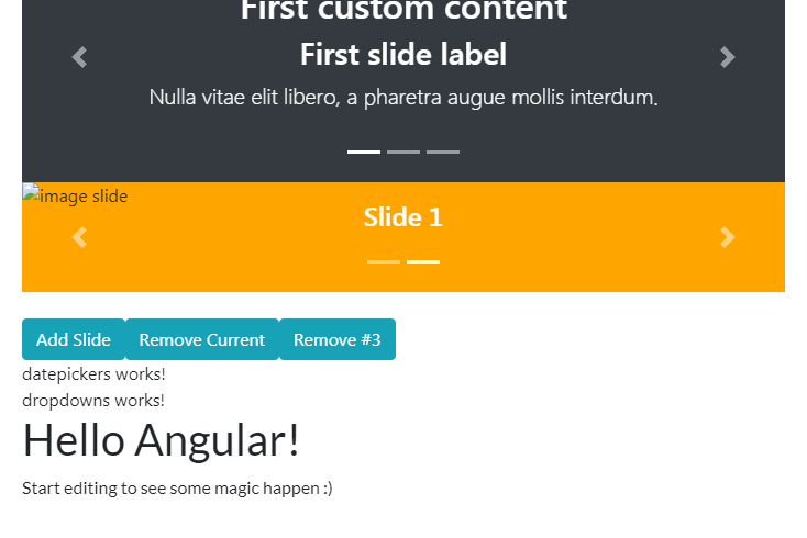
<carousel [(activeSlide)]="activeSlideIndex" >
<slide *ngFor="let slide of slides; let index=index">
<img [src]="slide.image" alt="image slide" style="display: block; width: 100%; height: 100px; background: orange;">
<div class="carousel-caption">
<h4>Slide {{ index }}</h4>
<p>{{ slide.text }}</p>
</div>
</slide>
</carousel>
<br/>
<div>
<button type="button" class="btn btn-info"
(click)="addSlide()">Add Slide
</button>
<button type="button" class="btn btn-info"
(click)="removeSlide()">Remove Current
</button>
<button type="button" class="btn btn-info"
(click)="removeSlide(2)">Remove #3
</button>
</div>
We also need to update the carousels.component.ts file, like so:
1
2
3
4
5
6
7
8
9
10
11
12
13
14
15
16
17
18
19
20
21
22
23
24
25
26
27
import { Component } from '@angular/core';

@Component({
  selector: 'my-carousels',
  templateUrl: './carousels.component.html'
})
export class CarouselsComponent {
  slides: { image: string }[] = [];
  activeSlideIndex = 0;

  constructor() {
    for (let i = 0; i < 4; i++) {
      this.addSlide();
    }
  }

  addSlide(): void {
    this.slides.push({
      image: `assets/images/nature/${this.slides.length % 8 + 1}.jpg`
    });
  }

  removeSlide(index?: number): void {
    const toRemove = index ? index : this.activeSlideIndex;
    this.slides.splice(toRemove, 1);
  }
}
With these updates, our app now has a dynamic carousel, which can have slides added and removed via a button click:
The Github repo for the app at this point is available as Added a dynamic ngx-bootsrtrap carousel.
Note that the images in the slides are not showing. These will be added once the app is completed.
3. Adding datepickers
 Photo by Estée Janssens, @esteejanssens on Unsplash
We’ll continue our journey through ngx-bootstrap components with the datepicker component.
Adding a basic datepicker
Let’s first import the BrowserAnimationsModule and the BsDatepickerModule into our app.module.ts file, as follows:
1
2
import { BrowserAnimationsModule } from '@angular/platform-browser/animations';
import { BsDatepickerModule } from 'ngx-bootstrap/datepicker';
Next, we’ll add it to the list of imported modules, like this:
1
2
3
4
5
6
7
8
  imports:      [
    BrowserModule,
    FormsModule,
    ButtonsModule.forRoot(),
    CarouselModule.forRoot(),
    BrowserAnimationsModule,
    BsDatepickerModule.forRoot()
  ],
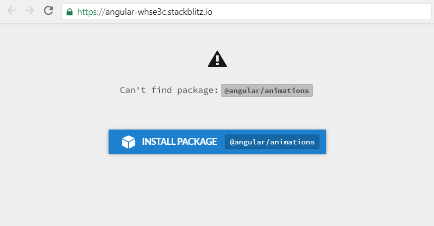
Once we save our changes, Stackblitz will notify us that we need to install the @angular/animations package, so let’s click the “INSTALL PACKAGE” button.
When the installation of the animations package is complete, we’ll navigate to the basic datepicker example link on ngx-bootstrap site.
As the docs say, we need to install another css file from a CDN. We already know how to do that; let’s just import it into our styles.scss file:
@import url(https://stackpath.bootstrapcdn.com/bootstrap/4.3.1/css/bootstrap.min.css);
@import url(https://unpkg.com/ngx-bootstrap/datepicker/bs-datepicker.css);
Next, let’s open the datepicker.component.html file and paste in the example code:
1
2
3
4
5
6
7
8
9
10
11
12
13
14
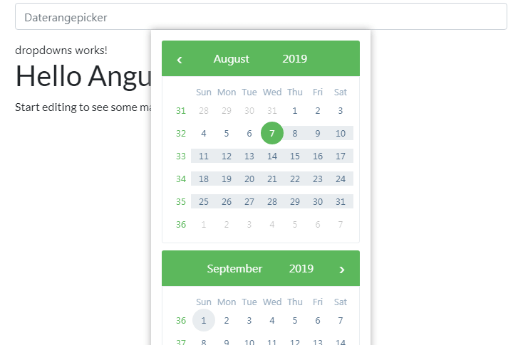
<div class="row">
<div class="col-xs-12 col-12 col-md-4 form-group">
<input type="text"
placeholder="Datepicker"
class="form-control"
bsDatepicker>
</div>
<div class="col-xs-12 col-12 col-md-4 form-group">
<input type="text"
placeholder="Daterangepicker"
class="form-control"
bsDaterangepicker>
</div>
</div>
We don’t have to make any changes to the datepicker.component.ts file.
Our datepicker inputs are now showing!
The commit for this stage is titled Installed a basic ngx-bootstrap datepicker.
There are a bunch of possibilities with a wide variety of datepickers with ngx-bootstrap library. There is an option to disable dates, use min and max ranges, animate your datepickers, theme them with a variety of colors, and so on.
At this stage, after covering so many components and seeing how easy it is to add a datepicker to your app, you should have no issues implementing any datepicker example from the ngx-bootstrap documentation.
4. Adding dropdowns
 Photo by Raphael Koh, @dreamevile on Unsplash
By now, you know the drill:
- Visit the component’s official documentation
- Import the needed modules (in this case, the
BsDropdownModule) into a module you want (in our case,app.module.ts) - Copy-paste the code for the specific example - we’re using the basic example here, but it could have been any other example.
- See the updates in your web browser.
It should be very straightforward to do this on your own by now.
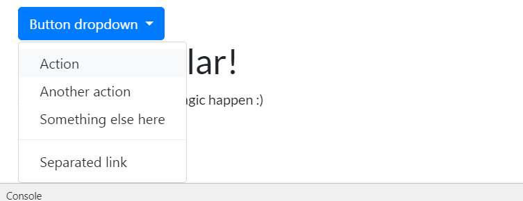
Here’s the screenshot of the completed four steps above, on Stackblitz.
The Github commit can be found under the commit message titled Add button dropdown.
Note: If the dropdown won’t work after all the updates, try restarting webpack, or in this case, refreshing the Stackblitz app.
With this, we wrap up another post in our ngx-bootstrap series of articles.

