Working with ngx-bootstrap modals, pagination, popover, and progress bars in Angular 8
We continue our exploration of ngx-bootstrap library
By: Ajdin Imsirovic 30 August 2019
In this article, we’ll be working with several components in ngx-bootstrap library:
If you’re completely new to ngx-bootstrap layouts, you can check out these two posts:
- How to prototype Bootstrap layouts with Angular 8, part 1
- How to prototype Bootstrap layouts with Angular 8, part 2
To see what we’ll build, have a look at the completed app in Stackblitz.
1. Adding all the components’ folders and files
Let’s add all the folders and files we’ll need for our components. Inside the app folder, let’s add the following structure of new folders and files:
app/
├── modals/
│   ├── modals.component.html
│   └── modals.component.ts
├── pagination/
│   ├── pagination.component.html
│   └── pagination.component.ts
├── popover/
│   ├── popover.component.html
│   └── popover.component.ts
├── progressbar/
│   ├── progressbar.component.html
│   └── progressbar.component.ts
├── ...
We’ve added a total of 4 new folders and 8 new files.
1. Adding the modal component
Here’s the HTML for modal.component.html file:
1
2
3
4
5
6
7
8
9
10
11
12
13
14
15
16
17
18
19
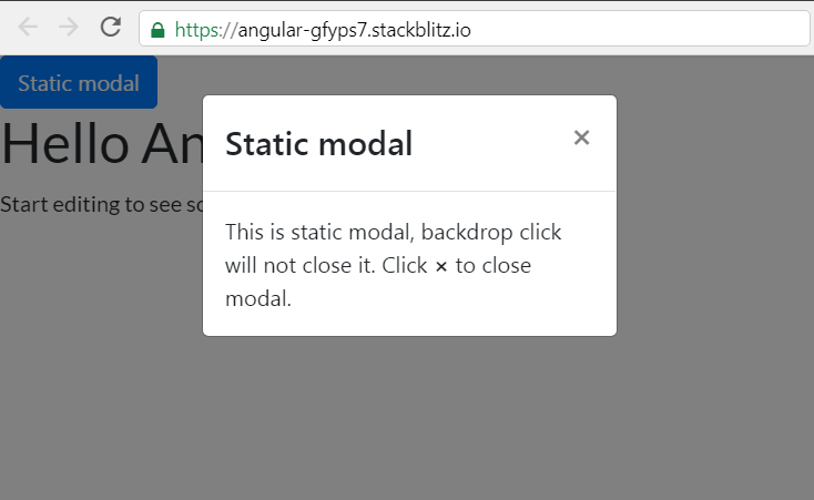
<button type="button" class="btn btn-primary" (click)="staticModal.show()">Static modal</button>
<div class="modal fade" bsModal #staticModal="bs-modal" [config]="{backdrop: 'static'}"
tabindex="-1" role="dialog" aria-labelledby="dialog-static-name">
<div class="modal-dialog modal-sm">
<div class="modal-content">
<div class="modal-header">
<h4 id="dialog-static-name" class="modal-title pull-left">Static modal</h4>
<button type="button" class="close pull-right" aria-label="Close" (click)="staticModal.hide()">
<span aria-hidden="true">×</span>
</button>
</div>
<div class="modal-body">
This is static modal, backdrop click will not close it.
Click <b>×</b> to close modal.
</div>
</div>
</div>
</div>
As for the Typescript files, here’s the code for the modal component’s modal.component.ts file:
1
2
3
4
5
6
7
import { Component } from '@angular/core';

@Component({
  selector: 'demo-modal-static',
  templateUrl: './modals.component.html'
})
export class DemoModalStaticComponent {}
The code above was copied from the Directive examples section of the ngx-bootstrap modal docs.
Before we can import the DemoModalStaticComponent into the App module (app.module.ts), we need to import the ModalModule from ngx-bootstrap/modal, and add it to the App module’s import array, like this:
// ... code skipped for brevity ...
import { ModalModule } from 'ngx-bootstrap/modal';
// ... code skipped for brevity ...
imports: [
  BrowserModule,
  FormsModule,
  ModalModule.forRoot()
],
If you get prompted to install the ngx-bootstrap package at this stage, do so. For adding Bootstrap styles via a CDN to Angular 8 on Stackblitz, refer to this post.
Next, we need to use our new component, in the form of a custom HTML tag, inside app.component.html. At the very top of the App Component’s HTML template file, add this code:
<demo-modal-static></demo-modal-static>
Upon save, we’ll get an error:
Template parse errors:
'demo-modal-static' is not a known element:
1. If 'demo-modal-static' is an Angular component, then verify that it is part of this module.
To resolve the error, we’ll add the demo-modal-static element to AppModule’s declarations array, like this:
DemoModalStaticComponent
Once we’ve made all the above changes, our app will look like this, with a fully-working static modal:
Here’s the Github commit for the app at this stage.
Recipe: Adding a new component to an Angular 8 app
Based on what we’ve seen above, we can deduce a generic recipe for adding a new ngx-bootstrap component to our Angular 8 apps:
Add the component’s class and template files:
- Add a new folder named after the component
- Add 2 files:
<some-name>.component.htmland<some-name>.component.ts - Add the HTML template code, and the Typescript component code (which exports a class
<SomeName>Component)
Optional step:
- Import a module into AppModule, and add it to AppModule’s
importsarray
Import the component into the App module, and use it in the App Component’s template:
- Import the
<SomeName>Componentinto the App module and add it to thedeclarationsarray. - Use the
<some-name>custom HTML tag inside theapp.component.htmltemplate file.
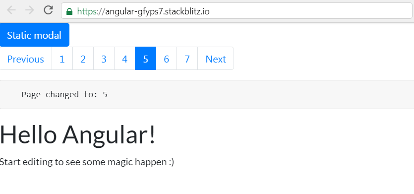
2. Adding the pagination component
In adding the pagination component, we’ll follow the recipe:
- We have already added the
paginationfolder - We’ve already added the class and the template file
- We’ll copy the HTML template and the Typescript class code from this pagination example
- As described under the usage title for pagination component we’ll import the
PaginationModuleinto the App Module, and add it to the App Module’simportsarray. - We’ll import the new
DemoPaginationPageChangedComponentinto the app module, and add it to thedeclarationsarray ofapp.module.ts. - Finally we’ll add
<demo-pagination-page-changed-event>toapp.component.htmltemplate file.
Once we’ve save our changes, here’s our app’s updated view:
The current point in our app is saved in a Github commit titled Added a pagination component.
3. Adding the popover component
We’ll follow our recipe again:
- The folder is already added
- The files are already added
- The files’ contents are copied from this popover example
- The necessary module,
PopoverModule, is imported to AppModule and added to itsimportsarray - The new component titled
DemoPopoverDynamicComponentis imported into AppModule and added to itsdeclarationsarray. - The custom HTML element titled
<demo-popover-dynamic>is added to theapp.component.htmlfile.
Our app now looks like this:

Our Github commit for this improvement is called Added a popover component
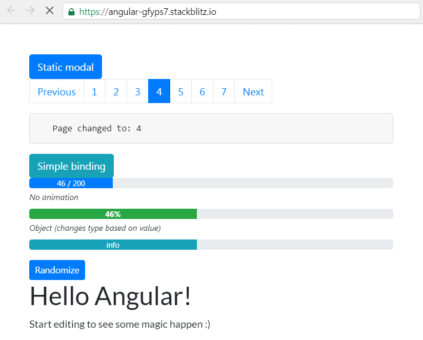
4. Adding the progress bar component
With the progress bar component, we can even further simplify our recipe:
- Add the folder, the
*.component.html, and the*.component.tsfile. - Copy the class and the template code from a progress bar example in the official docs.
- Add the module, and list it in
imports. - Import the new component, and list it in
declarations. - Use the custom HTML element from the new component’s
selectorentry where needed.
Our full app code is available here, and our app now looks like this:
With this, we wrap up our article.

