Rebuild a Bootstrap 4 example with BootstrapVue
This is a practical exercise in using BootstrapVue to rebuild a popular Bootstrap 4 layout
By: Ajdin Imsirovic 08 October 2020
This tutorial builds from tutorial titled Build your first Vue 2 app today, in which we took care of all the pre-requisites of setting up Vue and working with VueBootstrap.
To understand our starting point, here’s a quick overview of what we’ve covered in the previous (above-linked) tutorial:
- installation of VS Code editor and Vue.js
- Basic tweaking of components and displaying of data within Vue components
- Setting up ESLint and including it in our workflow
- Styling with BootstrapVue, adding BootstrapVue navbar
- Adding Vue Chrome extension
While that previous tutorial was chock-full of all kinds of information - after all, setting up any web technology today involves multiple interconnected parts - this tutorial will be a lot more focused and might feel a bit repetitive. This is good, because we’ll get to practice working with various components of the BootstrapVue framework.
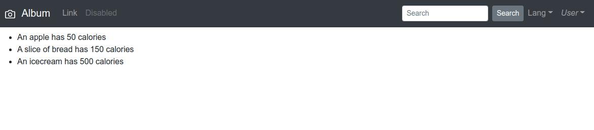
To begin, let’s go back to the calories folder to work on the app of the same name. This is the screen that we had when we finished work in the previous tutorial:
Let’s pick a theme to convert to BootstrapVue, next.
1. Choosing an official Bootstrap 4 example to rebuild
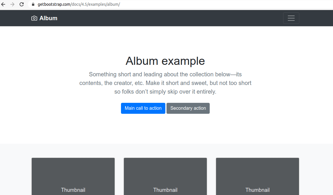
One of the logical examples to pick is the Album example on the official Bootstrap website.
Now that we’ve found the example layout that we want to rebuild with BootstrapVue, we’re going to list the sections that this layout consists of:
- Navbar
- Jumotron with a heading, a description, and two buttons
- A bunch of identical cards (repeating the same component 12 times)
- A footer
A quick analysis of the above layout will show us that it has 3 components: the navbar, the jumbotron, and the card component.
2. Updating the navbar
Since we already have the navbar component, we will just update it a bit, so it more closely resembles the example layout’s navbar.
The concept of contextual colors in Bootstrap has been adopted in BootstrapVue as well.
That’s why, to update the navbar background color, we can use contextual colors, as follows.
Go to line 3 of MainNavigation.vue. This is the line we’ll be updating:
<b-navbar toggleable="lg" type="dark" variant="info">
All we need to do here is update the variant attribute’s value from info to something else. Here are all the contextual colors we can change our variant to:
primarysecondarysuccessdangerwarninginfolightdark
We’ll go with the dark value, so that our line 3 of MainNavigation.vue is now updated to this:
<b-navbar toggleable="lg" type="dark" variant="dark">
After this update, our app now looks like this:
Additionally, we need to update the contents of the <b-navbar-brand> custom element, which is a part of the MainNavigation.vue file. Here’s the updated code:
<b-navbar-brand href="#">
	<svg
		xmlns="http://www.w3.org/2000/svg"
		width="20"
		height="20"
		fill="none"
		stroke="currentColor"
		stroke-linecap="round"
		stroke-linejoin="round"
		stroke-width="2"
		aria-hidden="true"
		class="mr-2"
		viewBox="0 0 24 24"
		focusable="false"
	>
		<path
			d="M23 19a2 2 0 0 1-2 2H3a2 2 0 0 1-2-2V8a2 2 0 0 1 2-2h4l2-3h6l2 3h4a2 2 0 0 1 2 2z"
		></path>
		<circle cx="12" cy="13" r="4"></circle>
	</svg>

	Album
</b-navbar-brand>
As far as styling goes, initial copy-pasted code from the original Album theme on Bootstrap docs, caused a linting error. To fix it, all we had to do was stop the npm run serve command with CTRL + c, and then we ran npm run lint --fix.
After that, to see the update, we simply need to run the npm run serve -- --port 4567 command again.
Here’s the updated screenshot:
3. Adding the toggle button
To add the toggle button, we’ll use the BootstrapVue’s toggle directive.
The toggle directive works hand-in-hand with the <b-collapse> component (additionally, it also works with the <b-sidebar> component, but we’re not interested in it here).
How do we add it and make it all work?
First, we’ll add the button itself:
<b-button>Trigger collapse</b-button>We’ll add this button to the right edge of the navbar, so the update affects the code at the bottom of the main navigation template:
          <b-nav-item-dropdown right>
            <!-- Using 'button-content' slot -->
            <template v-slot:button-content>
              <em>User</em>
            </template>
            <b-dropdown-item href="#">Profile</b-dropdown-item>
            <b-dropdown-item href="#">Sign Out</b-dropdown-item>
          </b-nav-item-dropdown>

          <b-button>Trigger collapse</b-button>

        </b-navbar-nav>
      </b-collapse>
    </b-navbar>
  </div>
</template>
Additionally, let’s improve the newly added <b-button> component by adding a burger menu icon, like this:
<b-button>
	Trigger collapse
	<span class="navbar-toggler-icon"></span>
</b-button>
Note: if you at any time get an error in the console, simply stop the webpack server with CTRL + c and run npm run lint, and then, once all the errors have been resolved, run npm run serve -- --port 4567, as explained in the introductory BootstrapVue article.
Alternatively, we can even remove the words “trigger collapse” so that we’re left only with the burger collapse button.
<b-button>
<span class="navbar-toggler-icon"></span>
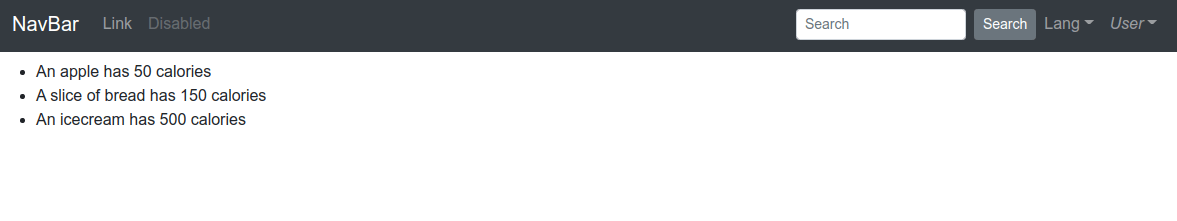
</b-button>The next step would be to remove all the other links in the navbar, so that we’re left only with the Album brand name with an icon to its left, and the toggle button we just added, at the far right.
Here is all the code that we’ll delete:
	<b-nav-item href="#">Link</b-nav-item>
	<b-nav-item href="#" disabled>Disabled</b-nav-item>
</b-navbar-nav>

<!-- Right aligned nav items -->
<b-navbar-nav class="ml-auto">
	<b-nav-form>
	<b-form-input
		size="sm"
		class="mr-sm-2"
		placeholder="Search"
	></b-form-input>
	<b-button size="sm" class="my-2 my-sm-0" type="submit"
		>Search</b-button
	>
	</b-nav-form>

	<b-nav-item-dropdown text="Lang" right>
	<b-dropdown-item href="#">EN</b-dropdown-item>
	<b-dropdown-item href="#">ES</b-dropdown-item>
	<b-dropdown-item href="#">RU</b-dropdown-item>
	<b-dropdown-item href="#">FA</b-dropdown-item>
	</b-nav-item-dropdown>

	<b-nav-item-dropdown right>
	<!-- Using 'button-content' slot -->
	<template v-slot:button-content>
		<em>User</em>
	</template>
	<b-dropdown-item href="#">Profile</b-dropdown-item>
	<b-dropdown-item href="#">Sign Out</b-dropdown-item>
	</b-nav-item-dropdown>
… and here’s all the code that’s left after all these changes:
<template>
  <div>
    <b-navbar toggleable="lg" type="dark" variant="dark">
      <b-navbar-brand href="#">
        ...
      </b-navbar-brand>

      <b-navbar-toggle target="nav-collapse"></b-navbar-toggle>

      <b-collapse id="nav-collapse" is-nav>
        <b-navbar-nav>

          <b-button>
		  	Trigger collapse
            <span class="navbar-toggler-icon"></span>
          </b-button>
        </b-navbar-nav>
      </b-collapse>
    </b-navbar>
  </div>
</template>

<script>
export default {
name: 'MainNavigation',
};
</script>
The most important part of the above code is this section right here:
<b-navbar-toggle target="nav-collapse"></b-navbar-toggle>

<b-collapse id="nav-collapse" is-nav>
<b-navbar-nav>

	<b-button>
		Trigger collapse
		<span class="navbar-toggler-icon"></span>
	</b-button>
</b-navbar-nav>
</b-collapse>
