Building Bootstrap 4 layouts, part 1: Containers and contextual colors
We're having a look at the Bootstrap's container class and its concept of contextual colors
By: Ajdin Imsirovic 28 September 2019
Welcome to article series titled: Building Bootstrap 4 Layouts. This is the first of 20 articles in this article series.
 Photo by
Victoire Jncheray, @victoire_jonch on Unsplash
Photo by
Victoire Jncheray, @victoire_jonch on Unsplash
The structure of every HTML page
At the very root level of every HTML page, there are just 2 elements:
- the doctype declaration
- the html tag
In code, it looks like this:
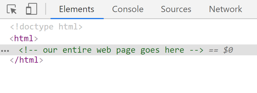
<!doctype html>
<html>
    <!-- our entire web page goes here -->
</html>
The line that’s wrapped inside the <html> tag is an HTML comment. An HTML comment is a piece of code that the browser will simply skip when it renders a web page on the screen. However, if you look inside the source code, you’ll still see the comment:
Let’s now replace this comment with some additional tags. These tags are also required for a properly-structured HTML page:
<html>
    <head>
        <!-- meta information goes here -->
    </head>
    <body>
        <!-- body information goes here -->
    </body>
</html>
The purpose of the <head> tag that we see above, is to hold some meta information. What is that meta information? Among other things, the meta information contains links to outside resources - such as the Bootstrap 4 stylesheet.
Adding Bootstrap 4 link meta information
To link to the Bootstrap 4 stylesheet (or to any stylesheet for that matter), we need to use the HTML <link> tag.
Every link tag has at least a couple of HTML attributes, most notably the rel and the href attributes:
<link rel="stylesheet" href="https://some-web-address-which-has-the-css-file">
The link HTML tag is an example of a self-closing HTML tag. This means that there’s no closing </link> tag.
There are a few other HTML attributes that sometimes go into the link tag. We’ll see them soon, when we copy-paste the Bootstrap link tag from the official Boostrap docs.
This is the copied code:
<link rel="stylesheet"
href="https://stackpath.bootstrapcdn.com/bootstrap/4.3.1/css/bootstrap.min.css"
integrity="sha384-ggOyR0iXCbMQv3Xipma34MD+dH/1fQ784/j6cY/iJTQUOhcWr7x9JvoRxT2MZw1T"
crossorigin="anonymous">
As it can be seen above, besides the rel attribute, which describes the type of the resource the link element links to, we also see the href attribute, which points to a minified version of all the Bootstrap framework’s styles.
If we directly open the link in the href attribute, we’ll see this:
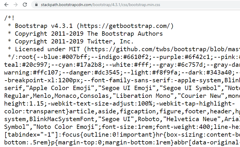
Alright, so when we open the minified Bootstrap 4 code in the link tag’s href attribute, it shows in the browser as a bunch of CSS code with spaces removed.
Basically, minified CSS code is just plain old CSS with whitespace removed. This is done so that the CSS file is made smaller, and thus faster to be downloaded from the server to a browser. This improves user experience and keeps server costs down (on websites with lots of traffic).
Here’s our updated page:
<!doctype html>
<html>
    <head>
        <link rel="stylesheet" href="https://stackpath.bootstrapcdn.com/bootstrap/4.3.1/css/bootstrap.min.css" integrity="sha384-ggOyR0iXCbMQv3Xipma34MD+dH/1fQ784/j6cY/iJTQUOhcWr7x9JvoRxT2MZw1T" crossorigin="anonymous">
    </head>
    <body>

    </body>
</html>
We could be adding some more meta information inside the head tag, but this is it for now.
We’ll be adding more complete meta information in the next article in this series.
At this point however, let’s focus on building the first layout.
We’ll start off by just adding some background color.
Adding background color to an HTML element in Bootstrap 4
Let’s update our <body> tag so that it looks like this:
<body class="bg-warning">
    Our layout goes here.
</body>
Here’s a screenshot of the updated page in the browser:
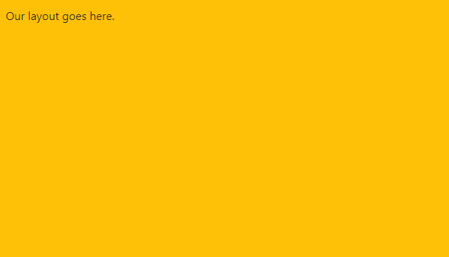
The CSS class of bg-warning is an example of Bootstrap’s so-called contextual colors.
There are other colors in Bootstrap, besides the warning contextual color. For example, in the default Bootstrap styles, the red color is the danger contextual color.
Here’s the full list:
- primary, e.g
bg-primary, - secondary, e.g.
bg-secondary, - success, e.g.
bg-success, - danger, e.g
bg-danger, - warning, e.g
bg-warning, - info, e.g
bg-info, - light, e.g
bg-light, - dark, e.g
bg-dark
Contextual colors are used throughout Bootstrap. You can find them used in text classes too, or to style borders.
For example, to give a nice red border to a div, we simply do this:
<div class="border border-danger">
    ...
</div>
Note that above, we’re using two CSS classes to style that border. To understand why this is happening, let’s look at the CSS declaration for the border class first:
.border {
    border: 1px solid #dee2e6!important;
}
The hex color of #dee2e6 is a light shade of gray, so if we just used the border class on our div, we’d get a light, gray-colored border around the div.
However, when we additionally use the border-danger class on that div, we’re adding the following styles:
.border-danger {
    border-color: #dc3545!important;
}
That’s why we need two classes for contextual-colored borders in Bootstrap 4.
If you’d rather like to use, for example, some red-colored text inside a div, you could write code like this:
<div class="text-danger">
    ...
</div>
The text-danger class has the following CSS:
.text-danger {
    color: #dc3545!important;
}
Ok, so that’s it for contextual colors in Bootstrap 4. We’ve learned about contextual colors, and we’ve seen how to use them on backgrounds, borders, and text.
Before we wrap up this section, let’s just mention a handy CSS class that helps us make our text huge: the display-* class. Note that the * here is actually a wildcard: it stands for numbers 1 through 4, so the actual classes are:
display-1(the largest huge text)display-2display-3display-4(this is the smallest large text of all four classes)
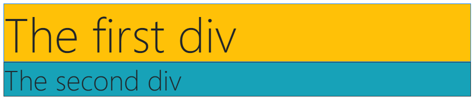
Now we can update our example layout like this:
<!doctype html>
<html>
    <head>
        <link
        rel="stylesheet"
        href="https://stackpath.bootstrapcdn.com/bootstrap/4.3.1/css/bootstrap.min.css"
        integrity="sha384-ggOyR0iXCbMQv3Xipma34MD+dH/1fQ784/j6cY/iJTQUOhcWr7x9JvoRxT2MZw1T"
        crossorigin="anonymous">
    </head>
    <body>
        <div class="bg-warning border border-primary display-1">
            The first div
        </div>
        <div class="bg-info border border-dark display-4">
            The second div
        </div>
    </body>
</html>
Now that we’re aware of how we can easily change background colors, border colors, text colors, and add very large text in Bootstrap, let’s learn about another important concept: containers.
Containers in Bootstrap 4
In Bootstrap, there’s this concept of a container.
It comes in 2 flavors: the first one is container, which has a fixed maximum width of 1170 pixels, and the second one is container-fluid, which spans the entire available width of the browser window.
By adding the value of container to an HTML tag’s class attribute, it’s pre-defined CSS code affects how that HTML tag looks on the screen.
Let’s update our first layout to see this in action.
<!doctype html>
<html>
<head>
<link
rel="stylesheet"
href="https://stackpath.bootstrapcdn.com/bootstrap/4.3.1/css/bootstrap.min.css"
integrity="sha384-ggOyR0iXCbMQv3Xipma34MD+dH/1fQ784/j6cY/iJTQUOhcWr7x9JvoRxT2MZw1T"
crossorigin="anonymous">
</head>
<body>
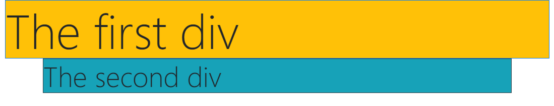
<div class="container-fluid">
<div class="bg-warning border border-primary display-1">
The first div
</div>
</div>
<div class="container">
<div class="bg-info border border-dark display-4">
The second div
</div>
</div>
</body>
</html>
Here’s the screenshot of the updated layout:
To see this layout live visit this codelab.
Completing our first Bootstrap 4 layout
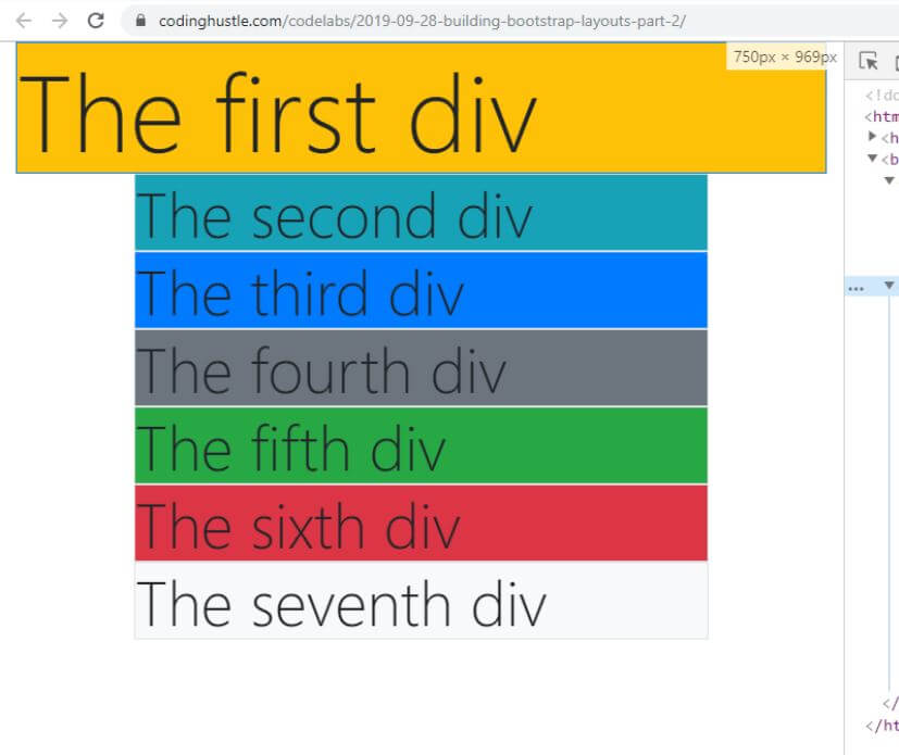
To complete our first Bootstrap 4 layout, all we have to do is add a few more divs with some contextual classes thrown in.
Here’s the code: Let’s update our first layout to see this in action.
<!doctype html>
<html>
<head>
<link
rel="stylesheet"
href="https://stackpath.bootstrapcdn.com/bootstrap/4.3.1/css/bootstrap.min.css"
integrity="sha384-ggOyR0iXCbMQv3Xipma34MD+dH/1fQ784/j6cY/iJTQUOhcWr7x9JvoRxT2MZw1T"
crossorigin="anonymous">
</head>
<body>
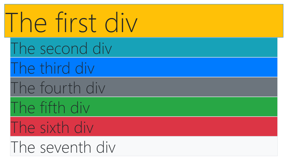
<div class="container-fluid">
<div class="bg-warning border border-primary display-1">
The first div
</div>
</div>
<div class="container display-4">
<div class="bg-info border">
The second div
</div>
<div class="bg-primary border">
The third div
</div>
<div class="bg-secondary border">
The fourth div
</div>
<div class="bg-success border">
The fifth div
</div>
<div class="bg-danger border">
The sixth div
</div>
<div class="bg-light border">
The seventh div
</div>
</div>
</body>
</html>
To see this layout live visit this codelab.
Here’s the screenshot of the updated layout:
The difference between container and container-fluid
To really appreciate the difference between container and container-fluid CSS classes, we need to mention another important feature of Bootstrap: its responsive breakpoints.
In another article series, HTML and CSS basics, we covered breakpoints as one of the important foundations of responsive web design.
TL; DR: a breakpoint is a specific resolution at which the layout responds to a change in resolution.
In other words, a breakpoint is defined by the CSS @media declaration - also known as a media query.
For example, let’s say we have a media query that looks like this:
@media(min-width: 576px){
    /* ...some CSS code... */
}
…then we can say that such a CSS layout has a breakpoint at 576 pixel width.
In Bootstrap, there actually is a breakpoint of 576 pixels. It’s the small breakpoint.
All together, there are actually 5 responsive breakpoints in Bootstrap 4.
These breakpoints are explained in detail at the above link, but here we can just give a quick overview, and list them out:
xsbreakpoint (no media query, since this breakpoint is the default)smbreakpoint for small screens (mobile)mdbreakpoint for tabletslgbreakpoint for smaller desktopsxlbreakpoint for larger desktops.
Now that we know about breakpoints in Bootstrap, we can understand the difference between the container-fluid and the container class in Bootstrap 4, through the lens of these breakpoints.
The container-fluid and container class at xs resolutions
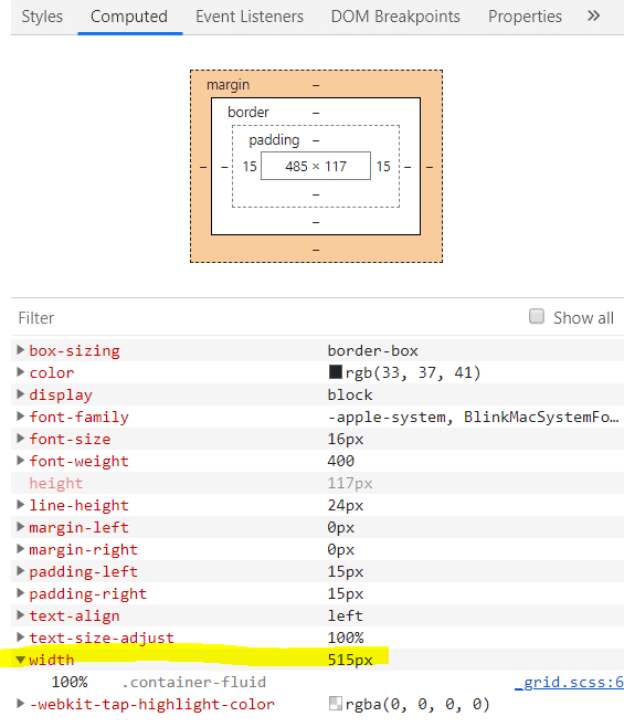
As we’ve seen above, at screen resolutions with widths under 576 pixels, there’s no difference between the container and container-fluid CSS class.
They both behave exactly the same, and stretch the full width of the screen, as seen in the following screenshot.
Note the Chrome developer tools screen measure in pixels in the above screenshot: it reads “515px X 969px”. Obviously, at a random width of under 576 pixels - 515 pixels to be precise - the first div and all the other divs have exactly the same widths.
The screenshot is from the example layout we built in this article, so we know that the first div has the Bootstrap 4 container-fluid class applied to it, while all the others have the container class applied - however, at this resolution, they both look exactly the same.
Why is that the case?
In Chrome developer tools, let’s look at computed styles for the div with the class of container-fluid:
Let’s now look at computed styles for the div with the class of container:
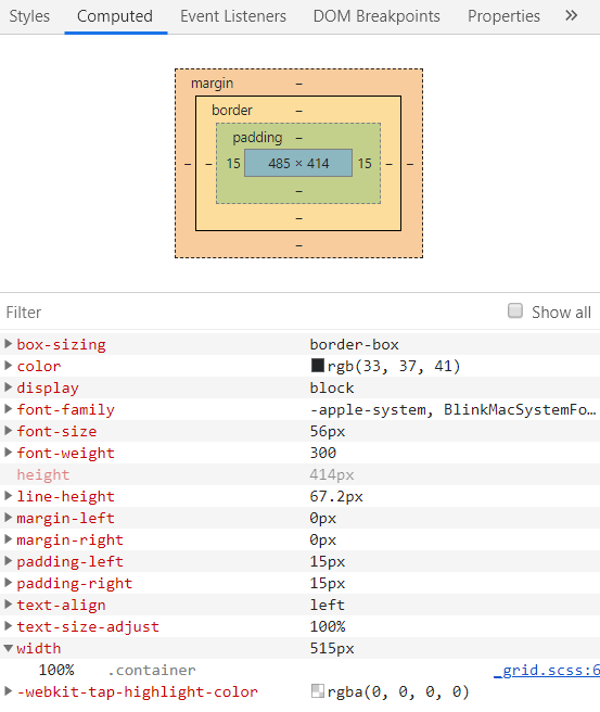
Computed properties in Chrome developer tools are just the properties that the browser calculates based on all the CSS styles that apply on a certain HTML element. Put differently, computed properties show us the result of browser’s CSS specificity calculations on a given element.
The container-fluid and container class at sm resolutions
While we saw that both the container-fluid and the container CSS classes end up with their width set to 100% of the parent div, meaning their widths are exactly the same at xs resolutions, things change as soon as we hit any width larger than 576 pixels.
Let’s see a screenshot of such a scenario, at a random 740 pixels, which are still inside the sm resolution.
This screenshot shows us the main distinction between the container and container-fluid CSS classes: it’s their width on all the Bootstrap resolutions, besides the xs resolution.
In other words, while the container-fluid CSS class will always be 100% wide in Bootstrap 4, the container class will have lots of breathing space on the side on all screen sizes except xs - that is, on sm, md, lg, and xl resolutions.
Conclusion
In this article, we’ve seen how to get started building layouts in Bootstrap 4, using container classes, contextual color classes, and some textual utility classes.
The layout that we’ve built might not be anything to write home about, but in my humble opinion, it’s the best way to start building some excellent layouts in the Bootstrap 4 framework.
We’ve also learned exactly why there are two kinds of container classes in Bootstrap.
In the next article in this series, we’ll expand on this good foundation further, by building a simple layout using Bootstrap’s column grid.

