Beginner-level tips and tricks in React
In this tutorial we'll get acquainted with various handy beginner-level tips and tricks in React
By: Ajdin Imsirovic 25 January 2022
In this chapter, we’ll cover some simple begineer-level tips and tricks. We had to leave them out from previous chapters for simplicity’s sake, but now there are enough of these tidbits of knowledge that we can bundle them up in a single chapter.
We’ll cover the following topics here:
- Code organization
- Passing objects as props
- Default props
- Using ternary statements in our components
- Using fragments
- Handling events
- Lifecycle methods in class components
In other words, we’ll demo one of the ways to improve the control over our app’s organization, by grouping all the components into a single folder, named ./components.
Table of contents
- Code organization: Reorganizing our reactbootstrap1 app
- Passing objects as props
- Default props
- Using ternary statements in our components
- Using fragments
- Render styles if a prop is truthy
- Handling events
- Simplifying a complex component (without props)
- Simplifying a complex component (with props)
- Updating the Footer to accept a copyright prop
- Extracting the Copyright component from the Footer component
- Don’t display a component if a prop is not passed in the parent
- Conditionally returning a different string than the one passed in from a prop
- Render prop if truthy using the AND operator
- Conclusion
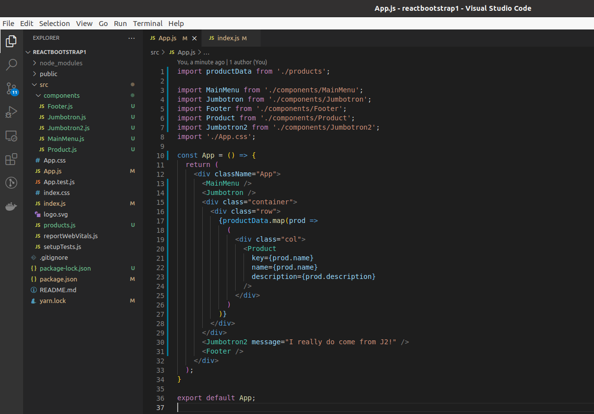
Code organization: Reorganizing our reactbootstrap1 app
Let’s look at the current state of things in our app.
Now, we’ll add a new sub-folder inside the ./src folder, and we’ll name it /components.
Next, we’ll move all the components into this nested sub-folder, namely, the following files:
Footer.jsJumbotron.jsJumbotron2.jsMainMenu.jsProduct.js
We’ll also need to update imports in App.js, for example:
import Footer from './components/Footer';
Here’s a screenshot of our VS Code showing the updates to App.js and to our file structure.
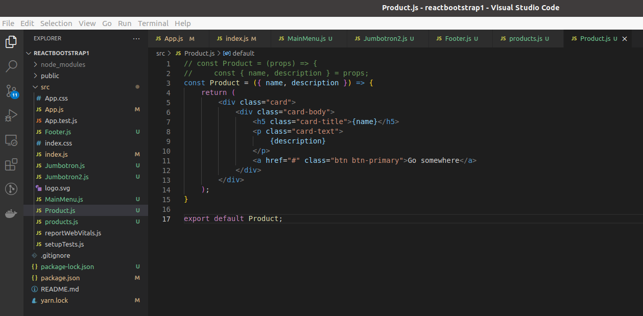
Passing objects as props
Let’s have a reminder of props destructuring (used in Product.js):
1
2
3
4
5
6
7
8
9
10
11
12
13
14
15
const Product = ({ name, description }) => {
    return (
        <div className="card">
            <div className="card-body">
                <h5 className="card-title">{name}</h5>
                <p className="card-text">
                    {description}
                </p>
                <a href="#" className="btn btn-primary">Go somewhere</a>
            </div>
        </div>
    );
}

export default Product;
The name and description values of the props object are destructured right in the parameter passed to the Product function. This allows us to then use {name} and {description} instead of a more complex approach, namely this:
1
2
3
4
5
6
7
8
9
10
11
12
13
14
15
const Product = (props) => {
    return (
        <div className="card">
            <div className="card-body">
                <h5 className="card-title">{props.name}</h5>
                <p className="card-text">
                    {props.description}
                </p>
                <a href="#" className="btn btn-primary">Go somewhere</a>
            </div>
        </div>
    );
}

export default Product;
Regardless of whether we’ve used the props object or direct props destructuring in our components, when we’re passing values via props in parent components, everything stays the same. With the Product.js component, in App.js, that looks as follows:
1
2
3
4
5
<Product
    key={prod.name}
    name={prod.name}
    description={prod.description}
/>
But what happens if we want to pass objects as prop values in parent components? We’d do it like this:
<Product
    {{ key: 1, name: "T-shirt", description: "Cool t-shirt" }}
/>
So, we’re using regular curly braces, and then another, inner set of curly braces for our object.
Default props
There are situations where we’d like our props to have some default values. This is achieved using defaultProps, as follows.
1
2
3
4
5
6
7
8
9
10
11
12
13
14
15
16
17
const Product = ({name, description}) => {
    return (
        <div className="card">
            <div className="card-body">
                <h5 className="card-title">{name}</h5>
                <p className="card-text">
                    {description}
                </p>
                <a href="#" className="btn btn-primary">{cta}</a>
            </div>
        </div>
    )
}
Product.defaultProps = {
    cta = "Go somewhere";
}
export default Product;
Above, we’re defining the cta (“call-to-action”) prop to be used as the button message.
Nothing changes in App.js:
1
2
3
4
5
<Product
    key={prod.name}
    name={prod.name}
    description={prod.description}
/>
The result is that each of our buttons will now have a dynamic cta value.
Using ternary statements in our components
Continuing from the previous example, let’s make our cta variable even more dynamic, through the use of a ternary statement.
I’ll reuse a recipe from my book A Better Way to Learn JavaScript: Useful Snippets (this is the third book in my book series on JavaScript).
Let’s first examine the recipe on its own:
const randomBool = Math.random() > 0.5 ? true : false;
The above code snippet randomly returns either a true or false Boolean value.
We’ll now use this ternary logic to make our cta more dynamic.
Back in Product.js, here’s the updated code:
1
2
3
4
5
6
7
8
9
10
11
12
13
14
15
const Product = ({name, description}) => {
    let cta = (Math.random() > 0.5) ? "Go somewhere" : "Go anywhere";
    return (
        <div className="card">
            <div className="card-body">
                <h5 className="card-title">{name}</h5>
                <p className="card-text">
                    {description}
                </p>
                <a href="#" className="btn btn-primary">{cta}</a>
            </div>
        </div>
    )
}
export default Product;
On the first attempt at bundling the app using the above component, the buttons showed the following output.

Using fragments
We’ll stick with our ternary setup and make it even more interesting with fragments.
Here’s how it works: Instead of putting out a short string of text in our ternary, we’ll add an entire structure, surrounded by parentheses.
1
2
3
4
5
6
7
8
9
10
11
12
13
14
15
16
17
18
19
20
21
22
23
24
25
26
27
28
29
30
31
32
33
import React from "react";

const Product = ({name, description}) => {
    return (Math.random() > 0.5)
    ? (
        <React.Fragment>
            <div className="card">
                <div className="card-body">
                    <h5 className="card-title">{name}</h5>
                    <p className="card-text">
                        {description}
                    </p>
                    <a href="#" className="btn btn-secondary">Go somewhere</a>
                </div>
            </div>
        </React.Fragment>
    )
    : (
        <React.Fragment>
            <div className="card">
                <div className="card-body">
                    <h5 className="card-title">{name}</h5>
                    <p className="card-text">
                        {description}
                    </p>
                    <a href="#" className="btn btn-primary">Go anywhere</a>
                </div>
            </div>
        </React.Fragment>
    )
}

export default Product;
Note that we need to wrap everything in <React.Fragment> to make this work.
Here’s a result.

There is even shorthand syntax for <React.Fragment>, and it looks like this:
1
2
3
4
5
6
7
8
9
10
11
12
13
14
15
16
17
18
19
20
21
22
23
24
25
26
27
28
29
30
31
32
33
import React from "react";

const Product = ({name, description}) => {
    return (Math.random() > 0.5)
    ? (
        <>
            <div className="card">
                <div className="card-body">
                    <h5 className="card-title">{name}</h5>
                    <p className="card-text">
                        {description}
                    </p>
                    <a href="#" className="btn btn-secondary">Go somewhere</a>
                </div>
            </div>
        </>
    )
    : (
        <>
            <div className="card">
                <div className="card-body">
                    <h5 className="card-title">{name}</h5>
                    <p className="card-text">
                        {description}
                    </p>
                    <a href="#" className="btn btn-primary">Go anywhere</a>
                </div>
            </div>
        </>
    )
}

export default Product;
The effect is the same, but we do need to type less, and our code looks a bit tidier.
Render styles if a prop is truthy
Another useful approach is to render styles based on whether a prop is truthy.
For this, we’ll re-use a piece of code we’ve had in a previous section:
1
2
3
4
5
6
7
8
9
10
11
12
13
14
15
const Product = (props) => {
    return (
        <div className="card">
            <div className="card-body">
                <h5 className="card-title" style="{{display: props.name ? "block" : "none"}}>{props.name}</h5>
                <p className="card-text">
                    {props.description}
                </p>
                <a href="#" className="btn btn-primary">Go somewhere</a>
            </div>
        </div>
    );
}

export default Product;
In the code above, if the props.name prop exists, the attached style will be display: block. Otherwise, it will be display: none. Effectively, this is the same as if we were using the && operator approach.
Handling events
Let’s continue working on our reactbootstrap1 app to deal with a simple event.
We’ll add an event handling functionality which will take care of the Jumbotron component’s button. Specifically, any click events happening on that button.
We’ll achieve that using React hooks. Using hooks, we can work with state and deal with events.
So, let’s revisit the Jumbotron.js file, and start updating it by adding an import of useState:
1
2
3
4
5
6
7
import { FaAndroid } from "react-icons/fa";
import {useState} from 'react';

const Jumbotron = () => {
.
.
.
Note: The three dots are replacing the rest of the existing code in the Jumbotron.js component.
We imported the useState hook so that we can work with state in our component. In turn, this means that we need to setup a way to track state in our component. We’ll do that by adding a state-tracking variable. The following “weird-looking” line will be the first line at the very top of the Jumbotron function:
let [btnToggle, setBtnToggle] = useState(false);
The first value (btnToggle) is the name of the variable. The second value (setBtnToggle) is the variable modifier - something to react to state changes.
So, what’s happening above is: we’re utilizing the useState hook to set the value of the btnToggle variable to false, and to deal with events using setBtnToggle.
So now, let’s use fragments again, like this:
1
2
3
4
5
6
7
8
9
10
11
12
13
14
15
16
17
18
19
20
21
22
23
24
25
26
27
28
29
30
31
import { FaAndroid } from "react-icons/fa";
import {useState} from 'react';

const Jumbotron = () => {
    let [btnToggle, setBtnToggle] = useState(false);
    return (
        <div className="p-5 mb-4 bg-light rounded-3">
            <div className="container-fluid py-5">
                <h1 className="display-5 fw-bold">
                    <FaAndroid />
                    Custom jumbotron
                </h1>
                {
                    btnToggle &&
                    <p className="col-md-8 fs-4 m-auto">
                        Using a series of utilities, you can create
                        this jumbotron, just like the one in previous
                        versions of Bootstrap. Check out the examples
                        below for how you can remix and restyle it
                        to your liking.
                    </p>
                }
                <button className="btn btn-primary btn-lg" type="button">
                    Details
                </button>
            </div>
        </div>
    );
}

export default Jumbotron;
So, what we’re doing above is, we’re surrouding our fragment in {} brackets. Contrast that with the <> delimiters: the difference is that the btnToggle variable value will be processed when using { and } fragment delimiters, while with <> the value will be printed as plain text on the screen, including the && operator and the rest of the code.
Now, to make our currently hidden paragraph toggle, we’ll add an event listener to our button, as follows:
1
2
3
4
5
6
7
<button
    onClick={ () => {} }
    className="btn btn-primary btn-lg"
    type="button"
>
    Details
</button>
There’s a few of things to unpack in the above code:
- first, the
onClickattribute is assigned to the result of running an expression (everything between the opening and closing{}braces) - second, we’re using the
onClickwith the capitalC, which is React’s way to implement the built-inonclickevent handling HTML attribute - third, we’re passing, in between the
{and}curly braces, the arrow function to be ran (obviously, currently, the arrow function is empty)
The arrow function that’s invoked in the onClick attribute will be very simple:
onClick={ () => {setBtnToggle(!btnToggle)} }
That’s all there is to it. Now the click on the button in the jumbotron component will toggle the Boolean value of our state tracking variable, and that will consequently show or hide the paragraph above that button. Here’s the full code of Jumbotron.js:
1
2
3
4
5
6
7
8
9
10
11
12
13
14
15
16
17
18
19
20
21
22
23
24
25
26
27
28
29
30
31
32
33
34
import { FaAndroid } from "react-icons/fa";
import {useState} from 'react';

const Jumbotron = () => {
    let [btnToggle, setBtnToggle] = useState(false);
    return (
        <div className="p-5 mb-4 bg-light rounded-3">
            <div className="container-fluid py-5">
                <h1 className="display-5 fw-bold">
                    <FaAndroid />
                    Custom jumbotron
                </h1>
                {
                    btnToggle &&
                    <p className="col-md-8 fs-4 m-auto">
                        Using a series of utilities, you can create this
                        jumbotron, just like the one in previous versions of
                        Bootstrap. Check out the examples below for how you
                        can remix and restyle it to your liking.
                    </p>
                }
                <button
                    onClick={ () => {setBtnToggle(!btnToggle)} }
                    className="btn btn-primary btn-lg"
                    type="button"
                >
                    Details
                </button>
            </div>
        </div>
    );
}

export default Jumbotron;
We’re now handling button clicks in our React app.
Note that React uses these custom events such as onClick, onChange, onSubmit, etc. These are all known as Synthetic Events.
Simplifying a complex component (without props)
Let’s revisit the reactbootstrap1 app’s Footer component:
1
2
3
4
5
6
7
8
9
10
11
12
13
14
15
16
17
18
19
20
21
22
23
24
25
26
27
28
const Footer = () => {
    return (
      <div className="container">
        <footer className="py-3 my-4">
          <ul className="nav justify-content-center border-bottom pb-3 mb-3">
            <li className="nav-item">
                <a href="#" className="nav-link px-2 text-muted">
                Home</a></li>
            <li className="nav-item">
                <a href="#" className="nav-link px-2 text-muted">
                Features</a></li>
            <li className="nav-item">
                <a href="#" className="nav-link px-2 text-muted">
                Pricing</a></li>
            <li className="nav-item">
                <a href="#" className="nav-link px-2 text-muted">
                FAQs</a></li>
            <li className="nav-item">
                <a href="#" className="nav-link px-2 text-muted">
                About</a></li>
          </ul>
          <p className="text-center text-muted">© 2021 Company, Inc</p>
        </footer>
      </div>
    );
  }

export default Footer;
This component is relatively straightforward, but perhaps still complex enough so that we can simplify it and practice how to split a single component into a number of simpler components.
First, let’s think about the structure of the Footer component. It has:
- A footer menu
- A copyright notification
Let’s split these two sections into separate components.
We’ll extract the footer menu into a new component: we’ll save it as a brand new file, named SecondaryMenu.js.
1
2
3
4
5
6
7
8
9
10
11
12
13
14
15
16
17
18
19
20
21
22
23
24
25
26
27
28
29
30
31
32
33
const SecondaryMenu = () => {
    return (
        <ul className="nav justify-content-center border-bottom pb-3 mb-3">
            <li className="nav-item">
                <a href="#" className="nav-link px-2 text-muted">
                    Home
                </a>
            </li>
            <li className="nav-item">
                <a href="#" className="nav-link px-2 text-muted">
                    Features
                </a>
            </li>
            <li className="nav-item">
                <a href="#" className="nav-link px-2 text-muted">
                    Pricing
                </a>
            </li>
            <li className="nav-item">
                <a href="#" className="nav-link px-2 text-muted">
                    FAQs
                </a>
            </li>
            <li className="nav-item">
                <a href="#" className="nav-link px-2 text-muted">
                    About
                </a>
            </li>
        </ul>
    );
}

export default SecondaryMenu;
Now we’ll include it inside the Footer.js component:
1
2
3
4
5
6
7
8
9
10
11
12
13
14
import SecondaryMenu from './SecondaryMenu';

const Footer = () => {
  return (
    <div className="container">
      <footer className="py-3 my-4">
        <SecondaryMenu />
        <p className="text-center text-muted">© 2021 Company, Inc</p>
      </footer>
    </div>
  );
}

export default Footer;
Simplifying a complex component (with props)
Things are often going to be a bit more complex than what we had in the previous example.
We’ll use the fact that we still haven’t extracted the Copyright component from the Footer component, and thus we can first update the existing Footer component so that it accepts prop data to be passed into it from the app component.
Thus, our plan is as follows:
- First, we’ll update the Footer to accept a copyright prop.
- Second, we’ll extract the Copyright component from the Footer component, then add it and demo how that affects the prop being passed in.
Updating the Footer to accept a copyright prop
Let’s start with the App component, and update it to this (on line 31):
<Footer copyright="(c) 2021 THE Company, Inc" />
We’ve updated the company name from Company to THE Company - this is a simple reassurance that we’ve indeed changed something in our code - which will end up in the browser and thus confirm our updates.
The rest of the App component is unchanged.
Next, let’s open the Footer component, and update it to this:
1
2
3
4
5
6
7
8
9
10
11
12
13
14
...

const Footer = (props) => {
  .
  .
  .
  .
        <p className="text-center text-muted">{props.copyright}</p>
  .
  .
  .
}

...
Note: The dots are “pseudo-code” replacement for the actual, unchanged code - this allows us to highlight the actual changes in the above snippet.
Thus, the only thing we’ve changed in our code is passing the props object to the Footer function, and using the {props.copyright} in the p element in JSX syntax.
Extracting the Copyright component from the Footer component
Now we’re ready to extract another component from our Footer.
Let’s make another component and name it Copyright.js:
1
2
3
4
5
const Copyright = (props) => {
  return <p className="text-center text-muted">{props.copyright}</p>;
};

export default Copyright;
Additionally, let’s update the Footer.js component:
1
2
3
4
5
6
7
8
9
10
11
12
13
14
15
16
import SecondaryMenu from './SecondaryMenu';
import Copyright from './Copyright';

const Footer = (props) => {
  return (
    <div className="container">
      <footer className="py-3 my-4">
        <SecondaryMenu />
        {/* <p className="text-center text-muted">{props.copyright}</p> */}
        <Copyright copyright={props.copyright} />
      </footer>
    </div>
  );
}

export default Footer;
Notice the funny looking line of code above the Copyright component:
{/* <p className="text-center text-muted">{props.copyright}</p> */}
That’s a JSX comment.
Anyway, what we did in the Footer component is: we’ve included the Copyright component, replacing the original line of code that, before the update, read:
<p className="text-center text-muted">{props.copyright}</p>
Passing props (i.e state) like this can get messy. That’s why using Redux to manage state is so popular. But we won’t get into it just yet.
Don’t display a component if a prop is not passed in the parent
Here’s another important beginner-level tip.
Let’s say that for some reason our Footer component doesn’t pass the copyright prop - someting that our Copyright component expects.
In other words, let’s say that on line 10 of our Footer component, we have this:
<Copyright />
… instead of this:
<Copyright copyright={props.copyright} />
How do we make our app more “sturdy”, meaning: instead of throwing an error, the app still works, but it simply doesn’t show the Copyright component.
Put differently, under a certain condition, we want to not render anything from our Copyright component, and we also want to keep our app running rather than throwing an error.
We’ll do it by returning null in our Copyright.js component, if the conditions are right:
1
2
3
4
5
6
const Copyright = (props) => {
  if (!props.copyright) return null;
  return <p className="text-center text-muted">{props.copyright}</p>;
};

export default Copyright;
Now, even if we don’t pass the previously compulsory prop inside the Footer component:
1
2
3
4
5
6
7
8
9
10
11
12
13
14
15
16
17
import SecondaryMenu from './SecondaryMenu';
import Copyright from './Copyright';

const Footer = (props) => {
  return (
    <div className="container">
      <footer className="py-3 my-4">
        <SecondaryMenu />
        {/* <p className="text-center text-muted">{props.copyright}</p> */}
        {/* <Copyright copyright={props.copyright} /> */}
        <Copyright />
      </footer>
    </div>
  );
}

export default Footer;
… our app will not throw an error, but rather continue working (only without the copyright component showing in the browser).
All we had to do was add:
if (!props.copyright) return null;
Conditionally returning a different string than the one passed in from a prop
Let’s continue improving the Copyright component by adding another piece of logic.
This time we’re interested in the copyright prop’s text length. Let’s say that unless the length of text is longer than 10 characters, we want to show a different message, for example, “all rights reserved”.
Here’s the Copyright.js file after the update from the previous section:
1
2
3
4
5
6
const Copyright = (props) => {
  if (!props.copyright) return null;
  return <p className="text-center text-muted">{props.copyright}</p>;
};

export default Copyright;
We’ll start by adding a pair of parentheses after the return keyword:
1
2
3
4
5
6
7
8
9
const Copyright = (props) => {
  if (!props.copyright) return null;
  return (

  )
  <p className="text-center text-muted">{props.copyright}</p>;
};

export default Copyright;
Next, we’ll move the paragraph back into the return:
1
2
3
4
5
6
7
8
const Copyright = (props) => {
  if (!props.copyright) return null;
  return (
      <p className="text-center text-muted">{props.copyright}</p>
  )
};

export default Copyright;
Now we need to add a condition: “If x then show A, otherwise show B”.
We’ll do that using a ternary expression:
1
2
3
4
5
6
7
8
const Copyright = (props) => {
  if (!props.copyright) return null;
  return (
      {x ? A : <p className="text-center text-muted">{props.copyright}</p> }
  )
};

export default Copyright;
What’s happening above is: we’re giving a “formula” for the ternary, i.e we’re translating the “If x then show A, otherwise show B” condition, as explained earlier.
So, what’s our “x”? And why is the entire string in curly braces?
First of all, “x” is the condition, and the string is in curly braces because that’s how we add an expression inside JSX.
An expression is something that returns a value, and what we’re trying to establish is whether our prop’s text is less than 10 characters long and return a value based on that.
Thus:
{props.copyright.length < 10 ? A : B}
So, if the length of the copyright prop is less than 10 characters, whatever represents “A” will be run. Otherwise, whatever is in B will be run, which is our regular paragraph we already used:
<p className="text-center text-muted">{props.copyright}</p>
That means that the code of the Copyright component should now look like this:
1
2
3
4
5
6
7
8
9
10
const Copyright = (props) => {
  if (!props.copyright) return null;
  return (
      {props.copyright.length <10 ?
      null :
      <p className="text-center text-muted">{props.copyright}</p>}
  )
};

export default Copyright;
To avoid errors, we also need to wrap everything inside fragments, like this:
1
2
3
4
5
6
7
8
9
10
11
12
13
14
const Copyright = (props) => {
    if (!props.copyright) return null;
        return (
            <>
            {props.copyright.length < 10 ?
            null :
            <p className="text-center text-muted">
                {props.copyright}
            </p>}
            </>
        )
    };

export default Copyright;
Now, to test it out, let’s pass in a short copyright to App.js:
<Footer copyright="123456789" />
Obviously, the copyright prop has less than 10 characters, and thus it will not render any copyright.
But there’s a slight wrinkle here: it’s betetr to return anything else other than null, because passing any kind of string will give us an immediate cue that our update works. Thus, here’s the full updated Copyright component:
1
2
3
4
5
6
7
8
9
10
11
12
const Copyright = (props) => {
    if (!props.copyright) return null;
        return (
            <>
            {props.copyright.length < 10 ?
            "all rights reserved" :
            <p className="text-center text-muted">{props.copyright}</p>}
            </>
        )
    };

export default Copyright;
Additionally, we mustn’t forget to pass the prop from both the App.js:
<Footer copyright="123456789" />
… and the Footer.js:
<Copyright copyright={props.copyright} />
That’s it, we’re successfully displaying a string that is different than the one we passed in the prop, based on some custom logic we chose to use.
Render prop if truthy using the AND operator
To render a component if truthy, we can use the && operator.
Let’s use the example from the previous section as a starting point:
const Copyright = (props) => {
  if (!props.copyright) return null;
  return <p className="text-center text-muted">{props.copyright}</p>;
};

export default Copyright;
Instead of returning null like above, we can use the && operator as follows:
const Copyright = (props) {
    return (
        {props.copyright && <p className="text-center text-muted">{props.copyright}</p>}
    )
}
In the above code snippet, inside the return statement, we first check if props.copyright is truthy, because the && operator requires that both the code on its left side and the code on its right side is truthy.
If that’s the case, then it will return:
<p className="text-center text-muted">{props.copyright}</p>
However, if props.copyright is falsy, it won’t return anything.
Description of index.js through comments
Here’s the index.js file, only this version is updated with comments, so that a newbie can easily understand what is happening on each line of code in this file.
// 1) Import the React and ReactDOM libraries
    // The React library defines what a component is and how they're composed
    // The ReactDOM library defines how to get a component to render in the browser
import React from 'react';
import ReactDOM from 'react-dom/client';

// 2) Get a reference to the div with the id of 'root'
const el = document.getElementById('root');

// 3) Tell React to take control of that element
const root = ReactDOM.createRoot(el);

// 4) Create a component
function App() {
    return <h1>Hello React</h1>
}

// 5) Show the component on the screen
root.render(<App />);
Conclusion
That’s it for this chapter. In the next one we’ll discuss some differences in component syntax in React.

