Building Bootstrap 4 layouts, part 11: Build an AirBnB clone layout
Let's clone AirBnB layout in Bootstrap 4, and track it with Git
By: Ajdin Imsirovic 09 October 2019
This is the eleventh of 20 articles in the Building Bootstrap 4 Layouts article series.
 Image by
codingexercises
Image by
codingexercises
In this article we’ll clone an AirBnB website’s homepage using Bootstrap 4.
We’ll begin by planning the structure of our layout.
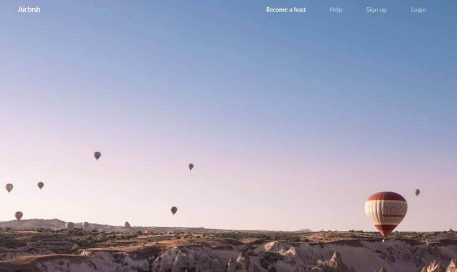
To do that, we’ll examine the AirBnB homepage screenshot and decide which Bootstrap components we’ll be using.
Planning our layout’s structure
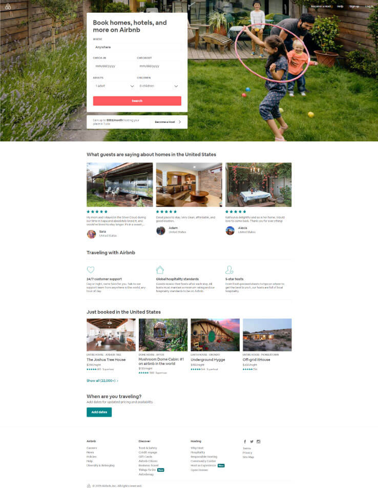
Here is the full-height screenshot of the AirBnB homepage at the time this article was written:
Here is the above screenshot, converted into a mockup:
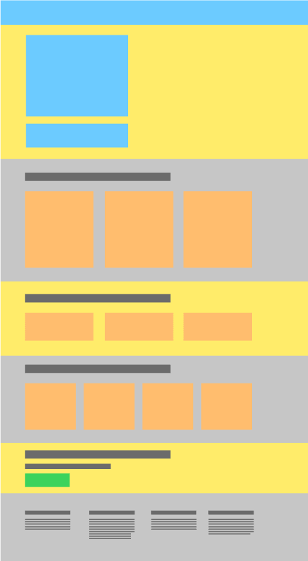
As we can see, this layout actually has 6 container-fluid divs, each on top of another.
Thus, let’s split the layout’s mockup and re-build it, one container-fluid div at a time.
Just like in the previous article in this series, we’ll also be tracking our progress with Git and Github desktop.
Let’s begin!
Add a new repository to Github
We’ll start by adding a brand new folder which we’ll call airbnb-clone-layout.
As we’ve already explained in the previous article, we’ll add this new folder to Github Desktop.
This folder will be our new repository.
Finally, as explained in detail in the previous article, we’ll publish our repository to Github.
Here’s the new Airbnb-clone-layout repo on Github.
We already explained how to start a new project in Brackets.
Add the starter Bootstrap template to index.html
We’ll add an empty index.html file into our Airbnb-clone-layout folder.
We’ll also copy the starter Bootstrap template from the official docs.
Once we’ve pasted in the starter template we can commit it with this message: Starter Hello World added.
Adding all the container-fluid divs
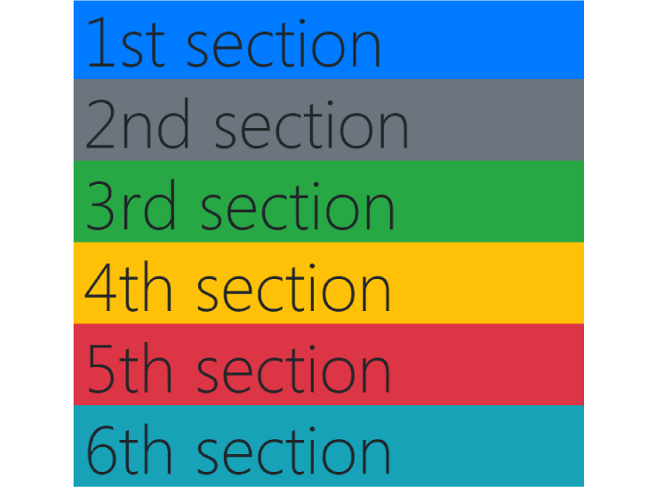
Next, let’s add all the wrapping divs for our project, as follows: inside the body element, we’ll add the 6 wrapping divs.
1
2
3
4
5
6
7
8
9
10
11
12
13
14
15
16
17
18
<div class="container-fluid container bg-primary display-1">
    1st section
</div>
<div class="container-fluid container bg-secondary display-1">
    2nd section
</div>
<div class="container-fluid container bg-success display-1">
    3rd section
</div>
<div class="container-fluid container bg-warning display-1">
    4th section
</div>
<div class="container-fluid container bg-danger display-1">
    5th section
</div>
<div class="container-fluid container bg-info display-1">
    6th section
</div>
This update is saved in the commit titled Add container-fluid divs.
Here’s the screenshot for this update:
Note that we do have container fluids on each wrapping div, but we don’t have any contextual backgorounds on them. Instead, we’ve also added inner divs and set both the container and the background classes on these divs.
Next, we’ll update the first section, the one with the large background image.
Adding the large background image area
There are several ways we could add the large backgorund image area.
Why not just copy the way it’s done on the actual AirBnB page? Even better, this first section looks a lot like what we’ve already built in the previous layout. So let’s just copy it!
This update’s commit message is: Add big image section.
This is the screenshot of our big image addition:
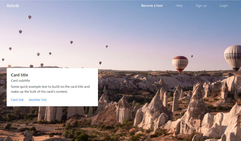
Next, inside the big image section, we’ll need to add the card with some input fields.
Adding the card with input fields
Let’s copy a card from the official docs.
Next, we’ll paste it into our theme, in a col-sm-4, inside a row, inside a container, under the navbar in the first container-fluid.
This addition will be saved in this commit message: Add a card to first section.
After this update, the layout looks like this:
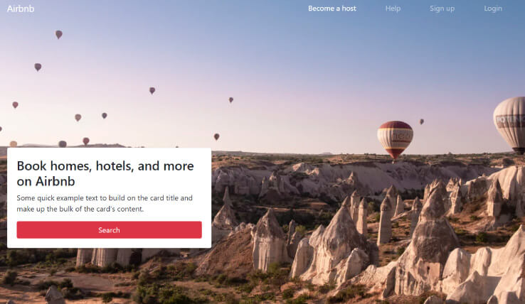
Next, let’s add the actual heading and cards like we have in the source AirBnb homepage.
First, we’ll add the title: “Book homes, hotels, and more on Airbnb”.
In the same commit, we could add the button at the bottom of the card that reads: “Search”. For now, we’ll give it the class of bg-danger.
This commit is titled Add the h1 and the button.
Our updated layout now looks as follows:
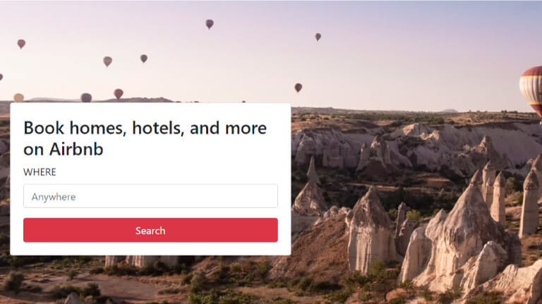
Now we can finally add some input fields, five in total:
- A regular text input with “Anywhere” placeholder and a WHERE label
- Two datepickers with CHECK-IN and CHECKOUT labels
- Two dropdowns to choose the number of adults and children, respectively
This shouldn’t be too hard to add with the help of the Bootstrap docs on the form inputs.
The copied-over code will look like this:
<form>
  <div class="form-group">
    <label for="locationInput">WHERE</label>
    <input type="email" class="form-control" id="locationInput" aria-describedby="locationInputHelp" placeholder="Anywhere">
    <small id="locationInputHelp" class="form-text text-muted sr-only">Please type in your desired destination.</small>
  </div>
</form>
The commit at this point is titled: Add the first input.
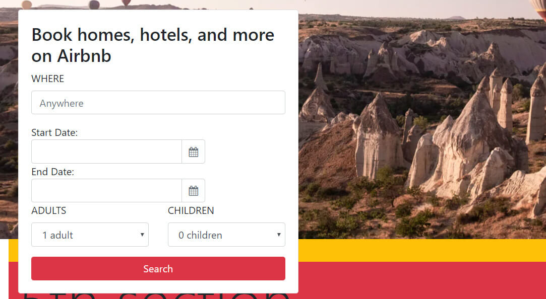
Here’s the screenshot of the layout as it is at this point:
Next, we’re adding two datepickers next to one another, on the same row.
Adding the two datepickers
There is an interesting website called Gijgo, there’s a daterange picker example. We’ll be using the example code from here and integrate it into our theme.
This is the code we copied from the example:
    <link href="https://maxcdn.bootstrapcdn.com/font-awesome/4.7.0/css/font-awesome.min.css" rel="stylesheet" integrity="sha384-wvfXpqpZZVQGK6TAh5PVlGOfQNHSoD2xbE+QkPxCAFlNEevoEH3Sl0sibVcOQVnN" crossorigin="anonymous">
    <script src="https://unpkg.com/gijgo@1.9.13/js/gijgo.min.js" type="text/javascript"></script>
    <link href="https://unpkg.com/gijgo@1.9.13/css/gijgo.min.css" rel="stylesheet" type="text/css" />
</head>
<body>
    <div class="container">
        Start Date: <input id="startDate" width="276" />
        End Date: <input id="endDate" width="276" />
    </div>
    <script>
        var today = new Date(new Date().getFullYear(), new Date().getMonth(), new Date().getDate());
        $('#startDate').datepicker({
            uiLibrary: 'bootstrap4',
            iconsLibrary: 'fontawesome',
            minDate: today,
            maxDate: function () {
                return $('#endDate').val();
            }
        });
        $('#endDate').datepicker({
            uiLibrary: 'bootstrap4',
            iconsLibrary: 'fontawesome',
            minDate: function () {
                return $('#startDate').val();
            }
        });
    </script>
</body>
And here’s the link to commit titled Add rangepicker.
Note that in order for the datepicker to work, we had to move the jQuery <script> up into the <head> tag.
After these changes, our card now looks like this:
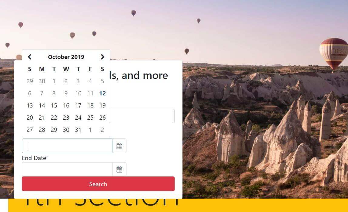
Even though the styling is not as good as it could be, the date picker is fully functional. We’ll improve the styles once we’ve added the entire form structure.
Next, we’ll add the fourth and fifth form items: the two dropdowns.
Adding the dropdowns
Inside the official documentation on Bootstrap, there’s a component’s toggle in the left sidebar. There you’ll find the Forms link, and inside the forms link, there’s the form controls section.
We’ll need to copy only a small part of this form controls section, namely, the example <select> element, as follows:
  <div class="form-group">
    <label for="exampleFormControlSelect1">Example select</label>
    <select class="form-control" id="exampleFormControlSelect1">
      <option>1</option>
      <option>2</option>
      <option>3</option>
      <option>4</option>
      <option>5</option>
    </select>
  </div>
Of course, we’ll update this example select so that it includes a dropdown with a maximum of 16 adult guests and 5 children guests.
Rather than listing out the code right here, let’s just have a look at the commit message titled Add the guests dropdowns.
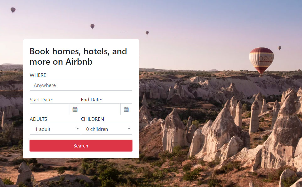
After this update, our card in the first section now looks like this:
Next, let’s fix the styling on the datepicker similar to how we did it with the dropdowns. We’ll just add a wrapping row and two col-sm-6 classes for each datepicker.
We’ll also add some additional spacing utility classes to make the labels group visually with their inputs.
Finally, we’ll add a custom CSS class of br0 - which stands for border-radius: 0.
With all these styling updates, we’ll call our commit Complete the Book now card, and the screenshot of our completed “Book now” card looks like this:
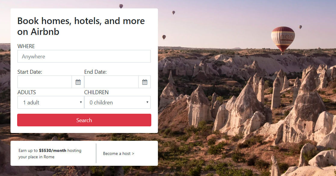
Now we need to add the additional smaller card - the Become a host card - under the Book now card.
Add the Become a host card
Let’s copy another card from getbootstrap.com.
The source card has an image to the left, but we’ve replaced it with text, and we’ve also flipped the colums.
In the source card, the columns are ordered so that the first one has the col-md-4 class, and the second one has the col-md-8 class, but in our code, we’ll flip their order.
Here’s our customized code:
<div class="card my-4 p-2 small border-0">
<div class="row no-gutters">
<div class="col-md-7 d-flex align-items-center">
<p class="my-0 px-3">Earn up to <strong>$5530/month</strong> hosting your place in Rome</p>
</div>
<div class="col-md-5 border-left border-secondary">
<div class="card-body">
<p class="card-text">Become a host <span>></span></p>
</div>
</div>
</div>
</div>
We’ll give this commit the message of Complete the Become a host card.
Here’s the screenshot of the result in browser:
Notice that I’ve forgot to give some spacing between the datepicker and the <select> elements in our Book now card. This is a quick fix, including the addition of two mt-3 classes at the right place.
This update can be seen in the commit message Fix spacing in Book now card.
Now that we’ve completed the first section, let’s begin working on the second one: Testimonials.
Working on the testimonials section
We’ll begin work on the testimonials section with a brand new commit: Format the code.
This commit is just some formatting applied to our layout.
It’s recommended to add code formatting in a separate commit.
The reason for this is that formatting updates the entire code of the formatted file, and adding another change together with formatting would make that change very hard to spot when you inspect a specific commit.
Now we can continue with updating the testimonials section.
This is the source AirBnb testimonials section:
Obviously, we’ll use an <h2> element with the class of h3 on it, and we’ll follow it up with three cards with images on top. Each of the three cards will have a little media object at the bottom. Also, we need to decide how we’ll add the stars: should they change on hover? Or maybe we should take the easy route and just display static star icons. Thus, if there is a four star rating, we’ll just add four star icons, one after another.
Now, with this tiny bit of planning, we know what it will take to build this.
Here are the copied snippets from the Bootstrap docs.
The cards:
<div class="card mb-3">
  <img src="..." class="card-img-top" alt="...">
  <div class="card-body">
    <h5 class="card-title">Card title</h5>
    <p class="card-text">This is a wider card with supporting text below as a natural lead-in to additional content. This content is a little bit longer.</p>
    <p class="card-text"><small class="text-muted">Last updated 3 mins ago</small></p>
  </div>
</div>
The media objects:
<div class="media">
  <div class="media-body">
    <h5 class="mt-0 mb-1">Media object</h5>
    Cras sit amet nibh libero, in gravida nulla. Nulla vel metus scelerisque ante sollicitudin. Cras purus odio, vestibulum in vulputate at, tempus viverra turpis. Fusce condimentum nunc ac nisi vulputate fringilla. Donec lacinia congue felis in faucibus.
  </div>
  <img src="..." class="ml-3" alt="...">
</div>
As for the stars, we’ll just use the HTML entity for star character, which is ★:
<span>★</span>
Now that we’ve got all the ingredients in place, let’s mix them in:
<div class="container-fluid container py-3 mt-4">
    <h2 class="h3">What guests are saying about homes in the United States</h2>
    <div class="row mt-4">
        <div class="col-md-3">
            <div class="card mb-3">
                <img src="https://images.unsplash.com/photo-1533654793924-4fc4949fb71e?ixlib=rb-1.2.1&ixid=eyJhcHBfaWQiOjEyMDd9&auto=format&fit=crop&w=1351&q=80" class="card-img-top" alt="...">
                <div class="card-body">
                    <h5 class="card-title">Card title</h5>
                    <p class="card-text">This is a wider card with supporting text below as a natural lead-in to additional content. This content is a little bit longer.</p>
                    <p class="card-text"><small class="text-muted">Last updated 3 mins ago</small></p>
                </div>
            </div>
        </div>
        <div class="col-md-3">
            <div class="card mb-3">
                <img src="https://images.unsplash.com/photo-1520908695049-da13395b27a6?ixlib=rb-1.2.1&ixid=eyJhcHBfaWQiOjEyMDd9&auto=format&fit=crop&w=1225&q=80" class="card-img-top" alt="...">
                <div class="card-body">
                    <h5 class="card-title">Card title</h5>
                    <p class="card-text">This is a wider card with supporting text below as a natural lead-in to additional content. This content is a little bit longer.</p>
                    <p class="card-text"><small class="text-muted">Last updated 3 mins ago</small></p>
                </div>
            </div>
        </div>
        <div class="col-md-3">
            <div class="card mb-3">
                <img src="https://images.unsplash.com/photo-1501785888041-af3ef285b470?ixlib=rb-1.2.1&ixid=eyJhcHBfaWQiOjEyMDd9&auto=format&fit=crop&w=1350&q=80" class="card-img-top" alt="...">
                <div class="card-body">
                    <h5 class="card-title">Card title</h5>
                    <p class="card-text">This is a wider card with supporting text below as a natural lead-in to additional content. This content is a little bit longer.</p>
                    <p class="card-text"><small class="text-muted">Last updated 3 mins ago</small></p>
                </div>
            </div>
        </div>
    </div>
</div>
For the home images, I’m using these three photos from Unsplash:
This commit is titled Add testimonial cards.
Currently, it looks like this:
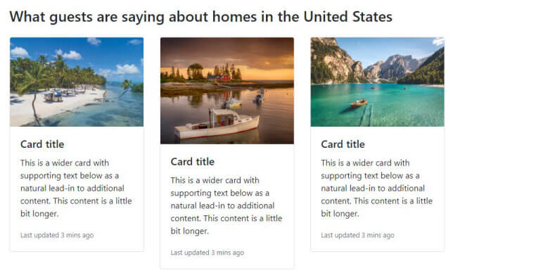
These cards are using a lot of defaults and dummy text, since we’ve copied it from the official docs.
We’ll next update them so that they look more like the AirBnB homepage we’re emulating.
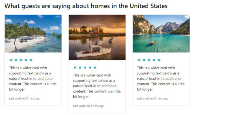
For example, instead of a card title, we’ll be adding three 5-star ratings, just like in the source layout.
Adding the 5-star ratings
Let’s update each <h5> element like this:
<h5 class="card-title text-info">★ ★ ★ ★ ★</h5>
This commit is saved as Add a 5-star rating
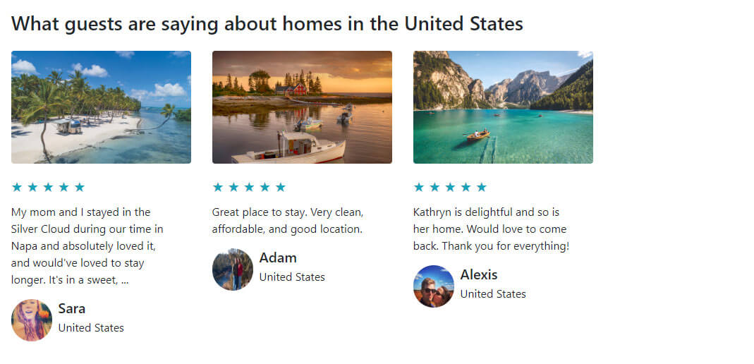
Here’s the updated image:
Now we’ll add the “media” cards.
Note that I’m putting the word media in quotes above because we’re not really using Bootstrap’s media object to build this part of the card.
Instead, we’re just using some regular helper Bootstrap 4 classes, and we’re combining them to get the desired effect that kind of looks like the media object in Bootstrap 4.
We’ll replace this…
<p class="card-text"><small class="text-muted">Last updated 3 mins ago</small></p>
…with this:
<div class="">
    <div class="d-flex">
    <img src="https://a0.muscache.com/im/pictures/660e2273-b37b-4f50-917e-369e7bc3f665.jpg?aki_policy=large" class="ml-0 mr-2 img-fluidX rounded-circle w-25 mb-3" alt="...">
    <div class="d-flex flex-column">
        <h5 class="mt-0 mb-1">Sara</h5>
        <p>United States</p>
    </div>
    </div>
</div>
The result will be as follows:
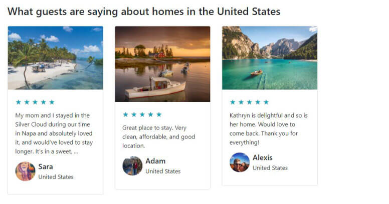
Note that the images have been copied from the actual AirBnb homepage.
The commit message for this update is Add testimonial bios.
Next, we’ll fix those image heights.
Add the same image height on all cards in Bootstrap 4
We need to extend each card’s card-img-top class with the following CSS declarations:
.card-img-top {
    max-height:160px;
    min-height:160px;
    object-fit: cover
}
We’ll do that by appending the above CSS class to the existing custom CSS in the <styles> element, just above the closing </head> tag.
We’ve saved this update as the Add same height on card imgs commit message.
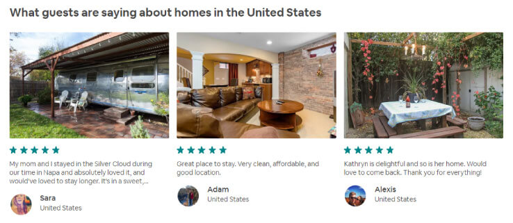
Finally, we have few minor tweaks on the testimonials section:
- set the
borderproperty tononewith this Bootstrap 4 CSS class:border-0 - remove the left-padding from
card-bodyby adding the class ofpl-0to it - make images more like the AirBnB cards using the
roundedclass withcard-img-top - replace
mb-3withmb-2classes on the testimonial bio images to make them closer to perfect circles
We’ll save this update as Additional tweaks to testimonials commit message.
Now the testimonals section is complete:
Rebuilding the Travelling with AirBnB section
This section is similar to the previous one, minus the stars and the bio footers on each of the cards.
Thus, we can begin by just copying already exisiting functionality from the previous section.
Here’s the first updated card, with the additional information removed:
<div class="col-md-3">
    <div class="card mb-3 border-0">
        <svg></svg>
        <div class="card-body pl-0">
            <h5 class="card-title">24/7 customer support</h5>
            <p class="card-text">Day or night, we’re here for you...</p>
        </div>
    </div>
</div>
In the place where there used to be an image, we’re putting an <svg> element. SVG is the name of a format. It’s not HTML, but it is quite similar to it. It stands for Scalable Vector Graphics, which makes it a perfect candidate for icons - and that’s what we’ll use.
Where do we get these icons though?
Let’s navigate over to material design icons website and get those icons that we need.
Once you find the heart-shaped icon, which is named “favorite”, and you click on it to select it, the website will offer you two download options: SVG or PNG.
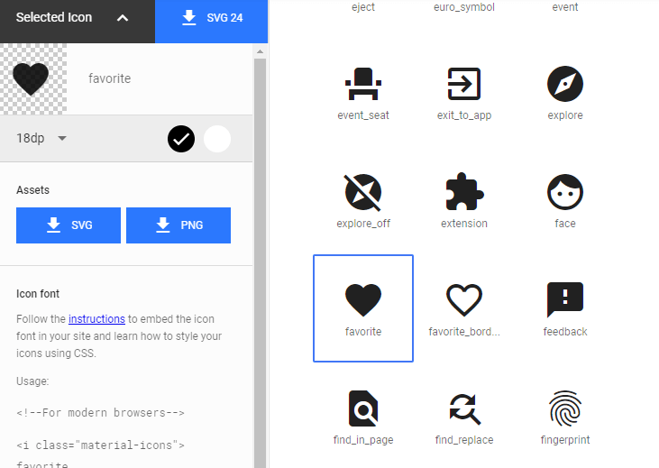
Let’s click on SVG, and that will download the icon.
Once downloaded, let’s open this icon in Brackets, then copy the entire contents of the file.
This is what we’ll get:
<svg viewBox="0 0 24 24" xmlns="http://www.w3.org/2000/svg" width="24" height="24"><path d="M0 0h24v24H0z" fill="none"/><path d="M12 21.35l-1.45-1.32C5.4 15.36 2 12.28 2 8.5 2 5.42 4.42 3 7.5 3c1.74 0 3.41.81 4.5 2.09C13.09 3.81 14.76 3 16.5 3 19.58 3 22 5.42 22 8.5c0 3.78-3.4 6.86-8.55 11.54L12 21.35z"/></svg>
Now that we’ve pasted in the first icon, let’s find two additional icons.
Here’s the home icon:
<svg xmlns="http://www.w3.org/2000/svg" width="24" height="24" viewBox="0 0 24 24"><path d="M10 20v-6h4v6h5v-8h3L12 3 2 12h3v8z"/><path d="M0 0h24v24H0z" fill="none"/></svg>
And here’s the how_to_reg icon:
<svg xmlns="http://www.w3.org/2000/svg" width="24" height="24" viewBox="0 0 24 24"><path fill-rule="evenodd" clip-rule="evenodd" fill="none" d="M0 0h24v24H0z"/><g fill-rule="evenodd" clip-rule="evenodd"><path d="M9 17l3-2.94c-.39-.04-.68-.06-1-.06-2.67 0-8 1.34-8 4v2h9l-3-3zm2-5c2.21 0 4-1.79 4-4s-1.79-4-4-4-4 1.79-4 4 1.79 4 4 4"/><path d="M15.47 20.5L12 17l1.4-1.41 2.07 2.08 5.13-5.17 1.4 1.41z"/></g></svg>
Note that this Material design icon font has its own icon names, and that they’re sometimes unintuitive, so you might spend some time trying to locate a suitable icon.
With all these icons added, our third section now looks like this:
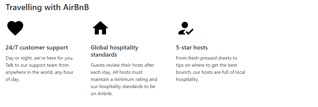
This is a good time for a commit, so let’s add a new one with the message: Add SVG icons to third section.
Let’s next color the icons.
Since SVG is a different kind of format than HTML - altough very similar - we’ll approach it differently.
We’ll take the color from the original website by inspecting the original website’s icons in developer tools in chrome. We’ve learned how to use the developer tools earlier in this article series.
It shouldn’t be hard to locate the fill color property inside any of the three original icons’ style class. Note that these are also SVGs, as seen in the screenshot below:
The fill color for these icons, as we can see, is #60B6B5, and so let’s add another commit, and add it this message: Add teal color to icons.
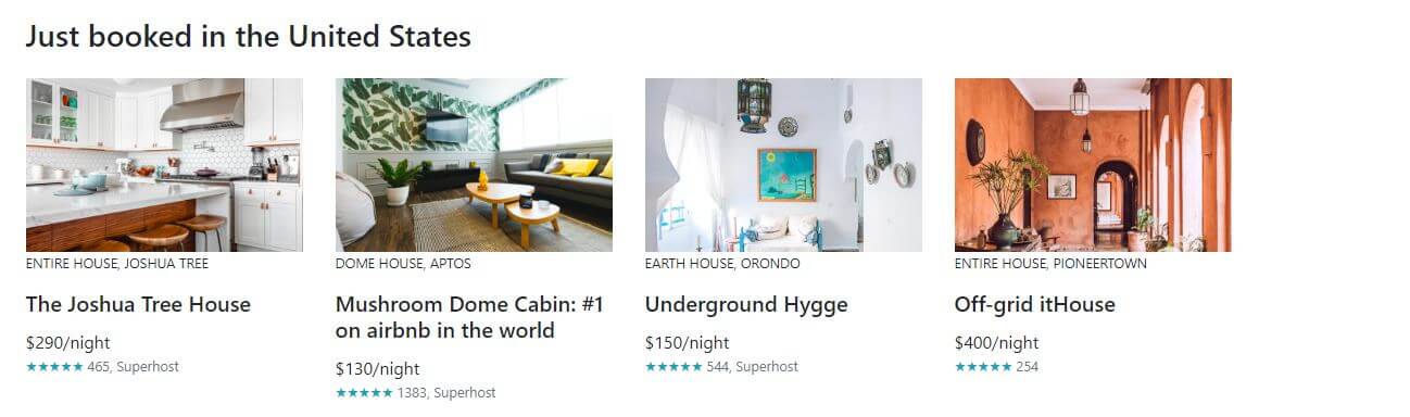
Next, we’ll add the fourth section: Just booked in the United States.
Adding the fourth section to our AirBnB clone homepage
Looking at the fourth section, we can see a similar structure, only this time there are four cards on the same row:
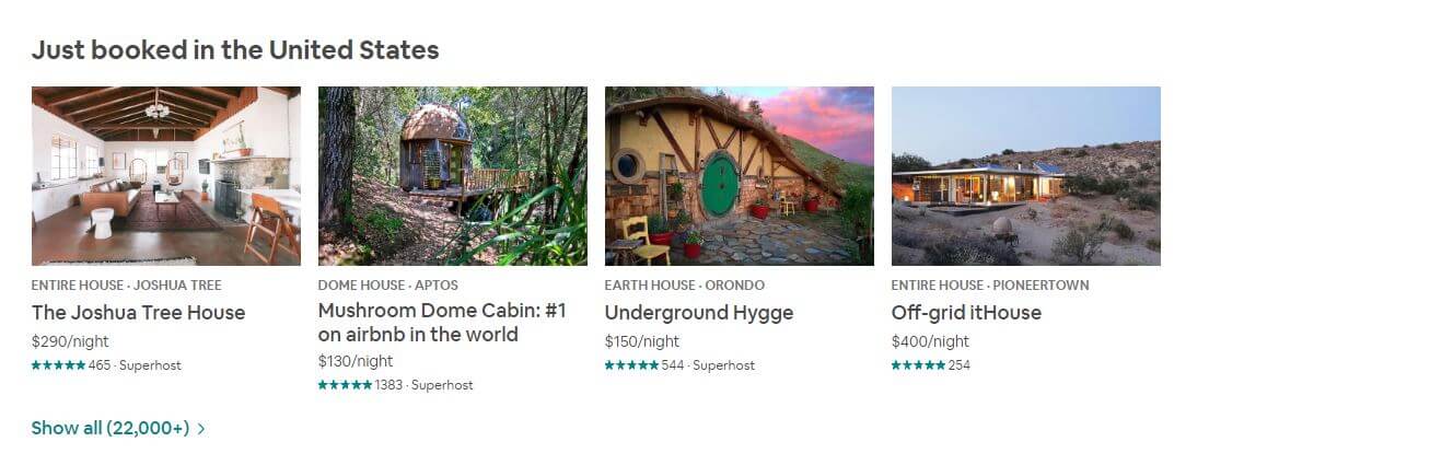
Looking at the above cards, we can see some similarity with the cards in section two of this rebuilt layout. Thus, let’s begin by simply copying a card from the second section, and wrapping each card in a col-md-3 class.
Next, we’ll update the card’s HTML code and look at the changes in Brackets editor’s Live Preview, until we get the desired result:
<div class="col-md-3">
<div class="card mb-3 border-0">
<img src="https://images.unsplash.com/photo-1556912172-45b7abe8b7e1?ixlib=rb-1.2.1&ixid=eyJhcHBfaWQiOjEyMDd9&auto=format&fit=crop&w=1350&q=80" class="card-img-top br0" alt="...">
<p class="small text-uppercase pb-0">Entire house, Joshua Tree</p>
<div class="card-body p-0">
<h5 class="card-title">The Joshua Tree House</h5>
<p class="card-text m-0">$290/night</p>
<p class="small m-0 text-info">★★★★★<span class="text-secondary"> 465, Superhost</span></p>
</div>
</div>
</div>
We’re also making sure to wrap all the cards inside a div with the class of row, and we’re adding another row as a separate wrapper for the button that reads Show all(22,000+). To make a button lose all its styling in bootstrap, we add it the following values in the class attribute:
btn btn-link
To color the text in the button with any contextual class, we just use regular text coloring classes, so we get this HTML:
<div class="row mt-2 mb-5">
<button class="btn text-info btn-link">
<span class="h6">Show all(22,000+) ></span>
</button>
</div>
This update is saved as Complete the Just booked section commit message on Github.
The updated section now looks like this:
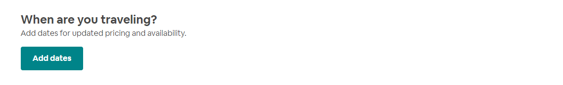
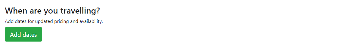
Next, we’ll add the fifth section to our AirBnB clone.
Add the When are you travelling section
On the source AirBnB homepage, the fifth section looks like this:
This is a pretty easy thing to add.
We’ll have a wrapping container, inside of which there will be a row. The row iself will wrap a col-12 div, inside of which we’ll have:
- an
h2heading, - a
ptag, and - a button
Here’s the code for the complete section 5:
<div class="container-fluid container">
    <div class="container pl-0">
        <div class="row">
            <div class="col-12 pl-0 mb-5">
                <h2 class="h3  mt-0 mb-2">When are you travelling?</h2>
                <p class="mt-0 ml-0 mb-2">Add dates for updated pricing and availability.</p>
                <button class="btn btn-lg btn-success">Add dates</button>
            </div>
        </div>
    </div>
</div>
With this code added to our own layout’s fifth section, the update looks like this:
The commit message of this update is: Add the When are you travelling section.
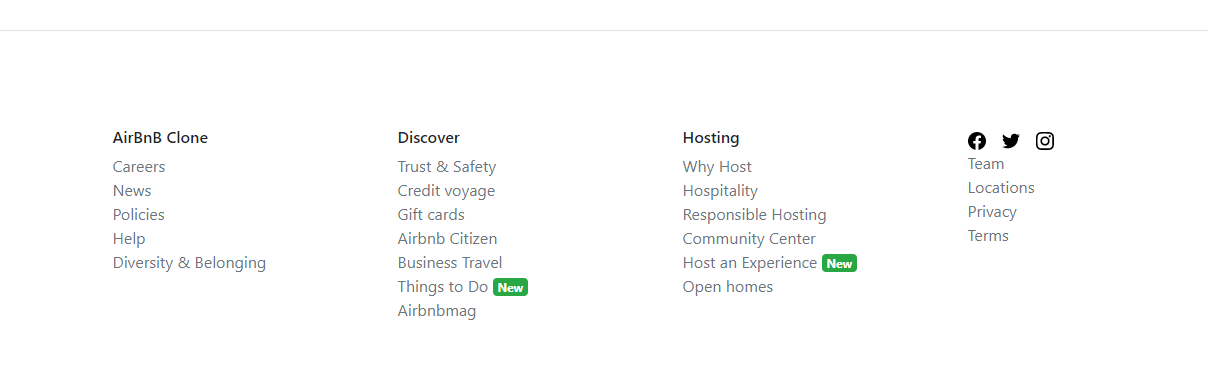
All we’ve got left to do is add the footer now.
Adding the footer section
To quickly add the footer, let’s find a suitable footer example on official Bootstrap 4 docs.
The footer on the pricing layout is a nice starting point, so let’s begin by copy-pasting that code into our AirBnB clone:
<footer class="pt-4 my-md-5 pt-md-5 border-top">
    <div class="row">
        <div class="col-12 col-md">
        <img class="mb-2" src="/docs/4.3/assets/brand/bootstrap-solid.svg" alt="" width="24" height="24">
        <small class="d-block mb-3 text-muted">© 2017-2019</small>
        </div>
        <div class="col-6 col-md">
        <h5>Features</h5>
        <ul class="list-unstyled text-small">
            <li><a class="text-muted" href="#">Cool stuff</a></li>
            <li><a class="text-muted" href="#">Random feature</a></li>
            <li><a class="text-muted" href="#">Team feature</a></li>
            <li><a class="text-muted" href="#">Stuff for developers</a></li>
            <li><a class="text-muted" href="#">Another one</a></li>
            <li><a class="text-muted" href="#">Last time</a></li>
        </ul>
        </div>
        <div class="col-6 col-md">
        <h5>Resources</h5>
        <ul class="list-unstyled text-small">
            <li><a class="text-muted" href="#">Resource</a></li>
            <li><a class="text-muted" href="#">Resource name</a></li>
            <li><a class="text-muted" href="#">Another resource</a></li>
            <li><a class="text-muted" href="#">Final resource</a></li>
        </ul>
        </div>
        <div class="col-6 col-md">
        <h5>About</h5>
        <ul class="list-unstyled text-small">
            <li><a class="text-muted" href="#">Team</a></li>
            <li><a class="text-muted" href="#">Locations</a></li>
            <li><a class="text-muted" href="#">Privacy</a></li>
            <li><a class="text-muted" href="#">Terms</a></li>
        </ul>
        </div>
    </div>
</footer>
We’re going to take social icon SVGs from simpleicons.org.
Other than that, you should mostly already understand what’s going on it the footer code.
If by any chance you are still getting confused even at this point of our journey through building Bootstrap 4 layouts, you have at least two options:
- Search keywords related to a CSS class name inside Bootstrap documentation
- Inspect the element and its CSS using developer tools
Here’s a screenshot of checking out CSS class border-top, which is a default Bootstrap 4 CSS class.
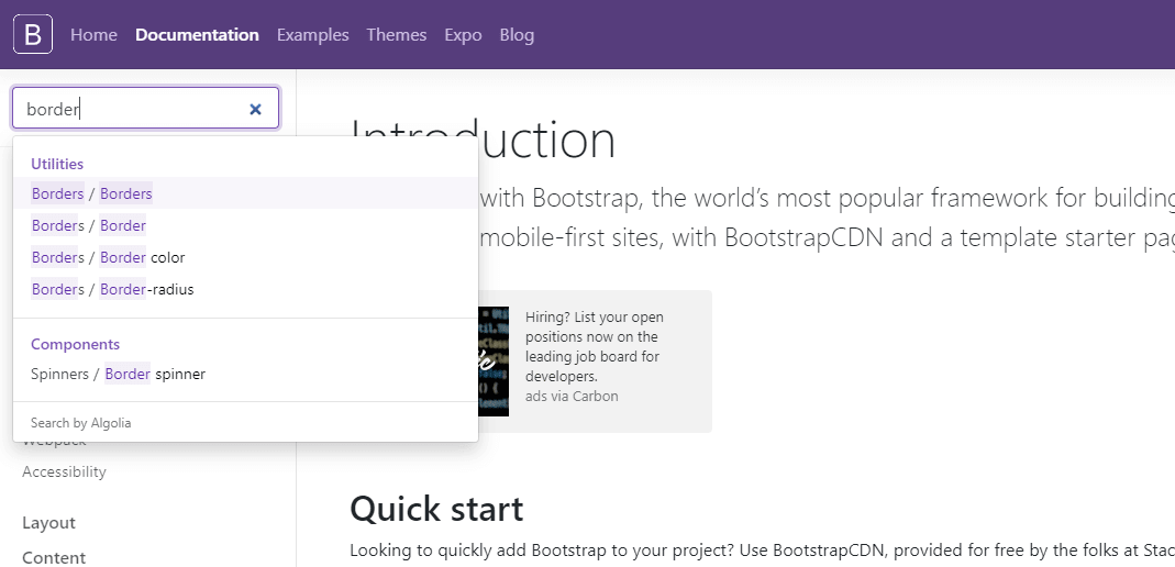
We’ve already discussed how to inspect styles using devtools in a previous article.
This update is saved with the following commit message: Add the footer section.
Note that we’ve used a new component in the footer: the badge component.
The footer we’ve built looks like this:
Let’s now wrap up our repository with another commit: Format the layout code. Like we already said earlier in the article, it is best to keep formatting changes to your code in separate commits.
Live preview of AirBnB Bootstrap 4 clone
After all these updates completed, let’s have a look at the completed AirBnB Bootstrap 4 clone.
That’s it for this article. Let’s revisit what we’ve learned.
Conclusion
In this article, we’ve improved our layout-building skills by building an AirBnB clone. The approach used was to get the maximum effect while using minimal custom CSS. We were relying mostly on the built-in Bootstrap 4 classes.
With this update, our AirBnB clone is complete and we can continue with our article series.
In the next article, we’ll build a Shopify clone.

