Building Bootstrap 4 layouts, part 7: Building a typography-focused layout
In this article we'll build a typography-focused layout
By: Ajdin Imsirovic 04 October 2019
In this seventh of 20 articles in the Building Bootstrap 4 Layouts article series, we’ll build a complete layout. Let’s begin by choosing google fonts to use.
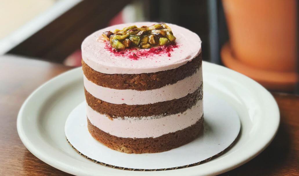
 Photo by
Gemma Evans on Unsplash.com
Photo by
Gemma Evans on Unsplash.com
Downloading Google fonts
For this layout, we’ll be using 2 fonts: Roboto and Roboto Slab. Both fonts are available at the Google fonts website.
Once you’ve found the font you like, to the right of the font name you have a little plus icon in a red circle. If you click it, the font you clicked will be added to the list of font families selected, showing in a toggleable bar at the bottom of the screen.
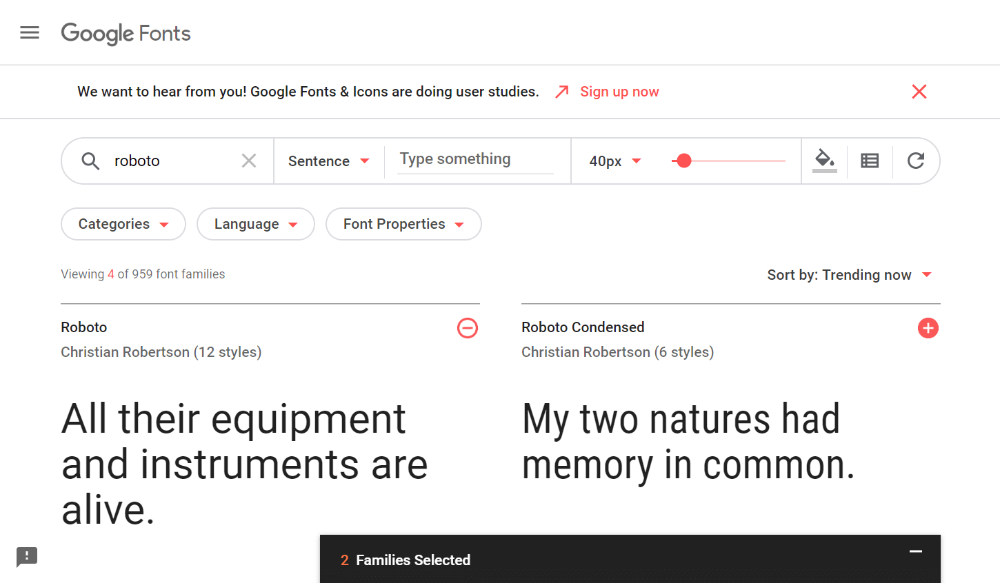
I’ve clicked the plus sign on Roboto and Roboto Slab, so there’s 2 Families Selected in the screenshot above.
We’ve got two options of embedding fonts, the standard way and the @import.
To import your fonts with the standard syntax, use this HTML syntax:
<link href="https://fonts.googleapis.com/css?family=Roboto|Roboto+Slab&display=swap" rel="stylesheet">
You can also use the @import from within the stylesheet:
<style>
@import url('https://fonts.googleapis.com/css?family=Roboto|Roboto+Slab&display=swap');
</style>
In this article, we’ll use the standard approach.
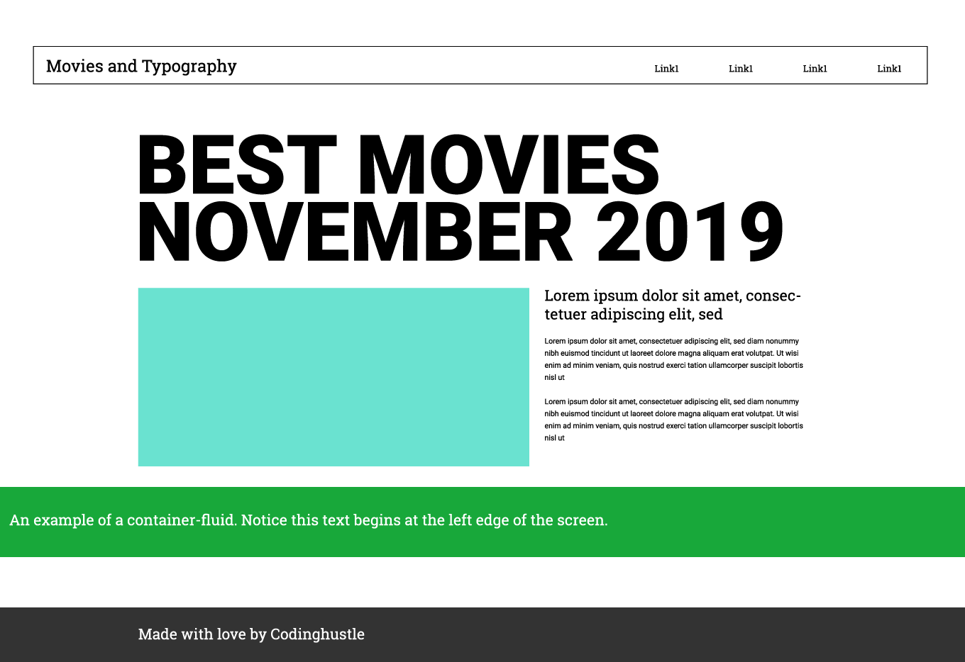
The mockup and the starter layout
Next, let’s have a look at a mockup for the layout we’ll be building.
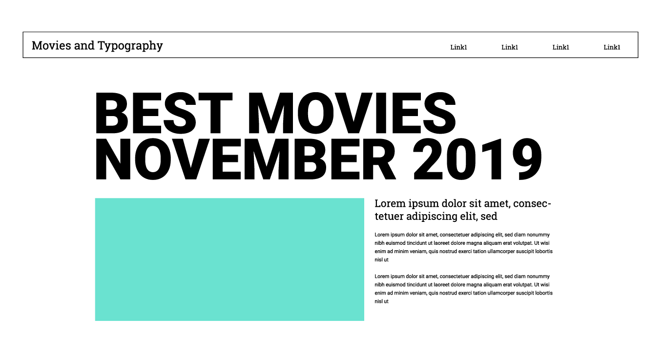
Looking at the above mockup, we can notice a few things:
- the layout is supposed to have a lot of whitespace
- the headings in this layout are supposed to be huge
- We’ll mix and match two fonts: the sans-serif (Roboto) and the serif (Roboto-slab)
To speed up our development even further, we’ll be using the starter template from getbootstrap.com.
Open a new HTML file in your computer, and paste in the code you copy-pasted from the link above:
1
2
3
4
5
6
7
8
9
10
11
12
13
14
15
16
17
18
19
20
21
22
23
24
25
26
27
28
29
30
31
32
33
34
35
36
37
<!doctype html>
<html lang="en">
  <head>
    <!-- Required meta tags -->
    <meta
        charset="utf-8">
    <meta
        name="viewport"
        content="width=device-width, initial-scale=1, shrink-to-fit=no">

    <!-- Bootstrap CSS -->
    <link
        rel="stylesheet"
        href="https://stackpath.bootstrapcdn.com/bootstrap/4.3.1/css/bootstrap.min.css"
        integrity="sha384-ggOyR0iXCbMQv3Xipma34MD+dH/1fQ784/j6cY/iJTQUOhcWr7x9JvoRxT2MZw1T"
        crossorigin="anonymous">

    <title>Hello, world!</title>
  </head>
  <body>
    <h1>Hello, world!</h1>

    <!-- Optional JavaScript -->
    <!-- jQuery first, then Popper.js, then Bootstrap JS -->
    <script src="https://code.jquery.com/jquery-3.3.1.slim.min.js"
        integrity="sha384-q8i/X+965DzO0rT7abK41JStQIAqVgRVzpbzo5smXKp4YfRvH+8abtTE1Pi6jizo"
        crossorigin="anonymous"></script>
    <script
        src="https://cdnjs.cloudflare.com/ajax/libs/popper.js/1.14.7/umd/popper.min.js"
        integrity="sha384-UO2eT0CpHqdSJQ6hJty5KVphtPhzWj9WO1clHTMGa3JDZwrnQq4sF86dIHNDz0W1"
        crossorigin="anonymous"></script>
    <script
        src="https://stackpath.bootstrapcdn.com/bootstrap/4.3.1/js/bootstrap.min.js"
        integrity="sha384-JjSmVgyd0p3pXB1rRibZUAYoIIy6OrQ6VrjIEaFf/nJGzIxFDsf4x0xIM+B07jRM"
        crossorigin="anonymous"></script>
  </body>
</html>
Save the file in a new folder. We’ll call the new folder typography-layout, and the file name will just be index.html.
In this article in our series, we’ll finally start using a code editor.
Choosing the code editor
We have many different choices of editors, but we’ll go with Brackets, mostly because it’s very beginner-friendly.
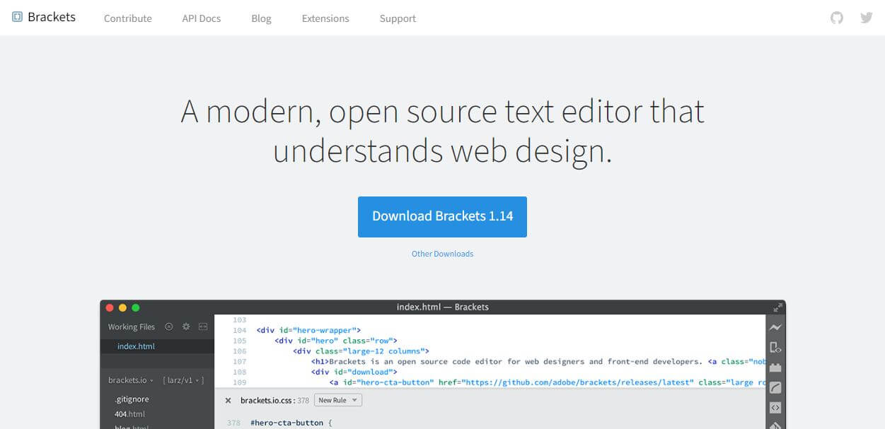
Once you’ve downloaded the Brackets editor, install it using the regular installation process of your operating system.
After the installation is complete, open the Brackets window, and you’ll see this:
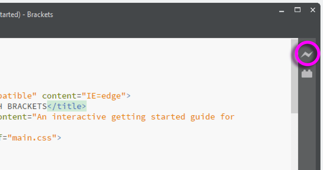
One of the best features of Brackets is the little live preview icon (highlighted in a magenta circle in the above image). To make your website reload every time you save a change in your layout, just turn on the live preview button.
Alright, we’ve finished all the prep work! Now let’s start building the layout.
Opening the starter template
Once you’ve downloaded brackets, open the index.html you’ve copy-pasted earlier.
If your Brackets window is already opened, you can just drag and drop the index.html file into the editor.
Next, click the live preview button, and you’ll see the following message pop-up:
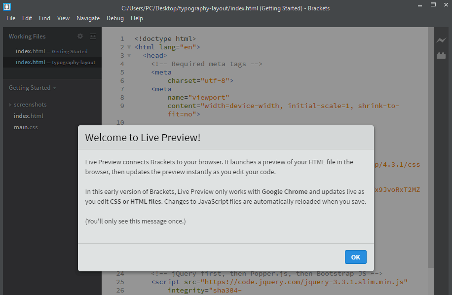
This one-time notification just says that it will launch and refresh your Chrome browser on every save of index.html.
Once you click ok, you’ll have to wait a couple of seconds, and you’ll see a new Chrome window launching.
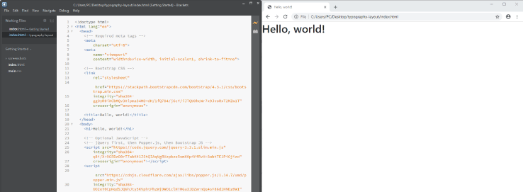
Here’s a split-screen view of this happening:
Now we are ready to add the navbar.
Adding the navbar
To add the navbar to our layout, we first need to pick one.
This time, we’ll go to the themes section on the getbootstrap.com website.
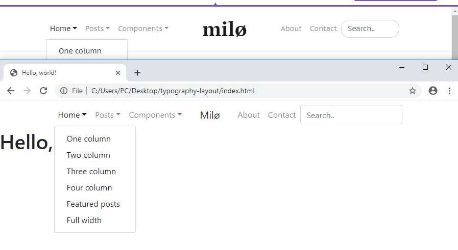
Browsing through the themes, I’ve found one with an interesting navbar. The theme’s called Milo.
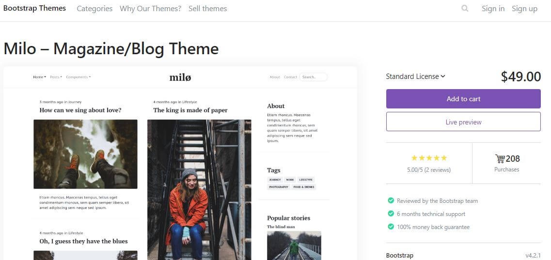
Click on the live preview button for the theme, and a new window will open.
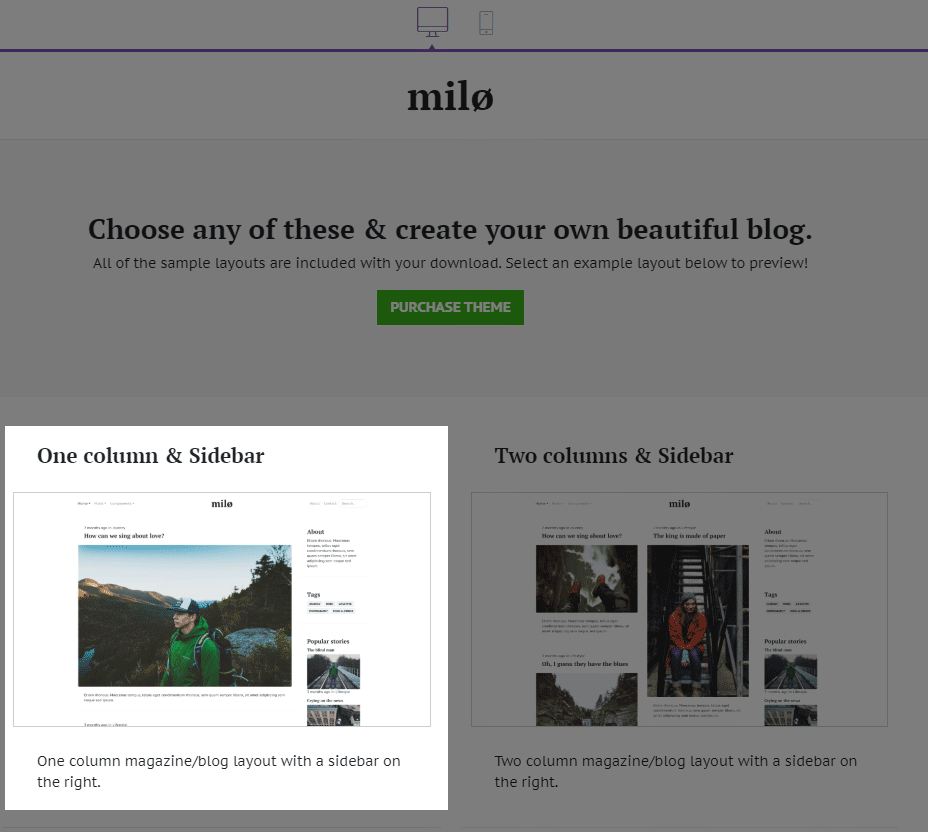
Next, click the One column & Sidebar theme preview.
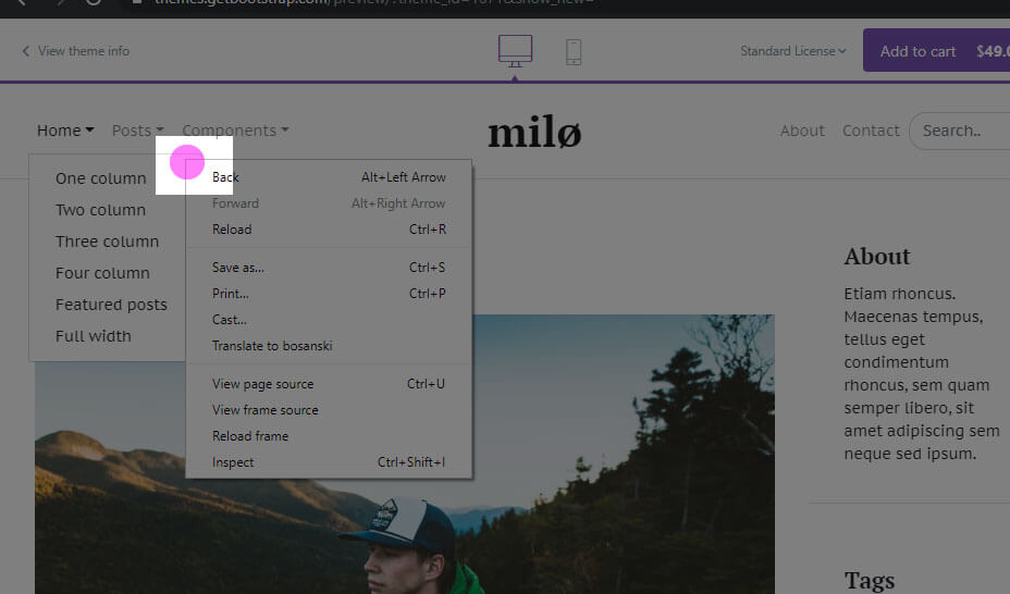
Once the theme is open, right-click on the navbar and click Inspect.
Alternatively, just press F12 and the developer tools will open. Now, you need to click the icon that shows a rounded square and an arrow over it:
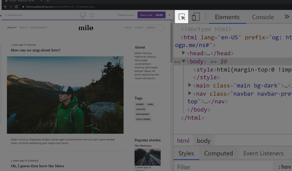
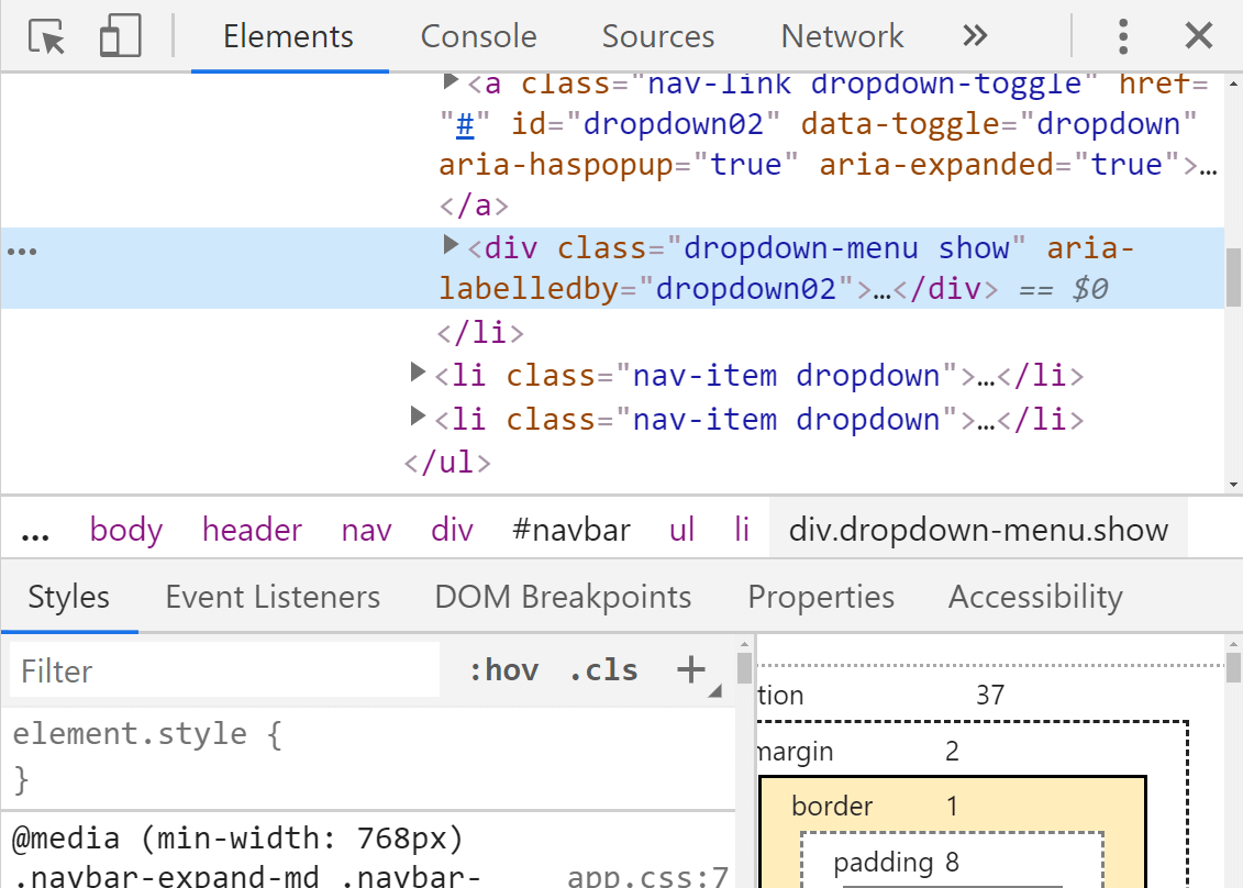
Now with the tool active, just hover over sections on the page until you find the navbar.
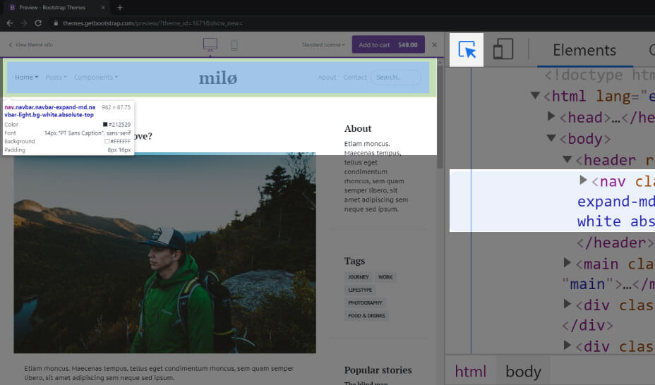
The above image shows the navbar in focus, highlighted both in the rendered web page and in the code in the Elements panel.
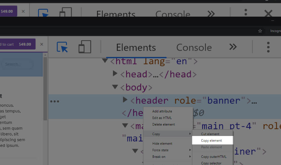
Now it’s just a matter of copying the HTML code, together with the wrapping element for the navbar. In this case, that element is the header element, located right under the opening <body> tag.
To copy an element, right-click it. This will open a right-click contextual menu, and now you can click the Copy command (highlighted in yellow in the image below):
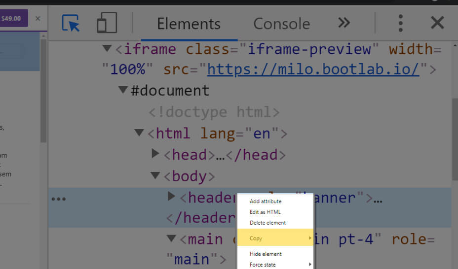
Now click the Copy element command from the sub-contextual menu.
Here’s the copied HTML:
1
2
3
4
5
6
7
8
9
10
11
12
13
14
15
16
17
18
19
20
21
22
23
24
25
26
27
28
29
30
31
32
33
34
35
36
37
38
39
40
41
42
43
44
45
46
47
48
49
50
51
52
53
54
55
56
57
58
59
60
<header role="banner">
    <nav class="navbar navbar-expand-md navbar-light bg-white absolute-top">
      <div class="container">

        <button class="navbar-toggler order-2 order-md-1" type="button" data-toggle="collapse" data-target="#navbar" aria-controls="navbar" aria-expanded="false" aria-label="Toggle navigation">
          <span class="navbar-toggler-icon"></span>
        </button>

        <div class="collapse navbar-collapse order-3 order-md-2" id="navbar">
          <ul class="navbar-nav mr-auto">
            <li class="nav-item dropdown active">
              <a class="nav-link dropdown-toggle" href="#" id="dropdown02" data-toggle="dropdown" aria-haspopup="true" aria-expanded="false">Home</a>
              <div class="dropdown-menu" aria-labelledby="dropdown02">
                <a class="dropdown-item" href="home-onecolumn.html">One column</a>
                <a class="dropdown-item" href="home-twocolumn.html">Two column</a>
                <a class="dropdown-item" href="home-threecolumn.html">Three column</a>
                <a class="dropdown-item" href="home-fourcolumn.html">Four column</a>
                <a class="dropdown-item" href="home-featured.html">Featured posts</a>
                <a class="dropdown-item" href="home-fullwidth.html">Full width</a>
              </div>
            </li>
            <li class="nav-item dropdown">
              <a class="nav-link dropdown-toggle" href="#" id="dropdown02" data-toggle="dropdown" aria-haspopup="true" aria-expanded="false">Posts</a>
              <div class="dropdown-menu" aria-labelledby="dropdown02">
                <a class="dropdown-item" href="post-image.html">Image</a>
                <a class="dropdown-item" href="post-video.html">Video</a>
                <a class="dropdown-item" href="post-new.html">New story</a>
              </div>
            </li>
            <li class="nav-item dropdown">
              <a class="nav-link dropdown-toggle" href="#" id="dropdown03" data-toggle="dropdown" aria-haspopup="true" aria-expanded="false">Components</a>
              <div class="dropdown-menu" aria-labelledby="dropdown03">
                <a class="dropdown-item" href="doc-typography.html">Typography</a>
                <a class="dropdown-item" href="doc-buttons.html">Buttons</a>
                <a class="dropdown-item" href="doc-tables.html">Tables</a>
                <a class="dropdown-item" href="doc-forms.html">Forms</a>
                <a class="dropdown-item" href="doc-cards.html">Cards</a>
              </div>
            </li>
          </ul>
        </div>

        <a class="navbar-brand mx-auto order-1 order-md-3" href="index.html">Milø</a>

        <div class="collapse navbar-collapse order-4 order-md-4" id="navbar">
          <ul class="navbar-nav ml-auto">
            <li class="nav-item">
              <a class="nav-link" href="page-about.html">About</a>
            </li>
            <li class="nav-item">
              <a class="nav-link" href="page-contact.html">Contact</a>
            </li>
          </ul>
          <form class="form-inline" role="search">
            <input class="search js-search form-control form-control-rounded mr-sm-2" type="text" title="Enter search query here.." placeholder="Search.." aria-label="Search">
          </form>
        </div>
      </div>
    </nav>
  </header>
Now you can paste in the copied code into Brackets, right under the opening <body> tag.
Once you save the update, the Brackets’ Live Preview will update the page to this:
Next, let’s update the CSS.
Visually comparing the navbars
Before we make changes to our new navbar’s CSS, let’s visually compare the two navbars.
With this quick comparison, we see there are just 2 main differences between the two navbars:
- The dropdowns’ borders are not rounded in the source theme
- The search input’s borders are rounded
- There’s a bottom border on the nav element in the source theme
To fix this quickly, we’ll add a style tag right above the closing </head> tag in our index.html file and update it as follows:
<!-- code skipped for brevity -->
  <style>
    .dropdown-menu, .form-control {
      border-radius: 0
    }
  </style>
</head>
We’ve settled for an easy solution: there’s no rounded borders on either the dropdown menu or the search input.
But, how did we find these styles?
Finding the styles to update using developer tools
To find the styles that need updating, we’ll use a similar technique that we used to copy HTML.
First, we’ll open the preview of the Milo theme again. Next, we’ll click the “Home” menu-item, so that it’s dropdown menu appears.
Next, click the Inspect command on the right-click’s contextual menu.
This will bring the dropdown’s wrapping element into focus in the Elements panel inside devtools.
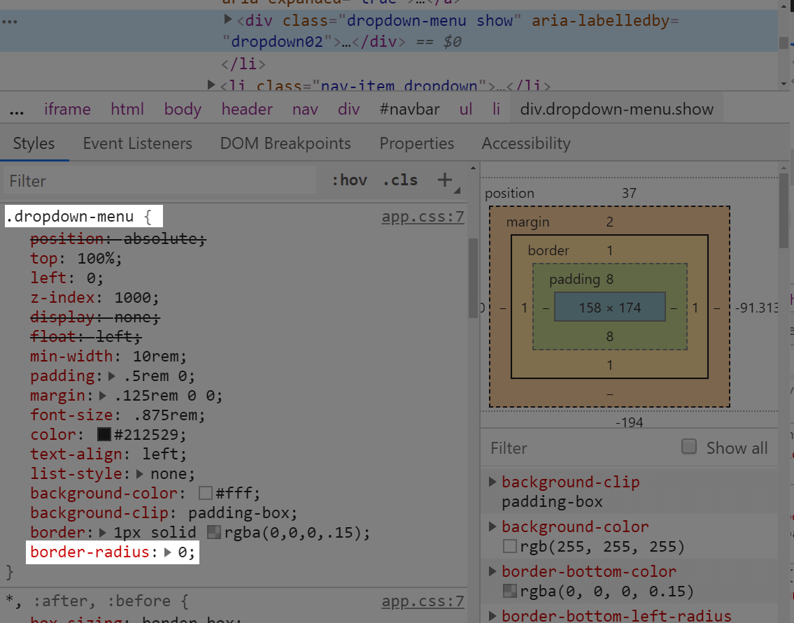
Now we need to focus on the Styles panel. Simply hover your mouse inside the styles under the Styles panel, and scroll down your mouse wheel. You’re looking for the CSS class of dropdown-menu, and a value for the border-radius property on this CSS class.
The below image shows the area inside the Styles panel in which you need to point your mouse and then scroll down.
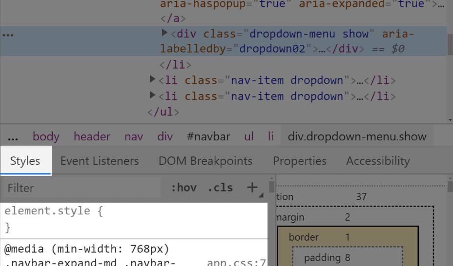
With a bit of searching, it shouldn’t be too hard to find.
Now, as mentioned above, you just need to add these styles to your own theme’s dropdown-menu class, as already explained above.
.dropdown-menu, .form-control {
    border-radius: 0
}
In this CSS code, we are giving the same CSS declaration to more than one CSS class. This is perfectly normal in CSS. In fact, it’s a very common technique.
To add a bottom border, we simply use the class border-bottom, and add it on the nav element:
<nav class="navbar navbar-expand-md navbar-light bg-white absolute-top border-bottom">
Now we can wrap up our layout’s navbar by updating the branding. The first ul element inside the nav, there’s an <a> tag (the anchor element), which holds the navbar’s brand. We’ll update it to this:
<a class="navbar-brand mx-auto order-1 order-md-3" href="index.html">Movies & Typography</a>
What is the & in HTML
There is a special class of characters in HTML, called HTML entities, and the ampersand is a member of this group.
The & marks the beginning of any such HTML entity, and the ; marks its end.
Why even use them?
We use them because browsers get tripped up when they see such special characters, including the ampersand.
Examples include the less than sign, i.e <, and the greater than sign, i.e >.
Written as an HTML entity, the less than sign becomes <, and the greater than sign becomes >.
TL;DR: If you wanna use the ampersand character, write it like this: & in your HTML.
Next, let’s start adding the site’s h1 heading.
Adding the h1 to our site
Earlier in this article, at the very beginning, we saw the mockup for our layout:
Now we’ll add the heading: “BEST MOVIES IN NOVEMBER 2019”.
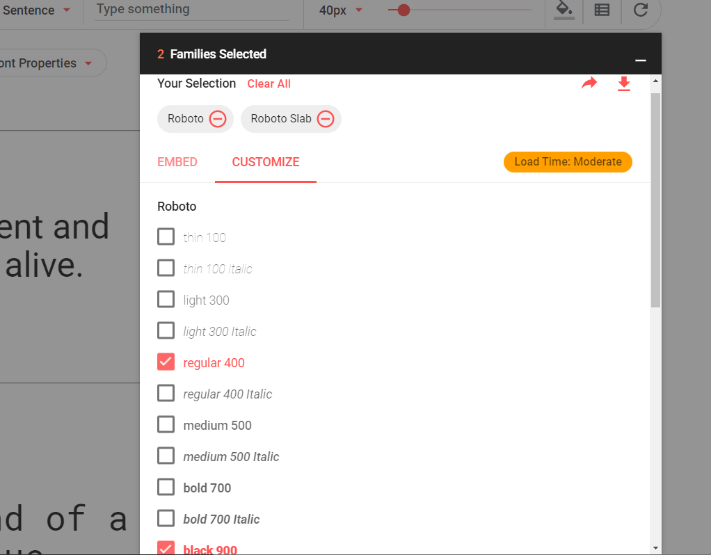
The font used is Roboto with font-weight of 900, and the font size is 116 pixels.
Let’s add it from Google Fonts to our layout.
To choose the font weights to inlude in your Google fonts, click the Customize tab next to the Embed tab in the “2 Families Selected” window on Google fonts.
Now we’ll add the copied font import into the <style> tag just above the closing </head> tag in our layout:
<style>
    @import url('https://fonts.googleapis.com/css?family=Roboto+Slab|Roboto:400,900&display=swap');
    .dropdown-menu, .form-control {
        border-radius: 0
    }
</style>
Next, we can add the huge h1 heading styles:
<style>
    @import url('https://fonts.googleapis.com/css?family=Roboto+Slab|Roboto:400,900&display=swap');
    .dropdown-menu, .form-control {
        border-radius: 0
    }
    .display-biggest {
        font-family: Roboto, sans-serif;
        font-weight: 900;
        font-size: 116px;
    }
</style>
Now we can use our new display-biggest class. Note that the reason we’re using this class name is to follow Bootstrap’s own large font class naming convention of display-1, display-2, display-3, and display-4.
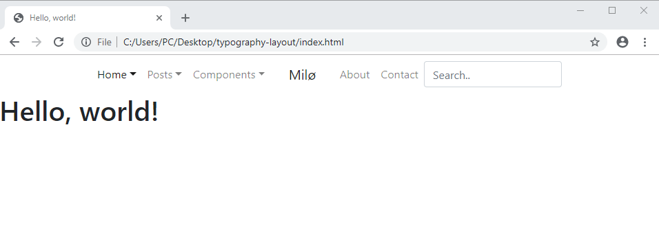
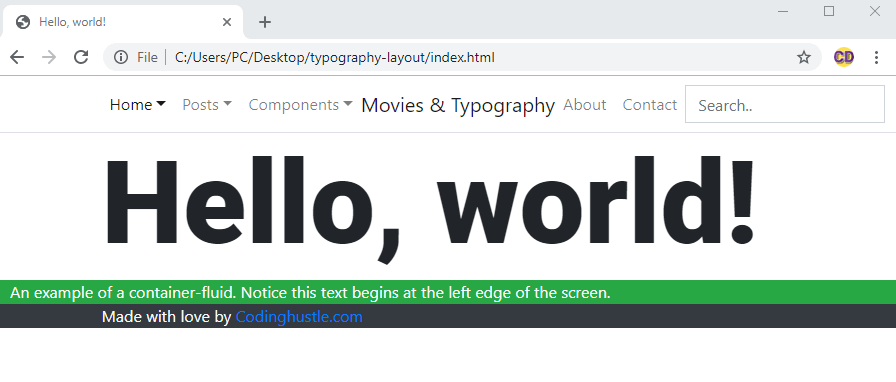
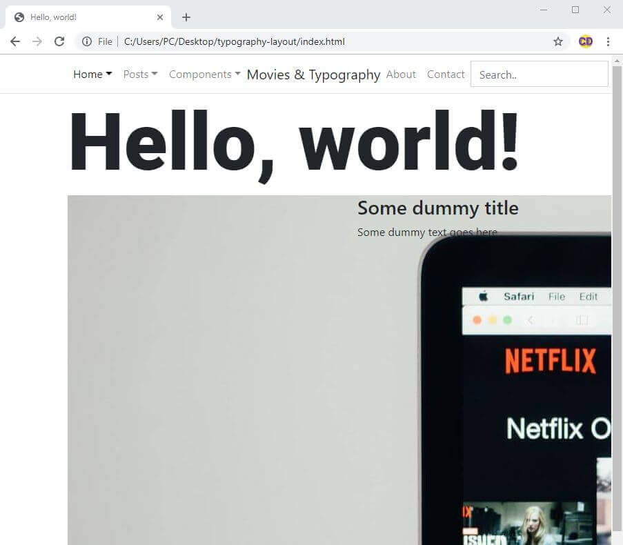
For now, let’s apply the display-biggest on the “Hello world” text under the navbar, on line 86 of our layout:
<h1 class="display-biggest">Hello, world!</h1>
Let’s see what our layout looks like now:
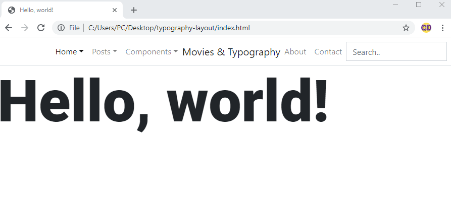
This is much better, our layout is slowly becoming what we imagined.
At this point, it might be good to link to a live example of our incomplete layout.
The layout at this stage is also available for download.
Next, let’s revisit a subject we covered earlier: containers.
Using containers to quickly structure our layouts
In the first article of this series, we covered containers in Bootstrap 4.
We saw how we have two options, that is, two Bootstrap CSS classes to use:
containercontainer-fluid
We further mentioned that the fluid container spans the full width of the page, while the regular container gets centered in the page, and by default, its maximum width is 1140 pixels.
Why are this facts important for our layouts?
Because you can, and should, think about Bootstrap layouts as layers of containers. Let’s see exactly what that means.
Bootstrap layouts as layers of containers
Bootstrap is very modular. We can just add and replace components (code) to get a new look.
We saw this approach earlier in this article when we replaced the default navbar with a custom one.
But this modularity goes even further: you can think of your entire layout as a layer cake.
Literally, this:
In our Bootstrap layouts, these layers are containers.
Let’s revisit our mockup:
In the above mockup, we see that with containers, we have three options:
- We can use the
containerclass, then wrap it in acontainer-fluidif we want to add it a - We can use the
containerclass without the wrappingcontainer-fluid - We can use the
container-fluidclass without thecontainerclass inside of it
Let’s add each of these combinations to our layout.
1. Wrapping container in container-fluid
We’ll build our footer using this technique, because our footer needs to stand out a bit.
We’ll make it stand out by giving it a darker background color, and some lighter font color.
We’ll add the darker background color to the wrapping container-fluid element, i.e the <footer>. Then we’ll specify the font color on the inner container div.
Here’s the code:
<footer class="container-fluid bg-dark">
    <div class="container text-light">
        Made with love by <a href="https://www.codingexercises.com">codingexercises.com</a>
    </div>
</footer>
2. Using container without wrapping it inside container-fluid
For now, we’ll use this technique to give our “Hello world” some horizontal margin:
<div class="container">
    <h1 class="display-biggest">Hello, world!</h1>
</div>
Above, we’re just wrapping the h1 element inside a container element.
3. Using container-fluid class without a container inside of it
In this layout, we don’t really have much use for just a div with container-fluid, but we’ll temporarily add it to our layout, just to see what it looks like in practice:
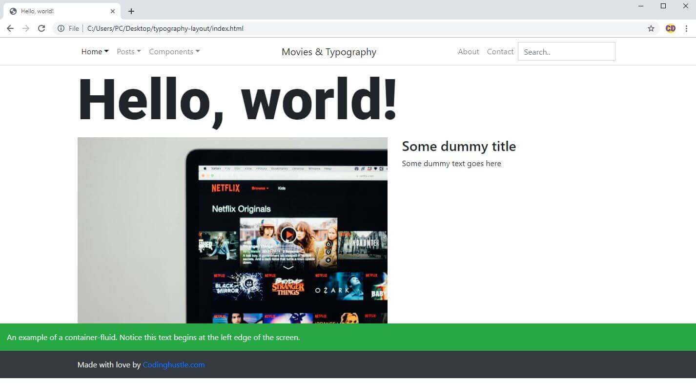
<div class="container-fluid bg-success text-light">
    An example of a container-fluid. Notice this text begins at the left edge of the screen.
</div>
With all these updates added, our layout now looks like this:
We can still improve our containers, by adding some padding utility classes.
We’ll update the green container to this:
<div class="container-fluid bg-success text-light pt-3 pb-3">
    An example of a container-fluid. Notice this text begins at the left edge of the screen.
</div>
In the above code, we’ve added the pt-3 (padding-top, “intensity” 3), and the pb-3 (padding-bottom, “intensity” 3) CSS classes. The pt-3 is the class for adding the CSS declaration of padding-top to an HTML element, and the pb-3 updates the padding-bottom property on an element.
We’ll update the footer with a short version of these two classes:
<footer class="container-fluid bg-dark py-3">
    <div class="container text-light">
        Made with love by <a href="https://www.codingexercises.com">codingexercises.com</a>
    </div>
</footer>
Understanding spacing utility classes in Bootstrap
If you want to add the same “level of intensity” on both the top and bottom padding classes, you can replace the pt-* and pb-* with py-*. Note that the * here needs to be the same number.
For example, you can replace pt-5 and pb-5 with py-5. Why the y letter in this class name? Because we’re updating the padding on the y axes.
We can do a similar thing with the horizontal padding, e.g replace pr-5 and pl-5 with px-5.
We can work with margins in the exact same way, for example:
- we can replace
mt-1andmb-1withmy-1 - we can replace
mr-4andml-4withmx-4
Our layout, improved with containers
After the above updates, our layout now looks like this:
Now we can see the result of the above updates in a live preview.
Next, we’ll add the the text and images.
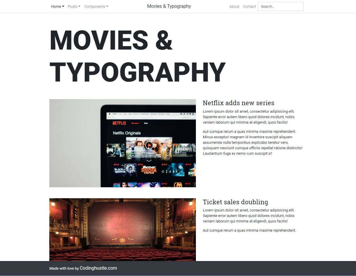
Adding images and text to our layout
All that’s left to do for this layout is add some elements in a layout grid.
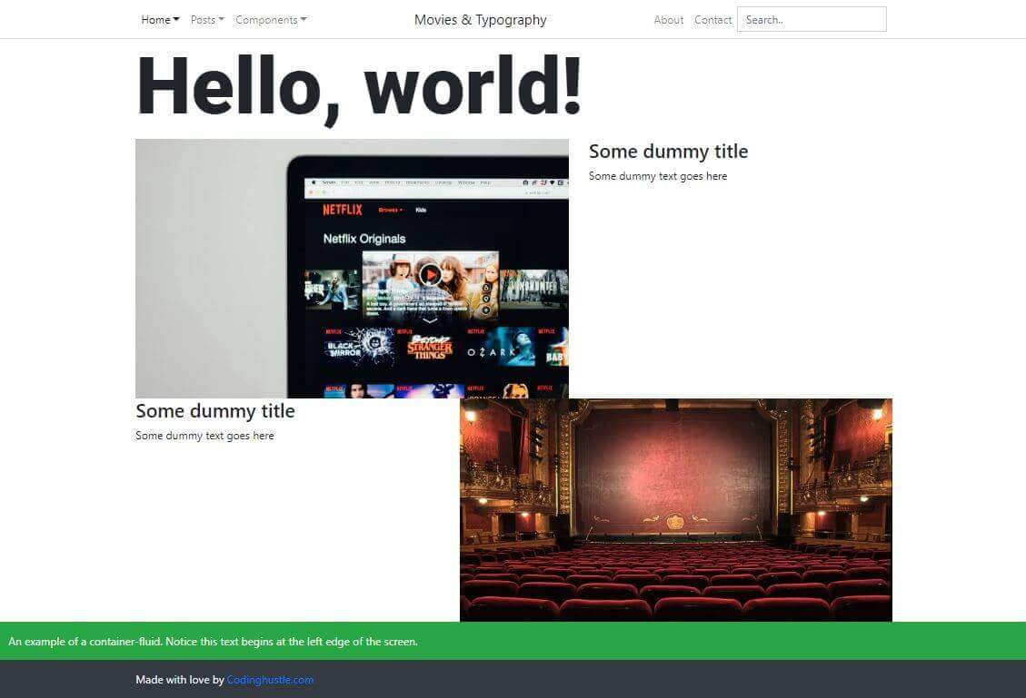
We’ll use two movie-themed images from Unsplash.com:
- the first one is an image of an old theather by Peter Lewicki
- the second one is a photo of Netflix website on a laptop by Charles PH
Both the images will spread 7 columns of Bootstrap’s 12-column grid. The first image will show on the left, with text on the right. The other image will appear on the right, and the text will appear on the left.
Let’s add the first image, the Netflix image.
For this, we’ll add a new container. We don’t want any backgrounds covering the full width of the screen, so we won’t be adding the container-fluid class:
<div class="container">
</div>
Next, we’ll add the row class:
<div class="container">
    <div class="row">
    </div>
</div>
Now we can add the column grid, which we briefly covered here. To understand the very basics of how and why column grids are used, check out this article.
Adding the columns
Let’s update our new container with the columns:
<div class="container">
    <div class="row">
        <div class="col-sm-12 col-md-7">
            <img src="./netflix.jpg" alt="netflix on a laptop">
        </div>
        <div class="col-sm-12 col-md-5">
            <h2 class="h3">Some dummy title</h2>
            <p>Some dummy text goes here</p>
        </div>
    </div>
</div>
Here’s the screenshot of our layout now:
Ooops, that’s not what we expected!
The image is displayed in its full, original size. That’s not good.
Luckily, it’s an easy fix: we just need to add the Bootstrap 4 class of img-fluid. This class will make our image responsive.
Here’s the updated img element from the above code:
<img class="img-fluid" src="./netflix.jpg" alt="netflix on a laptop">
That’s it, it’s all that it takes to get this:
Now we can add the other image too, as another row.
Here’s the complete update:
<div class="container">
    <div class="row">
        <div class="col-sm-12 col-md-7">
            <img class="img-fluid" src="./netflix.jpg" alt="netflix on a laptop">
        </div>
        <div class="col-sm-12 col-md-5">
            <h2 class="h3">Some dummy title</h2>
            <p>Some dummy text goes here</p>
        </div>
    </div>
    <div class="row">
        <div class="col-sm-12 col-md-7">
            <img class="img-fluid" src="./old-theatre.jpg" alt="old theatre">
        </div>
        <div class="col-sm-12 col-md-5">
            <h2 class="h3">Some dummy title</h2>
            <p>Some dummy text goes here</p>
        </div>
    </div>
</div>
Here’s the screenshot of the update:
You can also download the layout as it is now, or view it live in the browser.
Our layout is almost done; there’s only a few minor fixes left.
Polishing up our layout
There are a few things to improve:
- We could try adding more space between each row in our layout.
- We’ll remove the example fluid container fluid with the
bg-successcontextual color - We’ll see how to quickly flip the order of columns in our layout
- We’ll make the footer stick to the bottom no matter what!
- Update the typography (on paragraphs,
h2elements, and in the footer)
Let’s first add more space between each row.
We’ve learned about the spacing utility classes in this article, and now we have a chance to use them.
Let’s update both rows with the class of my-5, like this:
<div class="row my-5">
That’s it for the spacing, now let’s just erase the green bar above the footer. This is the code to delete:
<div class="container-fluid bg-success text-light pt-3 pb-3">
    An example of a container-fluid. Notice this text begins at the left edge of the screen.
</div>
Now we’ll see how to quickly flip the order of columns in our layout with a technique known as “source ordering”.
Source ordering our column grid
Source ordering is the practice of keeping our source (the HTML) the same, but ordering our layout differently, using CSS.
To achieve this, we can use Bootstrap 4 CSS classes of order-1 to order-12, where lower numbers come first.
Here’s the update in the second row:
<div class="row my-5">
    <div class="col-sm-12 col-md-7 order-1">
        <img class="img-fluid" src="./old-theatre.jpg" alt="old theatre">
    </div>
    <div class="col-sm-12 col-md-5 order-2">
        <h2 class="h3">Some dummy title</h2>
        <p>Some dummy text goes here</p>
    </div>
</div>
You might think at this point, why even bother with source ordering? Shouldn’t I just order the HTML to get the layout I want?
There’s actually two reasons for source ordering:
- Layouts are responsive and complex
- SEO
There’s sometimes a slight SEO advantage - more importance given - to those HTML tags that appear earlier in the site structure.
Also, layouts can get complex, so you might not want the same visual order of your columns on different breakpoints (i.e on mobiles, tables, laptops, and desktops).
Now I’ll show you a cool trick in devtools’ JavaScript console.
Testing layout variations using the JavaScript console in the developer tools
To get to it, open the devtools with F12, then press the ESC key to open the console.
After that, just type:
document.designMode = 'on'
Now you can type directly into the layout! You can even drag images around. The entire browser window becomes similar to Photoshop.
Let’s now take care of the footer.
Making the footer stick to the bottom
In our layout, this is very easy to do. We’ll just set the position to fixed and the bottom to 0. You can read more about positioning here.
We’ll also need to set the height of the <body> element to 100 percent of viewport height. The viewport height has it’s own unit of measure in CSS: the vh unit. Thus the CSS declaration will be: min-height: 100vh.
Here’s the full updated CSS:
<style>
@import url('https://fonts.googleapis.com/css?family=Roboto+Slab|Roboto:400,900&display=swap');
.dropdown-menu, .form-control {
    border-radius: 0
}
.display-biggest {
    font-family: Roboto, sans-serif;
    font-weight: 900;
    font-size: 116px;
}
.body {
    min-height: 100vh;
}
.pos-fix.b0 {
    position: fixed;
    bottom: 0
}
</style>
And we’ll update the <footer> element accordingly:
<footer class="container-fluid bg-dark py-3 pos-fix b0">
    <div class="container text-light">
        Made with love by <a href="https://www.codingexercises.com">codingexercises.com</a>
    </div>
</footer>
To test if the footer indeed sticks to the bottom, you can open the devtools and click on the top row, then press the DELETE button. This will remove the row from the DOM (Document Object Model) of the page. Note that this is a non-destructive change - meaning it won’t save changes, so you can do it without worrying you’ll mess up your layout.
Here’s a screenshot of testing out if our footer stays in place with one row erased from the DOM:
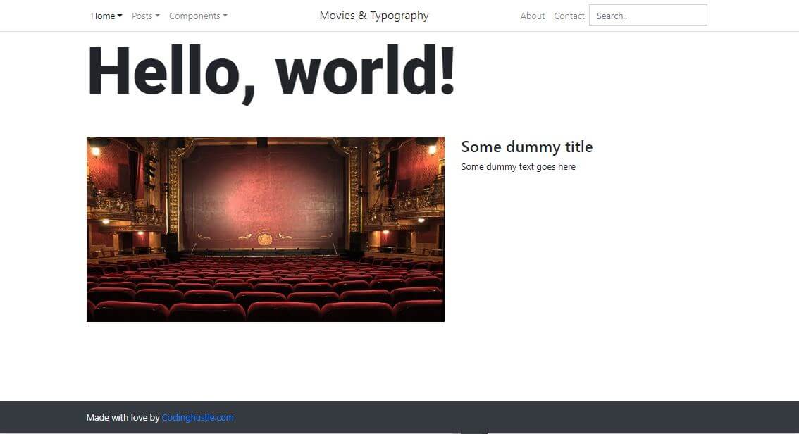
Improving typography
Let’s also change the color on the codingexercises link from default browser blue to the text-light. We’ll also use the lead text class to make it a bit more prominent:
<footer class="container-fluid bg-dark py-3 pos-fix b0">
    <div class="container text-light">
        Made with love by <a class="text-light lead" href="https://www.codingexercises.com">codingexercises.com</a>
    </div>
</footer>
Next, let’s make the entire page use the Roboto font:
* {
    font-family: Roboto, sans-serif !important;
}
The * is called the universal selector, and the !important flag we used on it overrides everything.
It’s best to not use it if you don’t have to, but if you do use it, it’s likely to override all the other styles on your page. In other words, it will disregard the CSS specificity.
Next, we’ll set the font of Roboto Slab on h2 headings.
h2 {
    font-family: "Roboto Slab", serif;
}
You must use quotes around font families whose names contain spaces.
Unfortunately, the above CSS won’t work, because we’ve applied the !important flag on the wildcard selector earlier.
To fix the issue, simply erase the !important flag from it.
The completed CSS now looks like this:
* {
  font-family: Roboto, sans-serif;
}
h2 {
  font-family: "Roboto Slab", serif;
}
.dropdown-menu, .form-control {
  border-radius: 0
}
.display-biggest {
  font-family: Roboto, sans-serif;
  font-weight: 900;
  font-size: 116px;
}
body {
  min-height: 100vh;
}
.pos-fix.b0 {
  position: fixed;
  bottom: 0
}
We’ve also added some more lorem ipsum text under each title, so that our layout looks more like a real web page.
Finally, we’ve added the text class of text-uppercase to the main, h1 heading, so that the font is all capitalized.
Here’s the screenshot of the completed layout:
You can also download the layout as it is now, or view it live in the browser.
That’s it for this article. Let’s revise what we learned:
Conclusion
In this article, we’ve learned the following:
- How to download Google fonts to our layout
- How to use the starter template from the official Bootstrap docs
- Use Brackets code editor because it’s very beginner-friendly (and it has Live Preview built-in!)
- How to add the navbar from another layout into our own layout
- How to inspect elements in the developer tools
- How to copy, alter, and delete elements in the developer tools
- How to make borders square on bootstrap dropdowns and form inputs
- How to work with styles inside developer tools
- What is the
&and why it’s used - How to use
containerandcontainer-fluid - How to use spacing utility classes in Bootstrap
- How to add images and text to our layout
- What is source ordering and why use it
- How to make our browser behave like Photoshop (sort of), with the help of
document.designMode = 'on' - How to make our footer stick to the bottom
- How to use the
*selector, the!importantflag, andtext-uppercasewhen building Bootstrap-based layouts
In the next article in this article series, we’ll discuss a better way to develop our layouts (by making them modular), we’ll use SCSS, and we’ll touch on a more efficient way to learn coding.

