HTML and CSS Basics, part 8: Relative, absolute, fixed, and sticky positioning
In CSS, positioning is relative, not just some absolutely fixed, static thing!
By: Ajdin Imsirovic 16 September 2019
This series of posts is titled HTML and CSS Basics. If you’re just starting out with web development, it is crucial to read and understand this series of posts.
This is the eighth post in this series of articles.
In the previous post, we’ve seen the difference between static and relative positioning. In this article, we’ll examine the differences between relative and absolute positioning.
Like we mentioned in article six in this series, CSS has a position property and it’s values can be set to static, relative, absolute, and fixed.
While the static property is the default behavior, meaning we can’t “nudge” elements from their normal flow, with the relative property, we can “nudge” elements from the normal flow, using the top, right, bottom, and left CSS properties, and giving them values, both negative and positive. These values are usually expressed in pixels, for example:
div {
  position: relative;
  bottom: -20px;
}
Video tutorial on position relative vs position absolute vs position fixed vs position sticky
I’ve recorded a video on CSS positioning to accompany this article.
I’ve separately recorded another video on how the position sticky works.
If you like these 👍 videos, please subscribe 🥰 to our Youtube channel.
Position relative vs position absolute
Note that position: absolute is similar to position: relative, because it also makes the element it’s applied to move away from its position in the normal document flow.
However, position: absolute moves the element NOT relative to its position in the document flow, but rather relative to the top, right, bottom, and left EDGE OF THE PARENT ELEMENT.
As we’ve seen earlier, with position: relative, “nudging” an element doesn’t actually remove the element from normal document flow, it just displaces it. However, the empty slot in the document flow, where the element originated from, is still there.
With position: absolute, this “empty slot” where the element originated from, is not visible anymore. It is so because we completely removed the element from normal document flow, so its “original empty slot” doesn’t exist anymore. That place now gets filled with whatever element comes after it in the document flow.
Absolute positioning means that the element is taken completely out of the normal flow of the page layout. As far as the rest of the elements on the page are concerned, the absolutely positioned element simply doesn’t exist. The element itself is then drawn separately, sort of “on top” of everything else, at the position you specify using the left, right, top and bottom attributes.
Using the position you specify with these attributes, the element is then placed at that position within its last ancestor element which has a position attribute of anything other than static (page elements default to static when no position attribute specified), or the document body (browser viewport) if no such ancestor exists.
An example to practice absolute positioning
Here’s an another practice example. This one has several classes, but all the divs are positioned absolutely.
The HTML code looks like this:
1
2
3
4
5
6
7
8
<div class="bg1 pad1 dib top">first div</div>
<div class="bg2 pad1 dib bottom">second div</div>
<div class="bg3 pad1 dib left">third div</div>

<div class="bg1 pad1 dib
            right0X right-50X right-100 right200X right350">
  example
</div>
The CSS code looks like this:
1
2
3
4
5
6
7
8
9
10
11
12
13
14
15
16
17
18
19
20
.bg1 { background: lightgray }
.bg2 { background: lightslategray }
.bg3 { background: orange }
.pad1 { padding: 20px }
.pad2 { padding: 40px }
.m1 { margin: 20px }
.m2 { margin: 40px }
.dib { display: inline-block }

div { position: absolute }

.top { top: 150px }
.right0 { right: 0px }
.bottom { bottom: 0px }
.left { left: 500px}

.right-50 { right: -50px }
.right-100 { right: -100px }
.right200 { right: 200px }
.right350 { right: 350px }
Here’s the preview of the above code in the browser:
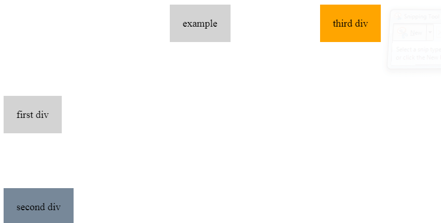
Feel free to play around with the values in the example above.
Next, we’ll discuss what happens when we position the parent element relative, and the child element absolute.
Position parent element relative and child element absolute
In this example, we’re setting the wrapping div to position: relative. Next, we’re setting the inside div to position: absolute.
Here’s our example’s HTML:
1
2
3
4
<div class="bg1 pad1 dib top w500 h200 relative">
  Outer div
  <div class="bg2 pad1 dib bottom right0 absolute" id="child">inner div</div>
</div>
And here’s the CSS:
1
2
3
4
5
6
7
8
9
10
11
12
13
14
15
16
.bg1 { background: lightgray }
.bg2 { background: lightslategray }

.pad1 { padding: 20px }

.dib { display: inline-block }

.top { top: 150px }
.right0 { right: 0px }
.bottom { bottom: 0px }

.w500 { width: 500px }
.h200 { height: 200px }

.relative { position: relative }
.absolute { position: absolute }
There are also some additional CSS properties stored in different CSS classes, so that the example is easier to understand visually.
This is the result of our code:
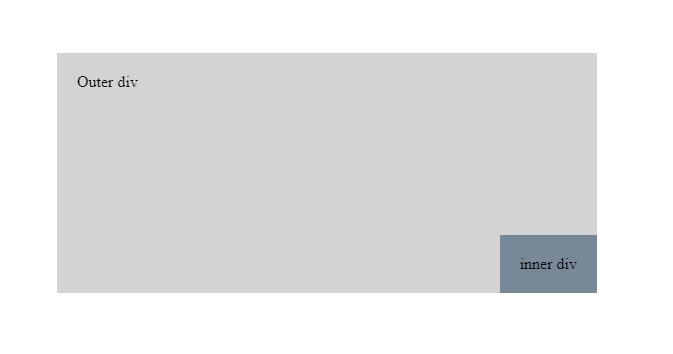
As we can see, when the outer div is set to position: relative, and the inner div is set to position: absolute, the inner div is then positioned in relation to the outer container.
This pattern is very handy and used frequently when laying out web pages, because it allows us to position child elements precisely in certain places in our layout, no matter what.
A mini-test on abolute elements inside relative elements
Here’s a quick pop-quiz: Try moving the inner div, which is currently located at the bottom-right corner of the outer div, into a different place:
- Move it to top-right corner of the outer div (ANSWER ONE)
- Move it to bottom-left corner of the outer div (ANSWER TWO)
- Move it 20 pixels from the top, and 50 pixels from the left (ANSWER THREE)
The answers can be found in the commented-out CSS code in the example codepen.
To make the answers as easy to preview as possible, we had to resort to the CSS id syntax. It’s a new concept, so let’s briefly explain it.
CSS id syntax
Similar to the class attribute, we also have an id attribute in our HTML.
As we’re already well-aware, the class attribute is targeted in CSS like this:
.some-class-name {
  property: value
}
In terms of syntax, the id attribute is almost identical:
#some-class-name {
  property: value
}
The difference is just that we use the # symbol to signify the id.
All the other syntax rules are the same: just like in a CSS class, in a CSS id selector, we can specify a single property: value pair, or as many property: value pairs as we want.
The important difference between ids and classes in CSS lies in specificity and usage:
- An id HTML attribute is supposed to be used only once per page.
- The id CSS selector has greater specificity than a bunch of class selectors
Just how much greater the CSS specificity is, will be left for another article.
The practical conclusion at this point is that by simply commenting out our #child selector in the commented ANSWER ONE, TWO, AND THREE, we can see the solution to our mini-test above.
As always, feel free to play around with this code.
Note: We’re also using the unset value in several CSS properties in the answers. That’s because the unset will reset any CSS property back to the default.
Thus, if we didn’t use right: unset and bottom: unset in our third answer’s #child selector, the <div> element would still have the bottom and right0 classes applied to it, which would result in the inner div stretching all the way to the bottom right corner of the outer div.
In other words, if we didn’t unset the bottom and right properties, this is what we’d get:
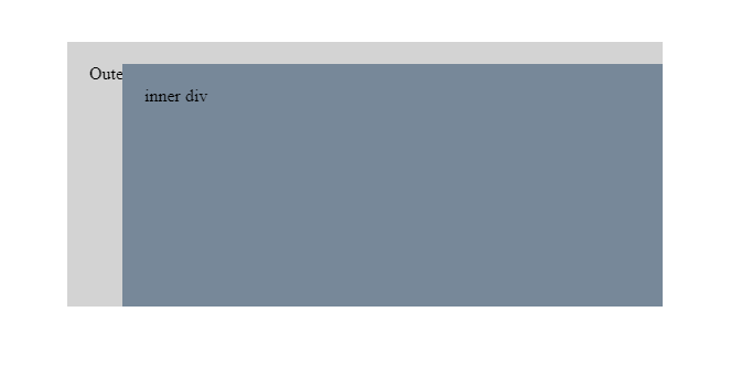
This also brings us to an interesting aside conclusion: If we want to have the inner element stretch the full width of the parent, we can simply use the position: absolute, left: 0, and right: 0. Of course, we can place it on top of the outer div with top: 0, or the bottom with bottom: 0.
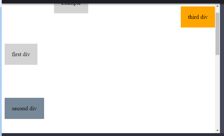
Working with position: fixed
Have you ever wondered how on some sites, the navbar always stays on top of the window - even if you scroll?
It is actually quite easy to make such a navbar. You just use the property: value of position: fixed.
You can think of position: fixed like this: it’s as if we glued our div onto the monitor. It’s not only outside the document flow, it’s as if it’s outside of the document itself!
Here’s an example of using fixed position on a div.
The effects of position: fixed can be seen when the document is tall enough to be scrollable, so we had to add some additional styling to make this happen.
Here’s the HTML:
1
2
3
4
5
6
7
8
<div class="bg1 pad1 dib top">first div</div>
<div class="bg2 pad1 dib bottom">second div</div>
<div class="bg3 pad1 dib leftX right0">third div</div>

<div class="bg1 pad1 dib
            right0X right-50X right-100 right200X right350">
  example
</div>
Here’s the CSS:
1
2
3
4
5
6
7
8
9
10
11
12
13
14
15
16
17
18
19
20
21
22
.bg1 { background: lightgray }
.bg2 { background: lightslategray }
.bg3 { background: orange }
.pad1 { padding: 20px }
.pad2 { padding: 40px }
.m1 { margin: 20px }
.m2 { margin: 40px }
.dib { display: inline-block }

div { position: absolute }
div.bg3 { position: fixed }
body { height: 1000px }

.top { top: 150px }
.right0 { right: 0px }
.bottom { bottom: 0px }
.left { left: 500px}

.right-50 { right: -50px }
.right-100 { right: -100px }
.right200 { right: 200px }
.right350 { right: 350px }
This is the result of the above code:
Conclusions for position fixed
Here are our conclusions for using position: fixed
- position: fixed acts as if we have pinned an element onto the screen; what this means is that the element is fixed in place (even when the user scrolls down the page)
- if an element has the position property set to “fixed”, if you additionally use the top, right, bottom, or left property and give it a value, it has the same result as it does with the position: absolute property.
- The difference between position: absolute and position: fixed is the following: an absolutely positioned element will scroll with the page, while a fixed element will remain in the exact same position regardless of whether the user is scrolling the webpage or not.
That’s it for this article. In the next one, we’ll look at images and floats in CSS.
Use the below links to navigate through other tutorials in this guide.
< Back to part 7: CSS positioning
You are here: Part 8, Relative, absolute, fixed, and sticky positioning

