HTML and CSS Basics, part 9: Images and floats in CSS
Understanding floats and how to work with images in your layouts
By: Ajdin Imsirovic 17 September 2019
This series of posts is titled HTML and CSS Basics. If you’re just starting out with web development, it is crucial to read and understand this series of posts.
This is the ninth post in this series of articles.
We’ve covered quite a lot in this series so far. We’ve discussed browser whitespace, CSS selectors, block, inline, and inline-block elements, CSS classes and CSS IDs, using the display property, the box model in CSS, and CSS positioning.
We’re already equipped with a lot of knowledge that will allow us to build all kinds of layouts in CSS.
However, we’ve still got a few concepts to cover.
One of them is the concept of floats, how they’ve been used and abused in the past, and how to use them in modern web development.
We’ll begin by looking at another inline element, <img>, and its relationship with the float CSS property.
Images are inline elements
Images are inline elements.
We’ll begin this post by looking at our first example, which showcases the fact that images are indeed inline elements.
The example’s HTML code looks like this:
1
2
3
4
5
6
7
8
9
10
11
12
13
14
15
<h1>Normal Document Flow in HTML</h1>
<div class="border dib">This is a div.
  <span> This is a span.</span>
  This is still the same div.
  <span>Some more text.</span>
  <img src="https://66.media.tumblr.com/avatar_24f9df58c75d_128.pnj" />
  <span>There is a whole lot of text here.</span>
<div>

<p>This is a paragraph.</p>
<p>This is another paragraph.</p>
<div>
  <p>This is a paragraph in a div.</p>
  <div>This is a div in a div.</div>
</div>
And the CSS code for our example looks like this:
1
2
.border { border: 1px solid gray }
.dib { display: inline-block }
The above code produces the following-looking web page:
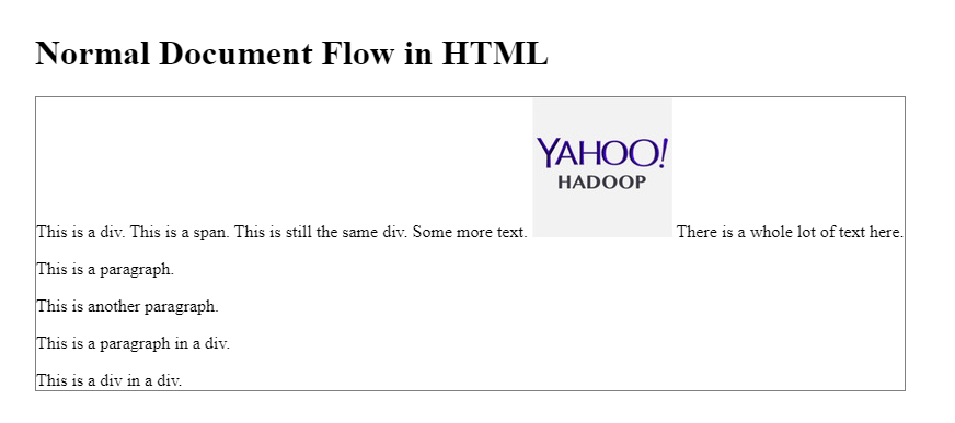
Obviously, the image is displayed inline, similar to a <span> element. Actually, the <img> tag’s display is by default set to inline-block - which means that the browser will render images with top and bottom margins on if we set these margins in our CSS.
Let’s say we want to have an image on the right or the left side of its container (its parent div). How do we do that? We’ll see that next.
Floating images left and right
In the codepen example titled floating images left and right, we have the following HTML code:
1
2
3
4
5
6
7
8
9
10
11
12
13
14
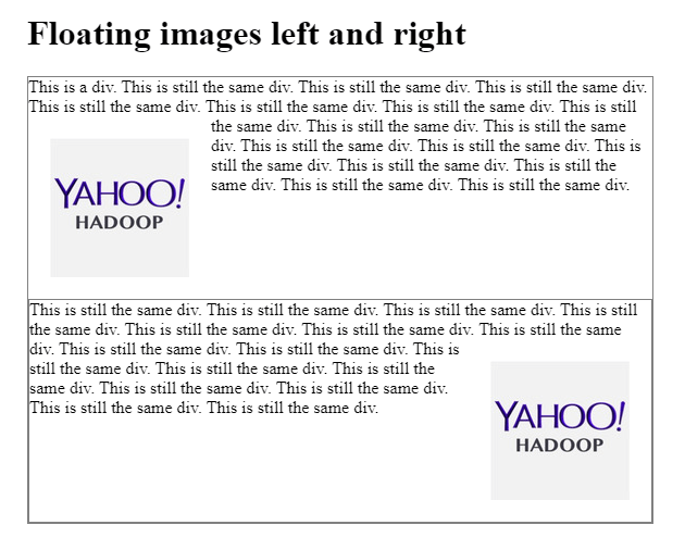
<h1>Floating images left and right</h1>
<div class="border dib">This is a div.
This is still the same div. This is still the same div. This is still the same div. This is still the same div. This is still the same div. This is still the same div.
<img class= "fl m20" src="https://66.media.tumblr.com/avatar_24f9df58c75d_128.pnj" />
This is still the same div. This is still the same div. This is still the same div. This is still the same div. This is still the same div. This is still the same div. This is still the same div. This is still the same div. This is still the same div. This is still the same div.
<div>
<div class="border dib">
This is still the same div. This is still the same div. This is still the same div. This is still the same div. This is still the same div. This is still the same div.
<img class= "fr m20" src="https://66.media.tumblr.com/avatar_24f9df58c75d_128.pnj" />
This is still the same div. This is still the same div. This is still the same div. This is still the same div. This is still the same div. This is still the same div. This is still the same div. This is still the same div. This is still the same div. This is still the same div.
<div>
Why so much HTML? Because we’re trying to add enough text to see how it starts wrapping around the image.
Here’s the example’s CSS:
1
2
3
4
5
6
7
.border { border: 1px solid gray }
.dib { display: inline-block }
.fl { float: left }
.m20 { margin: 20px }

.fr { float: right }
body { width: 30% }
Here’s the output in the browser:
In the past, floats were an extensively used hack to create layouts.
However, today we have flexbox and CSS grid, and thus it’s not recommended to use floats unless it’s for floating images.
Still, because it’s so pervasive even to this day, next we’ll look at problems with floats in layouts and how to solve them.
Issues with floats and layouts
We’ll begin with the following scenario: We have a floated inner div, but the outer div that wraps it is not floated.
The issue here is that the non-floated parent will not be aware of the height of its floated child div.
Non-floated parent floating a child div
Our codepen example for this issue can be found here.
Here’s the example’s HTML:
1
2
3
4
5
6
7
8
9
10
11
<div class="parent">
  <div class="child fl">
  </div>
</div>

<br><br><br><br>

<div class="parent">
  <div class="child">
  </div>
</div>
Here’s the example’s CSS:
1
2
3
4
5
6
7
8
9
10
.parent {
  padding: 20px;
  background: gray;
}
.child {
  height: 80px;
  width: 80px;
  background: tomato;
}
.fl { float: left }
This example shows the issue with the floated child in a non-floated parent.

The top part of the image shows the issue: the parent div is not “aware” of the height of its child element.
The bottom part of the image shows how the child element is wrapped by the parent element when the child is not floated.
How do we solve this issue?
One simple solution is to add the overflow: auto property-value pair to our parent div.
Here’s the solution’s HTML:
1
2
3
4
5
6
7
8
9
10
11
<div class="parent">
  <div class="child fl">
  </div>
</div>

<br><br><br><br>

<div class="parent">
  <div class="child">
  </div>
</div>
And here’s the CSS for this solution:
1
2
3
4
5
6
7
8
9
10
.parent {
  padding: 20px;
  background: gray;
}
.child {
  height: 80px;
  width: 80px;
  background: tomato;
}
.fl { float: left }
As we can see in the image below, our parent now correctly wraps the floated child (the top half of the image), just like it does a non-floated child (the bottom half of the image):

Next, we’ll discuss the concept of clearing floats. We’ll see what exactly it means to clear floats, why to clear floats, and how to do it.
Clearing floats
A CSS property that goes hand-in-hand with the float property is the clear property.
Without the clear property applied, the element that follows a floated element will be horizontally placed next to the floated element, if there is enough horizontal space available for the next element to fit.
With the clear property applied to any element that follows the floated element, that element will be placed below the floated element - even though it would horizontally fit next to the floated element if the clear property was not applied.
All of this being said, here’s a simple way to remember the role of the clear property:
If an element is floated left, apply clear: left to the element following the floated element; this will clear the horizontal space
to the right
of the floated element.
If the above definition doesn’t work for you, let’s try this one:
Apply clear: left to an element following a left-floated element to move it below the left-floated element.
To drive this point home, let’s look at an example of clearing floats.
Here’s the HTML for this example:
1
2
3
4
5
6
7
8
9
10
11
12
13
14
15
16
17
18
19
20
21
22
23
24
25
26
27
28
29
<h1>The clear Property</h1>

<h2>Clearing left</h2>

<div class="border">
  <img class="fl" src="https://66.media.tumblr.com/avatar_24f9df58c75d_128.pnj">
  <p>This is some text. This is some text. This is some text. This is some text. This is some text. This is some text.</p>
  <p class="clear-left">This is also some text. This is also some text. This is also some text. This is also some text. This is also some text. This is also some text.</p>
  <p><strong>Remove the "clear-left" class to see the issue we're fixing with the "clear-left" class.</strong></p>
</div>

<h2>Clearing right</h2>

<div class="border">
  <img class="fr" src="https://66.media.tumblr.com/avatar_24f9df58c75d_128.pnj">
  <p>This is some text. This is some text. This is some text. This is some text. This is some text. This is some text.</p>
  <p class="clear-right">This is also some text. This is also some text. This is also some text. This is also some text. This is also some text. This is also some text.</p>
  <p><strong>Remove the "clear-right" class to see the issue we're fixing with the "clear-right" class.</strong></p>
</div>


<h2>Clearing both</h2>

<div class="border">
  <img class="fl" src="https://66.media.tumblr.com/avatar_24f9df58c75d_128.pnj">
  <p>This is some text. This is some text. This is some text. This is some text. This is some text. This is some text.</p>
  <p class="clear-both">This is also some text. This is also some text. This is also some text. This is also some text. This is also some text. This is also some text.</p>
  <p><strong>Remove the "clear-both" class to see the issue we're fixing with the "clear-both" class.</strong></p>
</div>
And here’s the CSS:
1
2
3
4
5
6
.border { border: 1px solid gray }
.fl { float: left }
.fr { float: right }
.clear-left { clear: left }
.clear-right { clear: right }
.clear-both { clear: both }
As always, here’s the preview of the above code when ran in a browser:
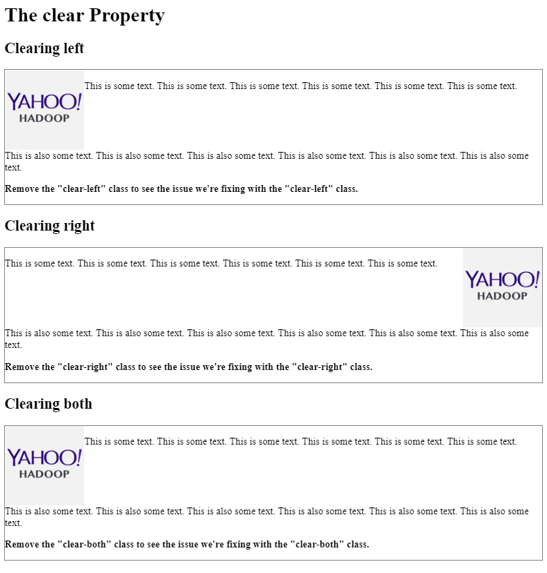
In the above example’s codepen, there’s also a simple mini-task to do to see the way that the elements following a floated element will behave with clear property applied or not. See the example for more details.
Possible values of the clear property
The clear property can have these values: none, left, right, and both.
With clear: none, the element is not moved down to clear any float.
With clear: left, the element is moved down to clear left-floated elements before it.
With clear: right, the element is moved down to clear right-floated elements before it.
With clear: both, the element is moved down regardless of whether the elements before it are floated left or right.
Why use clear: both over clear: left or clear: right
If you are not sure whether the floated elements will be floated left or right, and you also want to make sure that whatever is the case, a specific element following them is cleared, you need to use clear: both. That way you can rest assured that whichever float is applied, the cleared element following floated element(s) will always be moved below, and not the to site of floated element(s).
Practical examples of clearing floats
In the following two practical examples, we’ll look at a bit more real-life scenarios, with multiple divs.
The first of these two examples shows how a clear property moves the third box under the second floated box, as can be seen in the web page screenshot:
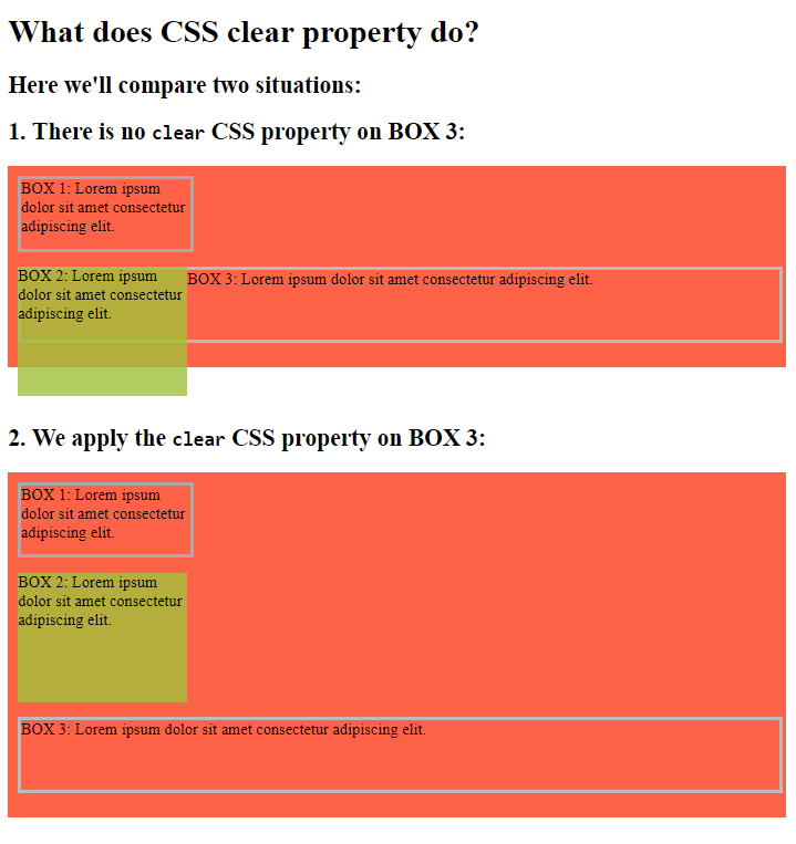
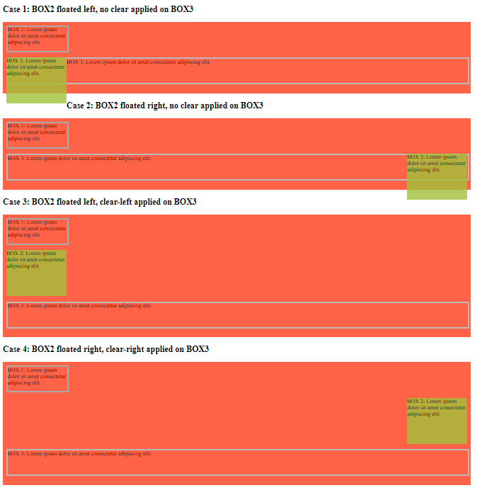
The second of these two examples shows several combination of floats and clears, as follows:
- box 2 floated left, no clear applied on box 3
- box 2 floated right, no clear applied on box 3
- box 2 floated left, clear-left applied on box 3
- box 2 floated right, clear-right applied on box 3
We can see a preview of all these combinations in the following screenshot:
The clearfix hack
It’s also important to mention the clearfix hack approach. Instead of using overflow: auto, you can use this code:
.clearfix::after {
  content: "";
  clear: both;
  display: table;
}
This will make sure that the element that follows either a right-floated or a left-floated element will clear no matter what.
The interesting part of the above syntax is the .clearfix::after. The ::after is what’s known as a pseudo-selector. We’ll cover that in the next post in this series.
This concludes our post on CSS floats. In the next post in the series, we’ll be revisiting CSS selectors to get a deeper understanding on the topic.
Use the below links to navigate through other tutorials in this guide.
< Back to part 8: Relative, absolute, fixed, and sticky positioning
You are here: Part 9, Images and floats
Continue to part 10: CSS selectors and CSS targeting revisited >

