HTML and CSS Basics, part 19: Building a layout with our micro CSS framework
Let's put our newly-build CSS framework to good use
By: Ajdin Imsirovic 25 September 2019
Here I’ll build a simple CSS layout.
To build this layout, we’ll use the CSS micro-framework we built in the previous post in this series.
 Photo by
Danielle MacInnes, @dsmacinnes on Unsplash
Photo by
Danielle MacInnes, @dsmacinnes on Unsplash
The layout we’ll be building is the same basic layout from part 13 of this article series.
Let’s first add our structure.
Adding HTML structure
We’ll be using the exact same structure we did in part 13:
<div>
  <header>This is the header.</header>
  <div>
    <aside>This is the sidebar.</aside>
    <main>This is the main content area.</main>
  </div>
  <footer>This is the footer.</footer>
</div>
Now we need to use the CSS framework we built in the previous article.
Which classes should we use to get the header, the footer and the main area align like it did in article 13 of this series?
An obvious choice would be to use our column grid and some background coloring classes, to make it easy to see what’s going on with our HTML elements.
Adding the column grid and background color CSS classes to our HTML
Let’s update our HTML to this code:
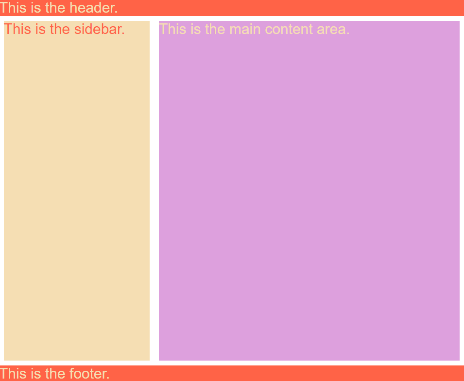
<div class="display-flex flex-direction-column arial fs30">
  <header class="smcol12 bg-tomato color-wheat">This is the header.</header>
  <div class="display-flex smcol12 h75vh ">
    <aside class="smcol12 lgcol4 bg-wheat color-tomato">This is the sidebar.</aside>
    <main class="smcol12 lgcol8  bg-plum color-wheat">This is the main content area.</main>
  </div>
  <footer class="smcol12 bg-tomato color-wheat">This is the footer.</footer>
</div>
The updated example can be seen in this codelab.
This is a screenshot of the result in the browser, at desktop resolution:
At mobile resolutions, our web page will look like this:
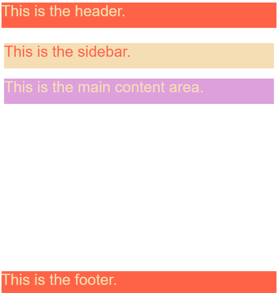
Obviously, as we can see, there are a few things missing from our layout above.
The problem with the above layout is that we need more custom classes to address the issues:
- fix the gap on mobile,
- make the app look nicer,
- have a mood that is followed throughout all the styles
Basically, it boils down to this: our micro-framework is too limited.
We have two options in resolving this issue:
- Either extend our micro-framework with custom styles, or
- Use a front-end framework such as Bootstrap
Both approaches have their pros and cons.
For example, if we choose to extend our micro framework, the pros are:
- our CSS will not be bloated
- we will be familiarized with the entire layout’s code, since we’re the ones who wrote it
The cons of using our micro framework are:
- we are “reinventing the wheel”, i.e this problem’s been solved by a number of frameworks
- it might be harder for our team members to get on board the way we structure and name the selectors in our CSS
- we might not have the ability to serve our custom CSS via a CDN (content-delivery network)
Let’s now look at the pros and cons of using a CSS framework such as Bootstrap.
Here are the pros:
- The framework, if it’s mature, has already found the best way to do things, through sheer volume of use, trial and error by other developers, bug reports, and so on
- If the framework is stable and popular, it is likely that it is well-documented, with many examples online
- Whatever edge case you’re faced with, someone has probably already solved it and you can save time and effort by just copy-pasting the solution
- Teams will be faster to prototype things
- If you are a junior developer, a framework will help you be productive and produce a decent design
Here are the cons of this approach:
- there will be CSS bloat
- you might not be intimately familiar with all the framework’s bells and whistles (which could result in you either writing sub-par code or not using features that you should)
If you weigh the pros and cons, it is obvious that there are a number of good reasons why you might want to pick a framework rather than build a completely custom solution.
Let’s put this conclusion to the test and build the same layout using Bootstrap 4, in the next article.
Use the below links to navigate through other tutorials in this guide.
< Back to part 18: Build your own micro CSS framework
You are here: Part 19, Building a layout with our micro CSS framework

