HTML and CSS Basics, part 20: Building a layout with Bootstrap
Let's rebuild the layout from the previous article, this time with Bootstrap 4
By: Ajdin Imsirovic 25 September 2019
This is the 20th article in this article series.
Here we’ll re-build our simple CSS layout from the previous article.
This will give us a chance to compare the layout we’ve built with our custom CSS micro-framework, and the same layout, rebuilt with Bootstrap 4.
 Photo by
Shahadat Shemul, @shemul on Unsplash
Photo by
Shahadat Shemul, @shemul on Unsplash
Adding the HTML structure
Just like in the previous article, we’ll the HTML structure we’ll begin with exactly the same HTML structure:
<div>
  <header>This is the header.</header>
  <div>
    <aside>This is the sidebar.</aside>
    <main>This is the main content area.</main>
  </div>
  <footer>This is the footer.</footer>
</div>
Next, let’s add Bootstrap styles.
Adding Bootstrap 4.3.1 styles
Here’s our updated HTML code:
<body class="container">
    <div class="row">
        <header class="col-sm-12 bg-warning">This is the header.</header>
        <div class="col-sm-12">
            <aside class="col-sm-12 col-md-4 bg-info">This is the sidebar.</aside>
            <main class="col-sm-12 col-md-4 bg-light">This is the main content area.</main>
        </div>
        <footer class="col-sm-12 bg-secondary">This is the footer.</footer>
    </div>
</body>
Let’s have a look at this layout’s completed codelab.
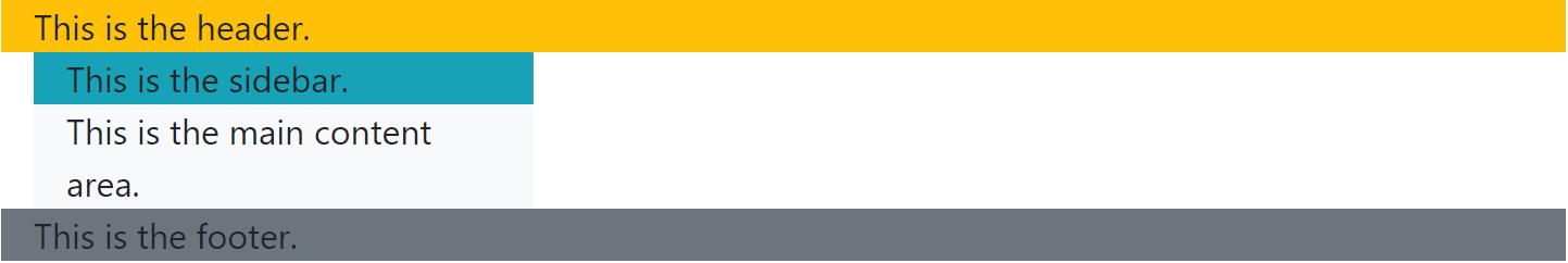
This is a screenshot of the above code on desktop:
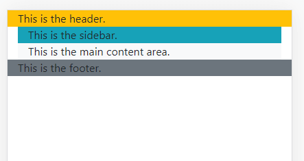
…and on mobile:
We have almost achieved the same look as we did in the previous layout.
What is missing is the vertically streched out middle section. Actually, the section is there, and it’s wrapping the <aside> and <main> tags, but it’s not stretching the available screen space. Let’s fix that next.
Vertically stretching the available screen space to fit the screen.
Here’s the updated code:
<body class="container-fluid d-flex h-100 vsc-initialized" style="height: 100vh">
  <div class="row flex-fill d-flex justify-content-start">
    <header class="col-sm-12 bg-warning h-25">This is the header.</header>
        <div class="col-sm-12 d-flex flex-fill d-flex justify-content-start overflow-auto flex-grow-1 h-75">
          <aside class="col-sm-12 col-md-4 bg-info">This is the sidebar.</aside>
            <main class="col-sm-12 col-md-4 bg-light">This is the main content area.</main>
        </div>
    </div>
</body>
As we can see, we’ve added even an inline style to update our new layout to its new look.
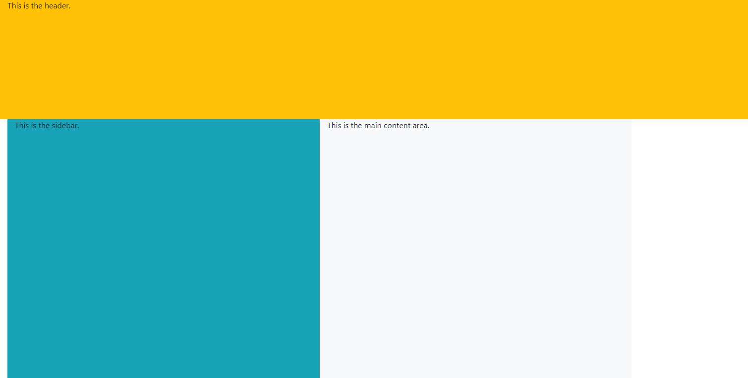
Here’s how our layout’s updated codelab.
This is what it looks like on desktop now:
Here it is on mobile after this latest update:
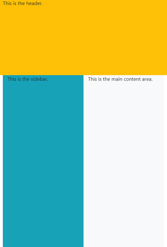
Looking at the above screenshots, we can see that we’ve obviously made an improvement over what we had before, but this is nowhere near what you’d expect from a framework.
Obviously, we are missing a piece of the puzzle.
And that piece is, using components.
Using Bootstrap 4 components
Like mentioned in the previous post in this series, rather than reinventing the wheel when building layouts with a framework, we can simply use complete components.
For example, if you navigate to Bootstrap’s official documentation, you will find that it has a component called navbar.
Here’s the link to the navbar component.
Here’s a copy of the first example from the page:
<nav class="navbar navbar-expand-lg navbar-light bg-light">
  <a class="navbar-brand" href="#">Navbar</a>
  <button class="navbar-toggler"
    type="button"
    data-toggle="collapse"
    data-target="#navbarSupportedContent"
    aria-controls="navbarSupportedContent"
    aria-expanded="false"
    aria-label="Toggle navigation">
    <span class="navbar-toggler-icon"></span>
  </button>

  <div class="collapse navbar-collapse"
       id="navbarSupportedContent">
    <ul class="navbar-nav mr-auto">
      <li class="nav-item active">
        <a class="nav-link"
           href="#">
           Home
           <span class="sr-only">
             (current)
           </span></a>
      </li>
      <li class="nav-item">
        <a class="nav-link" href="#">Link</a>
      </li>
      <li class="nav-item dropdown">
        <a class="nav-link dropdown-toggle"
           href="#"
           id="navbarDropdown"
           role="button"
           data-toggle="dropdown"
           aria-haspopup="true"
           aria-expanded="false">
          Dropdown
        </a>
        <div class="dropdown-menu" aria-labelledby="navbarDropdown">
          <a class="dropdown-item" href="#">
            Action
          </a>
          <a class="dropdown-item" href="#">
            Another action
          </a>
          <div class="dropdown-divider"></div>
          <a class="dropdown-item" href="#">
            Something else here
          </a>
        </div>
      </li>
      <li class="nav-item">
        <a class="nav-link disabled"
           href="#"
           tabindex="-1"
           aria-disabled="true">
           Disabled
        </a>
      </li>
    </ul>
    <form class="form-inline my-2 my-lg-0">
      <input
        class="form-control mr-sm-2"
        type="search"
        placeholder="Search"
        aria-label="Search">
      <button
        class="btn btn-outline-success my-2 my-sm-0"
        type="submit">
        Search
      </button>
    </form>
  </div>
</nav>
Notice that the code has been formatted so that it can fit on the screen easier.
Looking at the code structure now, our navigation has been inserted one level above from the original HTML structure:
<body class="container-fluid d-flex flex-column vsc-initialized" style="height: 100vh">
        <nav>...</nav>
        <div class="col-sm-12 d-flex flex-fill d-flex justify-content-start">
            <aside class="col-sm-12 col-md-4 bg-info">This is the sidebar.</aside>
            <main class="col-sm-12 col-md-4 bg-light">This is the main content area.</main>
        </div>
        <footer class="col-sm-12 bg-secondary" style="position: absolute; bottom: 0">This is the footer.</footer>
</body>
Notice that we’ve made some other minor changes to the code above.
Here’s the codelab of the above layout.
Here’s the updated layout’s screenshot on the desktop:
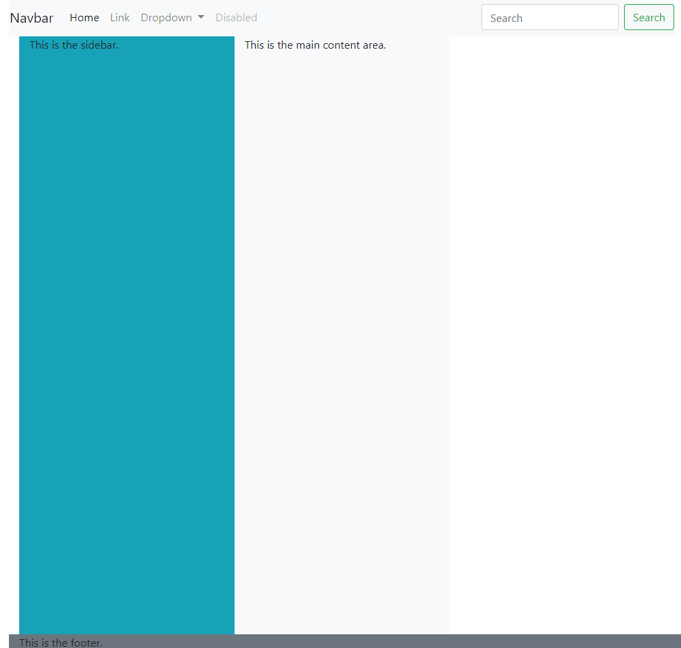
Looking at the above code for the navbar, we can see that it’s rather complex - and this brings us to the “reinventing the wheel” part we already discussed.
In the real world, many startups are trying to bring their product to market as soon as possible.
That’s why it’s crucial to understand how Bootstrap framework works, so that you can be productive in a team, even as a junior developer.
What does this mean for you, if you’re just starting out?
It means that obviously, the next step is to learn the basics of the Bootstrap framework. You could pick another framework, such as Materialize for example, but Bootstrap is used on half of the most popular 3 million websites on the entire web.
Even if you’re thinking about backend development, you should be able to be at least somewhat productive in the Bootstrap framework, meaning, you need to have at least some knowledge of how it works.
That’s why you’ll soon be able to read a Bootstrap series, similar to this HTML and CSS beginners series here on codingexercises.com.
However, it’s still to early for that, since we still have to cover a few remaining topics before we can call this series complete:
- CSS animations and transitions
- CSS variables
- CSS grid
So, let’s go on to the next article in this series, CSS animations and transitions.
Use the below links to navigate through other tutorials in this guide.
< Back to part 19: Building a layout with our micro CSS framework
You are here: Part 20, Building a layout with Bootstrap

