HTML and CSS Basics, part 6: the box model
The box model in CSS
By: Ajdin Imsirovic 14 September 2019
This series of posts is titled HTML and CSS Basics. If you’re just starting out with web development, it is crucial to read and understand this series of posts.
This is the sixth post in this series of articles.
The box model is a crucial concept to understand in CSS.
When a browser renders an element on the screen, it always uses this box model to calculate how the element will look.
Actually, the box model is so important that any modern browser’s dev tools utility has a special preview - the box model preview, that shows information on every single HTML element that you inspect using the dev tools inspector.
Video tutorial on CSS box model
The video explains how to interact with the box model on HTML elements using Chrome browser’s dev tools.
If you like 👍 the video, please subscribe 🥰 to our Youtube channel.
Previewing the box model in the browser
Let say you have a piece of content, for example, the words “This is how”, printed on the screen.
Of course, this piece of content could be any other number of words. It could even be an image. Regardless of whether it is a piece of text, or an image, let’s give it a single name, and let’s just call it: content.
So, in our practical example of a piece of content in a web page, we’re looking at the example that reads: “This is how”.
When a user visits a web page, they’ll just see the piece of content: “This is how”.
However, if we inspect it in the browser’s dev tools, we can see that it looks like this:
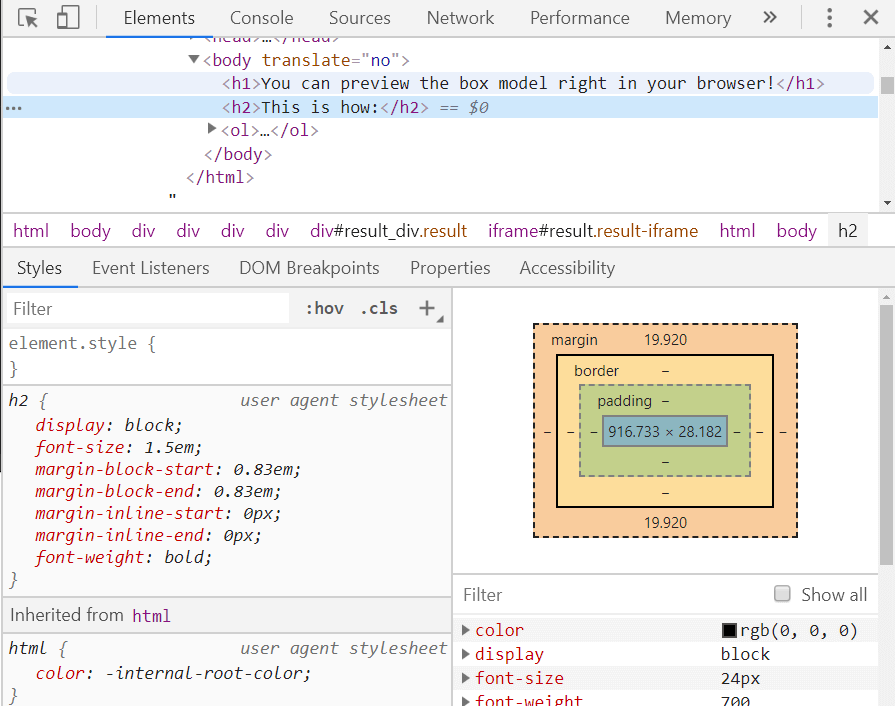
Notice the box in the middle-right of the above image?
Reading the box from inside-out, we can see that:
- The blue area is the actual content
- The green area is the padding
- The light-orange area is the border, and
- The dark-orange area is the margin.
Thus, we can conclude that all the HTML elements have the following CSS properties assigned to them: content area, padding, border, and margin.
To quickly preview the box model in your browser, you can follow the steps outlined in this code pen:
- Open a new tab using keys: CTRL T
- Once it’s open, press the F12 key
- Press CTRL SHIFT C to turn on element inspector
- Hover over an element in the webpage
- Make sure the Elements tab is open
- Inside the Styles sub-tab, you’ll see the box model diagram
Let’s use some clever styling to re-create the box model on our example page.
Visually mimicking the box model using CSS
In this code pen, we’re “drawing” a diagram of how box model works.
This is the HTML:
1
2
3
4
5
6
7
8
9
10
11
12
13
14
15
16
17
18
19
<h1>A diagram of how the box model works. In plain CSS!</h1>
<span class="margins">
  <span class="border">
    <span class="padding">
      <span class="content">
        Some text here...
      </span>
    </span>
  </span>
</span>
<span class="margins">
  <span class="border">
    <span class="padding">
      <span class="content">
        Some text here...
      </span>
    </span>
  </span>
</span>
And this is the CSS:
1
2
3
4
5
6
.content { background: plum }
.padding { padding: 20px; background: wheat }
.border { border: 5px solid purple }
.margins { padding: 20px; background: lightsalmon }

span { display: inline-block }
Here’s the output of the above code in a web page:
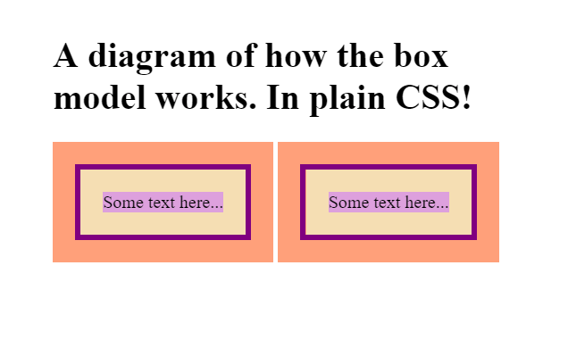
In the code above, we see that we’re setting the value of the <span> tag in our CSS to display: inline-block.
The display property can have a value of inline-block, which is a hybrid between inline elements and block elements. Here’s how it works:
- It behaves like an inline element, by NOT taking up the 100% width of its parent element.
- It behaves like a block element, because it PROPERLY renders MARGINS on the screen.
Controlling the box model
Let’s play around with the box model by controlling its individual properties, such as individual paddings and margins (the top, right, bottom, and left ones).
Here’s the codepen example, and here’s the example’s HTML:
1
2
3
4
5
6
7
8
9
10
<h1>Controlling the box model!</h1>
<span class="margins">
  <span class="border">
    <span class="padding">
      <span class="content">
        Some text here...
      </span>
    </span>
  </span>
</span>
And here is the CSS:
1
2
3
4
5
6
.content { background: plum }
.padding { padding: 20px 40px 80px 160px; background: wheat }
.border { border: 5px solid purple }
.margins { padding: 0px 2px 20px 500px; background: lightsalmon }

span { display: inline-block }
The above code produces the following layout:
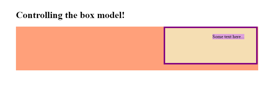
Let’s look at some conclusions:
- We can specify individual values for padding-top, padding-right, padding-bottom, and padding-left
- We can specify individual values for margin-top, margin-right, margin-bottom, and margin-left
Specifying separate CSS classes for individual padding and margin properties
In the next example, we’ll see how we can separate all of these settings into invididual CSS classes.
This example is titled Specifying individual paddings and margins
Here’s the HTML:
1
2
3
4
5
6
7
8
9
10
<h1>The box model with individual paddings and margins</h1>

<span class="padding-top bg-purple">
  Some content
</span>
<span class="pt20 pr20 pb pl b mt mr mb ml t c">
  Just some more additional content goes here
</span>

<div class="purpleBox"></div>
The CSS file is slightly bigger this time:
1
2
3
4
5
6
7
8
9
10
11
12
13
14
15
16
17
18
19
20
21
22
23
.pt20, .padding-top { padding-top: 20px }
.pr20, .padding-right { padding-right: 20px }
.pb, .pb20, .padding-bottom { padding-bottom: 20px }
.pl, .pl20, .padding-left { padding-left: 20px }
.b, border { border: 3px solid gray }
.mt, .mt20, .margin-top { margin-top: 20px }
.mr, .mr20, .margin-right { margin-right: 20px }
.mb, .mb20, .margin-bottom { margin-bottom: 20px }
.ml, .ml20, .margin-left { margin-left: 20px }

.t, .tmt, .bg-purple { background: purple }

.c, .colr, .color-lightgray { color: lightgray }

span { display: inline-block }

.purpleBox {
  padding: 20px;
  margin: 20px;
  border: 3px solid gray;
  color: lightgray;
  background: purple
}
The above code produces the following layout:
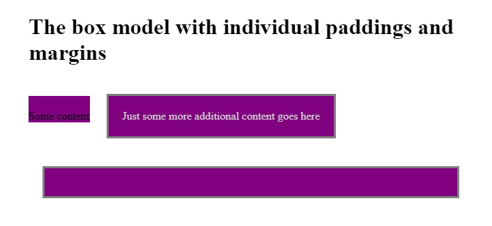
Looking at the above example, here are the conclusions:
- We can specify individual sizes for padding-top, padding-right, padding-bottom, and padding-left
- We can specify individual sizes for margin-top, margin-right, margin-bottom, and margin-left
- We can give as many names as we like to any number of CSS property-value pairs (even duplicates with different names!)
- A block element such as a
<div>covers the full width of its parent even if that<div>doesn’t hold any text
Use the below links to navigate through other tutorials in this guide.
< Back to part 5: Block VS inline elements
You are here: Part 5, Block VS inline elements

