Rebuilding an example Bootstrap 4 layout in Angular 8
Build a full layout with ngx-bootstrap in Angular 8 on Stackblitz
By: Ajdin Imsirovic 03 September 2019
This post builds on the ngx-bootstrap 8-part series of articles, in which we saw how to add all the individual ngx-bootstrap components to example Angular 8 apps.
Here is the list of posts for the entire series:
- How to prototype Bootstrap 4 layouts with Angular 8, part 1
- How to prototype Bootstrap 4 layouts with Angular 8, part 2
- Working with ngx-bootstrap tabs in Angular 8
- Working with ngx-bootstrap alerts in Angular 8
- Working with ngx-bootstrap buttons, carousel, datepicker, and dropdowns in Angular 8
- Working with ngx-bootstrap modals, pagination, popover, and progress bars in Angular 8
- Working with ngx-bootstrap’s rating, sortable, timepicker, and tooltip components in Angular 8
- Working with ngx-bootstrap’s typeahead component
We’ll begin by looking the completed layout on Stackblitz.
Following the component-building recipe
A layout in Angular will usually consist of several components.
The simplest possible recipe for adding a new component to an Angular app is as follows:
- Add the component folders and files (the files’ contents comes from the respective ngx-bootstrap component’s official docs)
- Import the usage module, and list it in
imports. Then import the class component, and list it indeclarations. - Use the newly added component’s template as a custom HTML tag inside the parent component (in our case,
app.component.html)
A pre-requisite for the above steps to work, is for you to already have added the ngx-bootstrap dependency and Bootstrap 4 styles, as described here.
Thus, our first commit on this project is the barebones Angular app, and the second commit shows the changes we added to install ngx-bootstrap and Bootstrap 4 styles to our project.
Throughout the rest of this post, we’ll be adding components by relying on this component-building recipe.
Our layout’s structure
We’ll rebuild the example Bootstrap 4 layout available here.
If we think about the linked layout, we can conclude that it consists of the following areas:
- header (with collapsible toggle button)
- jumbotron
- repeatable card (with an image, some text, and a couple of buttons)
- footer
We should split each of these features into their own component, as so the frist step in our recipe will be to add the following files and folders:
app/
├── header/
│   ├── header.component.html
│   └── header.component.ts
├── jumbotron/
│   ├── jumbotron.component.html
│   └── jumbotron.component.ts
├── cards/
│   ├── cards.component.html
│   └── cards.component.ts
├── footer/
│   ├── footer.component.html
│   └── footer.component.ts
├── ...
The contents of these files is almost the same at this point. Here’s the code for the header’s template file (header.component.html):
<div>header works!</div>
Here’s the code for the header’s class file:
1
2
3
4
5
6
7
import { Component } from '@angular/core';

@Component({
  selector: 'header-area',
  templateUrl: './header.component.html'
})
export class HeaderComponent {}
We’ll add the other files in the similar way. Have a look at the commit if you’d like to copy-paste them.
Back in app.component.html file, we’ll import the new components:
1
2
3
4
5
6
<div class="p-5">
  <header-area class="display-4"></header-area>
  <jumbotron-area class="display-4"></jumbotron-area>
  <cards-area class="display-4"></cards-area>
  <footer-area class="display-4"></footer-area>
</div>
Of course, we’re faced with the following error now:
Template parse errors:
'header-area' is not a known element:
1. If 'header-area' is an Angular component, then verify that it is part of this module.
2. If 'header-area' is a Web Component then add 'CUSTOM_ELEMENTS_SCHEMA' to the
...
To fix it, we’ll need to import the components’ class files into the app.module.ts file, and also add them to the declarations array, like this:
// ...code skipped for brevity...
import { HeaderComponent } from './headers/header.component';
import { JumbotronComponent } from './jumbotron/jumbotron.component';
import { CardsComponent } from './cards/cards.component';
import { FooterComponent } from './footer/footer.component';
// ...code skipped for brevity...
declarations: [
    AppComponent,
    HelloComponent,
    HeaderComponent,
    JumbotronComponent,
    CardsComponent,
    FooterComponent
]
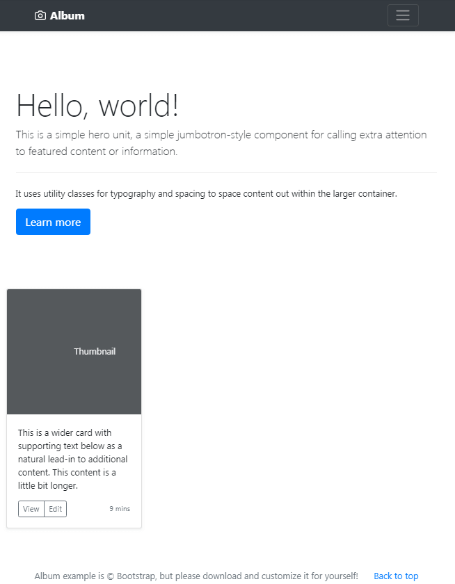
After making all these changes, our app now looks like this:
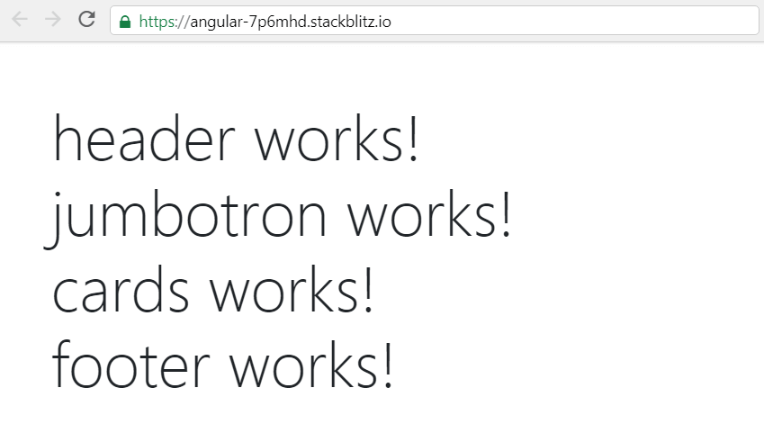
Once again, this is our current commit.
Next, we’ll add the jumbotron, since it’s a simple addition to our app.
Adding the jumbotron
We’re adding jumbotron first because it consists only of HTML and CSS. Thus, it’ll be enough to copy-paste the example code from Bootstrap docs.
We’ll paste the code for the first jumbotron example into jumbotron.component.html:
1
2
3
4
5
6
7
<div class="jumbotron">
  <h1 class="display-4">Hello, world!</h1>
  <p class="lead">This is a simple hero unit, a simple jumbotron-style component for calling extra attention to featured content or information.</p>
  <hr class="my-4">
  <p>It uses utility classes for typography and spacing to space content out within the larger container.</p>
  <a class="btn btn-primary btn-lg" href="#" role="button">Learn more</a>
</div>
We’ll also remove the display-4 class from all of our custom HTML tags inside app.component.html so that now it looks like this:
1
2
3
4
5
6
<div class="p-5">
  <header-area></header-area>
  <jumbotron-area></jumbotron-area>
  <cards-area></cards-area>
  <footer-area></footer-area>
</div>
Here’s a screenshot of our update at this stage:
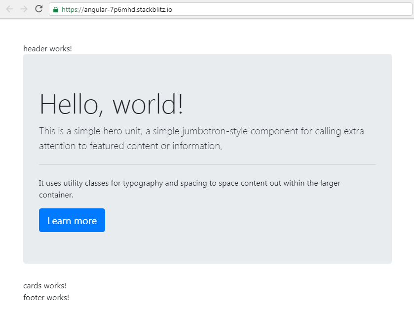
And here is the commit with this jumbotron update.
Adding header code
We’ll copy the header HTML code straight from the example on Bootstrap docs, and paste it into header.component.html:
1
2
3
4
5
6
7
8
9
10
11
12
13
14
15
16
17
18
19
20
21
22
23
24
25
26
27
28
29
30
31
<header>
  <div class="collapse bg-dark" id="navbarHeader">
    <div class="container">
      <div class="row">
        <div class="col-sm-8 col-md-7 py-4">
          <h4 class="text-white">About</h4>
          <p class="text-muted">Add some information about the album below, the author, or any other background context. Make it a few sentences long so folks can pick up some informative tidbits. Then, link them off to some social networking sites or contact information.</p>
        </div>
        <div class="col-sm-4 offset-md-1 py-4">
          <h4 class="text-white">Contact</h4>
          <ul class="list-unstyled">
            <li><a href="#" class="text-white">Follow on Twitter</a></li>
            <li><a href="#" class="text-white">Like on Facebook</a></li>
            <li><a href="#" class="text-white">Email me</a></li>
          </ul>
        </div>
      </div>
    </div>
  </div>
  <div class="navbar navbar-dark bg-dark shadow-sm">
    <div class="container d-flex justify-content-between">
      <a href="#" class="navbar-brand d-flex align-items-center">
        <svg xmlns="http://www.w3.org/2000/svg" width="20" height="20" fill="none" stroke="currentColor" stroke-linecap="round" stroke-linejoin="round" stroke-width="2" aria-hidden="true" class="mr-2" viewBox="0 0 24 24" focusable="false"><path d="M23 19a2 2 0 0 1-2 2H3a2 2 0 0 1-2-2V8a2 2 0 0 1 2-2h4l2-3h6l2 3h4a2 2 0 0 1 2 2z"></path><circle cx="12" cy="13" r="4"></circle></svg>
        <strong>Album</strong>
      </a>
      <button class="navbar-toggler" type="button" data-toggle="collapse" data-target="#navbarHeader" aria-controls="navbarHeader" aria-expanded="false" aria-label="Toggle navigation">
        <span class="navbar-toggler-icon"></span>
      </button>
    </div>
  </div>
</header>
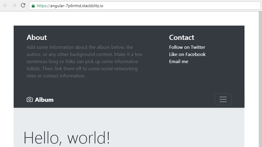
The commit for this stage is available here
However, our toggle button is not working? Why is that?
It’s because Bootstrap, out-of-the-box, uses jQuery. However, in Angular, using jQuery is frowned upon, because the whole point of Angular is not to update the DOM directly - which jQuery does - but rather let the Angular’s VDOM engine do the heavy lifting.
This also means that we need to somehow make the toggle button work with Angular, without relying on jQuery.
Making the toggle button work
Luckily, here on codingexercises.com, we’ve already covered implementing a toggle on a navbar, using ngx-bootstrap’s collapsible component.
So, we’ll begin by adding the BrowserAnimationsModule and CollapseModule, and listing it inside the imports array in app.module.ts.
// ...code skipped for brevity...

import { BrowserAnimationsModule } from '@angular/platform-browser/animations';
import { CollapseModule } from 'ngx-bootstrap/collapse';

// ...code skipped for brevity...

  imports: [
    BrowserAnimationsModule,
    CollapseModule.forRoot(),
    ...
  ]
Stackblitz will require us to install the @angular/animations package, so let’s click the INSTALL PACKAGE button.
We also need to use the isCollapsed property inside the header’s class file, as well as add the toggleCollapsed() function:
1
2
3
4
5
6
7
8
9
10
export class HeaderComponent {

  isCollapsed = true;

  toggleCollapsed() {
    this.isCollapsed = !this.isCollapsed;
    console.log(this.isCollapsed);
  }

}
Now we’ll bind the click event to the toggle button inside the template file, like this:
1
2
3
4
5
6
7
8
9
<button
    class="navbar-toggler"
    type="button"
    data-toggle="collapse"
    data-target="#navbarHeader"
    aria-controls="navbarHeader"
    aria-expanded="false"
    aria-label="Toggle navigation"
    (click)="toggleCollapsed()" >
And finally, we’ll bind the isCollapsed property to the collapsing div, like this:
<div class="collapse bg-dark" id="navbarHeader" [collapse]="isCollapsed">
Now we have a working collapsible toggle button in our layout.
Here’s the commit for the working toggle button.
Adding the footer
Similar to how we copy-pasted the header, we’ll add the footer’s HTML from the example on Bootstrap docs:
1
2
3
4
5
6
7
8
9
<footer class="text-muted">
  <div class="container">
    <p class="float-right">
      <a href="#">Back to top</a>
    </p>
    <p>Album example is © Bootstrap, but please download and customize it for yourself!</p>
    <p>New to Bootstrap? <a href="https://getbootstrap.com/">Visit the homepage</a> or read our <a href="/docs/4.3/getting-started/introduction/">getting started guide</a>.</p>
  </div>
</footer>
To get the correct styling, we’ll also need to copy the entire custom CSS file from the example layout, available at this link.
The best place to copy this file to is probably styles.scss file, since there might be some CSS code that applies to the entire layout.
This is the copy-pasted CSS code:
1
2
3
4
5
6
7
8
9
10
11
12
13
14
15
16
17
18
19
20
21
22
23
24
25
26
27
28
29
30
31
32
33
.jumbotron {
  padding-top: 3rem;
  padding-bottom: 3rem;
  margin-bottom: 0;
  background-color: #fff;
}
@media (min-width: 768px) {
  .jumbotron {
    padding-top: 6rem;
    padding-bottom: 6rem;
  }
}

.jumbotron p:last-child {
  margin-bottom: 0;
}

.jumbotron-heading {
  font-weight: 300;
}

.jumbotron .container {
  max-width: 40rem;
}

footer {
  padding-top: 3rem;
  padding-bottom: 3rem;
}

footer p {
  margin-bottom: .25rem;
}
Now our app looks like this:
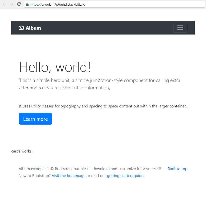
At this point, it’s probably a good idea to commit everything, so here’s the latest update.
Adding the card component
Similar to what we did before, we’ll copy-paste the HTML for the cards component:
1
2
3
4
5
6
7
8
9
10
11
12
13
14
15
16
17
18
19
20
<div class="card mb-4 shadow-sm">
  <svg class="bd-placeholder-img card-img-top" width="100%" height="225" xmlns="http://www.w3.org/2000/svg"
    preserveAspectRatio="xMidYMid slice" focusable="false" role="img" aria-label="Placeholder: Thumbnail">
    <title>Placeholder</title>
    <rect width="100%" height="100%" fill="#55595c"></rect><text x="50%" y="50%" fill="#eceeef"
      dy=".3em">Thumbnail</text>
  </svg>
  <div class="card-body">
    <p class="card-text">This is a wider card with supporting text below as a natural lead-in to additional content.
      This content
      is a little bit longer.</p>
    <div class="d-flex justify-content-between align-items-center">
      <div class="btn-group">
        <button type="button" class="btn btn-sm btn-outline-secondary">View</button>
        <button type="button" class="btn btn-sm btn-outline-secondary">Edit</button>
      </div>
      <small class="text-muted">9 mins</small>
    </div>
  </div>
</div>
To contain the width of the card so that it doesn’t strech the full width of its parent container, we’ll also add three wrapping divs:
- the first wrapping div will have a CSS class of
container-fluid, - the second div will have a CSS class of
row, and - the third div will have a CSS class of
col-md-4
While we’re at it, let’s also remove the padding class, p-5, from the wrapping app.component.html div.
The commit for this stage in our app can be found here.
This is what our app looks like with a single card added:
Making the cards repeat
One of the benefits of working with a framework like Angular is that is makes it very easy to repeat an element for any number of times.
Here is the code we’ll use:
*ngFor="let card of ','.repeat(12).split(',')"
We’ll add this code to the col-md-4 div, to repeat it 12 times.
It’s that easy!
Our Angular 8 layout is now starting to look a lot like the the example layout from the official Bootstrap documentation.
Next, we’ll fix the jumbotron so it looks exactly like the one in the source layout. We’ll also add a few other minor tweaks so we can call it a day.
As always, here’s the commit at this stage.
Improving the jumbotron and adding other minor fixes
We’ll begin by copy-pasting the code for the jumbotron from the official example layout:
1
2
3
4
5
6
7
8
9
10
11
<section class="jumbotron text-center">
	<div class="container">
		<h1 class="jumbotron-heading">Album example</h1>
		<p class="lead text-muted">Something short and leading about the collection below—its contents, the creator, etc. Make
			it short and sweet, but not too short so folks don’t simply skip over it entirely.</p>
		<p>
			<a href="#" class="btn btn-primary my-2">Main call to action</a>
			<a href="#" class="btn btn-secondary my-2">Secondary action</a>
		</p>
	</div>
</section>
Next, we’ll wrap everything in between the header and the footer component with a main HTML tag. We’ll do it inside app.component.html, like this:
1
2
3
4
5
6
7
8
<div>
  <header-area></header-area>
  <main role="main">
    <jumbotron-area></jumbotron-area>
    <cards-area></cards-area>
  </main>
  <footer-area></footer-area>
</div>
We’ve also moved the image title that reads “Thumbnail”, so that it’s visually centered in the image area.
The full-page view of the re-created layout in Angular 8 is available at this Stackblitz link.
The commit at this point can be found here.
To update the width of the main area, we can simply add the following CSS to styles.css:
main {
  max-width: 1200px;
  margin: 0 auto
}
Also, since the arrays are counted from zero, we’ve updated the repeater to repeat(11) instead of repeat(12).
With this updated commit we wrap up this article.

